Microsoft Surface Pro 3 Review
by Anand Lal Shimpi on June 23, 2014 3:55 AM EST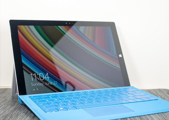
I can't believe it's only been sixteen months since I published our review of the original Microsoft Surface Pro. It feels like longer but that's likely because Surface RT made its sale debut a few months prior to that, and both devices were announced in the Summer of 2012. As far as an end user is concerned however, in February 2013 Microsoft released Surface Pro and proceeded to deliver two more iterations of the hardware in sixteen months. That's three Surface Pros in less than two years.
While the last two were largely similar, the third time is definitely more charming. Surface Pro 3 abandon's Microsoft's 10.6-inch 16:9 form factor in favor of 12-inch 3:2 design. The result is a far less cramped design, and one that does a better job of approximating a normal laptop. To offset the increase in surface area, Surface Pro 3 goes on a substantial diet and shrinks to only 9.1mm thick. Despite using the same SoC as Surface Pro 2, the 3rd generation device is substantially thinner.
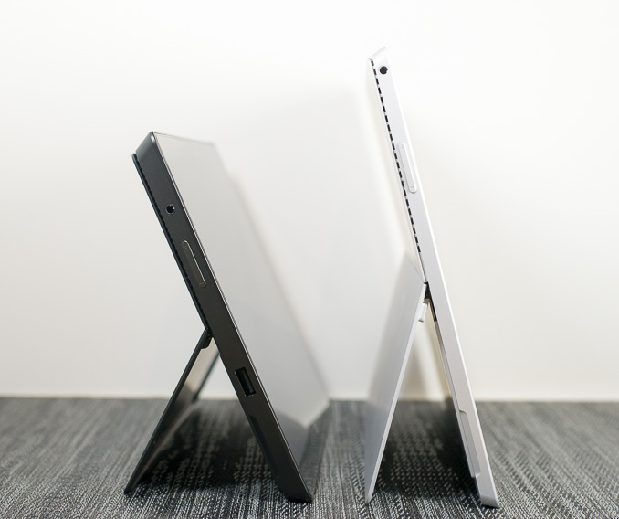
Surface Pro 2 (left) vs. Surface Pro 3 (right)
When Surface first launched, Microsoft set out to prove to the world that it too could build a thoughtfully designed, premium device. Much was said about Microsoft's custom injection moulded Magnesium process, VaporMg, and the extensive testing of the Surface kickstand and hinge. The latter was said to be able to last for over a million actuations.
Surface Pro 3 retains all of the build quality goodness that made the previous designs so unique in the Windows space. The chassis is still made out of Magnesium (although Microsoft curiously has dropped the term VaporMg), and now features the same lighter finish as Surface 2. The design is far more squared off than what we're used to seeing from Apple or any of Google's partners. Surface Pro 3 continues the line's tradition of exuding a more utilitarian design than the softer, more consumption (and consumer?) oriented tablet designs on the market.
| Microsoft Surface Pro Comparison | |||||||||
| Surface Pro 3 | Surface Pro 2 | Surface Pro | |||||||
| Dimensions | 11.5 x 7.93 x 0.36" | 10.81 x 6.81 x 0.53" | 10.81 x 6.81 x 0.53" | ||||||
| Display | 12-inch 2160 x 1440 | 10.6-inch 1920 x 1080 w/ Improved Color Accuracy | 10.6-inch 1920 x 1080 PLS | ||||||
| Weight | 1.76 lbs | 2.0 lbs | 2.0 lbs | ||||||
| Processor | As Configured: Core i5-4300U with HD4400 Graphics (15W Haswell ULT) - Optional Core i3 or Core i7 | Core i5-4200U/4300U with HD4400 Graphics (15W Haswell ULT) | Core i5-3317U with HD4000 Graphics (17W Ivy Bridge) | ||||||
| Cameras | 5MP/5MP (front/rear) | 1.2MP/1.2MP (front/rear) | 1.2MP/1.2MP (front/rear) | ||||||
| Connectivity | 2-stream 802.11ac WiFi | 2-stream 802.11n WiFi | 2-stream 802.11n WiFi | ||||||
| Memory | 4GB or 8GB LPDDR3 | 4GB or 8GB LPDDR3 | 4GB | ||||||
| Storage | 64, 128, 256 or 512GB |
64 or 128GB (4GB RAM) 256GB or 512GB (8GB RAM) |
64GB or 128GB | ||||||
| Battery | 42.0 Wh | 42.0 Wh | 42.0 Wh | ||||||
| Starting Price | $799 ($1299 review configuration) | $899 | $799 | ||||||
Other than the chassis upgrade, there are now more CPU options with the base model starting at $799:
| Microsoft Surface Pro 3 Configuration Options | |||||||||||
| Configuration | $799 | $999 | $1299 | $1549 | $1949 | ||||||
| CPU | Intel Core i3-4020Y | Intel Core i5-4300U | Intel Core i5-4300U | Intel Core i7-4650U | Intel Core i7-4650U | ||||||
| TDP | 11.5W | 15W | 15W | 15W | 15W | ||||||
| Cores/Threads | 2/4 | 2/4 | 2/4 | 2/4 | 2/4 | ||||||
| Frequency Base/Max Turbo | 1.5GHz/- | 1.9/2.9GHz | 1.9/2.9GHz | 1.7/3.3GHz | 1.7/3.3GHz | ||||||
| GPU | Intel HD 4200 | Intel HD 4400 | Intel HD 4400 | Intel HD 5000 | Intel HD 5000 | ||||||
| GPU EUs | 20 | 20 | 20 | 40 | 40 | ||||||
| GPU Frequency Base/Max Turbo | 200/850MHz | 200/1100MHz | 200/1100MHz | 200/1100MHz | 200/1100MHz | ||||||
| Storage | 64GB SSD | 128GB SSD | 256GB SSD | 256GB SSD | 512GB SSD | ||||||
| RAM | 4GB | 4GB | 8GB | 8GB | 8GB | ||||||
The Kickstand: Perfected
From the moment I first used Surface RT, I fell in love with its kickstand. In fact, I went as far as as to say that it was one of the most useful features to ever meet a tablet. The original kickstand was great for desk use. The second generation kickstand added a second stop to improve usability in non-desktop (read: lap-bound) scenarios. With each generation, Microsoft improved its kickstand by adding in the one thing we asked for the last round. With Surface Pro 3, Microsoft perfected the kickstand.
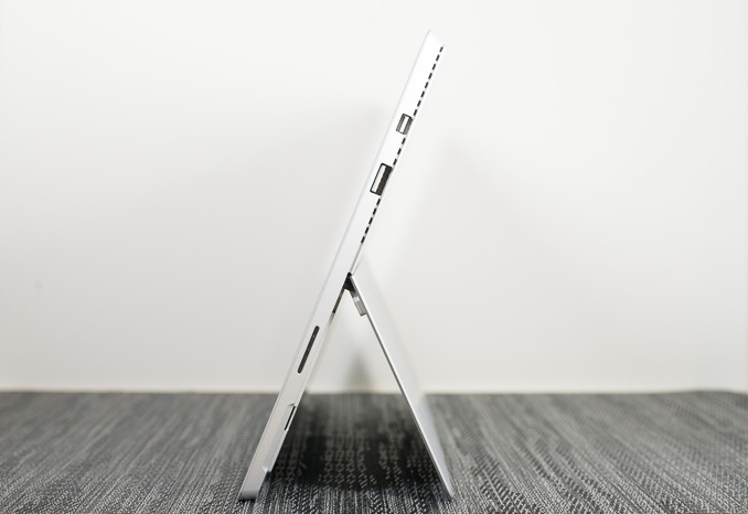
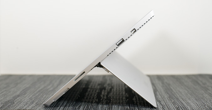
The default opening is still 22-degrees, and the process of getting it open is just as easy as it was before. After you hit that initial stop however, friction in the hinge increases dramatically and with a bit more effort you can push and set the kickstand to any other opening between 22 and 150 degrees. The increased flexibility gives Surface Pro 3 the best kickstand implementation I've seen on any mobile device. Not only can I find a more comfortable position for notebook use, but I can also put the device into tent mode which is great for browser and other tablet workloads. In tent mode Surface Pro 3 is the most comfortable tablet I've ever used.
Lapability
For as much criticism as Microsoft received over Windows 8 and Surface, the company bet big on fixing one of the biggest unsolved problems in mobile. Tablets and notebooks are both great, wouldn't it be amazing if someone could converge the two. Given Microsoft's relative inaction in mobile for the years prior to Windows 8, attempting to leapfrog the market was a very sensible thing to do.
Surface Pro in particular running Windows 8 was designed to be the Swiss Army Knife of mobile computing devices. Whether you wanted a tablet, laptop or even a desktop, Microsoft had a single device it could sell you to serve all three functions. In reality however, Surface always ended up a series of compromises that never seemed to work for the masses. Windows 8 was a disappointment as a tablet OS, and Surface didn't quite work as a laptop, specifically in one's lap. Microsoft referred to the inability for the prior hardware to function ergonomically in the lap as "lapability".
To understand how Surface Pro 3 changed mechanically in pursuit of better "lapability", we need to first understand the difficulties faced by all of the previous Surface designs (Surface RT, Surface Pro, Surface 2 and Surface Pro 2).
The challenge with the Surface design has always been the amount of room it requires on your lap. While you only need to accommodate the room behind the keyboard on a normal laptop, a Surface device requires that much room plus a contact point for the outer edge of the kickstand. At narrow angles, this amounts to another couple inches of lap-room. However, the kickstand opened at a narrow angle forces a less natural display viewing angle. Open the kickstand wider, a feature enabled by Surface Pro 2 (and furthered by Surface Pro 3) and you address the viewing angle concern at the expense of now requiring more room on your lap. You can always pull the device closer to you to compensate, but then you end up sacrificing typing position/comfort.
There's also the issue of stability on your lap. Traditional laptops have a rigid base supporting the device. The Surface devices, on the other hand, don't. The strongest, most rigid part of Surface is the display, which needs but doesn't give much support. Instead the stability duties come from the small contact point of the kickstand and the Type Cover. The Type Cover itself is quite rigid, but the flexible hinge between it and the Surface device was a clear weakspot. In order to allow the Type Cover to function as a cover, its hinge couldn't be totally rigid - it needed to be able to fold around the spine of the tablet. In doing so you get an incredibly useful cover, but a weakened base for using a Surface tablet as a notebook on your lap.
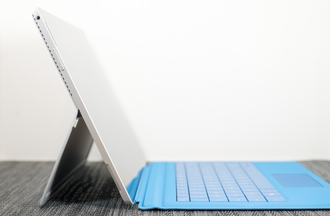
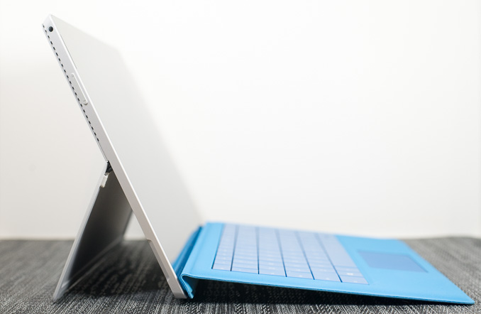
With Surface Pro 3, Microsoft managed to largely address the stability issue and in doing so somewhat addressed the lap-space requirement. The new Type Cover has a second magnetic strip in it that allows you to fold it in even closer to the display when you're in laptop-mode. Doing so completely occludes the bottom bezel, but it eliminates the floppy cover spine from resting on your lap. Now the only parts of the device touching your lap in laptop-mode are rigid elements, which tremendously improves the stability of the design.
As a side effect, by shortening the length of the cover in laptop-mode Microsoft reduces the amount of lap room needed by about an inch. It's not perfect, but it goes a long way to making Surface Pro 3 actually usable on your lap.
The design continues to be a tradeoff however. The new, continuously adjustable kickstand lets you maintain a better viewing angle by opening to wider angles, which require correspondingly more lap area. While the new Type Cover takes up less room, the wider angled kickstand can negate a lot of those savings. The net result is still an ergonomic improvement though. Surface Pro 3 is much easier to position properly on my lap compared to any previous Surface device. While the latter were all ultimately a pain to use on my lap, Surface Pro 3 is passable. I still prefer a laptop, but the gap has been narrowed considerably.
The only other issue that remains with the new foldable Type Cover hinge is the occlusion of the lower bezel on the display. Windows 8 was built around edge gestures, where a swipe in from a bezel would bring up a task switcher, the charms bar or an application-specific menu. By covering the bottom bezel you can no longer use it for edge gestures within an application. Thankfully the top bezel serves the same purpose, but it does require a longer reach than going for the bottom one - something I'd grown used to doing on previous Surface tablets. The occluded bottom bezel forced the relocation of the capacitive Start button to the right side of the panel, which can create issues with accidentally bringing up the Start Screen.





274 Comments
View All Comments
dupawow - Monday, June 23, 2014 - link
Great review! Can't wait till i get mine.drmyfore - Monday, June 23, 2014 - link
WEIGHT:Surface Pro 3 / 800g (+295g TypeCover=1095g)
Macbook Air 11 / 1.08kg
Macbook Air 13 / 1.35kg
RES:
Surface Pro 3 / 2160*1440
Macbook Air 11 / 1366*768
Macbook Air 13 / 1440*900
THICKNESS:
Surface Pro 3 / 9.1mm (4.8mm TypeCover=13.9mm)
Macbook Air 11 / 17mm
Macbook Air 13 / 17mm
BATTERY LIFE (OFFICAL):
Surface Pro 3 / 9H
Macbook Air 11 / 9H
Macbook Air 13 / 12H
Why not compare with Air 11?
dylan522p - Monday, June 23, 2014 - link
Because it is luster in terms of screen size and real estate.dylan522p - Monday, June 23, 2014 - link
Bigger*rodolfcarver - Friday, October 3, 2014 - link
It sure is an fantastic tablet. For work, I don't see how you could get anything better (but for other things there are, see http://www.consumertop.com/best-tablets/ ). I've had mine for a couple of weeks and couldn't be more pleased.bestllc - Monday, July 8, 2019 - link
Thanks for Your writing i found them interestinghttps://www.bestllcservices.us/
MarcSP - Monday, June 23, 2014 - link
Then, why compare it with the even bigger MBA13? :-]darwinosx - Tuesday, June 24, 2014 - link
Bigger? By what? Oh, pretty much nothing.basroil - Tuesday, June 24, 2014 - link
"Bigger? By what? Oh, pretty much nothing."I suggest you pull out a calculator and do the math, that 2" increase is a 40% increase in area!
With 40% more area you get a hell of a lot more room to dissipate heat and that much larger battery (54W vs 38W). When comparing surface pro's 7.58 hour life to the 13" MBA the difference is only 22% despite a 29% decrease in battery size (both on windows, . Compared to the 11" MBA (about 8.5hours on OSX) the SP3 should be very competitive, and should last substantially longer in heavy use tasks.
retrospooty - Tuesday, June 24, 2014 - link
You are also comparing a laptop to a convertible. Not really in the same category. The SP3 kicks the MBA's ass IMO.