Microsoft Surface Pro 3 Review
by Anand Lal Shimpi on June 23, 2014 3:55 AM ESTThe New Type Cover
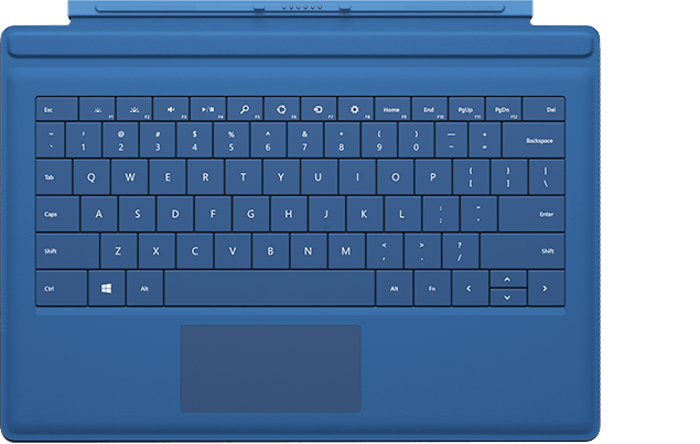
Along with the integrated kickstand, the Surface tablet was always designed around being used with a detachable keyboard cover. In the first two generations this meant having two different options: a pressure based Touch Cover and a Type Cover with low profile keys that actually move. The Touch Cover always offered the low profile behavior of a traditional tablet cover but it was never all that great as a keyboard. I could always justify the Touch Cover's existence by saying it was better than typing on glass, but the reality remained that I almost always used a Type Cover with Surface Pro.
It seems as if Microsoft came to the same conclusion as Surface Pro 3 is only offered with an optional Type Cover. All previous Type and Touch Cover accessories will still work with Surface Pro 3, including features like the backlit keyboard on previous Touch Covers. Keep in mind though, those old accessories are built for a 10.6" 16:9 Surface but the move to a 12" 3:2 requires a larger cover to completely protect the display.

The new Type Cover has a larger surface area, it includes a second magnetic strip for added stability in laptop mode and it's thinner compared to last year's model. The larger cover doesn't result in larger keys or bigger spacing between the keys, the keyboard portion of the cover doesn't really change compared to the previous design. There's a slight difference in key feel. The design feels less mushy overall.
Substantial changes are limited to the trackpad. You get a few extra millimeters of height and a substantial increase in trackpad width. The surface of the trackpad is now a rigid plastic rather than the soft touch material surrounding it. The trackpad surface is also hinged at the top and physically moves like a clickpad, just smaller. The result is the first usable trackpad on a Surface device. Two finger scrolling works reasonably well. In the past scrolling was so bad that I almost always used the touch screen instead, but with the new Type Cover I'd say 80% of the time I'm ok with using it for scrolling. Edge gestures are supported by the new trackpad and although they work the action still doesn't feel all that natural. Clicking and dragging is still problematic.
| Microsoft Touch/Type Cover Evolution - Thickness | ||||||
| Touch Cover | Type Cover | |||||
| Surface Pro 1 | 3.35 mm | 5.7 mm | ||||
| Surface Pro 2 | 2.91 mm | 5.22 mm | ||||
| Surface Pro 3 | - | 4.95 mm | ||||
The only real issue with the Type Cover is that it's a bit thick when you're not using it as a keyboard. Microsoft is counting on the quick attach/detach mechanism to minimize the burden but you still have to deal with the cover when detached. There are also times when the keyboard and/or trackpad will stop responding. In some situations only certain aspects of the Type Cover won't work. For example right now I can't seem to get two finger scrolling or any other trackpad gestures to work. This is a problem I've seen on every single Surface since its release, although the problem itself seems to have gotten better over the years. Thankfully unlike previous implementations, detaching/reattaching the cover is usually enough to fix things.
Overall the new Type Cover is a substantial improvement over the previous design and a key part of the Surface Pro 3 experience. Once again Microsoft insists on charging extra for the accessory. The new Type Cover is optional and priced at $129. It comes in four colors Cyan, Red (exclusive to Microsoft Stores), Purple and Black plus Blue that's exclusive to Best Buy.
The Pen
The first two Surface Pro devices included an integrated Wacom digitizer layer. The Wacom electro-magnetic resonance grid integrated into the display would generate a weak EM field that could induce a current in the Surface Pro pen. Relying on induction, the pen didn't require a battery. As with many other Wacom devices, the first two Surface Pros featured 10-bit pressure resolution (the digitizer could recognize 1024 different pressure levels).
With Surface Pro 3, Microsoft hoped to reduce all aspects of the display assembly thickness in order to meet the 9.1mm thickness requirement of the tablet. Among other things, this meant the Wacom EMR layer had to go. Without the ability to induce current in an external pen, Microsoft had to move to an active pen that could interact with the display. Microsoft partnered with NTrig to provide a solution for Surface Pro 3.
The new pen ditches the magnetic mount of the previous design and instead needs to be carried separately. The old magnetic pen attached to the charge port on Surface Pro which wasn't much better as it meant that the pen only had a place to live whenever your tablet was unplugged.
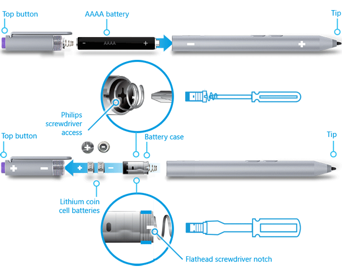
The new pen is battery powered but ships with the batteries needed for operation. The body of the pen uses a single AAAA battery. This battery powers all writing and button functions (with the exception of the eraser launch button). The eraser portion of the pen houses two button-type 319 1.5V batteries. As far as I can tell, these batteries are necessary to enable the eraser launch button and to allow the pen to bring Surface Pro 3 out of sleep.

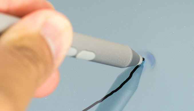
Feature wise the new pen is quite similar to its predecessor. You still get support for hover and the design is pressure sensitive. New to the Surface Pro 3's pen are a pair of buttons on the edge of the pen and a new eraser button. The latter comes configured to wake the tablet from sleep and launch OneNote by default. With Surface Pro 3 locked and asleep I can wake the device from a single click of the eraser button and have an active OneNote window open in around 1.5 seconds. That's around 200 ms longer than it takes to wake the device from sleep altogether. The pen's other two buttons are configurable in Windows.
On paper the big regression is in a reduction in pressure sensitivity. While the old design had 10-bit pressure resolution, Surface Pro 3 only allows for 8-bits of pressure resolution. In other words, Surface Pro 1/2 could detect 1024 different levels of pen pressure while Surface Pro 3 can only detect 256. In practice, I haven't found this to be an issue at all. I'm definitely not an artist, but I spent a lot of time drawing on both Surface Pro models (Wacom and NTrig) and couldn't find a situation where the new design regressed when it comes to pressure sensitivity. The pressure curves are definitely different between the Wacom and NTrig implementations, but in terms of pure ability I don't think the reduction in pressure resolution will amount to much.
The bigger difference is the new thinner display stack isn't as strong as the previous model. When applying maximum pressure to the pen on Surface Pro 2, I couldn't cause the LCD to distort at all. The same isn't true for Surface Pro 3. The new display stack behaves a lot more like a traditional LCD display in that pushing hard on it will cause color distortion at the point of pressure.

Surface Pro 3's display stack distorts under heavy pressure from the new pen, the older thicker display stack was more resilient
I don't know how well Microsoft has beefed up the display to ensure that doing a lot of heavy pressure drawing on it won't cause harm in the long run, but it's clear that the design isn't as robust as it used to be. Again, in the grand scheme of things this is likely the right tradeoff. The best solution here would be for control over the new pen's pressure curve so you don't need to press as hard to get reach max pressure levels.
I didn't notice a substantial difference in the feel of the new pen's tip. The old tip was spring loaded and would move inwards a bit as you pressed down on it. The new tip by comparison is rigid with virtually no play. Both felt as natural or unnatural as the other depending on how convincing dragging a plastic tip on a glass display is for you. There is a difference in the minimum attack angle supported by the pen. The old design allowed for as little as a 15-degree angle between the pen tip and the display's surface, the new design seems to only activate at around 30 or 40-degrees.
Palm rejection works quite well on Surface Pro 3, a definite step up from the Wacom based Galaxy Note Android devices if you're looking for a reference point. I didn't have any issues resting my palm on the display while writing or sketching. I also found the palm rejection did a good job of not accidentally triggering the capacitive Windows button, although PA's Gabe ended up being quite frustrated by its positioning. I have a feeling the Windows button's behavior may vary on a per app basis as it always seemed to do a good job of disabling itself while running SketchBook Express. I could get the Windows button to trigger but only if i poked at it with a finger while drawing with my other hand.
Microsoft was quick to point out that by thinning the display stack and reducing reflections it could do a better job of mimicking a traditional pen/paper setup by reducing the distance between the tip of the Surface pen and the resulting dot drawn on the screen. I have to say I didn't notice a substantial improvement in this area but it wasn't really bad to begin with in the previous design. I was curious to see if draw latency changed at all with a shift away from Wacom. I pointed a high speed camera at Surface Pro 2 and 3 and measured the lag between the tip of my pen and its impact in software. The results were consistently in favor of Surface Pro 3:
| Surface Pro Pen Drawing Latency | |||||||
| Min | Average | Max | |||||
| Surface Pro 3 | 75 ms | 97.8 ms | 141 ms | ||||
| Surface Pro 2 | 100 ms | 129.6 ms | 166 ms | ||||
On average the new design seems to have reduced pen latency by around 30ms.
Overall I have to say the new pen is an improvement. You get a much thinner display, an unnoticeable impact to pressure sensitivity, improved latency and the experiential improvements are substantial (one click wake/OneNote launch is useful). There's definitely room for tuning the pressure curve on the pen though. The only unknown at this point is the pen's battery life, which I haven't had enough time to really devise a test for and measure.


274 Comments
View All Comments
dupawow - Monday, June 23, 2014 - link
Great review! Can't wait till i get mine.drmyfore - Monday, June 23, 2014 - link
WEIGHT:Surface Pro 3 / 800g (+295g TypeCover=1095g)
Macbook Air 11 / 1.08kg
Macbook Air 13 / 1.35kg
RES:
Surface Pro 3 / 2160*1440
Macbook Air 11 / 1366*768
Macbook Air 13 / 1440*900
THICKNESS:
Surface Pro 3 / 9.1mm (4.8mm TypeCover=13.9mm)
Macbook Air 11 / 17mm
Macbook Air 13 / 17mm
BATTERY LIFE (OFFICAL):
Surface Pro 3 / 9H
Macbook Air 11 / 9H
Macbook Air 13 / 12H
Why not compare with Air 11?
dylan522p - Monday, June 23, 2014 - link
Because it is luster in terms of screen size and real estate.dylan522p - Monday, June 23, 2014 - link
Bigger*rodolfcarver - Friday, October 3, 2014 - link
It sure is an fantastic tablet. For work, I don't see how you could get anything better (but for other things there are, see http://www.consumertop.com/best-tablets/ ). I've had mine for a couple of weeks and couldn't be more pleased.bestllc - Monday, July 8, 2019 - link
Thanks for Your writing i found them interestinghttps://www.bestllcservices.us/
MarcSP - Monday, June 23, 2014 - link
Then, why compare it with the even bigger MBA13? :-]darwinosx - Tuesday, June 24, 2014 - link
Bigger? By what? Oh, pretty much nothing.basroil - Tuesday, June 24, 2014 - link
"Bigger? By what? Oh, pretty much nothing."I suggest you pull out a calculator and do the math, that 2" increase is a 40% increase in area!
With 40% more area you get a hell of a lot more room to dissipate heat and that much larger battery (54W vs 38W). When comparing surface pro's 7.58 hour life to the 13" MBA the difference is only 22% despite a 29% decrease in battery size (both on windows, . Compared to the 11" MBA (about 8.5hours on OSX) the SP3 should be very competitive, and should last substantially longer in heavy use tasks.
retrospooty - Tuesday, June 24, 2014 - link
You are also comparing a laptop to a convertible. Not really in the same category. The SP3 kicks the MBA's ass IMO.