The HTC One X for AT&T Review
by Brian Klug on May 1, 2012 6:00 PM EST- Posted in
- Smartphones
- Snapdragon
- HTC
- Qualcomm
- MSM8960
- Krait
- Mobile
- Tegra 3
- HTC One
- NVIDIA
For just over a week, I’ve been using two phones interchangeably. The first is the Lava Xolo X900 with Medfield inside, the second is the flagship of HTC’s new One series, the HTC One X on AT&T. It’s a device with lofty goals, as it’s the flagship of HTC’s new branding and strategic positioning behind a single line of devices, industrial design, and focus. The strategy mirrors that of Samsung’s with their Galaxy series, and if successful will rekindle the excitement behind HTC’s brand.
The One X on AT&T is really a One XL (L for LTE), however in the USA the device carries full One X branding. We’ve got the International One X and One S variants which will be reviewed in short order, but for today we’re talking specifically about the One X on AT&T.
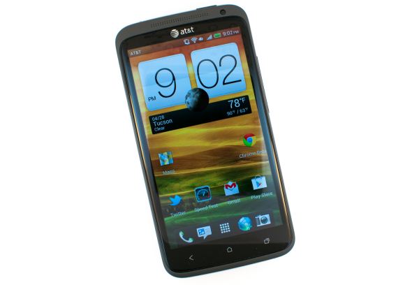
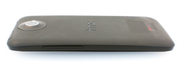
The One X is without doubt unlike any other HTC smartphone I’ve held to date. In fact, it’s a testament to how revised HTC’s industrial design is that I can even write that sentence. The phone is machined, not injection molded, from a single machined piece of polycarbonate plastic, and feels anything but cheap in the palm. If Nokia was really the first to demonstrate that you can have a polymer (read: plastic) device without making it feel second rate, HTC is the second OEM to do it properly. Probably the biggest part of that effort is giving the surface a proper texture. In this case the HTC One X backside is given a sand blasting for texture, while the sides remain slick with a piano finish gloss. It’s a great juxtaposition of textures that makes it easy to identify proper grip, and likewise break any homogenaity.
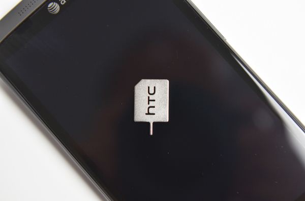
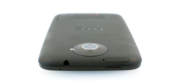
The buttons blend into the glossy sides of the One X, getting pretty close to the optimal combination of protrusion and clickiness. The power/standby button at top is no exception. Speaking of the top, there’s a secondary microphone for noise cancelation, headset jack, and finally the microSIM tray, which requires an ejector tool (provided in the box) like many other newer designs.
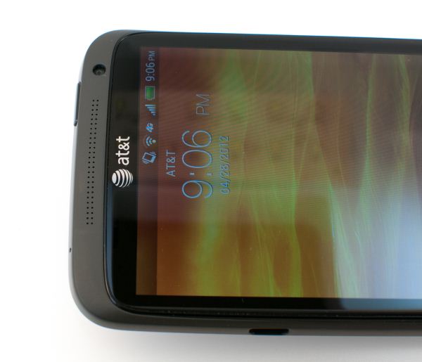
The case is again a single piece unibody construction. With exception of the microSIM tray, there are virtually no doors or covers, and the consequence is no flex, creaking, or chattering seams when the vibration motor is going. The speakerphone grille at the back and the earpiece at front are both arrays of pinholes no doubt cut with a laser through the polycarbonate. On the front, the notification LED (which shines green or amber) shines through one of the small holes. The only unfortunate part of this is that it’s hard to see the notification LED from extreme angles. At far right is the 1.3 MP front facing camera.
HTC has opted to place the microUSB port about one quarter of the way down on the left side of the phone. The result is that it’s possible to hold the device in portrait and type like normal without the cable poking into your hand. I also suspect that HTC has placed the majority of the PCB up top, and left the bottom three quarters of the device for the internal battery.
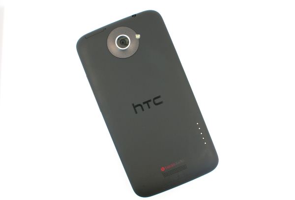
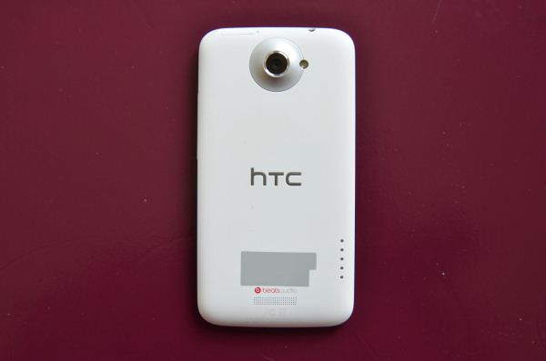
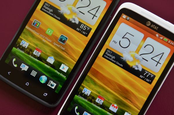
The rear of the device is again a softly textured finish. Our HTC One X is a dark, almost black color, but there’s also a white version as well. The white revision indubitably hides scuffing better than our black unit, though so far loss of texture at the contact points on the One X has been minimal. The surface roughness from HTC's bead/sand blasting is very high frequency, which is what makes it somewhat prone to appearing shiny after rubbing on planar surfaces. Interestingly enough I noticed that Nokia moved to a lower frequency surface texture on the Lumia 900 to combat this. I'm sure we'll eventually see HTC do something similar eventually. That said again the scuffing is minor.
There are five pogo pads at right for using a dock or accessory. I’m not sure whether the HTC Car Kit uses these pogo pins, but we’ve seen HTC and other OEMs use these for audio, power, and USB data signaling before. The camera module bulges out gently from the top center with a single LED flash at right.
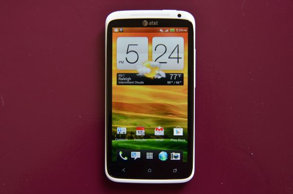
The obvious mainstay of the One X is the 4.7" 720p infinity display which has a gentle curve at the left and right edges. The display isn’t curved, however the overall design makes it almost feel that way. Up top, HTC has done an excellent job hiding the ambient light and proximity sensor. I can spot the ambient light sensor, but it’s subtle, and I have no idea where the proximity sensor is, which is awesome. At bottom are the three capacitive buttons, which means the menu button becomes part of the UI for legacy applications that haven’t fully integrated it yet. I have no complaints with the capacitive buttons, this is something that has long since been completely settled and squared away. They’re backlit as well if the ambient brightness level is low enough. The result is even more vertical real estate than the Galaxy Nexus’ 720p display provides.
Overall I can’t understate how great the One X feels as a whole. It’s a new type of minimalism for the handset maker - mature, less chintzy and flashy like so many other Android devices. My only gripe is that the black color shows scuffs and loss of texture (from rubbing other solid surfaces at the contact points) more than I’d like - the white model probably makes more sense purely because I can’t imagine that showing.
What’s really interesting to me is just how many recent handsets from so many other OEMs have taken a similar design approach - microSIM, unibody polymer construction, no microSD card slot, and non removable battery. That combination of features seems necessary if you’re going to craft a device with competitive form factor this generation, and no doubt even more vendors will update with that profile. Polymer makes sense because it’s both a material transparent to RF, and easy to machine, and going with a microSIM makes sense since it’s all about minimizing area that isn’t dedicated to battery.
Next up is our specifications table. Again the chief differentiator between AT&T’s One XL turned One X is that the device has a Qualcomm Snapdragon S4 MSM8960 SoC, this is the first 28nm dual core Krait based part, and marks our first smartphone with it inside. The two krait cores are clocked at up to 1.5 GHz, and MSM8960 includes Adreno 225 graphics. The AT&T One X also includes 16 GB of onboard storage, and again there’s no microSD card expansion option.
| Physical Comparison | ||||
| Apple iPhone 4S | Samsung Galaxy S 2 | Samsung Galaxy Nexus (GSM/UMTS) | HTC One X (AT&T) | |
| Height | 115.2 mm (4.5") | 125.3 mm (4.93") | 135.5 mm (5.33") | 134.8 mm (5.31") |
| Width | 58.6 mm (2.31") | 66.1 mm (2.60") | 67.94 mm (2.67) | 69.9 mm (2.75") |
| Depth | 9.3 mm ( 0.37") | 8.49 mm (0.33") | 8.94 mm (0.35") | 8.9 mm (0.35") |
| Weight | 140 g (4.9 oz) | 115 g (4.06 oz) | 135 g (4.8 oz) | 129 g (4.6 oz) |
| CPU | Apple A5 @ ~800MHz Dual Core Cortex A9 | 1.2 GHz Exynos 4210 Dual Core Cortex A9 | 1.2 GHz Dual Core Cortex-A9 OMAP 4460 | 1.5 GHz Dual Core Qualcomm Snapdragon MSM8960 |
| GPU | PowerVR SGX 543MP2 | ARM Mali-400 | PowerVR SGX 540 @ 304 MHz | Adreno 225 |
| RAM | 512MB LPDDR2-800 | 1 GB LPDDR2 | 1 GB LPDDR2 | 1 GB LPDDR2 |
| NAND | 16GB, 32GB or 64GB integrated | 16 GB NAND with up to 32 GB microSD | 16 GB NAND | 16 GB NAND |
| Camera | 8 MP with LED Flash, Front Facing Camera | 8 MP AF/LED flash, 2 MP front facing | 5 MP with AF/LED Flash, 1.3 MP front facing | 8 MP with AF/LED Flash, 1.3 MP front facing |
| Screen | 3.5" 640 x 960 LED backlit LCD | 4.27" 800 x 480 SAMOLED+ | 4.65" 1280x720 SAMOLED HD | 4.7" 1280 x 720 LCD-TFT |
| Battery | Internal 5.3 Whr | Removable 6.11 Whr | Removable 6.48 Whr | Internal 6.66 Whr |
To be totally honest, I always found the Sensation’s industrial design to be world class, it was a few other devices with carrier influence that showed definite drift away from HTC’s unique vision. Keeping that from happening with the One series should be the next big concern for HTC.





137 Comments
View All Comments
frostyfiredude - Tuesday, May 1, 2012 - link
If there is one difference that really stood out between the International and ATT versions of the One X, it's the battery life. For all the talking nVidia did about Tegra3 allowing world beating battery life, it really got served by the S4 in that regard.In the fall I really hope HTC makes a One X like phone with WP8 on it, if I'm not feeling cheap I think I'll buy one.
ImSpartacus - Tuesday, May 1, 2012 - link
Yeah, that's really the most important thing for me. I'm glad Anandtech puts it earlier in the reviews.Chloiber - Wednesday, May 2, 2012 - link
It's true. I'm currently owning a One X (international). I'm okay with the battery life (it's better than my previously HTC Desire). But as Brian has mentioned, software updates are on the way. The second update has been released yesterday. The updates are coming out nearly weekly! The improvements are huge in many aspects. The last update (released yesterday in Europe for unbranded devices) finally enabled 2D GPU Acceleration. That's right: 2D GPU Acceleration wasn't working properly before. It couldn't even be forced in the dev settings.I really hope they can improve the device even more, and I'm pretty confident they will. To be perfectly honest, I would have preferred the S4 version of the One X. Nvidia still seems to have some problems with the T3 - again, I'm confident that the device's performance and battery life will improve massively over the next couple of months, but S4 seems to be the safer bet.
pikahatonjon - Tuesday, May 1, 2012 - link
i know its offtopic, however, how come it seems like the Droid Razr performs like 40% better than the galaxy nexus 58.7 fps vs 33.1 when they both have the same SoC? was there some error in the testfrostyfiredude - Tuesday, May 1, 2012 - link
Higher resolution display on the Nexus would be the cause of most if not all of the difference. 960x540 for the RAZR v 1280x720 for the NexusPyroHoltz - Wednesday, May 2, 2012 - link
I really wish Anandtech would normalize the graphics benchmarks to FPS/megapixel of screen resolution.Or, implement something that will take the fluctuations in native resolution, out of the equation a bit.
Goty - Wednesday, May 2, 2012 - link
Just look at the "offscreen" numbers, those are all rendered at the same resolution regardless of handset.ChronoReverse - Wednesday, May 2, 2012 - link
The Offscreen Test is a seriously flawed one. It's clear that the act of rendering to the screen has a different penalty for different GPU's.Since you have to render in actual 3D applications, this means that the Offscreen test is worse than useless since it's _misleading_.
You can't even say it's a VSync issue because in this very article, you have the GLBenchmark test at 720P where the results for both the Global and ATT OneX phones are both significantly below 59-60FPS.
Goty - Wednesday, May 2, 2012 - link
Writing of the framebuffer to the screen is the least part of what each GPU has to do and certainly has less of an impact that differing resolutions between screens; I highly doubt that writing out the framebuffer is even that different between different architectures.metafor - Thursday, May 3, 2012 - link
It's very much in line with the V-Sync results we've seen with the MDP and other devices that allow you to turn V-Sync off.The tests with the Qualcomm MDP show exactly this kind of difference with V-Sync turned on and off, even if the resulting average doesn't come close to 60fps.
Why? Because framerate can vary by a lot within the running of the benchmark. Simple sequences can burst up to the 100's of frames per second. That will throw off the average by a lot.