The HTC Droid Incredible Review, Clearly Better than the Nexus One
by Anand Lal Shimpi on May 10, 2010 1:27 PM EST- Posted in
- Smartphones
- Snapdragon
- Droid Incredible
- HTC
- Android
- Mobile
I'm very proud of companies like ASUS and HTC. These aren't your tradtional consumer electronics companies. They have their roots in the OEM business, working hard but for very little recognition. These Taiwanese companies have been desperately trying to bridge the gap to the mainstream consumer market over the past few years and honestly, they've done a great job thus far. Just earlier this year we saw HTC build Google's first branded smartphone: the Nexus One. A clear shot at the iPhone, the Nexus One was well built and only fell behind in software issues. It lacked the polish that Apple was able to provide with the iPhone. Rather than depend on Google to fix that, here we are a few months later and HTC has a solution.
It's called the Droid Incredible and it's available through Verizon ($199 subsidized with a 2-year contract). Similar in size and features to the Nexus One (not surprising, the two share the same base platform), the Incredible was a strong enough competitor to make Google cancel plans for a Verizon Nexus One. This isn't just a cosmetic thing though. The Incredible has real hardware and software advantages over the Nexus One. HTC has even fixed some of my issues with the Android platform.
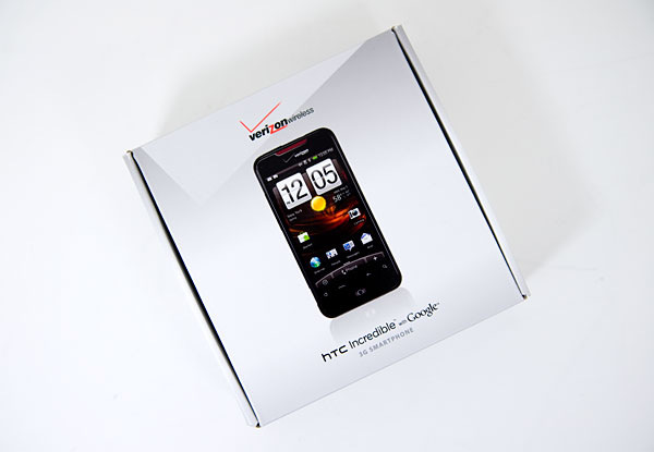
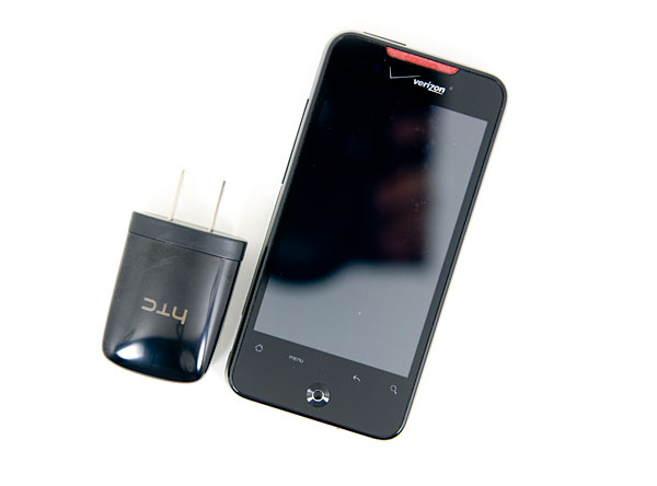
In the box you get the phone, a USB cable and a charger. There's no included micro SD card and no case, both of which Google gives you with the Nexus One.
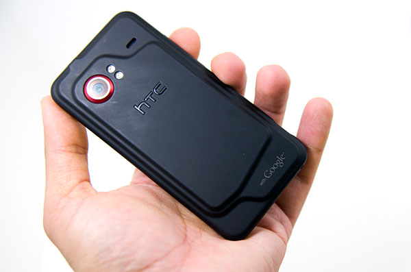
It's clear at first sight the pecking order in HTC's eyes. While the Nexus One was very much a Google phone, down to requiring a Gmail account before you could even use your phone, the Incredible is much more agnostic. A large HTC logo followed by a smaller with Google brand on the bottom, a bit bigger than the Verizon on the front but still not terribly prevalent:
HTC doesn't want to be another Taiwanese OEM house, it wants to be an ASUS, a Palm or an Apple. It wants brand recognition and to get there, it needs good hardware, as well as software differentiation. While the Incredible runs Android 2.1 just like the Nexus One, it features HTC's custom software on top of Android called Sense. HTC Sense is a collection of OS customizations, tweaks and even apps/widgets that are shipped by default on the phone. Google fully embraces this sort of UI flexibility making it very much the Windows Mobile of today rather than something iPhone-eqsue.
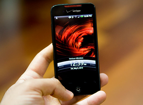
The basics of Android are still the same (read my Nexus One review for that), you get multiple home screens and a separate listing of all apps on the phone, but Sense makes the default setup closer to perfection in my mind. It’s all much more polished. HTC/Verizon ship a number of preconfigured Scenes which define what widgets/icons are present on your home screens by default. The Nexus One by comparison comes with more of a blank slate. Both phones can get to the same end point, but the Incredible just ships a bit more complete from the start.
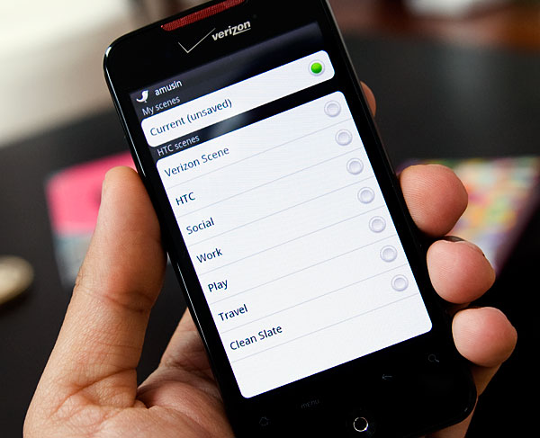
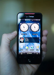
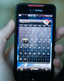
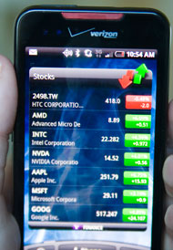
I found that the default Sense scene was pretty well done to begin with. You have a home screen for emails, one for Twitter and one to enable/disable things like WiFi or Bluetooth. The predefined scenes are self explanatory (e.g. the work scene puts more emphasis on the calendar, email and stocks), or you can always change things around and save your own custom scene.
 |
 |
 |
HTC offers its own Exposé clone with Sense. If you want to quickly see what’s on all of your home screens just press the optical joystick and you’ll zoom out to see all seven screens at once. Tap on any one to select it.
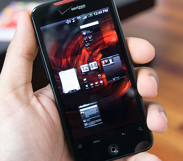
The modifications aren’t exclusive to UI, individual applications are different from your standard Android install. The Mail app has a threaded message view where all of your exchanges with a single contact are grouped together. There’s still no way to delete multiple emails at once, no way to copy/paste from an email and no way to search through emails stored on an IMAP server other than Gmail. Imperfect much?
The email widget is a great way of quickly reading through emails. Swipe up to view your next message, swipe down to view the previous one. Again there's no quick way to delete from this view, you have to tap the delete button and hit OK. The Twitter widget gives you similarly quick access to what's going on. The idea is to make your home screens function as intended from the start rather than relying on the user to configure them. HTC did a great job here.
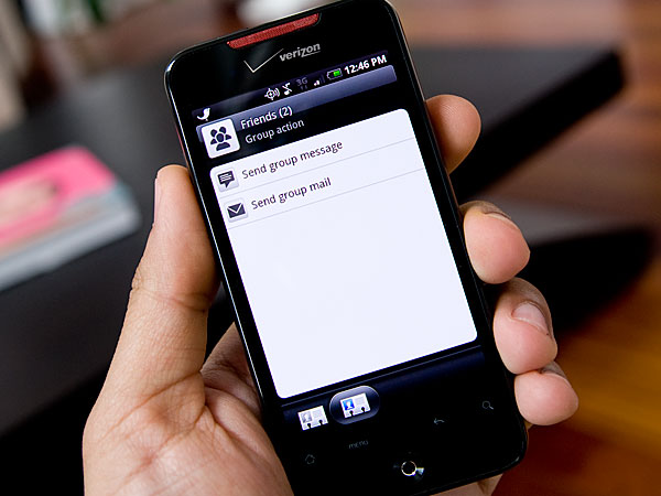
You can group contacts together and send SMSes or emails to an entire group rather than having to manually fill out a To: field with multiple names:
The Calendar and Camera apps are nicer and in general I don’t believe any of the HTC modifications do any harm to Android. In fact, I’d say that HTC’s added polish is a real benefit. It makes me wonder why Google doesn’t do some of this on its own.


59 Comments
View All Comments
Loser - Monday, May 10, 2010 - link
There is something wrong with the weight you have noted there130 g (3.6 oz) 130 g (4.6 oz)
Both 130g? :)
Anand Lal Shimpi - Monday, May 10, 2010 - link
Woops, fixed. Thank you :)puffpio - Monday, May 10, 2010 - link
I was reading your article, and one part that is slightly incorrect:When you use Goggles and look at buildings, but do not actually take the picture...the tags you see at the bottom of the screen are based off your GPS position and compass..it's not doing any image recognition of the scene until you take the pic...
But it's still cool nonetheless
The0ne - Monday, May 10, 2010 - link
"I honestly doubt if there are many folks who are on the fence between the two."Consumers respond very well to marketing and if the comparison of Incredible to iPhone came down to what you've stated,
1. UI
2. Flexibility
3. Apps
Then it's great. However, your review of the iPhone, in comparison to this review, has all the "ooohh.....aahhhh" associated with it. Little as it may seem, not to Apples awesome marketing team mind you, your review will persuade some consumers to go for the iPhone instead of others regardless of the factors listed.
Please do a respectable tech review and leave your personal opinions and comments for a section dedicated to that purpose. Judging by this review I say the phone stinks mainly because there's not cheering from you. We do respect you, I've followed you since you started the site. I don't like the bias "ohh...ahhs" that comes with the reviews.
Anand Lal Shimpi - Monday, May 10, 2010 - link
A lot of my excitement over the original iPhone has to do with the fact that it was first to deliver the things that made me go ooh and ahh. I'd argue the same is true about Android with features like Goggles. Only Palm has really impressed me in the same manner since then.What I was trying to say with that statement is that if a user plays with both devices they'll quickly figure out which type of person they. The two platforms are very polarizing it seems. As I mentioned in the Nexus One Review, there are folks who are totally unimpressed by the iPhone and others who are very disappointed by Android. It largely has to do with the differing approaches to UI design and role the smartphone plays in their respective corporate strategies.
I stand by my original statement. I believe those who like the iPhone won't find any Android device a suitable replacement. While those who are frustrated by the iPhone's limitations wouldn't dream of anything other than an Android.
Take care,
Anand
teohhanhui - Monday, May 10, 2010 - link
"While those who are frustrated by the iPhone's limitations wouldn't dream of anything other than an Android."There are those who are looking forward to MeeGo...
Anand Lal Shimpi - Monday, May 10, 2010 - link
I'm holding back excitement on that one until we see the right combination of hardware/software. But yes, MeeGo could be very good (not to mention forthcoming Palm/HP stuff).Take care,
Anand
T2k - Thursday, May 13, 2010 - link
MeeGooo? Pleahhhhse.Nokia so far managed to blew everything it's got including the super-widespread, #1 OS of the world Symbian - years after years of clueless mismanagement and still nothing from Nokia.
Nokia is a mess, they just started the third reorganization in 12 months or so... completely clueless MESS and their main dev head just left them recently.
It's Android, people, nothing else - Symbian is waaay behind especially if you consider the breakneck speed Google is developing Android, iPhone and Apple in general is rapidly becoming completely irrelevant especially when Flash won't even work in it.
The only question is WebOS - now that HP is behind Palm we might get some surprise competition for Android: real innovation instead of fake re-badging efforts at ripoff prices a' la Apple.
The0ne - Monday, May 10, 2010 - link
Well said.sebmel - Tuesday, May 11, 2010 - link
Hi Anand, thanks for a great review and contrary to the opinion of 'TheOne' please feel free to express your feelings regarding products. I have read your site for many years, just like 'TheOne' but unlike him I have come to recognise you as someone with intelligence and a good eye for design flair who understands that sometimes the best expression of recognition of design excellence is exactly an ooh or ah.I'm a fan of TopGear, the UK car program. I can just imagine the Soviet dullness that would ensue were 'TheOne' to exercise an editorial veto. The show would flounder in a morass of directives on equal time, exactly duplicated lighting and monotone intonation of spec sheets. I also found his request that you do a 'respectable' review an uncalled for snipe.
It was obvious to any reader that you were enthused about the iPhone because it pushed forward mobile phone OS design significantly. It is also obvious that AnandTech has a number of readers that have difficulty coming to terms with a revitalised Apple corporation and respond to any positive comment with partisan angst. The DailyTech news site you link to unfortunately still thinks its 1990 and regularly trolls for clicks with headlines designed to bait flaming. The result is all to obvious in the ensuing comments.
So, please don't make your reviews lifelessly unemotional. Express pleasure... express surprise. It means something to your readers that someone who spends so much time using the latest products is occasionally moved to pleasure by the competence of designers or developers. Product designers are not driven to greatness by spec. sheet competition. They only achieve it when they attempt to delight. Jonathan Ive, Apple's designer, regularly repeats that he is as proud of what he leaves out of products as what he has included. It is something that you, Anand, obviously understand. I suspect Ive repeats it as often as he does because there are still so many, raised in the Windows 'just add a buggy new feature, break the old format, and call it a new version' years who do not.
We are in a new era in which design excellence and not the politics and skulduggery of format wars is becoming essential. Reviews expressing sincere pleasure or disappointment are entirely appropriate to such a market and provide the kind of feedback that manufacturers and developers need in recognition of their efforts. How on earth can one quantify elegance in terms of grams or bytes? I felt the need to confirm to you that you do have readers who understand your emoting such things.
Keep up the good work.