The HTC Droid Incredible Review, Clearly Better than the Nexus One
by Anand Lal Shimpi on May 10, 2010 1:27 PM EST- Posted in
- Smartphones
- Snapdragon
- Droid Incredible
- HTC
- Android
- Mobile
HTC's Head in the Clouds
While Google’s Nexus One is setup to immediately sync to Google services, the Incredible is much more provider agnostic. The first time you power on the phone you’re asked to provide it with any email accounts you want to sync with. You’re not actually forced to supply a Google account. Of course giving the HTC Incredible your Google login will immediately sync your email, calendar and contacts but it’s not required.
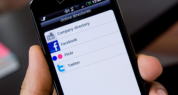
It’s not just about email though. The Incredible’s setup process will ask you for your Facebook, Twitter and Flickr logins. If you share them, all of your data from those services gets pulled down into your phone.

The obvious benefit is that moving to a new phone requires hardly any setup other than typing in your own login information. The downside, like on a webOS device, is that everything gets synced. My contact list on the Incredible is full of people who I seriously don’t know. I realize that’s my own fault for being too liberal in befriending people on Facebook, but it doesn’t change the situation. Just as I mentioned in my Palm Pre review however, it’s not that big of a deal. Finding the contacts I want to communicate with is relatively easy and at most I’m just risking accidentally calling someone I don’t know.
The cloud based syncing is nice for contacts because it means that you don’t have to keep up with everyone’s constantly changing contact information. If a friend updates his/her information on Facebook, it will automatically change on your phone as well. The limitation here being that if your friend’s privacy settings don’t give you access to information then you’re out of luck. There is something to be said for everyone making all information public, but I’m not quite willing to jump on the privacy is dead bandwagon just yet.
Cloud data from Facebook, Twitter, Google and Flickr is used in other ways on the phone. Everyone gets some sort of a profile pic, pulled from one of the aforementioned services, which is nice since I’m terrible about making my personal data all polished looking. Taking it one step further is the Photos app. While you get access to any photos you’ve synced with the Incredible or taken with its camera, you also get a list of all photos you have access to via Facebook or Flickr. Accessing these images is obviously slower since they all come over the cloud, but this is honestly how it has to be done. We’re one step away from having all of your photos, whether they reside in the cloud or on a personal device, all grouped together and sorted by location and faces.
HTC's supplied Friend Stream app groups together your Twitter and Facebook updates in one place. For me it meant that I had a copy of my Twitter stream with the promise of some Facebook updates mixed somewhere in there. It's still easier to view Facebook and Twitter updates independently but I get what HTC is trying to do here: pull you away from visiting websites, and using non-HTC apps and getting your experience entirely within HTC supplied software. It's HTC saying "come to my house" and under its breath adding "I will serve you ads there one day."

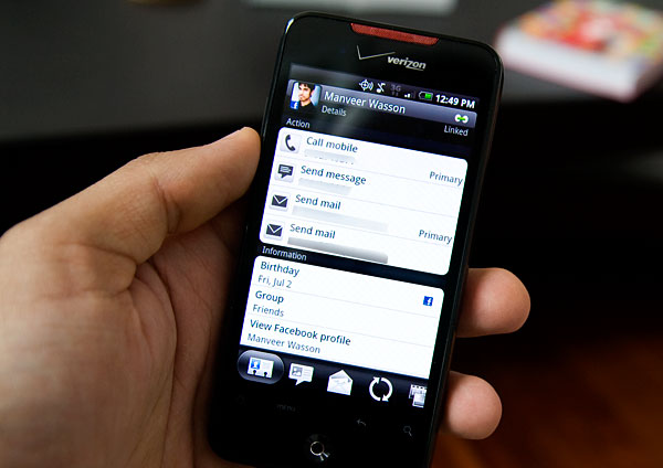
Organizing this data is important and luckily HTC’s mods to existing Android apps don’t disappoint. In the Phone app you can select a contact and get the same details you’d expect from any Android phone. The buttons along the bottom of the screen change everything though.
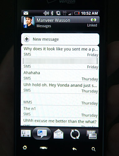
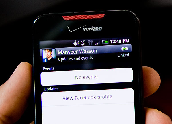
You have a single button to look at all messages you’ve exchanged with the contact. Another to see all of the emails between you and the contact. Another to look at their Facebook status updates and one to see all of their Facebook/Flickr photos.


The integration is duplicated across multiple apps. The Photos app for example, lets you view photos stored locally or in the cloud via Facebook/Flickr. The same functionality appears in the Camera app when you’re browsing pictures you’ve taken. This is also true for the People app and the Phone app, most functionality is duplicated with some differences in what each app can do.
While I like being able to do the same basic things in multiple apps, I feel like HTC needed to do a better job combining these apps so you don’t have so much duplication. For example why have a separate app for photos and the camera, or people and the phone. This may be a bit of my love for webOS coming out but unification really does work if done well.


59 Comments
View All Comments
Loser - Monday, May 10, 2010 - link
There is something wrong with the weight you have noted there130 g (3.6 oz) 130 g (4.6 oz)
Both 130g? :)
Anand Lal Shimpi - Monday, May 10, 2010 - link
Woops, fixed. Thank you :)puffpio - Monday, May 10, 2010 - link
I was reading your article, and one part that is slightly incorrect:When you use Goggles and look at buildings, but do not actually take the picture...the tags you see at the bottom of the screen are based off your GPS position and compass..it's not doing any image recognition of the scene until you take the pic...
But it's still cool nonetheless
The0ne - Monday, May 10, 2010 - link
"I honestly doubt if there are many folks who are on the fence between the two."Consumers respond very well to marketing and if the comparison of Incredible to iPhone came down to what you've stated,
1. UI
2. Flexibility
3. Apps
Then it's great. However, your review of the iPhone, in comparison to this review, has all the "ooohh.....aahhhh" associated with it. Little as it may seem, not to Apples awesome marketing team mind you, your review will persuade some consumers to go for the iPhone instead of others regardless of the factors listed.
Please do a respectable tech review and leave your personal opinions and comments for a section dedicated to that purpose. Judging by this review I say the phone stinks mainly because there's not cheering from you. We do respect you, I've followed you since you started the site. I don't like the bias "ohh...ahhs" that comes with the reviews.
Anand Lal Shimpi - Monday, May 10, 2010 - link
A lot of my excitement over the original iPhone has to do with the fact that it was first to deliver the things that made me go ooh and ahh. I'd argue the same is true about Android with features like Goggles. Only Palm has really impressed me in the same manner since then.What I was trying to say with that statement is that if a user plays with both devices they'll quickly figure out which type of person they. The two platforms are very polarizing it seems. As I mentioned in the Nexus One Review, there are folks who are totally unimpressed by the iPhone and others who are very disappointed by Android. It largely has to do with the differing approaches to UI design and role the smartphone plays in their respective corporate strategies.
I stand by my original statement. I believe those who like the iPhone won't find any Android device a suitable replacement. While those who are frustrated by the iPhone's limitations wouldn't dream of anything other than an Android.
Take care,
Anand
teohhanhui - Monday, May 10, 2010 - link
"While those who are frustrated by the iPhone's limitations wouldn't dream of anything other than an Android."There are those who are looking forward to MeeGo...
Anand Lal Shimpi - Monday, May 10, 2010 - link
I'm holding back excitement on that one until we see the right combination of hardware/software. But yes, MeeGo could be very good (not to mention forthcoming Palm/HP stuff).Take care,
Anand
T2k - Thursday, May 13, 2010 - link
MeeGooo? Pleahhhhse.Nokia so far managed to blew everything it's got including the super-widespread, #1 OS of the world Symbian - years after years of clueless mismanagement and still nothing from Nokia.
Nokia is a mess, they just started the third reorganization in 12 months or so... completely clueless MESS and their main dev head just left them recently.
It's Android, people, nothing else - Symbian is waaay behind especially if you consider the breakneck speed Google is developing Android, iPhone and Apple in general is rapidly becoming completely irrelevant especially when Flash won't even work in it.
The only question is WebOS - now that HP is behind Palm we might get some surprise competition for Android: real innovation instead of fake re-badging efforts at ripoff prices a' la Apple.
The0ne - Monday, May 10, 2010 - link
Well said.sebmel - Tuesday, May 11, 2010 - link
Hi Anand, thanks for a great review and contrary to the opinion of 'TheOne' please feel free to express your feelings regarding products. I have read your site for many years, just like 'TheOne' but unlike him I have come to recognise you as someone with intelligence and a good eye for design flair who understands that sometimes the best expression of recognition of design excellence is exactly an ooh or ah.I'm a fan of TopGear, the UK car program. I can just imagine the Soviet dullness that would ensue were 'TheOne' to exercise an editorial veto. The show would flounder in a morass of directives on equal time, exactly duplicated lighting and monotone intonation of spec sheets. I also found his request that you do a 'respectable' review an uncalled for snipe.
It was obvious to any reader that you were enthused about the iPhone because it pushed forward mobile phone OS design significantly. It is also obvious that AnandTech has a number of readers that have difficulty coming to terms with a revitalised Apple corporation and respond to any positive comment with partisan angst. The DailyTech news site you link to unfortunately still thinks its 1990 and regularly trolls for clicks with headlines designed to bait flaming. The result is all to obvious in the ensuing comments.
So, please don't make your reviews lifelessly unemotional. Express pleasure... express surprise. It means something to your readers that someone who spends so much time using the latest products is occasionally moved to pleasure by the competence of designers or developers. Product designers are not driven to greatness by spec. sheet competition. They only achieve it when they attempt to delight. Jonathan Ive, Apple's designer, regularly repeats that he is as proud of what he leaves out of products as what he has included. It is something that you, Anand, obviously understand. I suspect Ive repeats it as often as he does because there are still so many, raised in the Windows 'just add a buggy new feature, break the old format, and call it a new version' years who do not.
We are in a new era in which design excellence and not the politics and skulduggery of format wars is becoming essential. Reviews expressing sincere pleasure or disappointment are entirely appropriate to such a market and provide the kind of feedback that manufacturers and developers need in recognition of their efforts. How on earth can one quantify elegance in terms of grams or bytes? I felt the need to confirm to you that you do have readers who understand your emoting such things.
Keep up the good work.