Samsung Gear S2 Launch Event & Hands-On
by Andrei Frumusanu on September 4, 2015 4:30 PM EST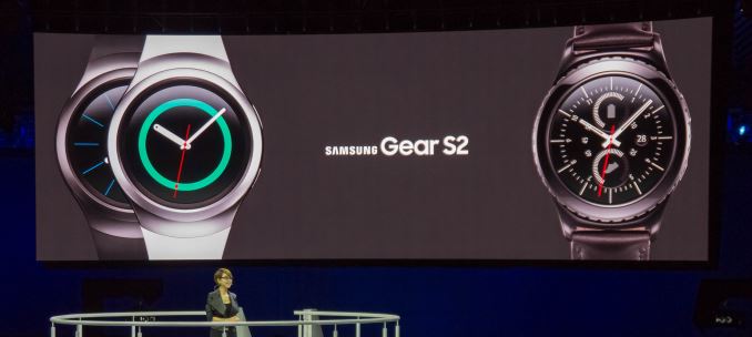
After quite a long day yesterday here in Berlin I finally managed to catch a breath to sit down and go over what was likely the biggest reveal over the course of this year's IFA. Last night Samsung formally presented the Gear S2 to the public and demonstrated what the new smartwatch is all about.
We've already covered the initial paper-launch a few days ago where took a look at the basic specification sheet of the three new smartwatch models. As a reminder, we're talking about 3 SKUs - the Gear S2 BT, Gear S2 3G and the Gear S2 Classic.
| Samsung Gear S2 BT Samsung Gear S2 Classic |
Samsung Gear S2 3G | |
| SoC | Exynos 3250 (2x Cortex A7 @ 1.0GHz) | |
| RAM/NAND | 512MB RAM, 4GB NAND | |
| Display | 1.2" Circular 360x360 SAMOLED (302ppi) | |
| Dimensions | Gear S2: 42.3x49.8x11.4mm (47g) Classic: 39.9x43.6x11.4mm (42g) |
44.0 x 51.8 x 13.4mm (51g) |
| Battery | 250 mAh (0.95 Whr) | 300 mAh (1.14 Whr) |
| OS | Tizen | |
| Sensors | Accelerometer, Gyroscope, Heart Rate, Ambient Light, Barometer | |
| Connectivity | 802.11/b/g/n + BT 4.1, NFC | |
One additional piece of information that we weren't sure of was the exact SoC selection. I was able to talk one of the Korean employees present during the launch and he pointed out that the Gear S2 uses the same SoC as the first Gear S - meaning an Exynos 3250. This is a SoC specifically designed for wearable use and features two ARM Cortex A7 cores at 1 GHz and a Mali-400MP2 GPU running at 133MHz.
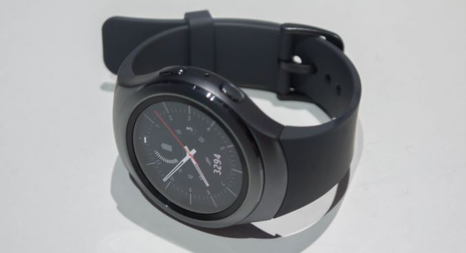
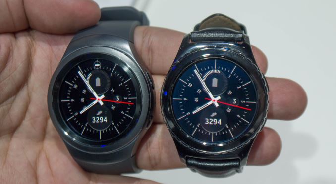
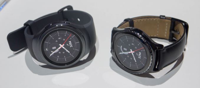
The way the three units differ is in their design and internal function. The Gear S2 BT and Gear S2 3G both sport the same modern look and only slightly differ in their size, with the 3G version bulking up a bit in all dimensions as well as in weight. The classic shares the internal specs of the normal BT version but changes its exterior design to a more traditional watch look.
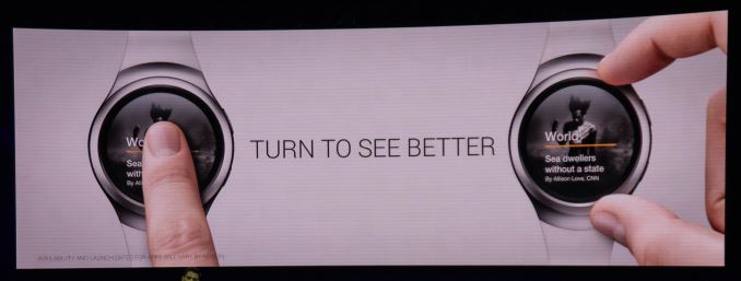
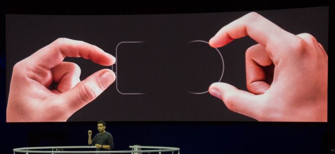
Samsung kept the presentation short and to the point - and that point is the rotating bezel. This is what makes the Gear S2 differentiate from all other smartwatches and Samsung rightfully put the feature center-stage during the talk.
Samsung argues that screen-estate on a smartwatch is valuable, and you don't want to waste any of it by swiping the screen for navigation. Rotating bezels have existed for decades on traditional watches such as diver watches, so Samsung took inspiration from such designs and made the bezel the primary control.
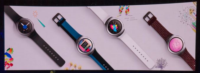
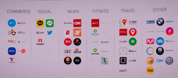
Before going into more details on how the bezel functions, we'll have a quick look at the ecosystem that Samsung promises to build around the watch. Samsung announced various cooperations with designers as well as companies to create a base portfolio of accessories such as watch-bands and applications.
The applications the demo units were loaded with were all working well although I didn't try too many of them rather than playing with Samsung's new Tizen OS in general. The availability of applications is definitely going to be a crucial factor in the success of the Gear S2, so I hope that Samsung is able to push as many developers as possible in creating content for the watch.
Starting off with the Gear S2 classic I was in for quite a ride in terms of design. Over the last few years ever since Samsung released the first Galaxy Gear there's been one common denominator for all smartwatches released to date: their extremely bulky size. I think that the thickness of my wrists falls below that of the average person, so up until now all smartwatches I tried out were extremely off-putting because their large size simply didn't fit me well. As a warning and disclosure: I'm probably the least objective person to talk about watch designs and evaluating them as my personal taste veers extremely towards minimalistic and thin watches. If I were to go into a jewllery shop with a selection mechanical watches I'd probably dismiss 95% of designs right off the bat.
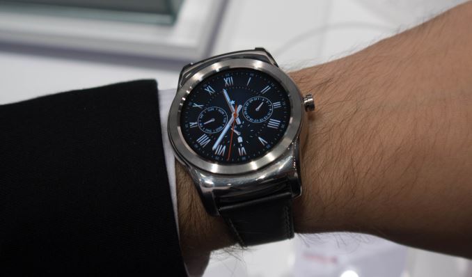
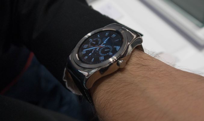
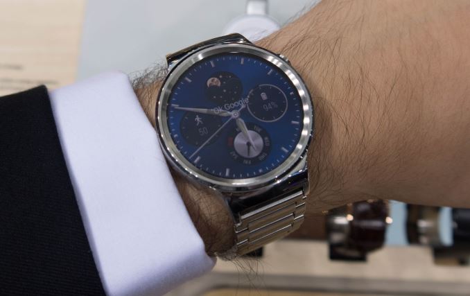
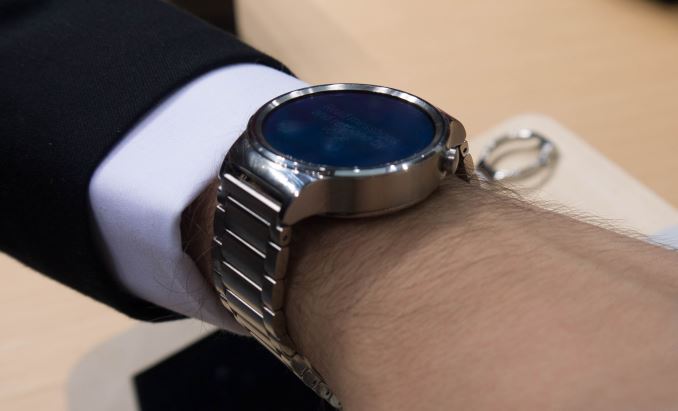
The LG Watch Urbane and the Huawei Watch are examples of what I would rather consider to be blunt weapons instead of practical watches that I would be able to wear daily. Unfortunately up until now this left small-wristed users with a lack of proper options when it came to smartwatches.
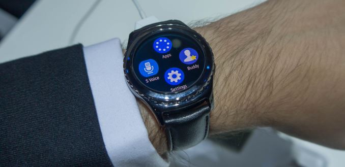
That being said, when I first put on the Gear S2 Classic it was quite a revelation to find a smartwatch that not only was a (subjective) visual fit, but more importantly was actually comfortable to wear.
The S2 Classic is a very good implementation of a smartwatch that doesn't immediately identify as a smartwatch. Samsung here has managed the task of blending the traditional watch style with smartwatch internals resulting in something that on the street would be very hard to pick out from normal watches.
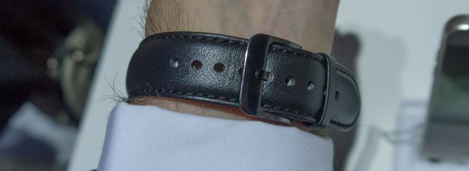
One thing I wasn't too happy about the Gear S2 Classic was the stock leather watch-band. While I had no issues with the design and looks of the band, putting it down was quite harder than putting it on as the buckle tongue mechanism was much too stiff. I hope this was just an effect of the brand-new leather's hardness as opposed to any functional issue with the buckle tongue itself.
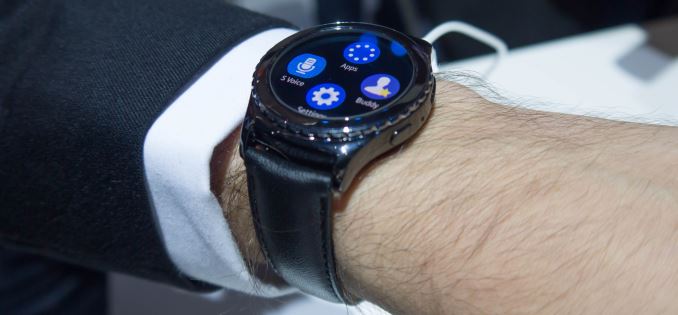
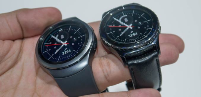
As I tried the Gear S2 Classic first, I was expecting the normal version to be bulkier and less comfortable. I was in for my second shock for the day as I actually found the differences to be minimal. Due to the more streamlined and rounded design of the Gear S2, it was able to hide the fact that it's a few mm bigger than the Classic.
While the Gear S2 Classic has the more traditional look going for it, the normal Gear S2 expresses more modern design characteristics. One of the most important ones in terms of look and feel is the sand-blasted metal finish of the watch body that gives it a distinct feeling over the glossy surface of the S2 Classic.
The second-most noticeable difference in feel between the two variants is the rotating bezel design. The Gear S2 Classic includes little notches on the side of the bezel ring which aren't present on the standard variant. I found the slight curve and bevelled edges of the normal version one of the factors that made it actually more comfortable to use than the Classic.
This is something I found to be extremely important, because the bezel ring navigation is something as crucial and defining to these devices as bread is to butter. I don't think it took me more than a mere 20 seconds to adapt to the rotary nature of the controls after which it felt like something so obvious and simple as if this was the way smartwatches had always been designed to be controlled. The best way I could describe the experience is as if you simply had a mouse-wheel laid horizontally, as that is exactly how it felt to me as I scrolled through the menus and interfaces.
The physical feel of the rotating bezel could also be compared to the feel of a clicking mouse-wheel, only that the clicks are much more fine-grained and solid. I feel that Samsung managed not only to create an innovative way of input but actually nailed the physical feedback feel of the rotation mechanism.
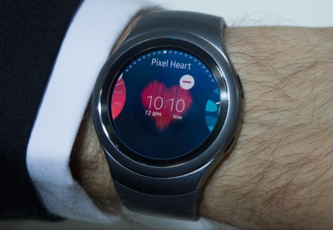
The interface seems also to be well-designed for the rotary control. The two main selection interfaces consist of the home-screen selection and the application drawer. The home-screens (or main screens) are the widgets for applications and may display any arbitrary information. At the "center" of the home screens is of course the watch face itself, which one can directly get to via the home button.
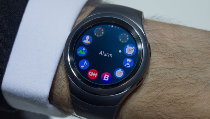
The app-drawer is also extremely intuitive to use with the rotating bezel. It functionally is nothing else than a linear menu when one scrolls through it with the bezel ring. Visually, this is represented in a circle of icons, but each circle contains 8 actual apps and 2 additional icons that jump to the previous or next 8 apps. So you can either use the touch-screen to go from selection screen to selection screen via the top "app-circle" shortcuts, or you simple turn the bezel until you get where you want. Because selection via the bezel is so fast, I found myself prefering to use this method than falling back to the touch-screen for anything other than launching an app. Launching apps or confirming a selections seems to be the last major repetitive use-case needing the touch-screen functionality, which kind of derails a bit the experience of using hardware controls. I imagine what an additional "select" button would be able to do to the experience.
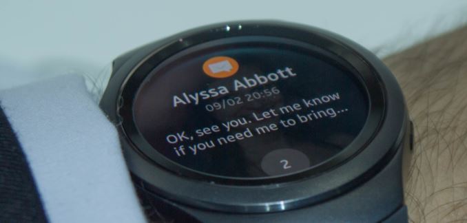
As earlier mentioned, the screen on the Gear S2 comes with a pixel density of 302ppi, making this quite a reasonably sharp wearable. The screen also seemed brighter than other smartwatches. The demo units were by default set to ~70% brightness but once you manually set them to 100% via the settings menu it really brought out the contrast of the very black-dominant UI.
I had some gripes with the default DPI and density some of the interface elements used. The screen sports a high-enough resolution that it could easily accommodate more information if one designed apps to take advantage of it, so I hope that in the future there will be some option to better adjust font and element sizes, as the system font-size control did not seem to have much an effect on apps.
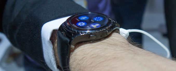
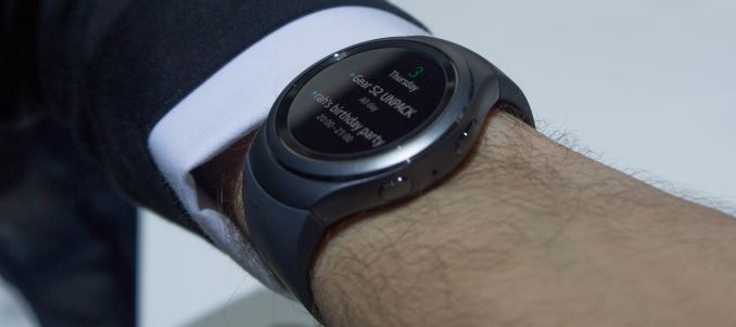
An odd characteristic of the display is that the glass seems much thicker than any other smartwatch out there. As I hope that it can be distinguished in the picture above, the actual AMOLED display sits around 1.5-2mm below the glass surface and bezel of the watch. The result is that the Gear S2 is able to replicate the "watch-face through glass" feel of a traditional watches better than any previous smartwatch attempt. In doing so it however sacrifices some of the "image pop-out" feel of zero-gap displays available on other smartwatches.
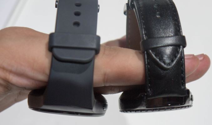
Both variants are roughly the same thickness, except that again the normal variant has rounder edges compared to the classic. The devices have two buttons on their right side; the top one acts as a back button and the bottom serves as the device's home button. For right-hand users who wear the watch on their left arm I would have wished if they had put the home button on the bottom left side of the watch for it to be easily accessible with one's thumb. The back button though is well located for right-handed people as it's in good reach for one's index finger.
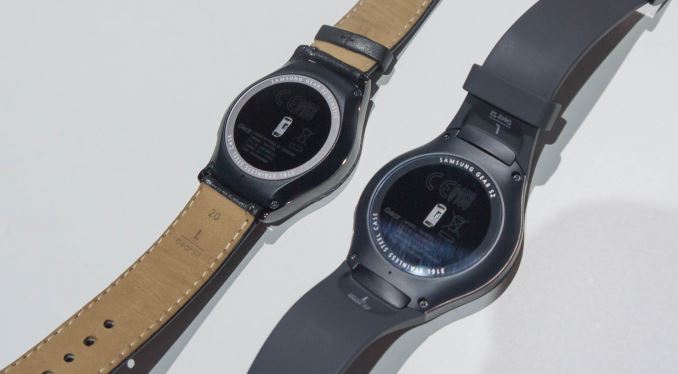
The watches are IP68 certified which means the watches are water-resistant up to 3m of depth. Due to this, they don't have any physical charging port but rather rely on wireless charging. Samsung claims that charging will be quite fast, but we won't be able to tell until we review the S2.
All in all, Samsung aimed high with the Gear S2 and instead of iterating on its previous designs, it chose to take on the smartwatch category from a new perspective. This seems to have paid off as the Gear S2 is the best feeling smartwatch I've been able to get my hands on to date. The rotary bezel design is something I envision to become a standard and defining feature for Samsung watches as I yet have to find a fault with it.
With excellent hardware and design, the success and consumer satisfaction of the Gear S2 will strictly fall in the hands of the software ecosystem. The Gear S2 presents itself as Tizen's biggest growth opportunity to date, and unless other Android Wear vendors manage to catch up with Samsung on the hardware side, I imagine that the S2 together with Samsung's helping push will be able to generate enough of gravity that it may pull in some much needed developer attention. More importantly, Samsung doesn't limit compatibility Gear S2 to only Samsung devices, but is open to any and all Android 4.4 devices and up (The version of Android which introduced Bluetooth Low-Energy), which should help adoption-rate.




31 Comments
View All Comments
MatthewTavares - Friday, September 4, 2015 - link
Check out my prediction of this back in september when the apple watch came out:https://twitter.com/MatthewTavares/status/51051982...
whiteiphoneproblems - Friday, September 4, 2015 - link
*golf clap*Samus - Friday, September 4, 2015 - link
Too bad you don't have the business sense Steve Jobs and didn't pull a patent.lopri - Sunday, September 6, 2015 - link
I am pretty sure it is patented. So is Apple's watch "crown." Meaning, no other OEMs can replicate these "innovations."It showcases the pathetic nature of U.S. patent system.
Gigaplex - Monday, September 7, 2015 - link
I'm not sure how this could qualify as patentable as there is plenty of prior art of other watches using a rotating bezel.lopri - Monday, September 7, 2015 - link
That is what Altoid maker thought. And canned tuna makers. And etch a sketch makers. And playing cards makers.. until one day Apple perfected the rectangles with rounded corners. The rest is history. :)GTRagnarok - Friday, September 4, 2015 - link
The Gear S2 is definitely a looker. Probably the first smartwatch I would consider buying.GTRagnarok - Friday, September 4, 2015 - link
Gear S2 Classic, that is.jospoortvliet - Sunday, September 6, 2015 - link
I personally prefer the normal one, looks - wise. Actually so much I can see myself buy one.SunnyNW - Monday, September 7, 2015 - link
The Qualcomm website and others i had seen show the s2 having a snapdragon 400 am i missing something....can you please confirm?