Samsung Announces The Gear S2 Smartwatch
by Brandon Chester on August 31, 2015 6:50 PM EST
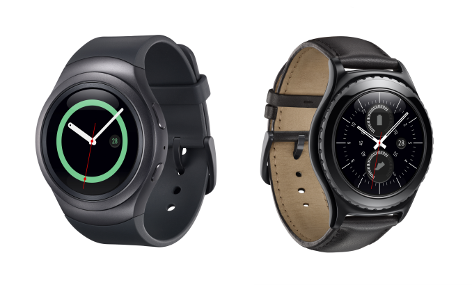
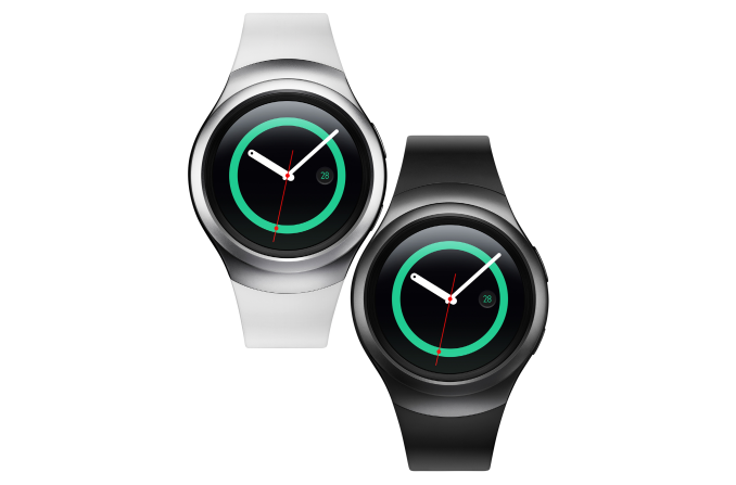
Today Samsung announced the Gear S2 and Gear S2 Classic, the newest products in their line of smartwatches. The Gear S2 has what Samsung describes as a more minimal and modern design, while the Gear S2 classic uses leather and a black finish in an attempt to appeal to fans of traditional mechanical watches.
In addition to WiFi versions, there's also the Gear S2 3G which includes cellular capabilities to allow the user to make phone calls from their watch. All three models of the Gear S2 are similar, but there are some differences to accommodate visual changes between the Gear S2 and Gear S2 classic, as well as to fit a larger battery in the 3G edition. I've laid out all the known specifications of the Gear S2 in the chart below.
| Samsung Gear S2 and Gear S2 Classic | Samsung Gear S2 3G | |
| SoC | 1.0GHz Dual Core CPU | |
| RAM/NAND | 512MB RAM, 4GB NAND | |
| Display | 1.2" Circular 360x360 SAMOLED (302ppi) | |
| Dimensions | Gear S2: 42.3x49.8x11.4mm (47g) Classic: 39.9x43.6x11.4mm (42g) |
44.0 x 51.8 x 13.4mm (51g) |
| Battery | 250 mAh (0.95 Whr) | 300 mAh (1.14 Whr) |
| OS | Samsung Tizen | |
| Sensors | Accelerometer, Gyroscope, Heart Rate, Ambient Light, Barometer | |
| Connectivity | 802.11/b/g/n + BT 4.1, NFC | |
The Gear S2 is powered by an unnamed dual core SoC with a peak frequency of 1GHz. The circular display has a maximum horizontal and vertical resolution of 360 pixels, which equates to 302 pixels per inch. With Tizen being Samsung's own operating system they can tune the interface to work best with their AMOLED displays to minimize power consumption. Both WiFi versions of the Gear S2 include a 250mAh battery, while the 3G edition increases this to 300mAh, with a corresponding increase in case thickness. According to Samsung, the WiFi only version of the Gear S2 will last between two and three days of typical usage, while the 3G model will last around two days.
The Gear S2 also includes a number of sensors in order to track information pertaining to exercise and fitness. It includes an accelerometer, a gyroscope, a heart rate tracker, an ambient light sensor, and interestingly, a barometer which can be used for tracking elevation by measuring atmospheric pressure. A barometer is a sensor that was notably absent from the Apple Watch, and it could help give Samsung an edge when it comes to the accuracy of their health tracking.
Notably absent from the 3G model is a SIM slot. This is because the Gear S2 makes use of an e-SIM card, an embedded version of the SIM chip current devices use to register and work on mobile networks. It's not clear what implications this will have for carrier compatibility, but it would make sense that support from a carrier would be required in order to use the Gear S2 3G on their network.
Something that differentiates the Gear S2 from Samsung's previous watches are the methods of input that Samsung has included. The bezel around the circular display acts as a rotating input, which the user can use to zoom, scroll, etc. There are also two buttons located next to each other on the right side of the case, which function as home and back buttons respectively. This is again an advantage of Samsung using their own operating system, as they can implement controls that may not work within the control scheme of another operating system like Android Wear.
Naturally, Samsung's Tizen smartwatches don't have access to the application library or functionality that comes with Android Wear. However, a look at Samsung's history with smartwatches makes it clear that they are pushing Tizen as their major wearable platform for their devices rather than Android Wear. It will be interesting to see how this turns out for them. On one hand, they can tune the OS to work seamlessly alongside the hardware. On the other hand, they're limited in terms of third party support from app developers.
The Gear S2, Gear S2 Classic, and Gear S2 3G will be launching in the near future. There's currently no word on pricing, but there is already a commitment from AT&T, Verizon, and T-Mobile USA to sell the 3G version of the watch.
Source: Samsung Mobile Press


16 Comments
View All Comments
uhuznaa - Monday, August 31, 2015 - link
Pushing away from Android is with the embryonic stage of smartwatch apps probably the best place to try. I like the scroll bezel.Samus - Monday, August 31, 2015 - link
+1 to both your comments. This could be a really creative UI. I've never really adjusted to using the crown on my Apple Watch, and at times simply prefer the old Pebble interface (before Timeline) because it wasn't so linear.lilmoe - Tuesday, September 1, 2015 - link
I too like that they're getting away from Android Wear. Other than UI, design and fit/finish, wearable tech should only be about vertical integration and optimization to maximize UX and battery life.eek2121 - Tuesday, September 1, 2015 - link
I don't know. I haven't really been looking for a smartwatch, but if i were, i'd want one that told me the time 99% of the time, and spent the remaining 1% of the time giving me notifications from my phone (along with a multi day battery life so I don't need 5000 charging cables at my nightstand). 99% of my music listening is in my car or at my desk (computer) and 90% of my movie listening is at my TV (raspberry pi, kindle fire tv stick, or my micro ITX HTPC), at the gym (smartphone) or at my desk (computer). I guess that's why i don't own a smartwatch...though I've been eyeing the LG G Watch R.smorebuds - Tuesday, September 1, 2015 - link
nice opinion. but this relevant how? and why do i care?mkozakewich - Wednesday, September 2, 2015 - link
The Pebble actually works pretty good for that, because the screen is always on and it lasts a week. I'm not sure if any smartwatch is worth the $200+ prices, but at least your options are open because of the powerful platform.SleepyFE - Tuesday, September 1, 2015 - link
Damn!! Lost again. The scroll bezel was an idea a have been thinking of ever since the first "smartwatch" came out. Should have patented it earlier. Everyone seemed so focused on touch and gesture input i figured i had enough time to graduate get a job and then suggest that at work. O well. At least they made a watch i like (the 3G version). Sadly i don't think my carrier will support it. With nanoSIM being small enough they should really add a SIM slot and i wouldn't have to carry a phone any more. Now i just can't wait for Samsung Gear S3G.basroil - Monday, August 31, 2015 - link
S2 Classic actually looks classy! Basically what people though the iwatch was supposed to look like, and definitely in the stylings of a medium range mechanical watch.Hell, I wouldn't mind trying one out.
mkozakewich - Wednesday, September 2, 2015 - link
It looks really 90s. Like something I could see James Bond wearing. Still, not bad; just classy in a retro-futurist way. You'd need a post-modern kind of suit for it to work.MonkeyPaw - Monday, August 31, 2015 - link
I must say, I like the looks of the leather model. It looks like a normal watch, but could have some advanced features for quick use. Still not sure of the absolute value of smartwatches, but at least they are moving from the calculator watch appearance.