Microsoft Surface Pro 3 Review
by Anand Lal Shimpi on June 23, 2014 3:55 AM ESTFinal Words
When I reviewed the first Surface Pro I was intrigued by the idea, but felt it needed a few more iterations to get to the right point. In less than two years what we have in front of us looks very different than Microsoft's original vision for the platform. Display size, aspect ratio and even the mechanics of the whole thing are all quite different. The changes are for the better as Surface Pro 3 is a much better laptop and a much better tablet than any of its predecessors. The device no longer feels cramped and tiring to use as a laptop. The new Surface Pro no longer feels heavy to use as a tablet either. It's truly an improvement on both vectors.
Microsoft might be overselling the design to say that it truly is the only device you need. Like most compromises, Surface Pro 3 isn't the world's best laptop nor is it the world's best tablet. It serves a user who wants a little of column A and a little of column B.
The device's "lapability" is tremendously better than any of its predecessors. While I wrote all of the previous Surface reviews on the very Surface devices I was reviewing, this is by far the most comfortable one to use as a laptop. It's still not perfect, and you still need a fairly long lap to make it work, but the design is finally really usable as a laptop.
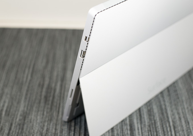
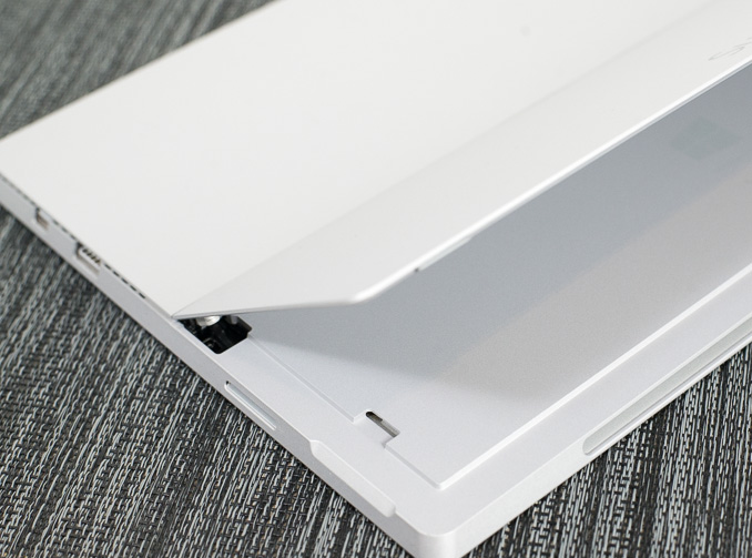
As a tablet the thinner and lighter chassis is much appreciated. The new kickstand remains one of the best parts of the design, enabling a flexibility unmatched by any other tablet. Tent mode in particular is awesome for tablet usage models.
Surprisingly enough the move away from Wacom to an active NTrig pen model comes with very few issues. The device could use some tuning of its pen pressure curves. Applying max pressure on the screen now distorts the LCD, something I'm never comfortable doing. But overall the new pen gives up very little and even improves performance and functionality.
The new Type Cover is awesome. The keyboard is probably as good as it's going to get, and the new trackpad is finally usable. The latter isn't perfect but it's so much better than anything that's come before it.
The device also launches with a far more polished version of Windows. With its latest updates, Windows 8.1 is a far cry from where it first started. I still think there's lots of room for improvement, but it's clear that Microsoft is marching towards a more cohesive vision of modern and desktop Windows UIs.
The downsides for Surface Pro 3 are obvious. Windows 8.1 remains a better desktop/notebook OS than a tablet OS. Yet in a device like Surface Pro 3 where you're forced to rely on touch more thanks to a cramped trackpad, I'm often in a situation where I'm interacting with the Windows desktop using the touchscreen - a situation that rarely ends well. As Microsoft improves the behavior of its modern UI apps, I would love to see a rethinking of what touch looks like on the desktop. If Surface Pro 3 exists to blur the lines between laptop and tablet, Windows 9 needs to do a better job of the same. The desktop needs to react better to touch and the modern apps need to feel even more integrated into the desktop.
On the hardware side, the device is a compromise. You have to be willing to give up some "lapability" in order to get a unified laptop/tablet device. Whether what you get as a tablet is worth the tradeoff is going to be up to how good of a tablet OS Windows 8.1 is for you. Personally I find that Android and iOS deliver better tablet experiences particularly when it comes to 3rd party applications. If everything you need on the tablet front is available in the Windows Store however then the point is moot.
Those users upgrading from Surface Pro 2 may notice a regression in performance, particularly when it comes to running prolonged CPU/GPU intensive workloads. In games, the difference can be noticeable. The simple fact is that in becoming a thinner device, Surface Pro 3 inherited more thermal constraints than its predecessors. While performance regressions aren't ideal, in this case I can appreciate what Microsoft has done. From the very beginning I wanted a lower TDP part in a thinner chassis. Had Microsoft done that from the start we wouldn't have seen any performance regression but rather a steady increase over time. From my perspective, Surface Pro 3 is simply arriving at the right balance of thermals and performance - the previous designs aimed too high on the performance curve and required an unreasonably large chassis as a result.
The remaining nitpicks are the same as last time: Microsoft needs to embrace Thunderbolt, and a Type Cover should come with the device. The display's color accuracy is good but grayscale performance needs some work.
Surface Pro 3 is easily the best design Microsoft has put forward. If you were intrigued by the previous designs, this is the first one that should really tempt you over. I was a fan of the original Surface Pro, and with Surface Pro 3 I think Microsoft has taken the hardware much closer to perfection. At this point the design needs more help on the software side than hardware, which is saying a lot for the Surface Pro hardware team. Personally I'd still rather carry a good notebook and a lightweight tablet, but if you are looking for a single device this is literally the only thing on the market that's worth considering. I don't know how big the professional productivity tablet market is, but it's a space that Microsoft seems to have almost exclusive reign over with its Surface line. With its latest iteration, Microsoft is serving that market better than ever.


274 Comments
View All Comments
dupawow - Monday, June 23, 2014 - link
Great review! Can't wait till i get mine.drmyfore - Monday, June 23, 2014 - link
WEIGHT:Surface Pro 3 / 800g (+295g TypeCover=1095g)
Macbook Air 11 / 1.08kg
Macbook Air 13 / 1.35kg
RES:
Surface Pro 3 / 2160*1440
Macbook Air 11 / 1366*768
Macbook Air 13 / 1440*900
THICKNESS:
Surface Pro 3 / 9.1mm (4.8mm TypeCover=13.9mm)
Macbook Air 11 / 17mm
Macbook Air 13 / 17mm
BATTERY LIFE (OFFICAL):
Surface Pro 3 / 9H
Macbook Air 11 / 9H
Macbook Air 13 / 12H
Why not compare with Air 11?
dylan522p - Monday, June 23, 2014 - link
Because it is luster in terms of screen size and real estate.dylan522p - Monday, June 23, 2014 - link
Bigger*rodolfcarver - Friday, October 3, 2014 - link
It sure is an fantastic tablet. For work, I don't see how you could get anything better (but for other things there are, see http://www.consumertop.com/best-tablets/ ). I've had mine for a couple of weeks and couldn't be more pleased.bestllc - Monday, July 8, 2019 - link
Thanks for Your writing i found them interestinghttps://www.bestllcservices.us/
MarcSP - Monday, June 23, 2014 - link
Then, why compare it with the even bigger MBA13? :-]darwinosx - Tuesday, June 24, 2014 - link
Bigger? By what? Oh, pretty much nothing.basroil - Tuesday, June 24, 2014 - link
"Bigger? By what? Oh, pretty much nothing."I suggest you pull out a calculator and do the math, that 2" increase is a 40% increase in area!
With 40% more area you get a hell of a lot more room to dissipate heat and that much larger battery (54W vs 38W). When comparing surface pro's 7.58 hour life to the 13" MBA the difference is only 22% despite a 29% decrease in battery size (both on windows, . Compared to the 11" MBA (about 8.5hours on OSX) the SP3 should be very competitive, and should last substantially longer in heavy use tasks.
retrospooty - Tuesday, June 24, 2014 - link
You are also comparing a laptop to a convertible. Not really in the same category. The SP3 kicks the MBA's ass IMO.