Android 4.2.2 Update Rollout for HTC One Begins - We Take a Look
by Brian Klug on July 8, 2013 10:55 PM EST- Posted in
- Smartphones
- HTC
- Android
- Mobile
- Sense
- HTC One
- Android 4.2
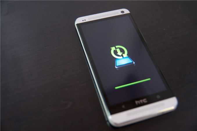
Back when I reviewed the HTC One, I also did a walkthrough of Sense 5 and how it worked with Android 4.1.2. Although Sense 5 is a big step forwards both in visuals and functionality over its predecessor, there were still some things I wanted out of Sense and a few friction points, a number of which have been addressed in this update. Since this is undoubtably the platform that the upcoming rumored smaller and larger versions of the HTC One will run, it's worth taking a look at what's coming.
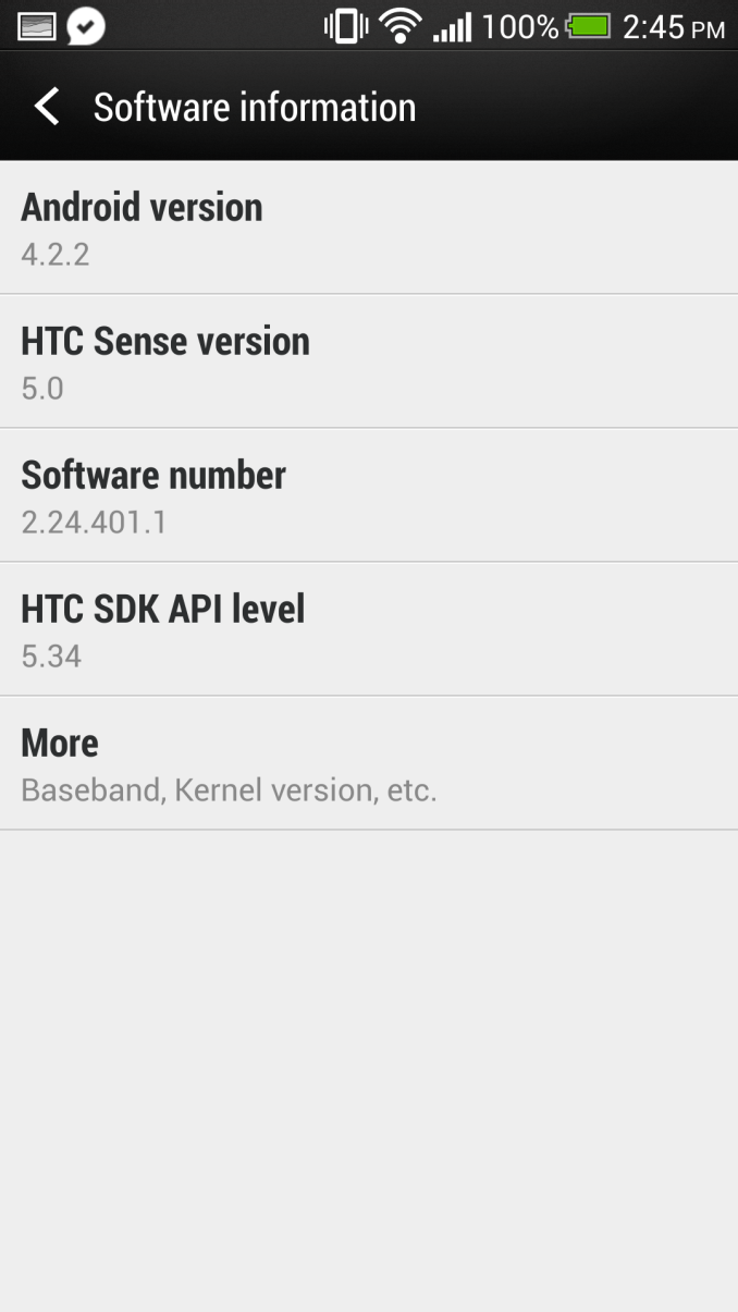
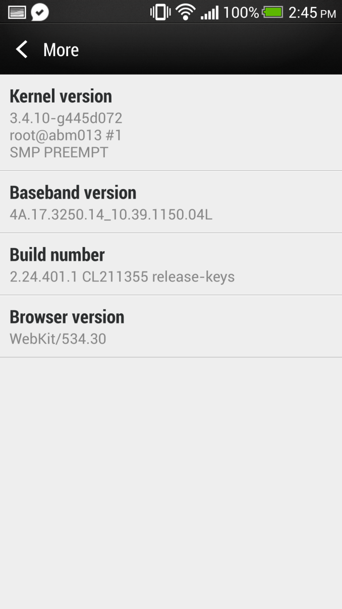
First a bit of context – HTC just recently started rolling out the Android 4.2.2 update to HTC One users in a number of regions, and our international HTC One (EMEA) just got the update, which is where we're looking at what's changed. These rollouts occur in phases and not necessarily for everyone at once, and I don't have any specific information on what regions are getting the update.
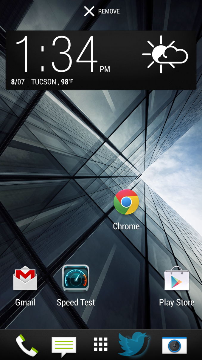
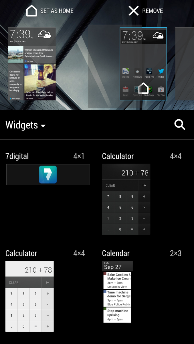
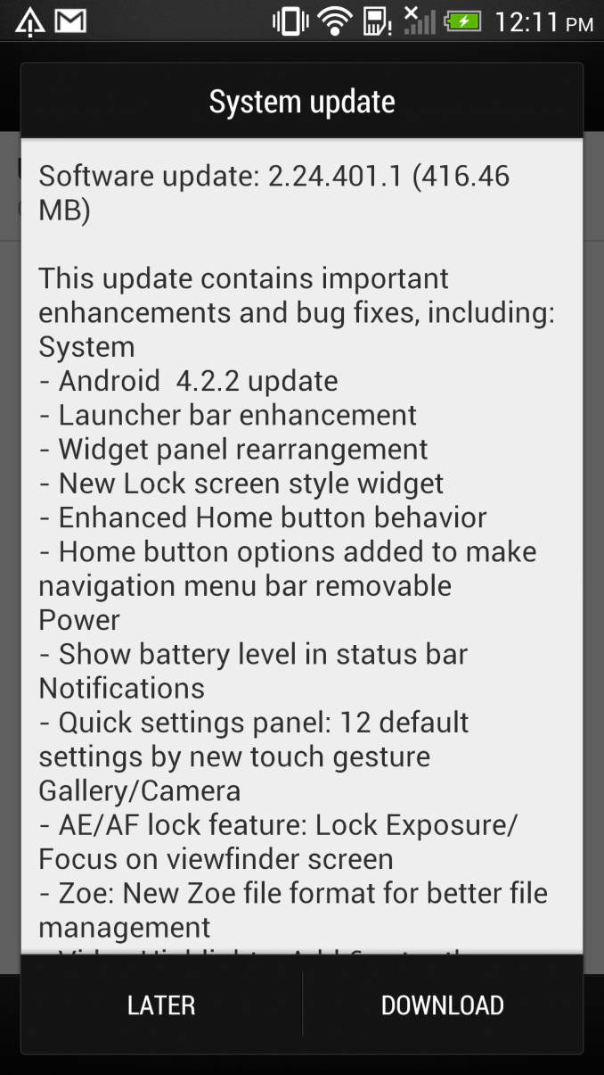
First up, there are some changes to basic functions. Widget panes can now be rearranged after their creation, though the BlinkFeed homepage remains pinned to the far left. Not a huge change, but a thankful one regardless. App shortcuts can also now be freely moved between the bottom launcher bar and widget panel by long pressing and dragging, something which shockingly enough couldn't be done before from that view.
Next, the home button gets two changes. Tapping the home button now takes you through a different, more logical flow than before. Previously pressing home after launching something from the all apps launcher view would take you back to all apps, pressing home after starting from all apps now takes you to your homepage, be it BlinkFeed or a widget pane.
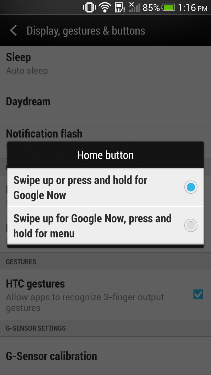
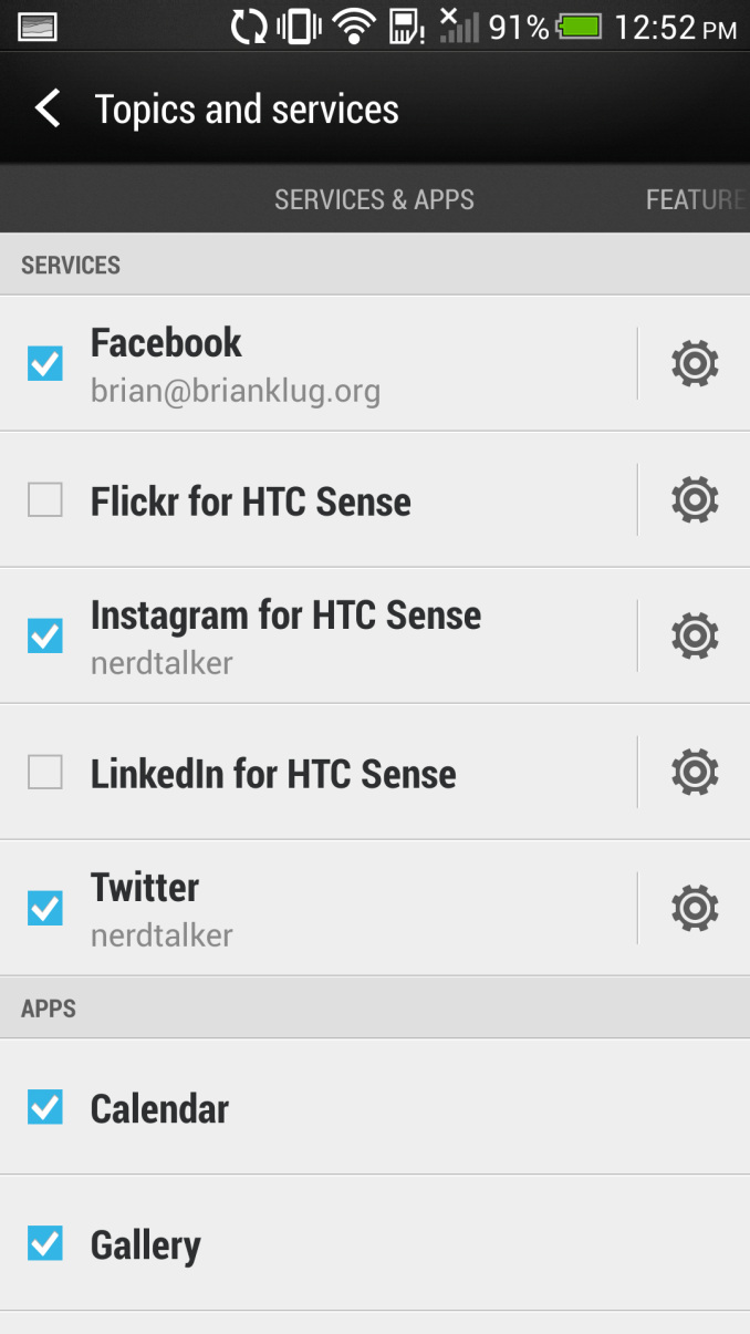
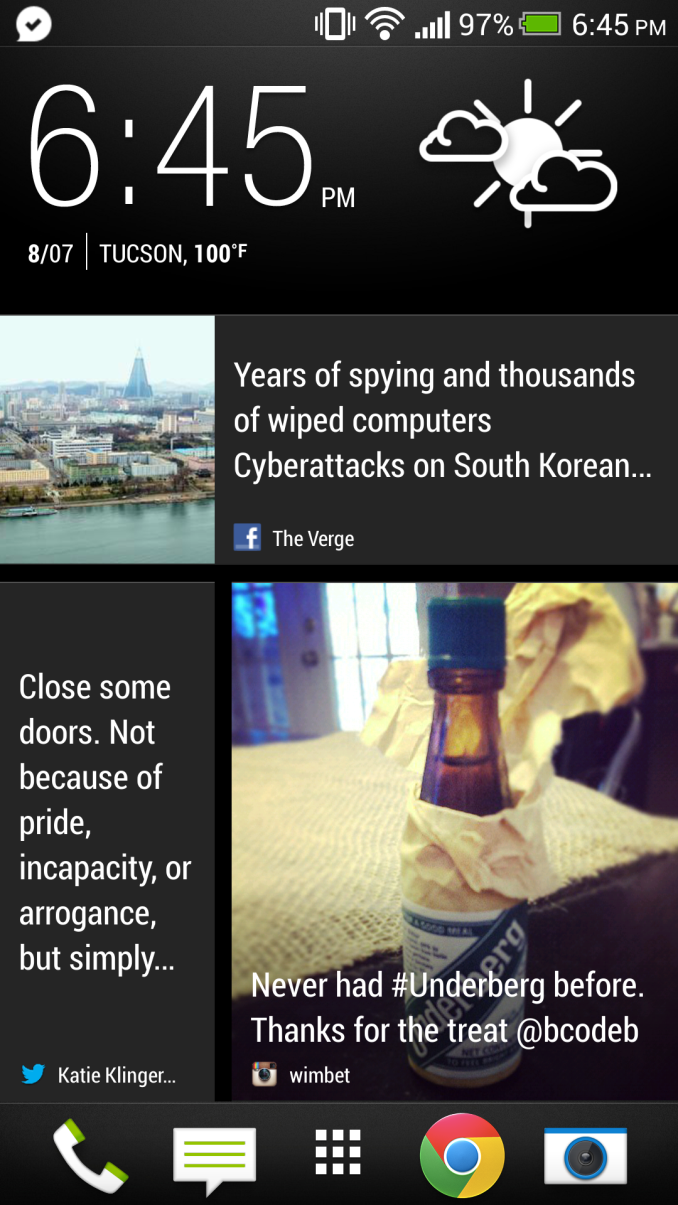
The second home button change is an interesting one – HTC has added back in the ability to long press on home for a menu button. Google Now then gets activated with a swipe up from home. By default the behavior is unchanged, but if you have some applications that still haven't killed the action overflow bar and said goodbye to the menu button, this second button option is you want to use. BlinkFeed also gets a change, there's now Instagram added in as an account. Only stills work at the moment, I'm pretty sure videos just show the still preview at this point if they show up at all.
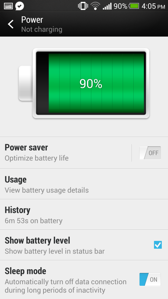
Another small but very thankful addition is I've begged every OEM for – battery percentage in the notification bar. Tap to turn it on under Power in settings, and it displays to the left of the battery visualization. You can see it in the top of basically all my screenshots. The battery percentage fuel gauging algorithm is improved as well.
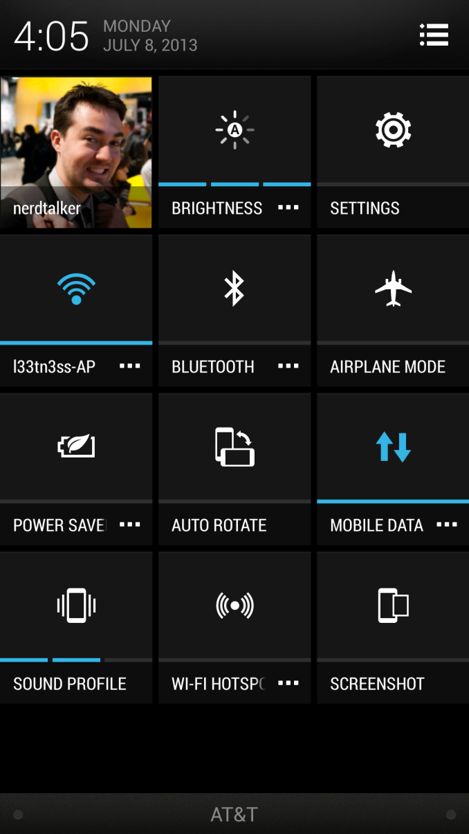
Obviously a big part of Android 4.2.2 is the inclusion of the quick settings shortcuts, which you can access by doing a two finger pull down or single finger and then tapping the icon. HTC has gone and added a few extra settings shortcuts here like Screenshot, Power Saver (yay, this no longer is a persistent notification), Auto Rotate, and Wi-Fi Hotspot. In Sense 5 tapping on these toggles them, and tapping on the overflow button brings you into the appropriate settings application page.
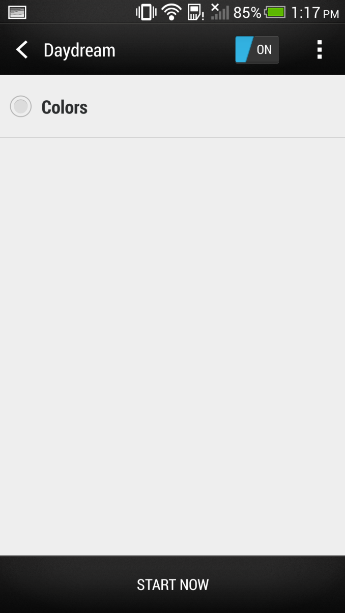
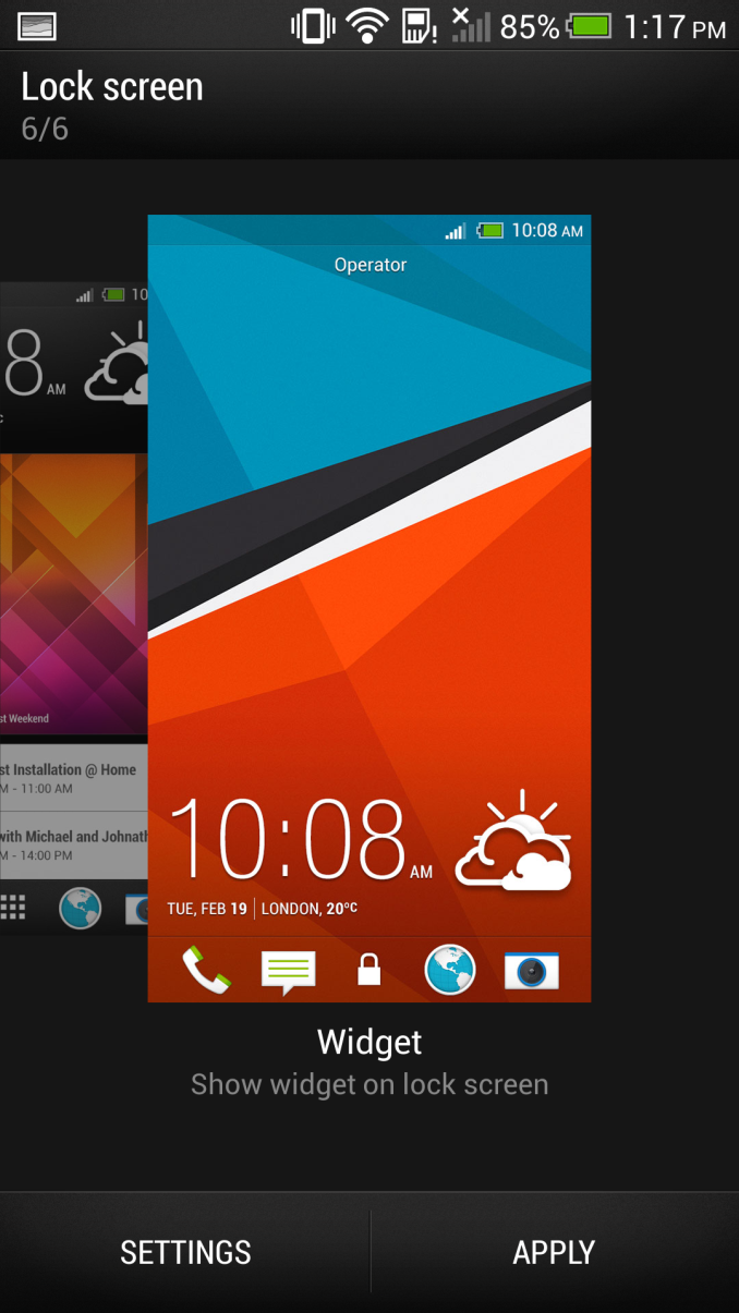
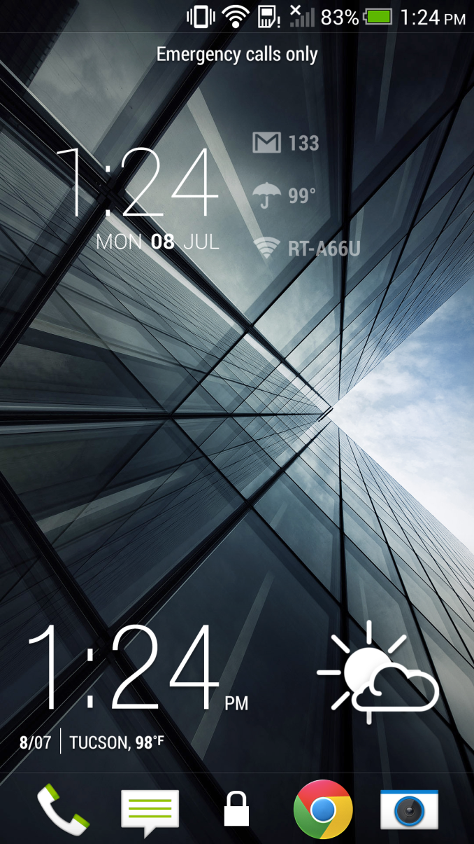
Android 4.2.2 also adds Daydreams, which is essentially a screensaver function for Android. I've never really ever used Daydream on Android 4.2.2, but it's here in the update. Also from 4.2.2 are lock screen widgets, which get included. Getting into the lock screen widgets requires going through personalize, selecting the widget lock screen style, then tapping settings to select one. You only get one widget lockscreen panel and one widget, as opposed to the 5 that stock Android gives you.
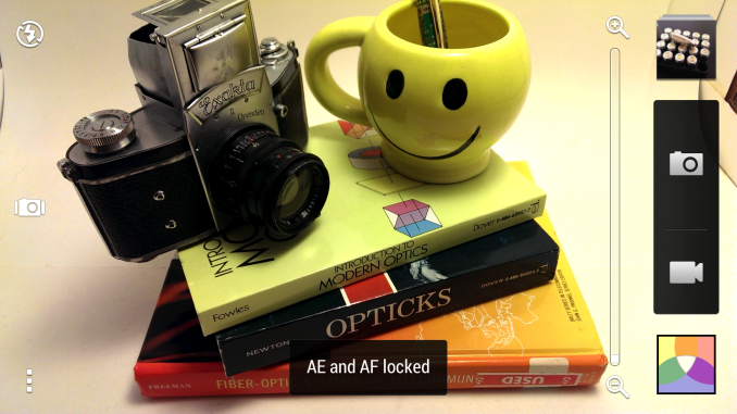
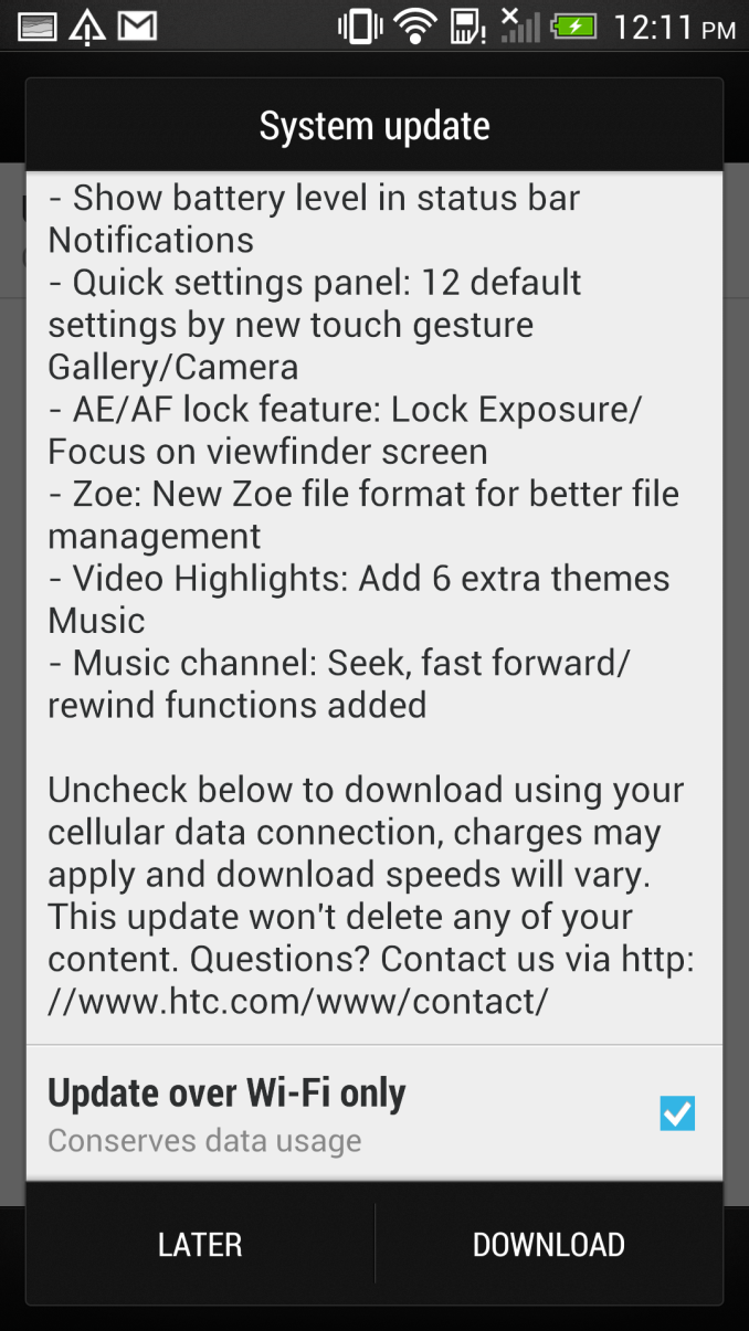
Camera gets a number of thankful additions and tweaks. I've wanted this from HTC's camera app for a long time now – AE/AF lock, and it's here. Long press anywhere in the preview, and after a few seconds AF/AE (Auto Focus and Auto Exposure) are locked until you tap to re-focus and re-expose again. One more thing I still want is the UI camera button to take the picture on tap release instead of on tap press, but maybe that'll come eventually.
Another very thankful change is the way Zoes are recorded. There's now just one JPG and one MP4 in the folder for a Zoe, instead of the 20 JPGs and one MP4 for the previous system. The full size photo of your choice can still be pulled out and saved with the same UI, they're just not all dumped into DCIM every time, just the default one, or the one of your choice. I'm not sure where the full size images are being stored, but they're still somewhere.
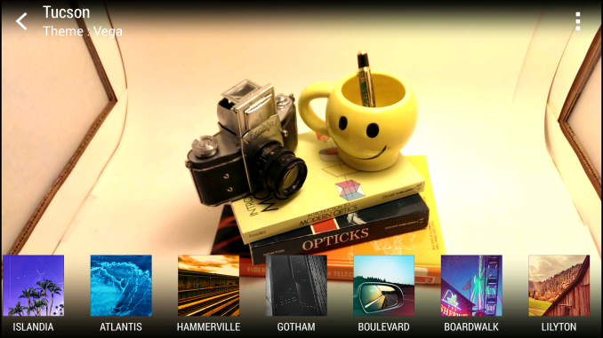
In the Gallery there's one less view now, tapping the gallery gets you immediately into Events view. A big one everyone wanted also was the inclusion of more highlights reel themes. There are now six new highlights reel themes, for a total of 12. There's also a new easier way to select custom content for a highlights reel.
So that wraps up the big changes in this 416.46 MB OTA update for the international variants of the HTC One. The update is again rolling out on a region by region variant, as always there's that operator overhead to think about for the USA, no word on specifics at this point.





33 Comments
View All Comments
djw39 - Monday, July 8, 2013 - link
Loving the three clocks in the lockscreen. ASK ME WHAT TIME IT IS!!!Brian Klug - Tuesday, July 9, 2013 - link
Ha, people love Dashclock, thought I'd use that as an example, but you're right, this looks hilarious now.-Brian
MonkeyPaw - Tuesday, July 9, 2013 - link
You better get to reading your 133 emails. Fanmail? :Ddesignerfx - Wednesday, July 10, 2013 - link
I imagined your comment being read by Samuel L Jackson.ASK ME WHAT TIME IT IS! ASK ME AGAIN! I DOUBLE DARE YOU!
LordOfTheBoired - Friday, July 12, 2013 - link
HTC One: The only cellphone approved by Doctor Emmett Brown.VivekGowri - Tuesday, July 9, 2013 - link
Give me AOSP or give me death.Mugur - Tuesday, July 9, 2013 - link
And give up Zoe and Video Highlights? Never!DWXDX - Tuesday, July 9, 2013 - link
Honestly I find those to be the features I would give up, but the lack of IR Blaster Apps on the Play Store is what's making me stick with Sense. Google has stated that they'll offer a solution for the IR blaster enabled phones, once that happens hello AOSPSamus - Tuesday, July 9, 2013 - link
ditto. just how touchwiz (Samsung) has those awesome gadgets (especially the calendar and task manager)mwarner1 - Tuesday, July 9, 2013 - link
AOSP is overrated. It's not bloated, has nice icons and is generally offers a smoother UI but (and it is a big, throbbing but) many of the standard apps are significantly worse than their OEM replacements - e.g. Camera, Calendar, SMS - and some of the third party extensions are actually useful e.g. battery percentage indicator and Samsung's Smart Stay (keep the screen on while looking at it).Personally I prefer a stock-based ROM with a replacement launcher.