OPPO Find 5 Review
by Vivek Gowri on May 29, 2013 6:55 AM EST- Posted in
- Smartphones
- Qualcomm
- Mobile
- APQ8064
- OPPO Find 5
I like the OPPO Find 5. When I first got it, it was a frustrating, buggy mess of a phone, but over time the firmware has gotten more stable (with much more promising software options currently on the horizon), I’ve gotten used to the random quirks, and the good stuff - the performance, display, and overall quality of the design - have really endeared the phone to me. It’s a nice, solid handset and that’s truly an accomplishment for a relative unknown like OPPO. It’s found itself a decent community of followers with an active enthusiast forum, and the manufacturer support and development for the device seems to closely follow the advice and feedback from owners and testers. That’s pretty rare to see these days, especially the post-launch software support. Maybe I’m still a little bit skittish since my days with LG’s scarce and often extremely late software updates - the Optimus 4X HD, a flagship device in summer 2012, only got the Jelly Bean update three weeks ago - but it’s definitely valuable to note that the Find 5 isn’t a device that hits market and then gets abandoned by OPPO’s firmware engineers.
As a loyal T-Mobile customer and someone who loathes the American network operator subsidy model, I’m a huge fan of this sales model. I’m a similarly huge fan of how Google is selling their cellular-enabled Nexus devices, and it’s nice to see it start to catch on. I think the next step in this is for handset prices to go down - $500 is still too much, I’d like to see the Find 5 drop by $50-100 to bring it closer to the Nexus 4 from a pricing standpoint. It’s admittedly cheaper than you’ll find the One, SGS4, or Xperia Z selling off-contract, though not by enough to really call the Oppo a low-cost alternative in the vein of the Nexus 4, which is still, eight months later, one of the best values on the smartphone market.
The Find 5 and the Nexus 4 have pretty similar internal hardware, as noted throughout the review. The main benefits you get with the OPPO over the Nexus are the display and the camera - both are solidly better, and the camera particularly is a definite Achilles heel for the Nexus 4. (Does Google have a rule to never ship a Nexus device with a competitive camera? It absolutely mystifies me why this is a knock against every single Nexus handset. But I digress.) The Nexus 4 display wasn’t bad though, it was one of the best 720p panels we saw last year, and overall it feels like a more complete, finished device. Nothing can touch the Nexus 4 from a software standpoint - it will always be the first to get updates and always a completely AOSP experience, plus it’s the easiest to find third party ROMs for. The OPPO on the other hand has some major flaws in the shipping software, and that really can’t be ignored, even if the development picture does look encouraging.
Even priced equally, I’d probably take a Nexus 4 over the Find 5 - let’s say 6 or 7 times out of 10. The camera experience of the Find 5 is way better than the Nexus, and that accounts for the other 3-4 times. Toss in the $150 price difference (though really it’s closer to $110 after you factor in tax and shipping from the Play Store), and the choice is clear. The Nexus is a thinner, lighter, easier to handle phone with similar silicon in addition to software that’s just miles ahead of where OPPO is right now. The price difference on top of that is almost like a bonus. This is obviously less of a factor in Europe and Asia, where the prices are more equivalent (the Nexus 4 is a phenomenal value in the US through the Google Play Store, but less so in the rest of the world), and at that point, it becomes a more interesting question. The OPPO is definitely a more unique device, not something you’ll come across with regularity, but that comes with things that are both good and bad.
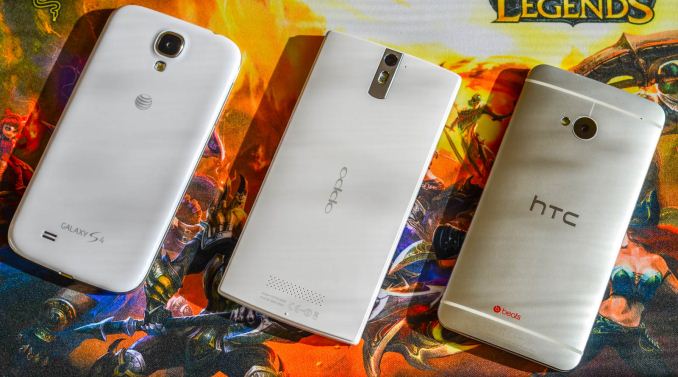
But let’s not take anything away from OPPO here. The hardware is honestly excellent, particularly considering the fact that it came from a small company with little previous awareness. I was very impressed with the design-level polish, and even if the industrial design was inspired by Nokia and Sony, at least OPPO did a good job integrating the various design touches into the Find 5’s design. The ergonomics are still a little questionable, but I’m willing to let it slide. The rest of the hardware package is great, with solid build quality and a top-notch display. From an imaging standpoint, this is basically as good as you’re going to get with a conventional high-resolution sensor. It’s not as premium feeling as devices like the One, Xperia Z, and iPhone 5, but it’s definitely a step above the Galaxy S4 and pretty much on par with the Lumia 920. When you think of hardware being on par with the best of what comes out of an elite design house like Nokia, you realize just how ambitious the Find 5 is from the standpoint of the engineering and development teams. It’s honestly a real accomplishment for the Find 5 to be even mentioned with those devices, and for that OPPO needs to be recognized. I’m excited to see where they can go with their next generation devices, particularly if they can get their software ducks in a row.


39 Comments
View All Comments
Kristian Vättö - Wednesday, May 29, 2013 - link
I agree with you on the button layout. Power button on the side design might be okay if you're right-handed as your thumb can easily reach the button but I can say from experience that it's awful if you're left-handed (like me). Given the size of the current phones, it's very, very hard to securely reach the power button with your left index finger - but I'd have no problems if the button was placed on the top of the device.That said, I know left-handed people are the minority and most designs ignore us, but I'm pretty sure there are scenarios when right-handed people use their phone with their left hand. Or at least I use my Nexus 4 with my right hand by time to time (e.g. while driving).
kondamin - Wednesday, May 29, 2013 - link
Powerbutton on the top of the device or the bottom is the way to do it. I'm constanly chaning the volume when I turn my s3 off because of that moronic idea of putting them on oposing sides.And you are spot on that these devices aren't friendly for left handed people, the biggest sinner in my book is nokia their lumia buttons are all on the same (and wrong) side.
JPForums - Wednesday, May 29, 2013 - link
I'm mostly ambidextrous, but I'm always using my Lumia 920 with my left hand. I have no trouble using it with my right either (just switch to operating the buttons with my thumb), but I find more often than not, I pick it up and operate it with my left hand. On that note, I suspect I'd get used to the OPPO button placement fairly quickly as well (even if it isn't ideal). I'm guessing you don't much care for operating your phone buttons with your fingers. I do agree with you that putting the power and volume rocker on opposite sides is a generically bad idea, though.mr_tawan - Wednesday, May 29, 2013 - link
I'm kinda like the Galaxy Nexus's button layout. In the other hand, button layout on the Nexus 7 sucks. I constantly press volume button instead of power button.I think the power button on the top is good for smaller phone. For a larger phone (>4.6"), it's should be on either left or right side, and on the opposite side of volume buttons). It's too far to reach the top.
WhiteAdam - Wednesday, May 29, 2013 - link
Love my job, since I've been bringing in $82h… I sit at home, music playing while I work in front of my new iMac that I got now that I'm making it online. (Home more information)http://goo.gl/fDMVb
nancy919 - Wednesday, May 29, 2013 - link
it's realy the easiest work Ive had.mwarner1 - Wednesday, May 29, 2013 - link
I actually prefer having buttons on the side of modern, large screened phones. The idea of having the power button on top is fine for a device the size of an iPhone, but when you are taking about devices with 5+ inch displays, it is rather awkward to reach all the way to the top of the device to press the power button.Zandros - Wednesday, May 29, 2013 - link
As a right-handed person, I'm usually holding my phone with my left hand so my dominant hand is free to do other things (which occasionally consists of stabbing at the screen).Maybe I'm missing something, though, but isn't having the power button on the left site (as in this case) advantageous for thumb use if you're using it with your left hand?
Kristian Vättö - Wednesday, May 29, 2013 - link
Oh, you're right - the power button is on the left side in the OPPO. I just looked at the "Finger Friendly Design" picture and thought that it's on the right side like in my Nexus, haha. At least for me, it would advantageous to have the power button on the left instead.Basically, with the OPPO all the right-handed people go through the same pain as I go through with the Nexus 4.
VivekGowri - Wednesday, May 29, 2013 - link
Yeah the OPPO power button is a nightmare. I am not impressed by their so-called finger friendly design.