OPPO Find 5 Review
by Vivek Gowri on May 29, 2013 6:55 AM EST- Posted in
- Smartphones
- Qualcomm
- Mobile
- APQ8064
- OPPO Find 5
Like many recent flagships, the OPPO comes with a 5” 1080p AH-IPS display produced by JDI. It’s pretty similar to the one you can find in the Droid DNA and other phones with this screen dimension and resolution, except for the Galaxy S4, which of course uses Samsung’s own 1080p SAMOLED panel. All of these displays share the 443 PPI pixel density, which is incredibly high, especially in the displays that have a full RGB stripe subpixel matrix. It’s hard to ask for anything more than this in a display, and the differences in sharpness and density in this panel versus the HTC One’s 468 PPI display (1080p on a slightly smaller 4.7” panel) are almost academic. We’re well beyond the point where one can see individual pixels with the naked eye, as on even most 720p displays were (notable exception: Galaxy S3).
The touch controller is provided by Synaptics, with the Find 5 utilizing the same ClearPad Series 3 S3202 as the HTC One and One X, with 10 points of multitouch detection. Even without in-cell touch, there’s not much of a perceptible gap between the LCD and the glass, and the display does quite well outdoors (as there isn’t much reflectiveness added due to air gap).


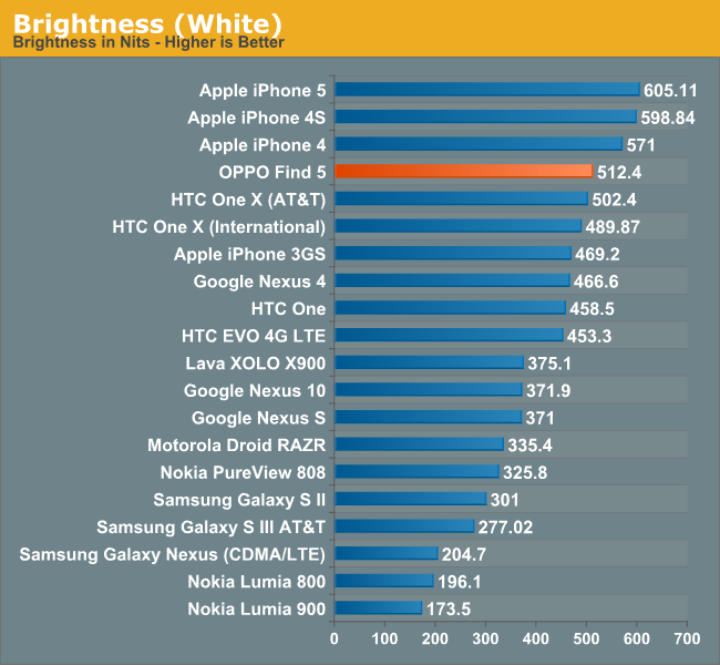
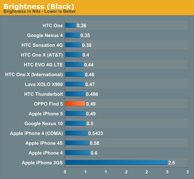
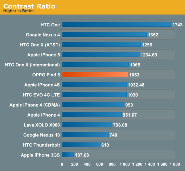
The display is really bright, one of the brightest Android devices we’ve ever tested. Contrast ratio, at just over 1000:1, is very good, but nothing special and well short of the HTC One’s 1750:1 contrast panel. The colour temperature of 6432K is very close to the 6500K we consider to be neutral, and the panel calibration overall seems to be decent though not as good as we’ve come to expect from manufacturers like Apple or HTC.
I think 4.7” is the sweet spot for display size, something that was reached with the last generation of handsets. There’s not really any benefit to going with a 5” panel over a 4.7” panel beyond just having a bigger number - it’s not like jumping to a Galaxy Note-sized 5.5” or larger display, where the device ends up being more of a phablet than a handset, but it does add just enough bulk to be on the cumbersome side.


39 Comments
View All Comments
Kristian Vättö - Wednesday, May 29, 2013 - link
I agree with you on the button layout. Power button on the side design might be okay if you're right-handed as your thumb can easily reach the button but I can say from experience that it's awful if you're left-handed (like me). Given the size of the current phones, it's very, very hard to securely reach the power button with your left index finger - but I'd have no problems if the button was placed on the top of the device.That said, I know left-handed people are the minority and most designs ignore us, but I'm pretty sure there are scenarios when right-handed people use their phone with their left hand. Or at least I use my Nexus 4 with my right hand by time to time (e.g. while driving).
kondamin - Wednesday, May 29, 2013 - link
Powerbutton on the top of the device or the bottom is the way to do it. I'm constanly chaning the volume when I turn my s3 off because of that moronic idea of putting them on oposing sides.And you are spot on that these devices aren't friendly for left handed people, the biggest sinner in my book is nokia their lumia buttons are all on the same (and wrong) side.
JPForums - Wednesday, May 29, 2013 - link
I'm mostly ambidextrous, but I'm always using my Lumia 920 with my left hand. I have no trouble using it with my right either (just switch to operating the buttons with my thumb), but I find more often than not, I pick it up and operate it with my left hand. On that note, I suspect I'd get used to the OPPO button placement fairly quickly as well (even if it isn't ideal). I'm guessing you don't much care for operating your phone buttons with your fingers. I do agree with you that putting the power and volume rocker on opposite sides is a generically bad idea, though.mr_tawan - Wednesday, May 29, 2013 - link
I'm kinda like the Galaxy Nexus's button layout. In the other hand, button layout on the Nexus 7 sucks. I constantly press volume button instead of power button.I think the power button on the top is good for smaller phone. For a larger phone (>4.6"), it's should be on either left or right side, and on the opposite side of volume buttons). It's too far to reach the top.
WhiteAdam - Wednesday, May 29, 2013 - link
Love my job, since I've been bringing in $82h… I sit at home, music playing while I work in front of my new iMac that I got now that I'm making it online. (Home more information)http://goo.gl/fDMVb
nancy919 - Wednesday, May 29, 2013 - link
it's realy the easiest work Ive had.mwarner1 - Wednesday, May 29, 2013 - link
I actually prefer having buttons on the side of modern, large screened phones. The idea of having the power button on top is fine for a device the size of an iPhone, but when you are taking about devices with 5+ inch displays, it is rather awkward to reach all the way to the top of the device to press the power button.Zandros - Wednesday, May 29, 2013 - link
As a right-handed person, I'm usually holding my phone with my left hand so my dominant hand is free to do other things (which occasionally consists of stabbing at the screen).Maybe I'm missing something, though, but isn't having the power button on the left site (as in this case) advantageous for thumb use if you're using it with your left hand?
Kristian Vättö - Wednesday, May 29, 2013 - link
Oh, you're right - the power button is on the left side in the OPPO. I just looked at the "Finger Friendly Design" picture and thought that it's on the right side like in my Nexus, haha. At least for me, it would advantageous to have the power button on the left instead.Basically, with the OPPO all the right-handed people go through the same pain as I go through with the Nexus 4.
VivekGowri - Wednesday, May 29, 2013 - link
Yeah the OPPO power button is a nightmare. I am not impressed by their so-called finger friendly design.