Amazon Kindle Fire Review
by Anand Lal Shimpi & Vivek Gowri on November 29, 2011 3:31 AM EST- Posted in
- Tablets
- Mobile
- Amazon
- Kindle Fire
- Kindle
The iPad Comparison
I'll be honest here (I always am?): I don't understand the iPad comparison. The Kindle Fire and iPad 2 couldn't be more different. They are vastly different sizes, shapes and prices. They even serve slightly different functions. The search for an iPad killer reminds me of the search for a Voodoo killer back during the heyday of 3dfx in the late 1990s.
The Kindle Fire serves entirely different purposes than to take marketshare away from Apple.
Why would Amazon enter the IPS LCD equipped multitouch tablet business to begin with? For users who are content reading ebooks on an e-ink screen, the vanilla Kindles are as good as they get. The problem is for users looking to consolidate devices, they may find themselves carrying a Kindle and a tablet of some sort (likely an iPad) and will ultimately ditch the Kindle in favor of the iPad. Should these users replace their Kindles with iPads, there's the argument that Apple could tempt them away from Amazon's Kindle store altogether. If they want a more affordable tablet however they are likely going to be forced into a solution that's probably not very good. Neither possibility is something Amazon likes, so the obvious answer is to offer a Kindle that delivers enough of the tablet experience that will satisfy those users looking for more than an e-ink Kindle could provide.
The Fire is that Kindle.
No Tradeoffs: Compute & Display
When faced with the task of bringing a not-sucky $200 tablet to market, Amazon refused to skimp in two areas: compute and the display. It reaffirms something that we've known for quite a while: to deliver the best user experience you still need fast silicon and a great display. The third thing you need is efficient software, which is something Amazon attempted to deliver by customizing Android, but I'll get to that later.
The SoC doesn't sound fast anymore, not with Tegra 3 and Krait waiting around the corner, but the OMAP 4430 is still one of the fastest things you can buy today. It features two fully equipped Cortex A9 cores (complete with MPE), a 1MB shared L2 cache, two 32-bit LPDDR2 memory channels and a PowerVR SGX 540. CPU clocks aren't as high as they could be at 1GHz, but if Amazon does its job well enough on the software side they should be sufficient. To put things into perspective, this is more general purpose compute than the original iPad and something competitive with the iPad 2. It only falls short of the iPad 2 in the GPU department, but seeing as the Kindle Fire isn't designed to be a big gaming platform the loss isn't significant.
| Tablet Specification Comparison | ||||||
| Amazon Kindle Fire | Apple iPad 2 | BlackBerry PlayBook | Samsung Galaxy Tab 8.9 | |||
| Dimensions | 190 x 120 x 11.4mm | 241.2 x 185.7 x 8.8mm | 194 x 130 x 10mm | 230.9 x 157.8 x 8.6mm | ||
| Display | 7-inch 1024 x 600 IPS | 9.7-inch 1024 x 768 IPS | 7-inch 1024 x 600 | 8.9-inch 1280 x 800 PLS | ||
| Weight | 413g | 601g | 425g | 447g | ||
| Processor | 1GHz TI OMAP 4430 (2 x Cortex A9) | 1GHz Apple A5 (2 x Cortex A9) | 1GHz TI OMAP 4430 (2 x Cortex A9) | 1GHz NVIDIA Tegra 2 (2 x Cortex A9) | ||
| Memory | 512MB | 512MB | 1GB | 1GB | ||
| Storage | 8GB | 16GB | 16GB | 16GB | ||
| Pricing | $199 | $499 | $199 | $469 | ||
The Fire is equipped with only 512MB of RAM but, once again, if Amazon does its job on the software side this should be sufficient. Moving to 1GB would allow you to keep more applications active at once and pave the way for more textures in games, but as I just mentioned, the Fire isn't much of a gaming platform to begin with.
The display is small by iPad standards, but as I mentioned in our PlayBook review, it does make the device far more likely to be by your side wherever you may go. The iPad and other 10-inch tablets make for a far better web browsing experience, but they are too big to just carry around with you like you would a wallet or smartphone. The Kindle Fire is bigger than anything that should occupy space in your wallet, but it's small enough that you might actually take it wherever you go.
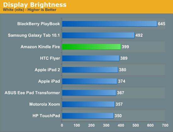
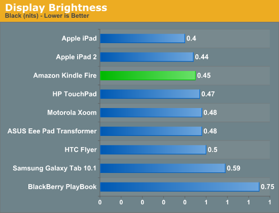
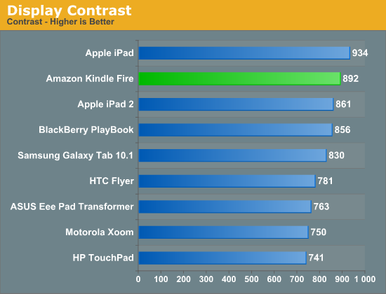
Display quality is pretty good. The 7-inch 1024 x 600 screen hits 400 nits at its brightest setting, and its black levels are reasonable at 0.45 nits. The resulting contrast ratio is good as well.
The white point is an almost Samsung-like 7200K across all brightness settings. Interestingly enough there's no difference in brightness once you get below 25% on the slider control.
The Form Factor
The first Kindle I ever bought was the second generation model. Upon receiving it I felt that it was the perfect handheld tablet form factor. The 2nd generation Kindle was both thin and light enough that it could truly be a book replacement. I'd carry it everywhere and it wasn't a burden to hold and read for hours.
The Kindle Fire strikes me with no similar feelings about its form factor. It's portable, more so than the iPad and it's reminds me of my old Kindle in surface area but that's it. The Fire is light enough to be held in one hand but when reading for extended periods of time I still find myself having to support the device with my chest if I'm lying on my back. There's simply no innovation in the form factor. While my old Kindle was the perfect form factor, the Fire is just acceptable.
This isn't all Amazon's fault however. The hardware in a plain old Kindle allows Amazon to build something ultra thin and ultra light. Moore's Law has yet to give us something that can perform as well as the Fire while operating within the confines (battery included) of a regular Kindle. I suspect that we'll eventually get to that point, however it may take a good three years for that to happen.
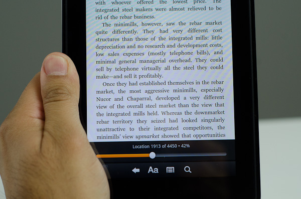
The standard Kindle's e-ink display is beautiful to read pages of books on, but it is hardly desirable for images or web content. The Kindle Fire is a bit better, but still not perfect in this regard. In text mode reading magazines or books is as pleasant as can be given that you're staring at an LED backlit LCD. If you're just going to be reading books, the experience on a vanilla Kindle is better. The advantage to the Fire of course is that you can do more than just read pages of text - it's good for magazines and web pages as well.
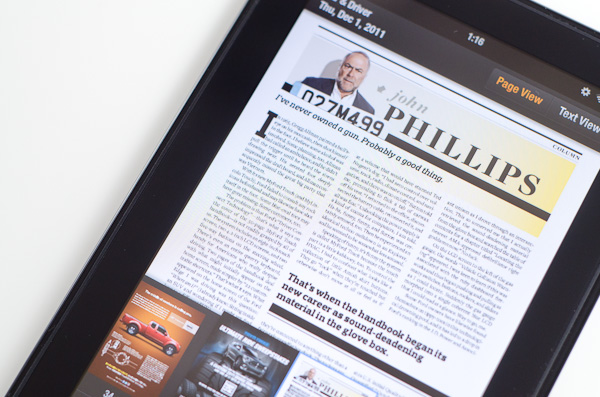
Unfortunately here the 7-inch 1024 x 600 display is limiting. It's virtually impossible to read a magazine (in magazine view) fully zoomed out like you would a book. I found myself preferring the text view of magazines I tried subscribing to on the Kindle Fire. Web browsing is more of a mixed bag. You get a really great browsing experience compared to a smartphone, or a really cramped browsing experience compared to an iPad. This is the same problem I pointed out in our PlayBook review:
Even when I'm not out and about, the PlayBook is quite usable as a content consumption device. In portrait mode fonts are a bit too small for me to read comfortably on the couch but in landscape it works well as a reddit browsing machine.It's in the couch-lounging usage model that the PlayBook does fall short of the iPad or Xoom. But in terms of portability the PlayBook is clearly a much better balance of functionality and mobility. If you read between the lines you'll come to the same conclusion I have: neither the PlayBook nor the iPad is the perfect form factor for a tablet. Further more, I'm not sure there is a single perfect tablet form factor.




70 Comments
View All Comments
StormyParis - Tuesday, November 29, 2011 - link
The original Nook Color, at $200, was an heck of a deal. The current proprietary tablets (Nook Color 2 and Kindle Fire) are a lot less compelling due to the arrival of non-proprietary tablets at the same price point. Those are.. non-proprietary, and offer arguably better features.I'm still happy ith my original Nook Color. WHen it gets replaced, if it does, it probably will be by a true, un-walled-gardened, tablet.
Wierdo - Tuesday, November 29, 2011 - link
Ars had a good review of the Nook tablet here:http://arstechnica.com/gadgets/reviews/2011/11/lea...
"I have less doubt about the Nook Tablet as a capable product than I did about the Kindle Fire. The experience is not frustrating or jagged and doesn't feel as unfinished... However, I do have some doubts about the value of the Nook ecosystem. Amazon's selection in all categories seems a bit more diverse..."
rruscio - Tuesday, November 29, 2011 - link
I wanted an entry level tablet that was an eReader. Check. But ...1) I really miss having Skype on here. Really.
2) The lack of Google native apps results in my using the browser for gmail, Reader, et al. And then Google gives me links to all the other apps. Not the most comprehensible experience.
3) The single/double/drag tap issues are more annoying than they need to be.
4) wiFi isn't immediately available when the device wakes up. It takes some number of seconds to make the connection. The "wiFi not available" error is easily resolved by me tapping again. Why isn't is resolved by the app / OS waiting instead?
5) The entire software experience seems less than fully baked. Yeah, I get the Christmas rush thing, but I don't have experience with Amazon updating software. Hope isn't change.
6) The device feels familiar because I'm used to my Droid Inc. The speed is better, and the screen size is acreage versus postage stamp.
If there's ever a phone that just 1) phone calls 2) text messaging 3) wiFi hot spot 4) non-larcenous plan, I'd predict that, and a tablet in this form factor, will kill the smart phone business.
Great review.
genomecop - Thursday, December 1, 2011 - link
1. I dont miss it at all.2. Not true. It comes preloaded with an email app that has gmail setup.
3. Dont know what your talking about never have this issue
4. Dont have this issue and I use mine all day long.
5. Have no problem with the software at all. Everything works very smoothly.
Just want to add...I've had an Ipad since launch and I have since stopped carrying it around. This fits in my coat pocket for use at the gym while doing cardio. At work, on my desk for quick web browsing. RSS feed for all Tech related news. Gmail. Reading on the subway. Uses my phones hotspot in the cab for use. Quick download of movies. I think its a great device.
mcturkey - Tuesday, November 29, 2011 - link
In your conclusion, you state that $199 should be the entry level price point now. I'm anxiously awaiting your review of the Nook Tablet to see if that extra $50 is worth it (excluding my personal bias towards B&N for their willingness to fight back against Microsoft's ridiculous patent war against Android).tipoo - Tuesday, November 29, 2011 - link
Agreed, the new Nook looks interesting. I remember reading it has a larger battery than the Fire. Locking all but 1GB of its memory to B&N content sucks, but I'm sure someone will take that limitation off.Lucian Armasu - Tuesday, November 29, 2011 - link
Hardware wise, the extra 8GB of internal storage, extra 512 MB of RAM, and microSD slot, I think it;s worth it. Still I think the extra $50 would be worth it a lot more with the full Android experience. If the other Android manufacturers could put android 4.0 on an equivalent tablet to Kindle Fire, and price it at $250, I'd pick that one any day. You can still get all Amazon's services on the full Android, too, so no point limiting yourself for $50.nace186 - Tuesday, November 29, 2011 - link
I don't understand why you are comparing the Fire with all the tablet out there that's in a different class. What it should really be compare to is the Nook Color, and the Nook Tablet. Which either of them were included.Wierdo - Tuesday, November 29, 2011 - link
Yeah I read a review on Ars about it and they think the Nook tablet is a more capable product but Amazon has the edge in the ecosystem department, link posted on this thread somewhere if interested.VivekGowri - Tuesday, November 29, 2011 - link
We'll have a Nook Tablet review that touches on the comparisons to the Kindle Fire relatively soon :)