The HTC Flyer Review
by Anand Lal Shimpi on June 21, 2011 4:05 AM EST- Posted in
- Tablets
- HTC
- Android 2.3
- Mobile
- Flyer
Gingerbread & Sense 3.0
The Flyer doesn't ship with Honeycomb but instead it comes with Android 2.3.3, a solid but not-quite-tablet optimized build of Google's mobile OS. Since the Flyer isn't your traditional tablet however, it actually works reasonably well with Gingerbread.
The UI is pretty smooth and in many cases actually smoother than many Tegra 2 tablets running Honeycomb. With a lower screen resolution (1024 x 600), the Flyer's GPU has less work to do and thus maintains a high (albeit not perfectly smooth) frame rate most of the time. Swiping between home screens is pretty smooth, even web browsing is relatively smooth. The overall experience still isn't quite as stutter-free as iOS, but it's definitely livable if you're ok with a UI that dips below 30 fps.
Gingerbread is partially GPU accelerated which is responsible for the relatively pleasant experience on the Flyer. It's worth pointing out that although Qualcomm wasn't the Gingerbread SoC partner, the port to its hardware seems to work very well.
Android 2.3 is only part of the software story here. The rest comes by way of HTC's Sense UI, version 3 to be exact. It all starts with the lock screen:
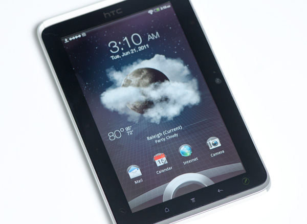
By default you get time, date, a giant ring and four application icons. Drag the ring up to unlock the Flyer or if you want to dive straight into Mail, Calendar, web browsing or the camera just drag one of those icons down into the ring. Doing any of the latter will unlock the Flyer and immediately launch you into the selected application. I can't stress enough how simple and cool this feature is, it's a productivity booster and it makes a ton of sense (bad pun, bad).
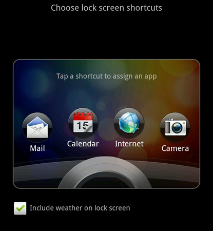
HTC even lets you customize what apps you can launch from the lock screen, you are limited to four shortcuts however. The only other trick the lock screen will do is display the weather based on your current location. I had problems with the Flyer getting an accurate location lock for weather regularly. Far too often I'd just get an error telling me that weather data couldn't be determined for my location. Forcing an update from the weather widget always fixed the problem however. It seems like HTC might have a bug related to grabbing location data after wake.
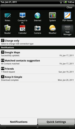
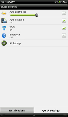
Once unlocked Sense 3 looks similar to previous iterations but with some notable enhancements. HTC customized the pulldown Android notification shade. You still get notifications but you also have a tab for quick settings, similar to those available in Honeycomb:
Sense also uses some of the extra screen resolution to include a list of recently used tasks at the top of the pull down shade.
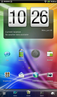
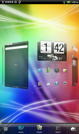
Along the bottom of the screen are five icons, three of which are customizable:
![]()
The two fixed icons are the all-apps and personalize buttons. The remaining three are notes, reader and watch by default but like I said, you can set them to anything else. These five icons remain present on every home screen.
There are eight home screens by default. Tapping the home button will bring up a tiled screen with all eight so you can quickly get to one. Swiping left/right also lets you flip through the home screens. The list is now circular as well, so once you hit the eighth screen you can swipe again to go back to the first one.
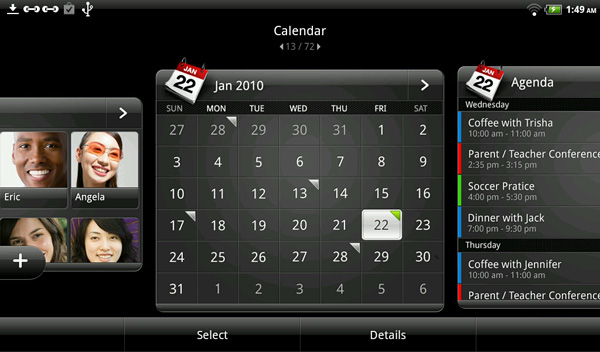
What do you put on all of these home screens? Giant widgets of course. Gingerbread may not be tablet optimized, but HTC's widgets sure feel at home on the 7-inch screen. If you want more of a smartphone experience however HTC typically gives you a few versions of each widget each a different size and/or configuration. For example, HTC has three different calendar widgets - the first is a full screen calendar with a list of today's appointments:
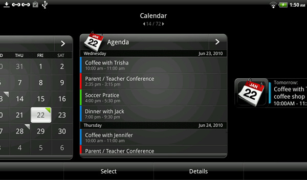
The second is just an agenda view, also full screen:
And the third is a smaller widget that just displays the date and next appointment.
HTC lets you preview all widgets and even shows you how the widgets would look in both portrait and landscape mode if you rotate the Flyer in preview mode.
There are widgets for contacts, weather, Twitter, email, Facebook and even a calculator. I'm not normally a fan of Android skins but Sense 3 is actually a productivity boon on the Flyer. This is still Gingerbread so the widgets aren't resizable, although you can scroll within them. The widgets don't always update as frequently as I'd like either. Take the email widget for example.
I often found I'd have new email which was visible in the email app, but it'd take several seconds of pausing at the home screen with the email widget for the updated messages to appear. The whole point of widgets are to give you a quick glance at your data, but having to wait for it to appear goes against that intent. I suspect HTC is trying to minimize background tasks by avoiding updating things super frequently but it'd be nice to be able to control how frequently the widgets updated.
Other widgets don't update automatically at all like the Friend Stream widget. To get the latest update there you actually have to hit the refresh button at the bottom of the widget. Again, it's not the end of the world but it does ruin some of the point of a widget.
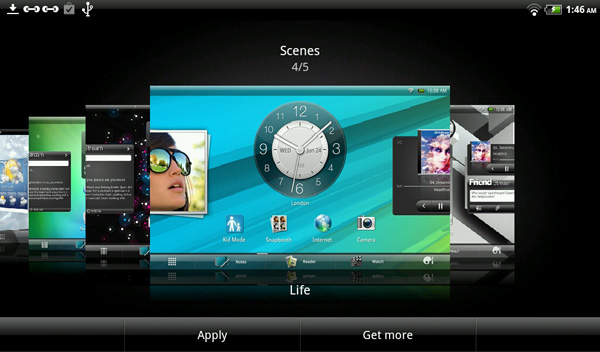
HTC offers a good amount of personalization through Sense. There are several pre-defined "scenes" for various usage models. For example there's a travel scene that puts a world time widget on the default home screen and a location widget on the screen to the left of it. There's a social scene that defaults to widgets that show more of your social network status updates and emails. More importantly, HTC lets you configure all eight home screens however you'd like and save the configuration as a custom scene. This way you can define your own work, play, travel, etc... scenes on the Flyer. Although not everyone will be find this level of customization useful, HTC does know how to speak to that niche of enthusiast users that do appreciate such things.




26 Comments
View All Comments
piroroadkill - Tuesday, June 21, 2011 - link
.. and should include the pen. Oh well.nitin213 - Friday, June 24, 2011 - link
At a recent roadshow in Singapore, HTC flyer was available for S$550 in a whispered deal (~US$460) and came bundled with the scribe and a cover.. I guess wait for similar deals in US if you really want it bundled.That said, I still went with an iPad even though i bought N1 immediately at launch. The key reason was quite simple... while numbers suggest that flyer is lighter, the smaller size meant it has much more heft and thus fingers get tired a bit faster (I was always holding flyer with a stronger grip). the scribe though useful addition wasnt always avlbl right away as there is no old-stylus style storage area on the tablet.. And lastly, the old adage.. never buy a first generation product from a company...I like HTC and am sure their next gen product would blow the competition, but flyer was not for me.
cheers
m.amitava - Tuesday, June 21, 2011 - link
I've seen that HTC Sense's facebook app captures higher res images of your contacts than the regular facebook app so that when you receive a call ( I am on a Desire HD on Gingerbread) from your contacts, their pic doesn't come out as a pixelated hash.So in that small way I do prefer the Sense implementation
Impulses - Tuesday, June 21, 2011 - link
HTC's whole FB contact integration system works better than the native one from the official FB app... That and the lovely lockscreen previews of calendar events, messages and music (plus app shortcuts now!) are the two biggest advantages that Sense has over stock Android. There's other minor things here and there (camera interface, motion sensing settings for the ringer, notification pane toggles, etc) but you can replicate most of them with market apps, and in some cases it's stuff that Honeycomb has addressed (and ICS surely will too).arbarath - Tuesday, June 21, 2011 - link
nice tablet.. but too expensive..therealnickdanger - Tuesday, June 21, 2011 - link
I wouldn't pay more than $200 for this. 7", not 10". Gingerbread, not Honeycomb. Poor battery life. You'd think with the that much thickness, they could have fit a huge battery in it. Oh well...xSauronx - Tuesday, June 21, 2011 - link
I think 300 or so is a fair price with the scribe stuff included, tops, considering the size and screen quality. Maybe 250 (since the nook color can pack an ips panel in a 7" tablet for that)but 500? No way. Why do companies keep pricing their devices so poorly?
Souka - Tuesday, June 21, 2011 - link
in attempt to recover part of development cost and because people keep buying themap90033 - Wednesday, June 22, 2011 - link
I agree this is a rip off and not that great of a product...Cow86 - Tuesday, June 21, 2011 - link
In Europe the pen IS included with every purchase, and the 16 GB model goes vor 499 euro's here...after the conversion maybe not really better value, but it's worth noting anyway. Puts it 20 euro's above the Ipad 2 16 GB wifi though, and I'm not sure a lot of people would pay that, except maybe the niche that really wants the scribe.