Acer Iconia A500 - Honeycomb on a Budget
by Vivek Gowri & Jarred Walton on June 24, 2011 4:00 AM ESTThe Software
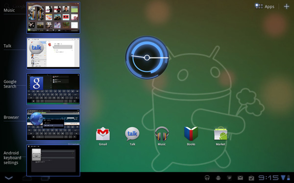
So the Iconia was my first real extended experience with Honeycomb, and I must say that while I’m impressed with what Google has going here, they’ve got some work to do. For the first time, Google’s UX is a cohesive, attractive, and polished experience. Really, it feels like all of a sudden they figured out what good UI design actually looked like. I suspect hiring away Matias Durante from the webOS team made a big difference here. Also, if the TRON: Legacy art direction team wasn’t paid a consulting fee for their contribution to the design, they really should ask for one.
It’s like a sci-fi retake on what a touch-friendly Windows would look like. And before anyone gets off on me for the comparison, I’d like to direct you to the systray in the bottom right, and the basic function keys in the bottom left. All they need to do is move the app launcher into the bottom left corner for the analogy to be complete.
I like the way Google went here, basically creating a UI similar to most full-fledged operating systems and integrating some elements of a smartphone operating system, instead of just scaling up a smartphone experience the way some other companies are doing it. For the first time using a tablet, I felt like I could be reasonably productive on it.
Most of the time when I’m writing, I have three things open—browser, IM, and music. Most of my writing is done in Google Docs, which makes it really convenient to hop from device to device as I’m writing. The Google Docs app for Android is still a smartphone app, so the UI in Honeycomb is mediocre at best, but it works for quick documents. Google Talk and Music are both very well integrated into Honeycomb, and the new notifications system makes it really easy to control them. Given the multitasking menu, switching between the browser, Google Docs, Talk, and music is relatively easy. The entire OS feels less limiting than any previous tablet operating system, which plays a big role in being more productive.

There’s a couple of missed opportunities with regards to the multitasking menu. A way to close apps would be brilliant, and being able to scroll through more than 5 preview windows would make the menu more useful (Google added this into Android 3.1, so it'll come to the Iconia soon.) The closing apps part of it seems like a no brainer; Google is the only one to give you a task manager with no way to terminate running processes. WebOS, iOS (yes, that’s a task manager, whether His Jobsness will call it that or not), QNX (which is similar to webOS in this regard), and even the upcoming version of Windows Phone 7 all let you kill apps from the multitasking menu. Why Google doesn’t let you remains an unsolved mystery, because it makes killing tasks a pain in the rear end. Why make me go through the hassle of getting a task killer and using that when everything else required for a visual task manager is already built into the OS? It’s my chief complaint with Honeycomb, by far.
I’m fairly reliant on Google services, including Gmail, Google Talk, and Google Docs, which makes me love the Gmail/Talk apps in Honeycomb. They’re seriously awesome if you use those services. The Google Docs app, not so much. It was designed for Android smartphones, it doesn’t scale up well, and ends up being much better for viewing documents as opposed to editing them. If Google puts out a Honeycomb specific version, it’d absolutely turn Honeycomb into a decent mobility solution for me.
Third-party apps, too, are a problem, mostly in that there aren’t very many of them built for Honeycomb specifically. Yes, you can use Android phone apps, but the UI scaling just doesn’t work right. It doesn’t look as stunted as original iPhone apps running on the iPad, but it’s getting there. There are roughly 175 apps optimized for Honeycomb tablets, about 50 of which are just games. For comparison, the iPad hit the 60,000 app milestone this January. Note, that’s apps designed specifically for the iPad, not iPhone apps. And yes, I agree, they’re not all good apps—there’s probably a ton of iBeer and other worthless apps, but even if you take 1% as being high quality apps, that’s four times the total number of Honeycomb apps. Make it 10%, and you're looking at about forty times the number of apps that Honeycomb has. Think about that. If 90% of the iPad apps in the App Store are absolute garbage, there's still 40 times more quality iPad apps than Honeycomb apps in total. 1% is an exceedingly low percentage, one that’s simply not realistic, but I’m giving exaggerated numbers to show the difference in sheer magnitude. It’s not close. Google needs to get developers to port apps over to Honeycomb, and fast.
But the overall takeaway from Honeycomb is that it’s pushing tablet operating systems to something much more PC-like, in stark contrast to Apple and Microsoft, who are pushing their desktop operating systems to be more tablet-like. I like that approach; it feels like Apple is dumbing down their OS significantly, but we'll see how it plays out in the long run.
Acer’s software preload on the Iconia is relatively light, focusing on things like Acer’s own LumiRead eReading app and Zinio reader for magazines, as well as a social networking application. In addition, Acer has included full versions of Need for Speed: Shift and Let's Golf. We'll get to those last two right now.


45 Comments
View All Comments
BishopZA - Friday, June 24, 2011 - link
A fine review, but you failed to mention the biggest advantage the Iconia A500 holds over other Honeycomb tablets: An Integrated USB Port and Micro-SD card slot.wsandman - Friday, June 24, 2011 - link
I agree with you! The USB port and Micro SD card capability more the balance the scale for this device. The gripes about workmanship were not even apparent to me when I bought my A500. I believe that at $449 the A500 is very competitive with similar devices on the market when you balance ALL attributes. Also, once again an article that wanders from the topic of reviewing the worthiness of the device and ventures into a rant against the family of devices the unit falls under. In short, I like my A500 and have no regrets about its purchase.cknobman - Friday, June 24, 2011 - link
I completely understand your wanting to defend the Acer as you purchased it but a a potential buyer of a table (as I dont own one yet) I feel the reviewer did a great job and pointed out exactly what is wrong with this tablet.I passed on purchasing this device for the very reasons pointed out in this article and I had made my mind up of this a few weeks ago after playing with one first hand in a Best Buy store.
The low overall build quality coupled with a mediocre screen, average performance SOC, and immaturity of the Android platform kept be from buying this especially at the $449 price point.
I agree with the review at a $379 price point which is where I might bite into the table experience.
Until more powerful hardware comes out and Android matures a little more I would never consider spending $400+ on a tablet especially when I can get so much more capabilities from a similar powered laptop.
My 4.3' EVO smartphone fills the gap of latpop-tablet without me having to spend extra money.
VivekGowri - Friday, June 24, 2011 - link
Just a heads up, the screen is better than you give it credit for. By the numbers, it's brilliant, and even without advanced screen technologies, it looks decent in day-to-day use. Maybe not as good as the iPad, but still good.peterfares - Friday, June 24, 2011 - link
You think the screen on the Acer is good? It looks like a crap PenTile display, though I don't think it even is. It had that fuzzy look that PenTile screens have.Rhitick - Thursday, July 14, 2011 - link
The screen on the Acer is excellent. I have one in the store, along with a Playbook, iPad 1/2, and a Viewpad (we rent tablets to people looking to try them). I am absolutely in love with the Iconia. The pics don't do it justice. We will be getting the Transformer in soon and I can't wait to try them back to back, but the USB port and MicroSD nail it for me.mdshullaw - Friday, August 19, 2011 - link
I am a video technician of over 40 years now, and run my own business. I can tell you without any doubt the display on the A500 is superb. The contrast is the best I have seen on a tablet, and the brightness can blind you, so what is the point of having more brightness than you can use. This is why the brightness comparison of these devices is pointless and not an indication of the screens quality. The designers of the supporting hardware set limits to the brightness range for each brand and model. Having messed around with all the tablets extensively, I ended up buying the Acer A500., With an excellent display, partially metal case, full size USB, a fast processor and excellent graphics, it was an easy choice to make.micksh - Friday, June 24, 2011 - link
Most tablets have microSD slot except Galaxy Tab and LG Optimus.Galaxy Tab has USB OTG with $20 adapter. Eee Pad has it on keyboard and Eee Pad surely has microSD.
Motorola Xoom has USB host. It may not be enabled in US yet on Xoom but it's there in Europe, as well as microSD support.
Pokey-O - Thursday, July 14, 2011 - link
BishopZA - I completely agree. I bought the A500 and the eeTransformer, expecting to sell/return one.I expected to love the Transformer, it was the one I was excited about (and I did like it, ended up keeping it for the family), but I've found myself using the A500 constantly, the key difference? the USB port. I can plug my thumb drive in, I can charge my phone off one power point (when travelling). The Transformer has the USB and the micro-SD, but it's on the dock, not the tablet, which is really surprisingly frustrating, I don't want to HAVE to have the dock with me at all times... otherwise it's a notebook!
Incidentally, Just a few other points I'd note from the above article:
- Jarred/Vivek I agree the build quality is marginally worse than the Asus, but (and it's a little thing) the rounded edges of the A500 are more comfortable to hold than the eeTransformer's sharper ones
- and with regard to tablets generally, they're mobile devices, they're not good for typing on a table, but when you're sitting on a bus/plane/taxi there's nothing easier to type on that the tablets, setting up a net/notebook is troublesome.
- lastly on the typing, one thing i like about both the Asus and the Acer is that the narrower screen means you can hold it like you would hold (or would have held, back in the day) a blackberry and type with your thumbs are at really quite fast speeds. I've not owned an ipad, but when I've borrowed them I've found them a little too wide to type in this way comfortably.
As someone who commutes I wouldn't be without my A500 now...
jjj - Friday, June 24, 2011 - link
Can you please stop saying "plain-Jane LCD panel",there is no such thing and you sound like Engadget .