What to Expect with Windows 11: A Day One Hands-On
by Brett Howse on October 4, 2021 4:00 PM EST- Posted in
- Software
- Operating Systems
- Windows
- Microsoft
- Windows 11

Tomorrow, Microsoft is officially launching Windows 11, the next installment of their operating system which underpins the majority of PCs in use today. Windows 10 has an install base of over 1 billion devices, and Windows 11 comes into existence in a much different place than its predecessor. After the much-maligned Windows 8 there was a sense of urgency and necessity which ushered Windows 10 into the world. Windows 11, on the other hand, comes into a market where most people are happy with Windows 10. So it raises the question: Why now?
When Windows 10 launched, it was said to be the final version of Windows, and future updates would be additive to Windows 10, rather than a new version number. But that was six years ago, and times have changed, as has the management and ownership of the Windows development team at Microsoft. For better or worse, the company has deemed that now is a good time to do a clean break again, with all of the animosity and angst that will bring to a good portion of their customers, especially businesses who may still be in the process of migrating to Windows 10.
The question is why now? What is new? Why is Microsoft choosing this moment to switch from the very successful Windows 10 and implement another upgrade cycle? Some of these questions can be answered, but others will take time.
Refreshed User Interface
The immediate change that everyone will notice is that Microsoft has completely revamped the user interface for Windows 11. They have apparently gotten tired of their obsession with flat, stark interfaces and moved to a much more colorful and expressive theme.
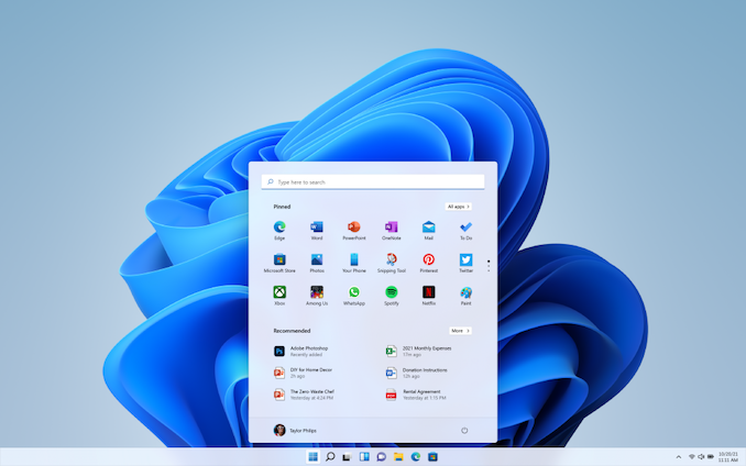
There are also major changes to the Start Menu and the taskbar. The Start Menu has ditched the live tile idea. Although a good idea on the now defunct Windows Phone platform, live tiles never really worked well on the desktop and could make it more difficult to find the application you were looking for since the icon would change. Instead, the Start Menu goes back to basic app icons, but now with the Start Menu, by default, centered in the middle of the display.
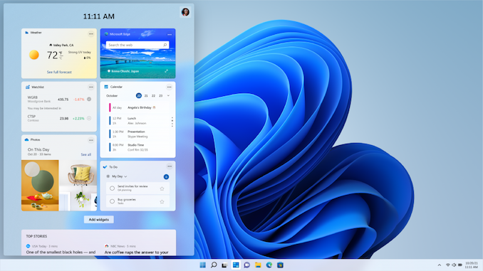
Live tiles have been replaced with Widgets and can be accessed via a Widget icon on the taskbar. Currently the selection of Widgets is only Microsoft ones, and it will be interesting to see if this expands over time.
Tablet Mode is now gone as well, so if you liked to use Windows 10 in its more touch-friendly mode, you will likely be disappointed.
The taskbar also moves from a left-justified look to being centered, and when more applications are opened, the icons already on the task bar will shift to the left to keep things centered. Apps can also no longer customize areas of the taskbar.
The taskbar can also no longer be moved from the bottom of the display if you were someone who liked to slide it to one of the other sides of the screen, which will likely disappoint a lot of people. When your user base is over 1 billion, if even only 1% of users used a feature, that’s still 10 million people that used that feature.
Overall, the new user interface is clean, colorful, and breathes some new life into what had become a bit stale in Windows 10. Functionally, it is not drastically different than Windows 10, although moving the Start Menu from the bottom left corner where it has been since Windows was first Windows is a bold change. The loss of Live Tiles seems like a downgrade in functionality, but it does make the interface more consistent and easier to access the applications you are looking for, with widgets hoping to take up the slack. But, there is a surprising amount of customization and features that are being dropped.


95 Comments
View All Comments
powerarmour - Monday, October 4, 2021 - link
First stage to switch to a MacOS UI, second stage will be a Linux kernel and then the cycle will be complete.Threska - Monday, October 4, 2021 - link
Third stage- "but why doesn't this work anymore"? :-DGigaplex - Monday, October 4, 2021 - link
WSL2 - it kind of already has a Linux kernel already (but not in the way you were thinking)damianrobertjones - Tuesday, October 5, 2021 - link
ZzzZzzz. Every single new Windows release, you funny guys appear, jealous of Windows.Oxford Guy - Saturday, October 16, 2021 - link
Whatever that was.Cygni - Monday, October 4, 2021 - link
I've been using it for the last few weeks and compared to the utter revulsion I had during the Windows 8 and even early Windows 10 beta periods, I have to say I'm... generally fine with it?There are absolutely some areas that feel overly dumbed down in the customization side, and the rounded bubble edges on everything sometimes look and feel a bit too babys first googoo gaga operating system. But there are also times that I generally appreciate the small changes, such as in the Settings app having a colorful icon next to the categories making it much easier to find. They have also made common tasks a lot more easy to find in settings, and cut down on some of the awful overlapping Settings/Control Panel madness... although comically control panel is still here and still needed. Sigh. Microsoft.
It DOES feel heavily Mac/PopOS, but I personally dont mind that for a daily driver at all. And it will still require a lot of regedit to get comfortable with/clean the bloat and tracking out of from a fresh install for a power user, just like Windows 10. But it seems like one of the better launch day Windows products.
A big caveat to that is that I'm running my gaming benchmarks today, but based on other peoples experience I don't expect too much of a drop off.
By the way, i was able to easily bypass the TPM requirements during install for my Ivy Bridge testbed with a little regedit and some Googling. Power users should expect to be in high demand for relatives/friends who want Windows 11 on their older devices.
Threska - Monday, October 4, 2021 - link
There's suppose to be a script out there.GeoffreyA - Friday, October 8, 2021 - link
https://www.theverge.com/22715331/how-to-install-w...https://support.microsoft.com/en-us/windows/ways-t...
flyingpants265 - Monday, October 4, 2021 - link
It sounds like a worse version of Windows 10.Cygni - Monday, October 4, 2021 - link
I wouldn't say "worse", because there are some upgrades and it is generally more similar than dissimilar. The settings app is much better, the OS wide animations are nicer, the new start menu layout and search are better, both file explorer and context menus are easier to navigate at a glance, the window snapping/mutli desktop functionality is both better imo... and thats really about it.It genuinely feels closer to a 98SE or Win 8.1 vs a whole new OS. Hell, it feels closer to a Rainmeter reskin then a new OS.