The Xiaomi Mi 11 Review: A Gorgeous Screen and Design
by Andrei Frumusanu on March 10, 2021 8:00 AM EST- Posted in
- Mobile
- Smartphones
- Xiaomi
- Snapdragon 888
- Mi 11
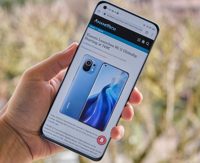
Xiaomi had first announced the Mi 11 in back in the last few days of 2020, with availability of the domestic Chinese version of the phone taking place in the early weeks of January. Later in February, the company followed up with the global launch of the device, divulging the pricing strategy in markets such as Europe.
The Mi 11 is a very interesting device – it was actually the very first Snapdragon 888 device worldwide, and to this date in many countries still is the only such available smartphone – at least until other vendors catch up with their model releases. In the past year or so, we’ve seen Xiaomi having gained a lot of market share in global countries, mostly picking up customers from Huawei – particularly in European markets where Xiaomi has been seeing lots of new success with carriers.
What characterises the Mi 11 from other devices – other than the new Snapdragon 888 SoC, is Xiaomi’s new design cantered around a new 6.81” AMOLED 3200 x 1440 screen with up to 120Hz refresh rate. It’s not Xiaomi’s first QHD device as we’ve seen some other implementations in the past, but those were all on LCD panels. The move to QHD and 120Hz this generation is a major leap for the Mi 11 series, particularly because Xiaomi is still pricing the device starting at only 749€ - much less than other current generation devices featuring the same specifications such as the S21 Ultra.
| Xiaomi Mi Series | |||
| Mi 10 |
Mi 11 (Reviewed) |
||
| SoC | Qualcomm Snapdragon 865 1x Cortex-A77 @ 2.84GHz 3x Cortex-A77 @ 2.42GHz 4x Cortex-A55 @ 1.80GHz Adreno 650 @ 587MHz |
Qualcomm Snapdragon 888 1x Cortex-X1 @ 2.84GHz 3x Cortex-A78 @ 2.42GHz 4x Cortex-A55 @ 1.80GHz Adreno 660 @ 840MHz |
|
| DRAM | 8GB LPDDR5-5500 | 8/12GB LPDDR5-6400 | |
| Display | 6.67" AMOLED 2340 x 1080 (19.5:9) 90Hz Refresh |
6.81" AMOLED 3200 x 1440 120Hz Refresh 480Hz Touch HDR10+ / 10-bit panel |
|
| Size | Height | 162.58mm | 164.3mm |
| Width | 74.80mm | 74.6mm | |
| Depth | 8.96mm | 8.06mm | |
| Weight | 208g | 196g | |
| Battery Capacity | 4780mAh (Typical) 30W Charging |
4600mAh (Typical) 55W Charging |
|
| Wireless Charging | 30W | 50W | |
| Rear Cameras | |||
| Main | 108MP 1/1.3" 0.8µm 4:1 Binning to 27MP / 1.6µm f/1.69 w/ OIS |
108MP Module f/1.85 w/OIS |
|
| Telephoto | - | 5MP (Macro only) 50mm eq. f/2.2 |
|
| Extra Telephoto |
- | - | |
| Ultra-Wide | 13MP 1.12µm f/2.4 117° FoV |
13MP f/2.4 123° FoV |
|
| Extra | 2MP Depth Camera 2MP Macro Camera |
- | |
| Front Camera | 20MP 0.8µm f/2.3 |
f/2.2 | |
| Storage | 128 / 256GB UFS 3.0 |
128 / 256GB UFS 3.1 |
|
| I/O | USB-C | ||
| Wireless (local) | 802.11ax (Wifi 6), Bluetooth 5.1 |
||
| Cellular | 4G + 5G NR NSA+SA Sub-6GHz | ||
| Special Features | Under-screen fingerprint sensor Full-range stereo speakers |
||
| Splash, Water, Dust Resistance | No rating | ||
| Dual-SIM | 2x nano-SIM | ||
| Launch OS | Android 10 w/ MIUI | Android 11 w/ MIUI | |
| Launch Price | 8+128GB: 799€ 8+256GB: 899€ |
8+128GB: 749€ 8+256GB: 799€ |
|
As mentioned, the new phone is powered by Qualcomm’s newest generation Snapdragon 888 SoC. We’ve covered the new chip extensively in our chipset-centric article of the Galaxy S21 Ultra where we pitted the new Snapdragon against the latest Exynos. In general, although the new chip does bring performance advantages this generation, it has to compromise in power efficiency as the new process node had seen some regressions compared to last year.
Xiaomi offers the Mi 11 in 8GB LPDDR5-6400 configurations in the global markets – the 12GB variant only exists in China. Storage comes in the form of either 128GB or 256 of UFS 3.1. Xiaomi is one of the vendors who do not offer expandable storage, but at least the 256GB version of the phone only costs an extra 50€ this year, half the cost of last year’s configuration up-sell.
The new display is a key feature of the phone and probably the main characteristic of the device. After a few years of 1080p OLED flagships, I’m very happy to see Xiaomi finally jump over to QHD, particularly given the phones are growing in size and the PPI of 1080p really isn’t sufficient at these dimensions. Xiaomi of course had to include 120Hz this generation as well as it’s a must-have feature to incorporate in 2021. Surprisingly, Xiaomi advertises that this is a 10-bit panel, which should offer better brightness and colour graduations, however comes at a cost power efficiency. The screen lacks variable refresh rate – neither hardware, nor software based, so it’s more in line with the screen technology generation we’ve seen in the Galaxy S20 and OnePlus 8 Pro series devices.
Edit March 12th: The Mi 11 does have a coarse software-based refresh rate switching mechanism, however it does not function below 110 nits screen brightness (around 70% on the brightness slider).
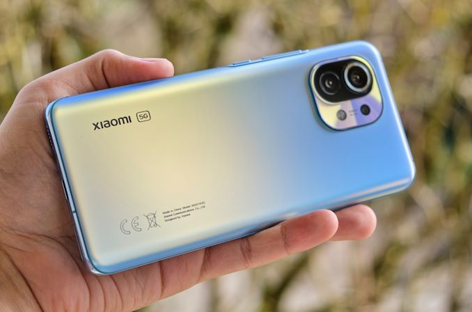
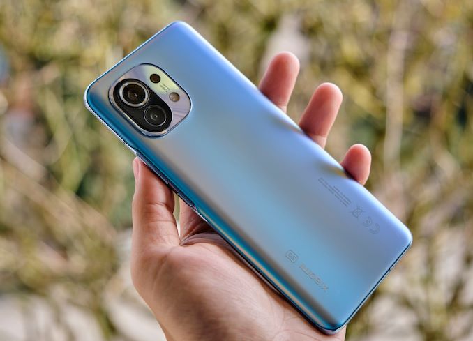
The design of the Xiaomi Mi 11 is quite attractive, and the company goes for an almost completely rounded aesthetic, with curved front and back glass. The back glass is a matte chemically etched finish similar to that of the Mi 10 Pro – it’s still quite smooth, but it’s much better than glossy materials.
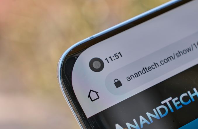
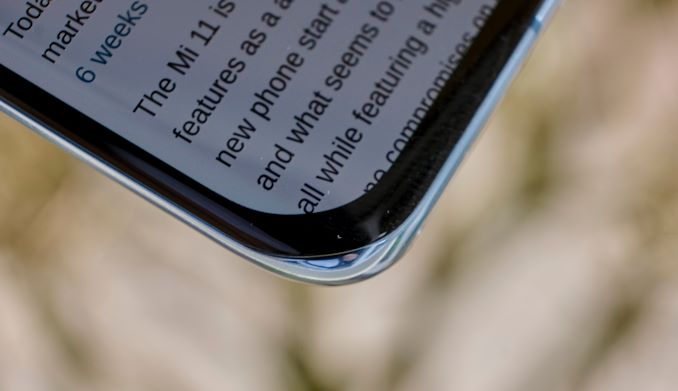
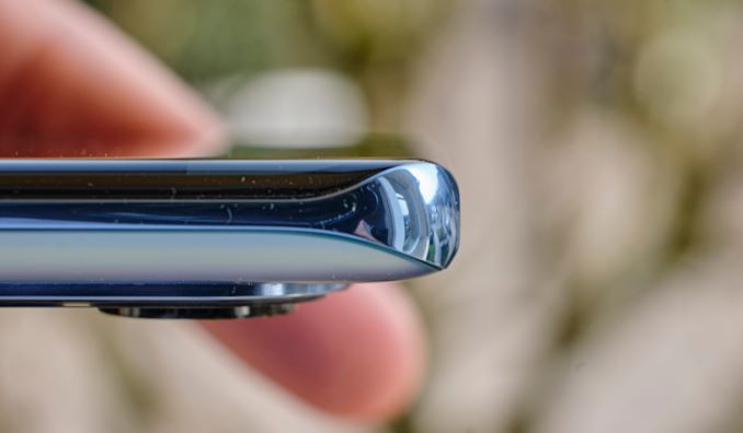
What’s maybe a bit weird about the design is the corners of the screen and the frame, the metal frame actually covers most of the phone’s thickness in the corners, unlike the sides where the front display curves around. It’s a design that reminds me of the Huawei P40 Pro – it’s a bit odd at first glance, but I think the companies are either doing this on purpose for better drop resistance, or it’s a manufacturing side-effect of the new build.
The side frames on both sides are extremely minimal and thin, which give the phone excellent ergonomics and in-hand feel even though it’s a larger device at 74.6mm width.
Xiaomi also managed to shave off some thickness this generation, going from 8.96mm to 8.06mm, a difference that’s immediately noticeable between generations. The weight of the phone has also been reduced from 208g to 196g, which is also very welcome in my book. The reduced form-factor cost 180mAh from its predecessor, and the new battery lands in at 4600mAh which is still plenty respectable.
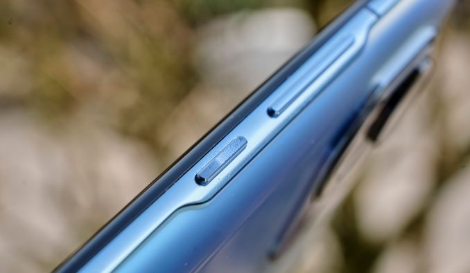
On the right side of the phone, we see a simple textured power button as well as the volume rocker – the metal side frame here slightly extends towards the back glass cover which reminds me of Samsung’s recent aesthetic.
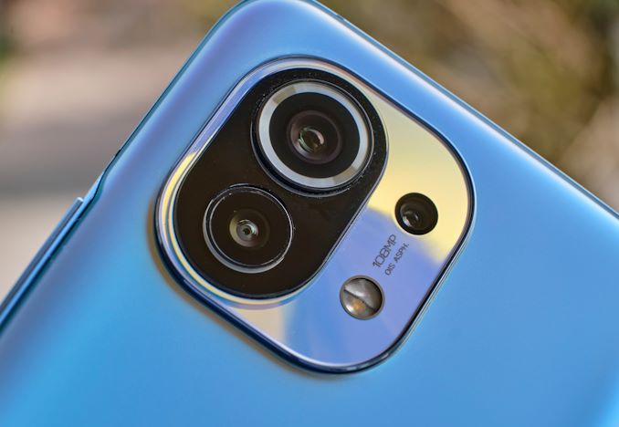
The main camera is the same as last year’s 108MP Xiaomi shooters – a Samsung HMX sensor that natively captures 108MP shots, but in general photography 2x2 bins things down to 27MP. Since there’s no telephoto module on the phone, the Mi 11 uses the raw resolution of this module to get tighter framed shots. The optics were changed this generation to a smaller f/1.85 aperture, which in my view might be more reasonable as the Mi 10 suffered in terms of its optics. There’s still OIS present here, which is good news. The Ultra-wide module is a 13MP f/2.4 module with a very wide 123° FoV, great for indoor capture, architecture, or landscapes.
I like how Xiaomi engineered the camera island to accommodate for the thick Z-height of the main camera module: it’s a 3-stepped design in terms of its thickness, with each “island” only being as thick as the minimum the cameras require. While the main camera module thickness is still thick, it’s not as evident as on other phones with similar giant sensors.
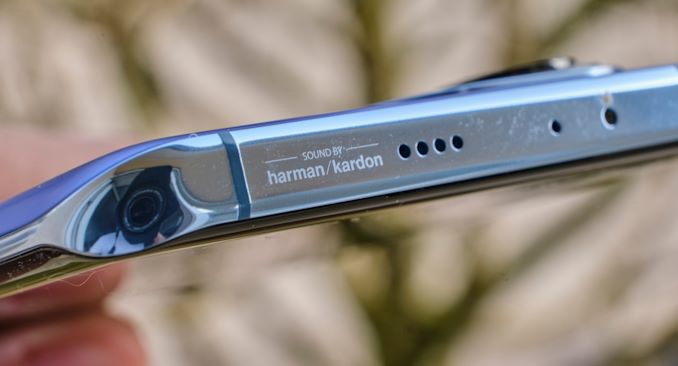
The top and bottom sides of the phone feature a relatively flat edge, and are characterised by dual-speaker setups the company employs. There’s a hardman/kardon logo on the top side, and generally the speakers get extremely loud and are among the best sounding on any device right now.
Generally, I really liked the design of the Mi 11, and I feel the company has managed to create their sleekest and most ergonomic design to date. It feels very premium and is very clearly a flagship device, which comes at a surprise given its 749€ starting point.




85 Comments
View All Comments
ZoZo - Wednesday, March 10, 2021 - link
Curved edge screen? Next.yankeeDDL - Wednesday, March 10, 2021 - link
Really? Why? I have an S8 (yes, Samsung S8, 4 years old and counting) with edge screen. It still works perfectly, it is a pleasure to hold and it has some decent edge effects that are actually useful.I'd definitely consider another phone with curved edges.
I look forward to something a tad smaller than this though: 6" for example.
I hate the fact that on Android if you want the top of the line HW you get it only on huge phones.
Wereweeb - Wednesday, March 10, 2021 - link
Because it's terrible to use and distorts images. It's stupid and should stop existing. I say this as a former S6 Edge user (I didn't buy it, it was handed down to me)theblitz707 - Friday, March 26, 2021 - link
thats your opinion. i never had a problem with my curves s10+ and quite like it, it makes the screen look more premium and i never felt a distortion problem when watching videos. in fact compared to 11 pro max, that looks like a phone from years ago.inighthawki - Wednesday, March 10, 2021 - link
Am I the only one who prefers a phone with a flat rectangle for a screen with no curves, notches, or rounded corners cutting off or warping various parts of the display?Wereweeb - Wednesday, March 10, 2021 - link
Eh, rounded corners makes it easier to hold, and doesn't really compromise images that much. I'll take notches over hidden cameras, but otherwise I also dislike them, and prefer pop-up cameras or a camera between the housing and the display.inighthawki - Thursday, March 11, 2021 - link
I guess I mean that I'm fine with having a bezel on the top/bottom for that kind of thing. The phone itself can still have some roundedness on the corners. For example right now I use a pixel 2 and love it. I think they could shrink the bezels without sacrificing the screen being a rectangle.And while the corners dont really compromise much, it's something that forces software developers to work around. For example, if you're right a game, you now have to query APIs to know how rounded the corners are to ensure you aren't putting text or status icons somewhere the user can't see. Like imagine if your desktop's monitor had rounded corners and it forced Microsoft to update the taskbar so that the start button wasn't flush against the edge. It serves no purpose. You're quite literally just losing functionality. And on a phone it's done for no other reason than the bragging rights of claiming the display is 0.2" larger than the previous generation with zero bezels.
inighthawki - Thursday, March 11, 2021 - link
If you're writing a game*Stupid no edit button :(
hanselltc - Thursday, March 11, 2021 - link
minor curved corners are acceptable if it truly helps the phone keep a more handleable shape. if it has a chin and/or a forehead, then it is stupid. other cutouts are all absolutely asinine.MetaCube - Thursday, March 18, 2021 - link
Rounded corners are great, stop smoking glue