The Huawei Mate 30 Pro Review: Top Hardware without Google?
by Andrei Frumusanu on November 27, 2019 10:00 AM EST- Posted in
- Mobile
- Smartphones
- Huawei
- Kirin 990
- Mate 30 Pro
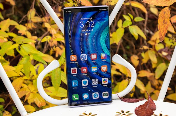
It’s been roughly 2 months now since Huawei announced the new Mate 30 Pro as well as the Kirin 990 chipsets. As an unusual hectic fall season finally calms down, it’s been due time to have a closer look at the new the company’s new flagship device and new silicon chipset.
There’s no beating around the bush that one aspect that vastly overshadowed the actual device itself, is the fact that Huawei had been banned from using Google’s mobile services. The Mate 30 Pro consequently is one of the first phones released by the company which doesn’t come with any Google applications preinstalled. There’s a lot to talk about in this regard and we’ll address this more in depth later on in the article, but I’d like to flip the narrative upside down here first and first discuss the hardware aspects of the new phone and see if Huawei had been able to create a competitive device, and if the worry about the software actually makes sense in the first place in terms of considerations of the device.
Today we’re reviewing the higher-end model of the Mate 30 series, the Mate 30 Pro. Specifically, we’re reviewing the 4G variant of this phone. The new Mate 30 Pro promises a brand-new design with a unique 90° curved screen on its sides – a first not only for Huawei but for the smartphone market overall. The phone is powered by HiSilicon’s latest Kirin 990 processor which will be powering power of Huawei and Honor’s devices for 2020 and is undoubtedly one of the more interesting aspects we’re looking forward to test. On the camera side, Huawei employs the same main sensor as on the P30 series and adopts the 3x telephoto module seen in the Mate 20 Pro and the regular P30, but innovates on the ultra-wide-angle module by adopting a second 40MP sensor alongside its main 40MP unit, which is undoubtedly going to be a unique feature for the phone and the company’s devices in 2020.
| Huawei Mate 30 Series | ||||
| Mate 30 | Mate 30 Pro (Reviewed) (Mate 30 Pro 5G) |
|||
| SoC | HiSilicon Kirin 990 2x Cortex-A76 @ 2.86 GHz 2x Cortex-A76 @ 2.09 GHz 4x Cortex-A55 @ 1.86 GHz |
|||
| (HiSilicon Kirin 990 5G) 2x Cortex-A76 @ 2.86 GHz 2x Cortex-A76 @ 2.36 GHz 4x Cortex-A55 @ 1.95 GHz |
||||
| GPU | Mali G76MP16 @ 600MHz (Mali G76MP16 @ 700MHz) |
|||
| DRAM | 8GB LPDDR4X | 8GB LPDDR4X | ||
| Display | 6.62" OLED 2340 x 1080 (19.5:9) |
6.53" OLED 2400 x 1176 (18.4:9) edge-to-edge |
||
| Size | Height | 160.8 mm | 158.1 mm | |
| Width | 76.1 mm | 73.1 mm | ||
| Depth | 8.4 mm (9.2mm) |
8.8 mm (9.5mm) |
||
| Weight | 196 grams | 198 grams | ||
| Battery Capacity | 4100mAh (Rated) 4200mAh (Typical) 40W charging |
4400mAh (Rated) 4500mAh (Typical) 40W charging |
||
| Wireless Charging | 27W charging + reverse charging | |||
| Rear Cameras | ||||
| Main | 40MP f/1.8 RYYB sensor 27mm equiv. FL |
40MP f/1.6 OIS RYYB sensor 27mm equivl. FL |
||
| Telephoto | 8MP f/2.4 OIS 3x Optical zoom 80mm equiv. FL |
|||
| Wide | 16MP f/2.2 Ulta wide angle 17mm equivl. FL |
40MP f/1.8 RGGB sensor Ultra wide angle 18mm equivl. FL 720p7680fps video capture |
||
| Extra | - | 3D Depth Camera | ||
| Front Camera | 24MP f/2.0 | 32MP f/2.0 | ||
| Storage | 128 / 256GB + proprietary "nanoSD" card |
|||
| I/O | USB-C 3.5mm headphone jack |
USB-C | ||
| Wireless (local) | 802.11ac (Wifi 5), Bluetooth 5.1 |
|||
| Cellular | 4G LTE (4G + 5G NR NSA+SA Sub-6GHz) |
|||
| Splash, Water, Dust Resistance | IP53 (no water resistance) |
IP68 (water resistant up to 1m) |
||
| Dual-SIM | 2x nano-SIM | |||
| Launch OS | AOSP 10 w/ EMUI 10 without Google services |
|||
| Launch Price | 8+128 GB: 799€ |
8+256 GB: 1099€ (5G 8+256GB: 1199€) |
||
Starting off on the hardware side, the new Mate 30 Pro employs the new Kirin 990 chipset. This year we’re actually seeing two versions of the chip: The 4G and the 5G variant, representing actually completely different chips even though the hardware specifications of the two are quite similar to each other. We’ll be dwelling more into the new chip on the next page so sit tight.
The phone this year comes in a static 8+256GB configuration in terms of DRAM and storage. The very high base storage of the phone isn’t necessarily just a case of goodwill and more aggressive competitive positioning of the company, as the phone’s price does come at a rather steep 1099€ for the 4G model, so one would expect a higher storage configuration at this price.
The phone comes with support for Huawei’s “NM” or nanomemory card standard – essentially, it’s an SD Card alternative in the form of a nanoSIM. Huawei seems to make these cards quite widely available and the price mark-up over regular SD cards isn’t too high, but it’s still a weird peculiarity that till now hasn’t seen adoption by any other vendor.
Other internal hardware aspects for the phone that do stand out a bit is the device’s WiFi capabilities. As 2019 comes to an end, we’ve seen more vendors adopt WiFi 6 / 802.11ax being adopted by the big vendors, particularly Samsung adopting it in both the S10 and Note10 series, and more recently Apple also launching its whole new line-up with support for the new standard. Given the Mate 30 Pro’s flagship positioning and respective pricing, it is a bit unfortunate that we’re seeing the phone make due with a WiFi 5 / .ac solution.
The one aspect that there’s most to talk about the Mate 30 Pro is its screen:
In terms of specification on paper, the screen actually saw a downgrade compared to what we’ve seen in the Mate 20 Pro last year. It’s still an OLED screen, but unlike the Mate 20 Pro which was Huawei’s first 1440p device, the new Mate 30 Pro reduces the resolution. The 20 Pro was plagued by display issues both in panel quality as well as power efficiency due to a suboptimal implementation which did end up being quite a big deal breaker for the phone. This year, Huawei decided to go back to their usual 1080p resolution for the 30 Pro, although to be exact, the resolution is in fact 2400 x 1176.
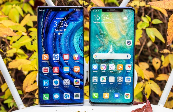
The reason for the odd resolution is the display’s form-factor. Although the device itself is quite similar in size to the Mate 20 Pro (more on that later), the screen size is increased from 6.39” to 6.53”. But this isn’t your usual increase we’ve seen from other phones which was mostly due to an elongation of the aspect ratio – for the Mate 30 Pro, the aspect ratio of the panel itself actually goes down from 19.5:9 to 18.4:9, meaning it’s wider. But the phone isn’t actually much wider, the feature that distinguishes the Mate 30 Pro from other devices is the fact that its screen is curved on its sides to an almost complete 90° angle.
This design choice is definitely the phone’s defining feature and what Huawei would like people to associate the Mate 30 Pro with. While I’ve tried to get used to the design and tried to find positives about it, after several weeks I’ve come to the conclusion that Huawei’s design gamble here has been pretty much a complete miss, and the reasons for that seem to be merely technical and related to the rest of the design, rather than a fault of the curved display itself.
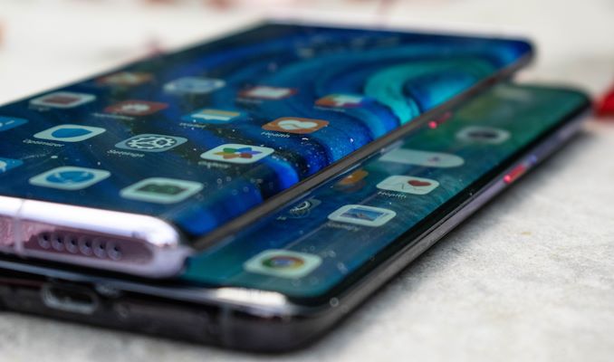
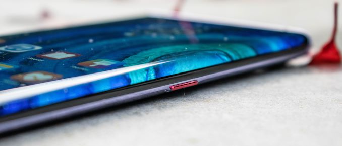
The most jarring aspect of the new Mate 30 Pro design is the ergonomics of the phone. In order to implement the curved screen, Huawei had to make a choice of a certain curvature radius that was reasonable in terms of actually managing to still display content. You can’t make the radius too small in this regard, but you also cannot make it too large as then you’re then encountering the issue of the thickness of the phone and how you’ll be designing the backside of the side frame. While the Mate 20 Pro and the P30 Pro were both symmetrical in their front and back curvatures, the Mate 30 Pro’s front curvature is of a lot larger radius than the back curvature, creating a very weird feeling asymmetrical design.
Because the screen is curved nearly 90° onto the edge of the phone, this means that the metal frame isn’t located in the middle of what would constitute the frame, but rather is pushed further towards the backside of the device. This also creates a “lip” that slightly protrudes out of the front and back glass, and because it’s located towards the backside of the phone, it’s a lot more noticeable in hand than say any other phone which has a flatter front glass but a more curved back glass. In fact, if you simply flip the Mate 30 Pro around, it’s suddenly a much more comfortable device to hold, but that’s really a way to use a phone now is it?
Victims of the curved design are the volume buttons which have now been completely eliminated from the phone. You now can bring up the software volume slider by double tapping either side the phone where the volume buttons would usually be located. The power button is still there, but due to the frame being pushed towards the back of the phone, is also located in a bit of an unusual location.
I might sound a bit overzealous on this aspect of the phone and maybe am a bit too negative and harsh, but for me the ergonomics of a phone are quite important and in this regard the Mate 30 Pro feels like a step backwards from the Mate 20 Pro and the P30 Pro.
The other negative aspect of the curved screen isn’t related to the ergonomics, but is more of a technical issue. Unfortunately, it seems that Huawei is again using a panel from either LG or BOE, and like the Mate 20 Pro last year, there’s one stand-out characteristic on the phone compared to other OLED device with panels from Samsung: worse viewing angles. Like the Mate 20 Pro, it’s quite immediately noticeable on the Mate 30 Pro that the phone’s display exhibits worse than usual colour and brightness shifts than usual from other OLED phones. While on the Mate 20 Pro I said that one could possibly get used to it, on the Mate 30 Pro the characteristic is a lot more noticeable thanks to the more drastic curvature of the screen.
The characteristic is noticeable in bright conditions, but especially in lower light conditions, and when viewing the phone from the side this can be excruciatingly visible as a bright stripe which is quite distracting. Everybody has their own subjective tastes, but I think I’ve made it clear that I’m not too big a fan of the Mate 30 Pro’s screen design choices.
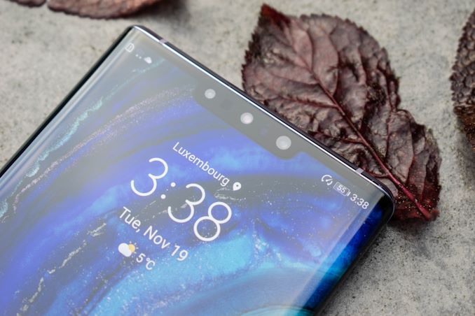
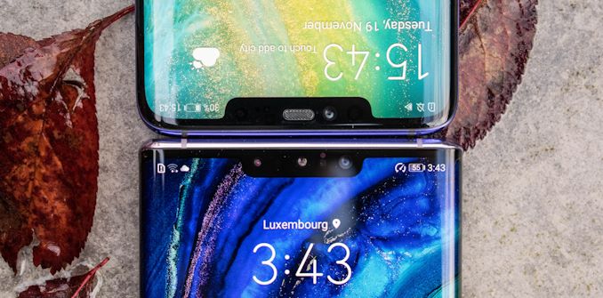
There’s been a big change in the front design of the phone, especially the notch area. There’s still a notch which houses the cameras and various sensors, but this year Huawei has been able to get rid of the earpiece speaker and integrate it under the screen via a vibration motor that vibrates the screen, turning it into a speaker membrane. There’s no stereo audio playback here for general media.
This change allows the phone to recoup more notification area as things were quite cramped with the Mate 20 Pro’s wide notch. Aside from the narrower notch, the phone’s corners are also a lot less curved, allowing icons nearer to the edges of the phone. Naturally the less curved corners mean that the phone feels boxier than its predecessors, which again for me constitutes as a regression in terms of the ergonomics of the device.
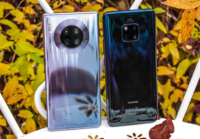
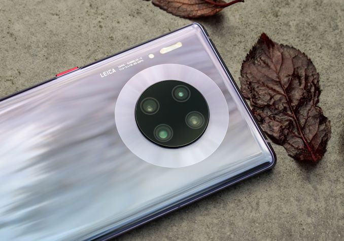
The back of the phone has seen a larger redesign, which is a bit odd given what Huawei had promised last year. For the Mate 20 Pro Huawei had proclaimed it wanted to make the square camera cut-out design a defining feature of the Mate series that people would instantly recognize. Well this year the square is a circle, and the triple-camera setup becomes a quad-camera setup.
The flash has been relocated to the side of the phone, and the new dual LEDs are a lot stronger than what we’ve seen on the Mate 20 Pro.
In regards to the cameras, the main sensor remains the same 40MP RYYB unit we’ve seen on the P30 series, and maintains an f/1.6 aperture. The telephoto is a 8MP 3x zoom factor in relation to the main camera and seemingly the same setup as on the Mate 20 Pro and regular P30.
The big new camera addition for this generation was the addition of a 40MP super-wide-angle module. The new sensor is a native 3:2 unit and promises to be optimised for video recording, as well as promising ultra-high framerate video capture up to 7680fps – although this latter feature is mostly a software trick done through interpolation. Finally, there’s a fourth camera module which Huawei just describes as serving as a 3D depth camera.
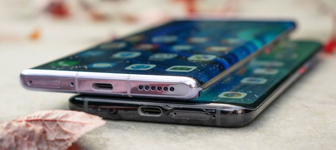
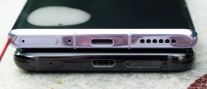
The top and bottom of the phone adopts a similar flat design introduced with the P30 series which is relatively unique. Huawei this year opted to go for an actual speaker grill for the bottom firing main speaker instead of reusing the USB-C port as a speaker vent. While I mentioned the Mate 30 Pro is a similar form factor as the Mate 20 Pro, it’s not exactly the same, as it is 0.8mm wider and 0.2mm thicker. It’s also 9g heavier at 198g, but manages to integrate a quite large 4400mAh rated / 4500mAh typical battery, a 5% increase over last year’s model.
Overall, if it wasn’t blatantly obvious until now, I’m a bit sceptical about the Mate 30 Pro’s design. I do highly recommend trying to get an initial first-hand experience of the phone to evaluate its unique design before considering to it for purchase, as I don’t think it’ll be something that fits everybody’s tastes.





58 Comments
View All Comments
psychobriggsy - Wednesday, November 27, 2019 - link
After years on Android, and a set of Android Apps and Services that I own via the Play Store (or because they come with the phone), the lack of Google Services and the Play Store is a critical piece of missing functionality.Indeed I'd say that this is not Android at all, Android for most people being the combination of core operating system and Google Services.
imaheadcase - Wednesday, November 27, 2019 - link
Exactly, the whole point of a android phone is to have google services. Anything else you are are developers whim in updates to OS and apps. Which if anyone who got burned by Samsung tablets know..its not pretty.prisonerX - Wednesday, November 27, 2019 - link
There's something to be said for there being an alternative to the Google monopoly in that respect. Let's hope that something like that emerges from this fiasco.versesuvius - Thursday, November 28, 2019 - link
Vendor lock-in does not even begin to describe what the US government is enforcing on the mobile phone users around the world. If at one time it was Apple or Microsoft or some other OS maker, now it is a political and economical system that the US government and Google want to lock the world in. That said, a mobile phone is nothing but Browser as OS. And the entire Google offering is nothing but open web technologies. The half hearthed attempts at something different from Google never added up to much because they always chose Google to fall back on from the get go. With Huawei on the one side and the general drift of the Western world towards Trumpism and the asinine single mindedness of what passes for American political and economical infrastructure, we are going to witness many wonderful shifts towards true freedom and innovation around the world and Huawei is just a very wonderful start.melgross - Sunday, December 1, 2019 - link
I hope Huawei has problems. The Chinese have been stealing secrets for some time, and Huawei is benefiting from that. In fact, early this year, two Apple vendors in China stated that they had been approached by Huawei for just that purpose.I have no sympathy for them.
shabby - Wednesday, November 27, 2019 - link
The round ring on this phone looks amazing, wish more phones had that kind of ring.yetanotherhuman - Thursday, November 28, 2019 - link
Reminds me of my old Sony Ericsson P990, with the little selfie mirror :Dyetanotherhuman - Thursday, November 28, 2019 - link
oh, and the actual physical protection for the lens.s.yu - Thursday, November 28, 2019 - link
...are you being sarcastic? This looks so last-decade-compact sort of cliché.Also many are commenting that it looks like a stove.
Alistair - Wednesday, November 27, 2019 - link
Can't me in the group that detests curved screens. Don't copy Samsung's mistakes. Every time I use a flat version, it feels and looks much better. Even the S10e vs the S10, or the Oneplus 7T vs 7 Pro, much better.