Huawei P20 and P20 Pro Hands-On: Embrace the Notch
by Ian Cutress on March 27, 2018 11:55 AM EST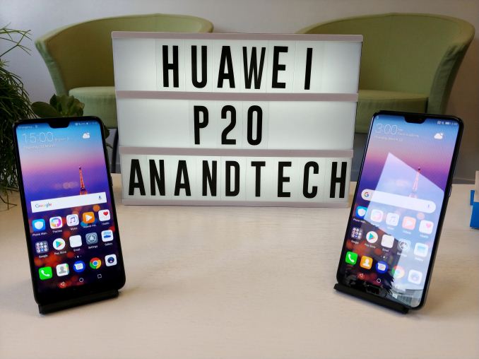
It’s time to have a serious discussion about the Notch. Love it or hate it, the Notch is going to be a defining element of major smartphones this year. The latest adherent to the Notch philosophy is the Huawei P20 family, being announced in Paris today. Using the Notch allows the handset to maximise the front-facing screen size compared to the size of the phone, and if used in the right way is designed not to be a distraction. We had some hands on time with the device, the P20 Pro triple camera setup, the new color schemes, and the new 960 fps mode.
Huawei is coming out with two new devices, the P20 and the P20 Pro. The strategy for the devices is certainly towards the up-sell: the P20 Pro is larger, has the additional features, and the more of everything, which makes some of the discussion here relate to only the P20 Pro. This is a worrying trend, seen with some other brands, as essentially the two phones share the same platform but have different features, rather than just being bigger versions of the other. The major feature for the P20 Pro in this case is the size, its triple camera setup, as well as its upgraded ingress protection (IP) rating.
The Look
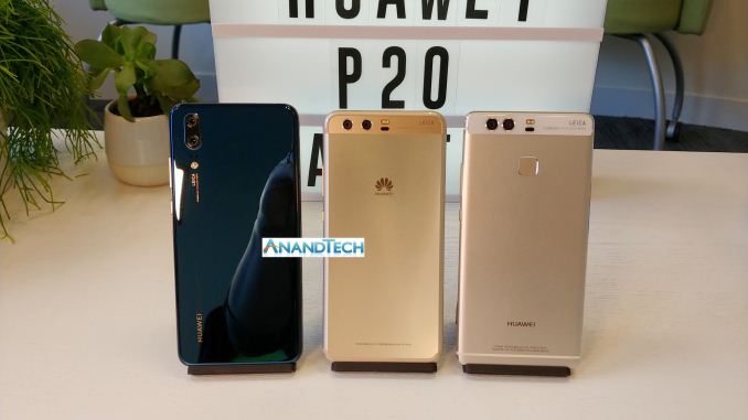
The more smartphones I see, and as the future marches on, the more rectangles with displays I see. The march into having as much of the front face of the phone being the display means we are moving away from particular defining features between the brands. Between the P20, the P10, and the P9, it is quite clear that the P20 applies a tangential look and feel to the brand that Huawei promotes as the more mainstream counterpart to the Mate series of smartphones.
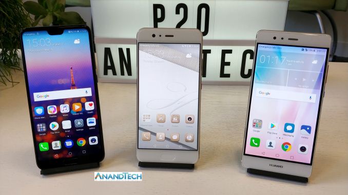
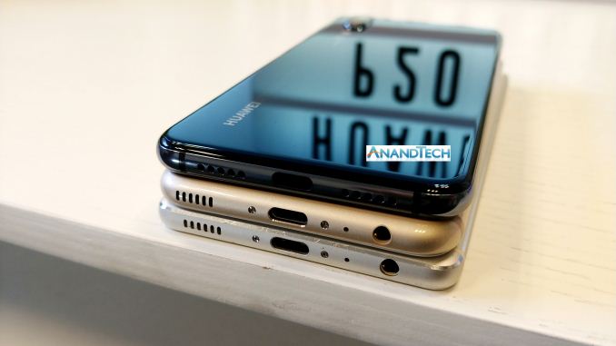
Huawei P20 (2018), Huawei P10 (2017), and Huawei P9 (2016)
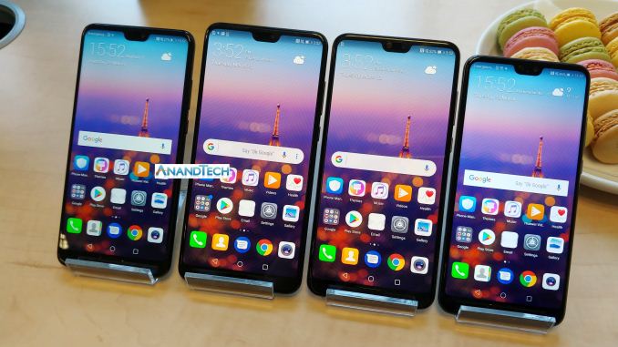
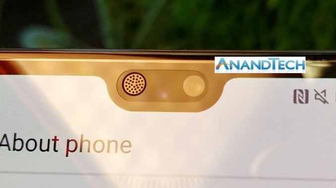
There is no getting away from the Notch. Ultimately this is our defining visual feature from the front, and the size of the Notch becomes the way to separate some of these devices. The Notch has to house the front facing camera, the associated flash, any additional detectors for other front-facing features, and usually the earpiece for actually making calls (remember when we used to do those with smartphones?). As a result, the number of features that a vendor wants to put here determines the size, and the software has to be built to deal with it.
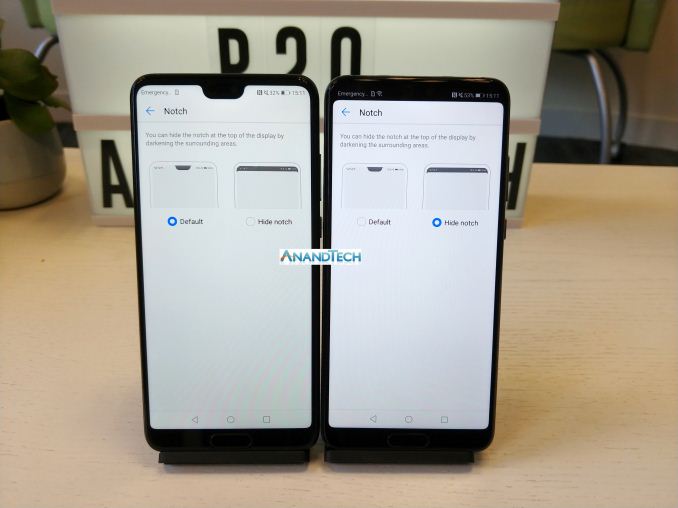
Specific advances in the Android ecosystem are being released to do this, but Huawei is taking it internal this generation, ensuring that the size of the Notch and the size of the notification area are the same. For anyone that doesn’t like the Notch, it can be ‘disabled’, as in the notch area of the screen will go dark but will keep the notification area at the top.
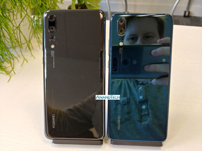
As with the P10, the fingerprint sensor is on front, whereas the P9 had it on the rear – if Huawei was to push the screen size even further, it is likely to be moved into the display, especially as Synaptics and Goodix have both recently released sensors for this (although for OLED displays only so far, like the P20 Pro). On the rear, the big difference is that Huawei has done away with the top differently colored window housing the cameras. On the P20, this is most obvious with the P10 and P9 side-by-side. The side-by-side dual camera arrangement has been moved to an above/below situation, with the markings on the rear rotated as if to say ‘when the P20 is held like a camera, it looks more like a camera’.
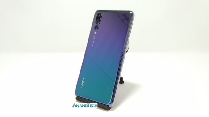
This is more pronounced with the P20 Pro, with its three camera setup. Interestingly in our recent trip to see Huawei in China, a couple of professional photographers noted in feedback to Huawei that holding a smartphone in a more photo-taking way would necessitate a button on the top right side to enable better ergonomics, however neither the P20 or P20 Pro have that option. The three cameras are designed such that the top camera is an 8MP sensor with a telephoto lens, the middle camera is a 40MP RGB sensor, and the bottom is a 20MP monochrome sensor. Between the middle two is a laser transmitter/receiver, and a color temperature sensor as well as LED flash is below the entire set. The camera has more features, which we’ll cover in a bit.
Huawei is introducing each model with a few colors, including this ‘twilight’ option as seen above that has a gradient going from green to blue that adjusts in the light. Other options include a gradient Pink Gold, a standard Blank, a standard Champagne Gold (P20 only), and Midnight Blue. To be honest, as much as these colors look fun, most of them are very dark, and the special colors will be negated by any case used by the consumer. Normally Huawei even puts in a transparent flexi-case in the box with most of its smartphones, which would instantly remove the ‘specialness’ of the color in play.
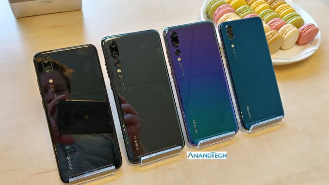
Black, Black, Twilight, Mignight Blue
With the new design, it is clear the antenna window has changed. This is most noticeable when viewing the devices side-on, showing the power and volume buttons. The positions of these buttons have been tweaked slightly, and Huawei has decided against putting a different textured power button on the side to differentiate the power button (much to my chagrin). For the antenna window, it is now along the edge of the device, rather than noticeably on the rear. This goes most of the way around the edge, but deviates on the bottom next to the USB Type-C ports.
Huawei is keeping the USB Type-C on the bottom, but however is moving to a dual speaker grille arrangement (we forgot to check if these are both for audio purposes). Sadly, there is no 3.5mm jack.
The Hardware
The P20 and P20 Pro are built on the same SoC that powers the flagship Mate 10 family: Huawei’s HiSilicon Kirin 970. For those unfamiliar with the hardware, Andrei did a great deep dive into its performance earlier this year. For the new smartphones, this SoC is at the front and center that drives the performance. Huawei is using more of the AI features for the P20 family, enabled through new software capabilities.
For the cameras, Huawei highlights several new features. The Camera app is now enabled by a better AI capability than the Mate 10 series, and this goes beyond identifying more scenes to pre-apply appropriate settings. The new camera allows for AI-assisted 4D predicative focus, adjusting the focus while a fast moving object (such as a flower in the wind) is in the viewfinder, with the AI predicting the motion of travel to adjust the focus on the fly. The camera also does AI image stabilization, which goes beyond the OIS/EIS to enable long-exposure shots without a tripod of up to eight seconds. The same stabilization AI algorithms are also in play for recording video, giving a smoother feel to recordings.
We asked whether these features would move down into other Kirin 970 devices (such as the Mate 10), however the response from Huawei was a fairly non-committal ‘we are looking into it’ without a timeframe.
The 40MP RGB sensor used in the P20 Pro is a rather impressive number to say the least. The sensor relies on 1 micron pixels, which are typically poor for low-light situations. Users can actually enable the sensor to run in ‘10MP’ mode, which uses what Huawei calls Pixel Fusion – data from a group of 2x2 pixels is reformed into a single pixel, essentially creating a 10MP image using quadruple sized pixels. Huawei states that this sensor should offer great 40MP photos is bright light, and similarly great 10MP photos in low light scenarios. Huawei has stated that the device can run up to 102400 ISO, more than any other smartphone on the market.
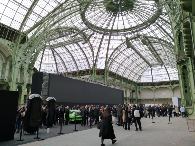
[ P20 Pro ] - [ Galaxy S9 ] -
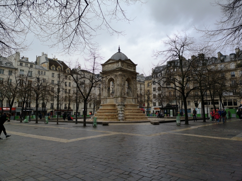
[ P20 Pro ] - [ Galaxy S9 ] -
[ P20 Pro ] - [ Galaxy S9 ] -
[ P20 Pro ] - [ Galaxy S9 ] -
[ P20 Pro ] - [ Galaxy S9 ] -
[ P20 Pro ] - [ Galaxy S9 ] -
The P20 Pro will also offer recording 960 FPS video, and we believe the system is using the Sony IMX363 sensor that enables this, though Huawei refused to state this was the case (when questioned, we got the odd answer of ‘we don’t give this information’, which would be a stark change in Huawei specification release policy, and a negative change at that). The way the slo-mo mode is implemented is a little different to other smartphones with this feature, and was a little tricky to pull off. For Huawei, the user has to specify the mode, and then has a one-button push which records the scene for one second, then records the next 0.2 seconds at 960 FPS, which is then stretched to six seconds of video. Unlike Samsung, where users can get multiple takes within the same recording, the Huawei implementation is just for short videos and very difficult to get right: it took us about 15 attempts just to get this simple video:
While it is a nice feature, the user experience of the implementation leaves a lot to be desired.
For the displays, again in the interests of the ‘sell-up’, the P20 Pro is the one that has the 6.1-inch OLED display running at 2240x1080 resolution for an 18.7:9 ratio. The P20 is a slightly smaller 5.8-inch with the same resolution, but has an RGBW LCC LED display. Huawei did not note what levels of color accuracy these panels have, nor the brightness, and have not responded to our questions from several weeks ago on this. Also in favor of the P20 Pro is the battery, with the larger smartphone having a 4000 mAh battery, while the P20 has a 3400 mAh unit.
| Huawei P20 and P20 Pro | ||||||
| P20 Pro | P20 | P10 Plus | P10 | P9 | ||
| SoC | HiSilicon Kirin 970 4x Cortex A73 4x Cortex A53 Mali-G72MP12 |
HiSilicon Kirin 960 4x Cortex A73 4x Cortex A53 Mali-G71MP8 |
HiSilicon Kirin 955 4x Cortex A72 4x Cortex A53 Mali-T880MP4 |
|||
| Display | S | 6.1-inch OLED |
5.8-inch RGBW | 5.5-inch IPS |
5.1-inch IPS |
5.2-inch IPS |
| R | 2240x1080 | 2240x1080 | 2560x1440 | 1920x1080 | 1920x1080 | |
| Dim | H | - | - | 153.5 mm | 145.3 mm | 145 mm |
| W | - | - | 74.2 mm | 69.3 mm | 70.9 mm | |
| D | 7.8 mm | 7.65 mm | 7 mm | 7 mm | 7 mm | |
| RAM | 6 GB | 4 GB | 4 / 6 GB | 4 GB | 3 / 4 GB | |
| NAND | 128 GB + microSD |
64 / 128 GB + microSD |
32 / 64 GB + microSD |
32 / 64 GB +microSD |
||
| Battery | 4000 mAh | 3400 mAh | 3750 mAh | 3200 mAh | 3000 mAh | |
| IP Rating | IP67 | IP53 | - | - | - | |
| Front Camera | 24MP f/2.0 | 8MP f/1.9 | 8MP f/2.4 | |||
| Rear Camera #1 |
20 MP BW f/1.8 |
20 MP BW f/1.8 |
20 MP BW f/2.2 |
12 MP f/2.2 1.25 micron |
||
| Rear Camera #2 | 40 MP RGB f/? 1 um 10 MP Mode 102400 ISO |
12MP RGB f/1.6 1.55um |
12 MP RGB f/1.8, OIS |
12 MP f/2.2 1.25 micron |
||
| Rear Camera #3 | 8 MP f/2.4 Telephoto 5x Hybrid Zoom |
- | - | - | - | |
| Modem | Cat 18 / 13 LTE 5CA / 2CA |
Cat 12 / 11 | Cat 6 | |||
| SIM Size | Dual Nano SIM | Dual Nano SIM | Dual Nano SIM | |||
| Wireless | 802.11ac 2x2 MIMO | 802.11ac BT 4.2 NFC A-GPS GLONASS BDS GALILEO |
802.11ac BT 4.2 NFC A-GPS GLONASS BSD |
|||
| Connectivity | USB Type-C | USB Type-C 3.5mm headset |
USB Type-C 3.5mm headset |
|||
| Features | Fingerprint Sensor AI Assisted Video Capture Pixel Fusion 4D Predicative Focus 960 FPS video (720p) Master AI AI Image Stabilization |
Fingerprint Sensor Pantone Color Bokeh Highlights / GoPro Ultra Memory |
Fingerprint Sensor Force Touch (P9 Plus) Knuckle Support |
|||
| OS | EMUI 8.1 | EMUI 5.1 | EMUI 4.1 | |||
| Price | 6/128: 899€ | 4/128: 649€ | 4/64: 699€ 8/128: 799€ |
4/64: 649€ | 3/32: 599€ 4/64: 649€ |
|
Compared to the previous generation P-series devices, the new units are certainly thicker, going beyond the 7mm z-height metric of the past generations. The Kirin 970 upgrade was likely a given based on the cadence of the family, however due to the new features it is clear that Huawei wants to push more of the HiSilicon leadership and the newer AI features through the stack. The P20 will ship with Huawei’s latest version of EMUI, which includes new features to allow for the user to go shopping using the AI engine to identify brands and objects, with the chip now supporting distributing deep learning platforms like PaddlePaddle.
Pricing and Availability
As this is being written, Huawei is set to launch the P20 and P20 Pro in an hour or two. Traditionally the company keeps the pricing information close to its chest until the major presentation. We will update when the information is released, however we expect it to be within short distance of pricing in previous years to keep the brand positioning.
Ian: If anyone asks, I'm pro-Notch. The push to more screen real estate means that this is, if anything, inevitable. As long as the software (such as video) compensates for it, then I don't see much problem with it.
Update:
Pricing was announced for the devices. The P20, in a 4GB / 128GB configuration, will retail at 649 Euros from today. This is double storage for the same price as the P10, making it an interesting upgrade. The P20 Pro, in a 6 GB / 128GB configuration, will retail at 899 Euros from April 6th. This price is substantially higher than both the P20 and the P10 Plus from last year, indicating a very bifurcated strategy.
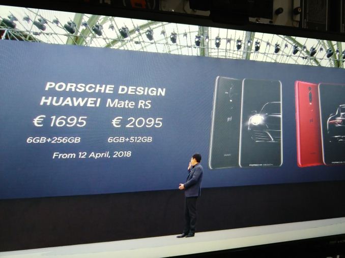
Huawei also announced the Porsche Design Mate RS model, which uses the P20 internals in a new design. We'll post on that in a bit, but the 6 GB/256 GB edition will retail at 1695 Euro, while the 6GB/512GB edition will retail at 2095 Euro.
Related Reading
- Hands-on With Huawei's Mate 10 and Mate 10 Pro
- Huawei P10 and P10 Plus: Performance & Battery Life Report
- Display Report: Huawei P10 and P10 Plus
- Huawei Launches the P10 and P10 Plus, in Green
- The Huawei Mate 9 Review
- Hands On With the Huawei Honor 6X
- Huawei Mate 9 Porsche Design Unboxing and Hands On Benchmarks








76 Comments
View All Comments
Che - Tuesday, March 27, 2018 - link
Put me down in the no notch group.sibuna - Tuesday, March 27, 2018 - link
firmly in the NEVER NOTCH group myselfmrvco - Thursday, March 29, 2018 - link
#NEVERNOTCHsharath.naik - Tuesday, March 27, 2018 - link
Notch, in place where you have to hold the phone? why? when was height of the phone ever a problem!halcyon - Tuesday, March 27, 2018 - link
On P20 you can turn the top part of screen off, hence no notch. it has rhe same effect as if they had not stretched the screen that far up.leo_sk - Tuesday, March 27, 2018 - link
That gives the statusbar android kitkat feel, which i personally don't likeOld_Fogie_Late_Bloomer - Tuesday, March 27, 2018 - link
I thought that this was what Apple was going to do, and I still think it's what they should have done. IMO it's a classier look.darkich - Wednesday, March 28, 2018 - link
Two words - BURN INMr Perfect - Tuesday, March 27, 2018 - link
Yeah, lets ditch this notch business. Just because Apple needed it for their design, doesn't mean everyone else needs to emulate it.s.yu - Wednesday, April 4, 2018 - link
Wow, this sentiment resonates across borders ;)