The Corsair Carbide 600Q Case Review: Upside Down But Right On
by E. Fylladitakis on September 12, 2016 8:30 AM EST- Posted in
- Cases/Cooling/PSUs
- Corsair
- ATX
- E-ATX
The Exterior of the Corsair Carbide 600Q
Just as Corsair advertises, the design of the Carbide 600Q truly is minimalistic, with smooth flat surfaces, straight lines and sharp turns. The designer added metal sheets on the front and top panels, giving the Carbide 600Q a quality all-metal appearance. The frame of these panels however remains plastic.
Measuring 53.5 cm tall, 23.5 cm wide and 45.4 cm deep (21 × 9.25 × 17.9 in), its dimensions are similar to those of other high end ATX cases with 5.25” bays, except from its significantly shorter depth. The design of the Carbide 600Q brings the 5.25” devices away from the main system, allowing the design to be just as small as cases without 5.25” device support at all. It has a volume of 57.1 liters, which is almost the same as that of the BitFenix Pandora ATX, a case without any 5.25” drive cages, and only 15% greater than that of the Zalman Z9 Neo, a significantly narrower low-cost design. However, the Carbide 600Q weighs 10.2 kg when completely empty, which is rather heavy for a case of this size.
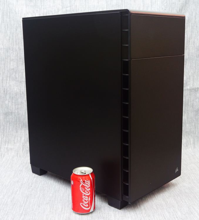 11.2 oz soda can added as a size reference.
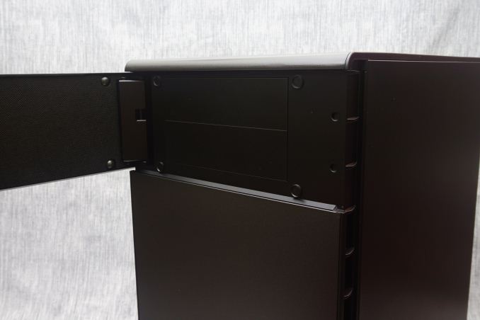
The metallic surfaces of the Carbide 600Q are very smooth, sprayed with a satin black paint that is highly resistant to fingerprints. A small door on the front panel hides the two 5.25” device bays. It has a magnetic latch and opens to the left side of the case only. Corsair also offers the 600C, a similar case but with a windowed right side panel instead, sacrificing sound absorption and utility for aesthetics.
Corsair designed the Carbide 600Q with low-noise operation in mind. It is not by chance that the case has no openings at the front and top panels, as the designer made sure to force the sound to deflect before reaching the user. The side, top and front panels of the case have sound-absorbing material applied to them, effectively reducing the noise level of the system.
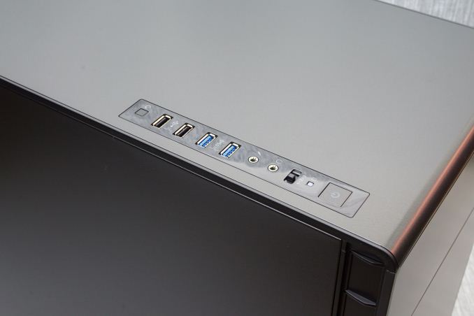
The front I/O ports and buttons can be found aligned across the left side of the top panel. A large square power on button can be seen towards the front of the array, followed by a simple 3-way fan controller switch, 3.5mm audio jacks near the center, two USB 3.0 ports, two USB 2.0 ports, and finally a small square reset button.
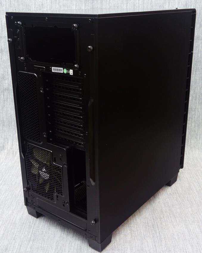
One look at the rear of the Carbide 600Q hints that the interior of the case will definitely be unusual. The motherboard’s I/O is located towards the bottom of the case and is facing the right panel. The exhaust cooling fan is located near the bottom of the case too, while the PSU compartment can be seen at the top. In short, the rear of the Carbide 600Q looks as if someone took a modern ATX case design and rolled it upside down.
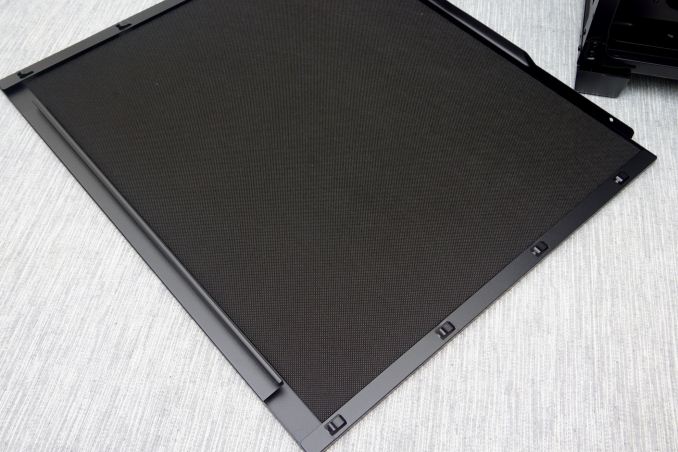
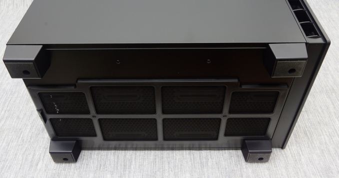
The bottom of the case serves as its main air intake, requiring substantial clearance via four tall rectangular legs. A large nylon filters covers the entire intake, which can be removed by pulling it from the rear of the case. Considering the length of the filter, I worry that it will be a pain to remove with the case beneath a desk, or even on a desk if the desk sits against a wall. It would have been far more practical if the designer allowed the user to pull the filter off from the front of the case.




46 Comments
View All Comments
BrokenCrayons - Monday, September 12, 2016 - link
"Cleverly, the designer moved the PSU compartment to the top of the case..."My mid-1990s Packard Bell and and early 2000s eMachine are rolling over in their respective graves over the idea of a top-mounted PSU being considered a clever idea in 2016.
dsraa - Monday, September 12, 2016 - link
So am I, I hate that all the newer cases have the PS at the bottom for 'structural integerity' or some sh*t. It logically makes sense to put it at the top, and keep the mobo at the bottom, so that the front case fan can just blow air straight over it, to be grabbed by the rear case fan......so simple!!!TetsuoS2 - Monday, September 12, 2016 - link
It's not that simple, for cubes and large cases, like this, a top mounted psu is fine and dandy since the psu isn't likely to be heavier than the case, but a top-mounted psu makes cases top heavy, and that makes it easier to fall over. That is simply how center of gravity works.damianrobertjones - Monday, September 12, 2016 - link
...Then don't smash into your case or put it under the desk? The force required would most likely topple a case with the PSU at the bottom as well.smartthanyou - Monday, September 12, 2016 - link
Nope, you are wrong.Ancillas - Monday, September 12, 2016 - link
And all it takes is one kid running in a bit too fast...MadAd - Monday, September 12, 2016 - link
Well who needs a hulking great ATX case if its going to be empty? Of course itll be top heavy then. For someone who can actually fill it itll be much more stable.Generally tho, who cares if its the other way around if theres enough airflow room to sleep a cat left over in either design? Really sucks constantly seeing reviews for cases way too big for anyone without extensive water, 3+ video or a mini HDD datacentre going on.
AnnonymousCoward - Saturday, September 17, 2016 - link
> Well who needs a hulking great ATX case if its going to be empty?To fit a huge GPU, huge CPU cooler, and silent 140mm fans.
JoeyJoJo123 - Monday, September 12, 2016 - link
There's more to it than just having the front intake fans in-line with the CPU and exhaust fans.The biggest component to traditional aircooling PCs (as opposed to watercooled PCs) is the proximity of the fans to the hot parts in the builds, the CPU and GPU. This leads to cases like the FT02 still remaining as one of the best aircooling PC cases on the market, just because it comes with 3 thick 180cm fans in very close proximity to the GPU and CPU areas.
The PSU being top-mounted or bottom-mounted has little to do with the overall cooling performance of the case. Today, it just makes more sense to put the heavy PSU on the bottom of the case (so the case remains stable) and elevating the case up using rubber feet so the PSU can intake fresh air from near the ground, as opposed to sharing the warm exhaust air floating inside the case, and expecting the PSU to act as an extra exhaust outlet for excess heat in the case.
Even if you were to say that old-style cases were "better" designed, the intake fan (of which in many cases there was only one typically small fan, not multiple) the intake fans lost all their air pressure as it tried to get air past the hard drive cage area, and without that air pressure (lost due to obstacles and distance) the cooling performance degrades.
Cases in general have tradeoffs. Even with the FT02, the tradeoff is you're forced to have to get a full-tower sized case, with very tall "feet" to get fresh air from the ground, and an awkward top I/O plate that's annoying to remove whenever you want to plug something in, or looks bad if it's simply left off. Otherwise, it performs admirably. Modern cases balance these tradeoffs and are typically rather quiet and perform rather well, along with having good features for hiding excess PC build mess, such as elevated motherboard trays for routing power cables and rear-mounted SSDs, etc.
This case takes a different approach, so there's different tradeoffs, but I don't necessarily think it's any better than the traditional modern-style cases we have.
SunLord - Monday, September 12, 2016 - link
I love my FT02 I just wish Silverstone would make a true replacement for it even a tweaked version that removes 2 or 3 5.25" as 5 is a waste of space and raise up the current drive bays along with making it a little wider allowing for more spacing behind the motherboard tray. It would also be nice if they made the top cover bigger or less restrictive even as running 3 DP and 1 HDMI cable along with all of the other cables a high end system can have is annoying.