The Google Nexus 6P Review
by Andrei Frumusanu on December 16, 2015 8:00 AM ESTDisplay Measurement
One of the more significant characteristics of the Nexus 6P is the device’s AMOLED screen. Similar to last year’s Nexus 6, Google has chosen to employ the 6P with a panel from Samsung. While the Nexus 6’s panel seemed to lack in quality, both power and image quality wise, the 6P’s unit is quite excellent.
The screen is very clear and offers excellent homogeneity. Ever since the first AMOLED devices came out a few years ago Samsung has managed to steadily advance the technology with improvement with each yearly generation. The Nexus 6P’s can be said to rank well among the Note 4 or Note 5 in terms of image quality, and it seems the 6P’s lamination actually provides slightly better viewing angles than what’s found on Samsung’s devices.
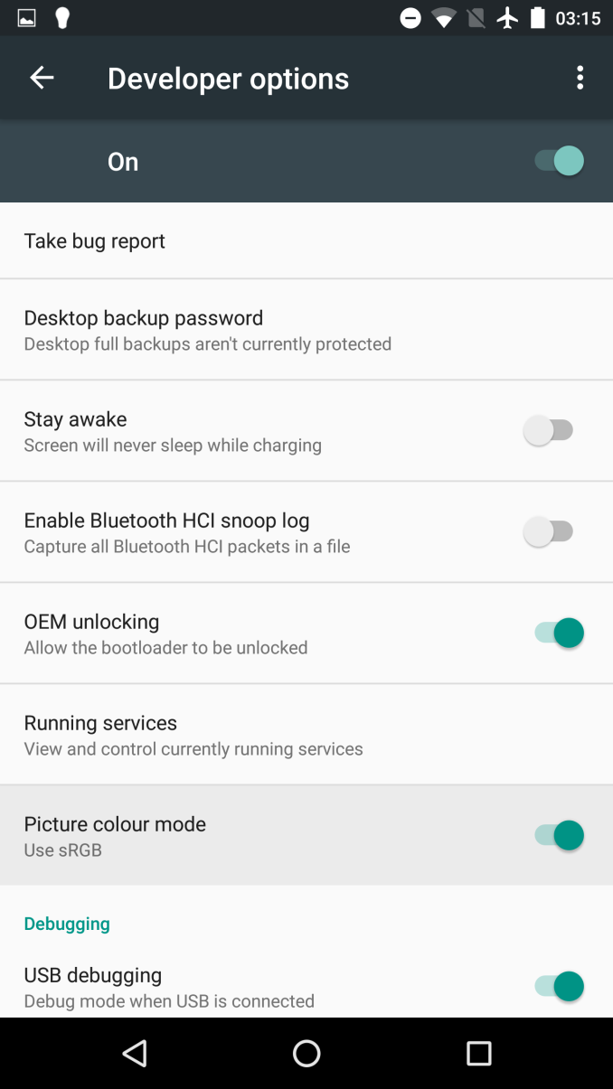
Settings => Developer Options => Picture Colour Mode
Before getting to the results, I'd like to mention that I tested both the device's default colour calibration as well as its sRGB calibration. This setting is rather hidden for the average user: You have to enable the developer options menu by tapping repeatedly on the "Build Number" found in Settings => About Phone, after which the menu will appear under the global settings menu. It's a pity that Google didn't make this option more accessible via the general display settings, but it will be required to access if you care about accurate colour reproduction on the Nexus 6P.
We start by measuring the maxium brightness of the 6P. As always, our display testing is done with an X-Rite i1Pro 2 spectrophotometer as our measurement hardware, in conjunction with SpectraCal's CalMAN software suite and our own workflow to be able to get an accurate display characterization.
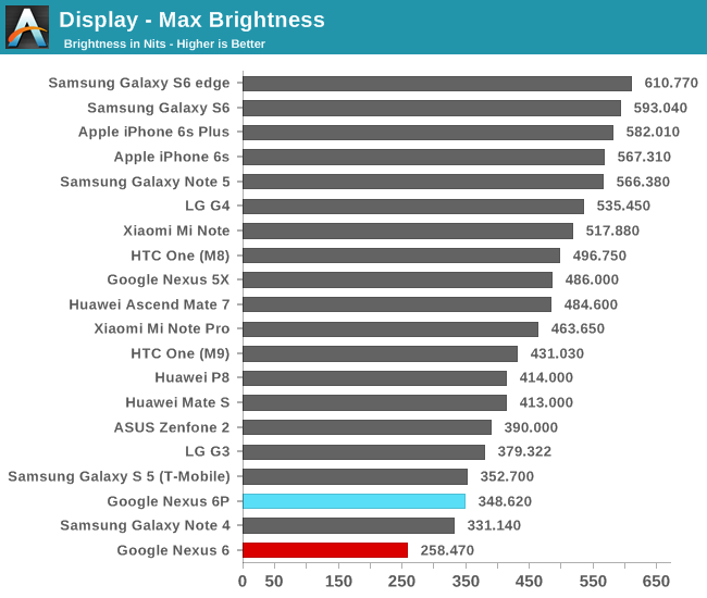
The Nexus 6P manages to drive the screen at up to 348nits, a quite satisfactory level of brightness that matches the Note 5’s characteristics. Unlike Samsung’s devices, it seems the Nexus 6P has no overdrive function which vastly increases the luminosity under high ambient light and auto-brightness. Nevertheless, I’ve had no issues whatsoever in terms with outdoor visibility (Although that’s not a very convincing statement for European winters) as the screen offers excellent contrast.
While still on the topic of brightness, I was actually disappointed to discover that the device’s software is set up so that the brightness slider bottoms out at 8.5 cd/m². While doing the power curve measurements I discovered that the panel and driver is actually able to go down as low as 1.5 cd/m², making this one of the rare devices whose panel can go that low. I’ve become accustomed to using phones at around 2 nits at night and in bed, so 8 nits was suddenly brighter than I wished for. Changing the minimum value of the stock brightness slider wouldn’t be a very complicated task so I hope Google considers this for future maintenance releases.
Edit: After further testing I discovered that it's possible to get to 1.5 cd/m², but only if Adaptive Brightness is enabled and one is located in a dark environment, as brightness without AB offsets the range of the brightness slider.
Default:
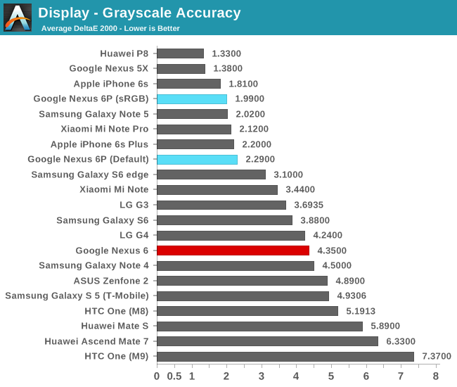
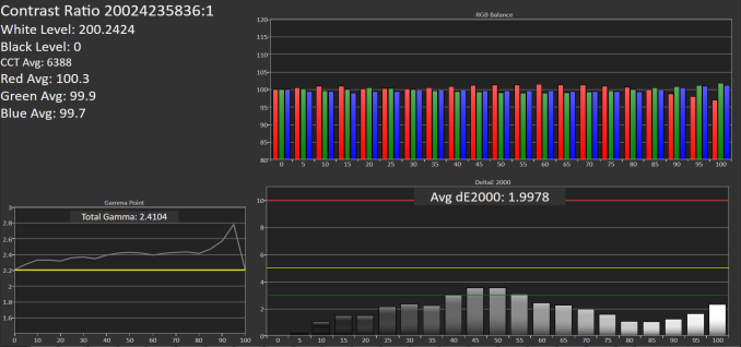
Moving on to the greyscale accuracy tests, we see the Nexus 6P behave very well. At a dE2000 of 1.99 the 6P lands as one of the best devices in terms of accurately reproducing greyscale content. There is however one problem, and that’s the average gamma of 2.41. This causes content to be darker than what it’s supposed to be and also has the effect of making colours seem more saturated. The default colour calibration doesn't differ very much from the calibrated sRGB norm, as it shows only a slight disadvantage with a dE2000 of 2.29.
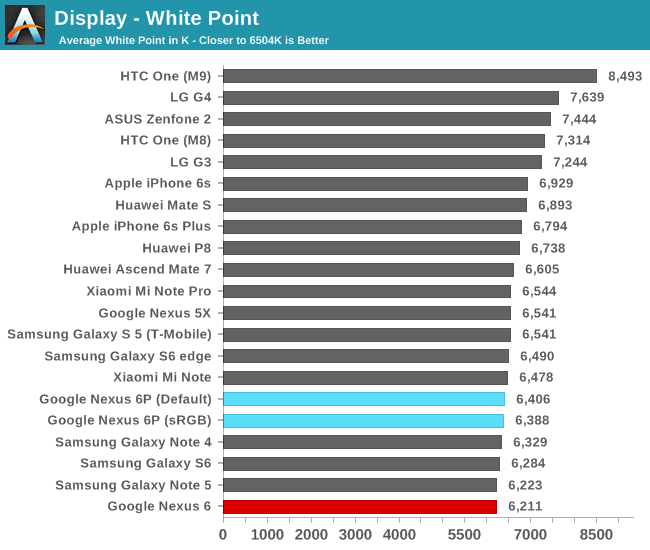
In terms of colour temperature, the 6P is slightly on the warm side as it comes at 6388K at 200cd/m². The latest generations of AMOLED screens seem for some reason to always slightly undershoot the target D65 (6500K) white, making the screen just slightly warmer than it should be.
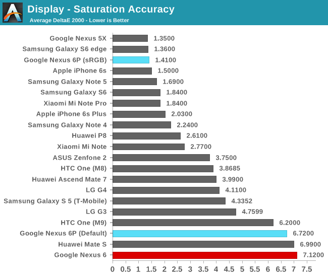
Moving on to the saturation accuracy measurements, we’re presented with some outstanding numbers from the sRGB mode as the 6P manages to deliver an excellent dE2000 of 1.41. At these accuracy levels I would argue that manufacturers would need to resort to individual device colour calibration to be able to provide even better results, as for example even by manually calibrating my own daily driver I wasn’t able to surpass a dE lower than 0.95. Unfortunately the default mode just fares little better than last year's Nexus 6, making for some very saturated colours. I tried to match the reproduced gamut against several standards but I didn't find anything that resembles the Nexus 6P's default mode, meaning this is not an AdobeRGB or DCI large gamut calibration.
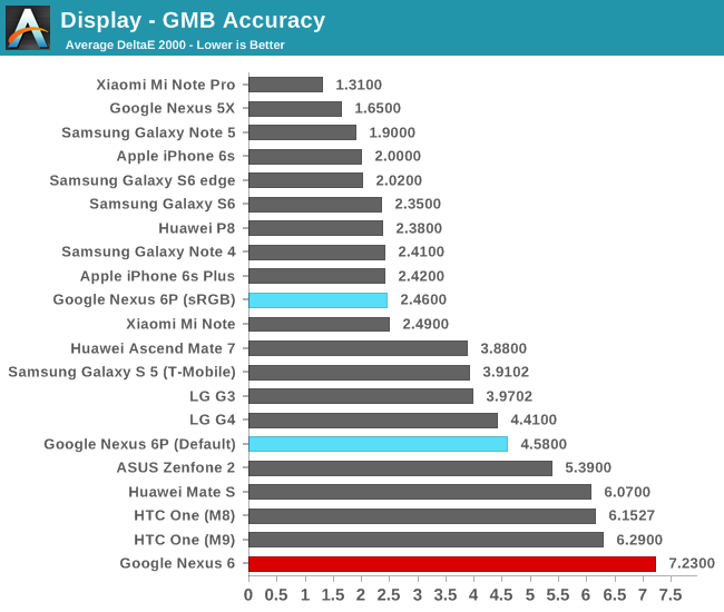
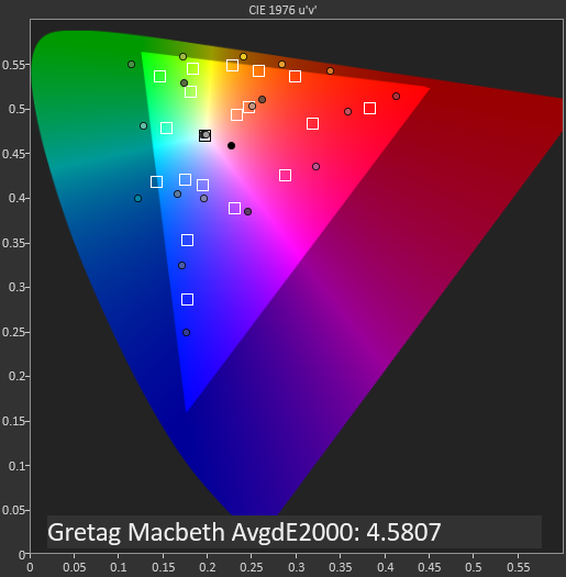
Moving onto the Gretag MacBeth set of commonly encountered colours we see the Nexus 6P fall behind when compared to its excellent greyscale or saturation results. Because the gamma on the 6P’s screen is too high, it causes the luminosity component of colours to be lower and thus, as can be seen in our comparison strip, they will appear darker and slightly more saturated than they should.
On the default settings the GMB accuracy is farther off as expected. There's not much to say here as it's a deliberately inaccurate mode that gives higher priority to vibrant colours as opposed to accuracy.
Overall the Nexus 6 screen ranks among one of the best. It’s a bit of a pity that the gamma calibration was slightly off under the sRGB profile but otherwise the 6P excels in all other metrics. Samsung currently offers the best quality displays and Google and the Nexus 6P takes full advantage of that fact.
Display Power
While we can safely declare that the Nexus 6P offers excellent image quality in its display, one aspect that hasn’t been characterised as much in the past was the power consumption and the resulting luminance efficiency. The Nexus 6 suffered from a quite inefficient panel that resulted in a battery runtime that was lower than expected from a device of its configuration. I was quite worried when I saw that Huawei chose a quite inefficient AMOLED screen for the Mate S, as that proved to be a double-edged sword for the device, as it also offered great image quality but at a great cost in power efficiency.
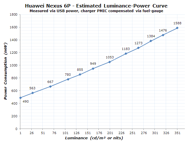
For the Nexus 6P, getting an accurate power curve for the screen was exceptionally hard as the fuel-gauge of the PMI8994 power management IC of Snapdragon 810 devices updates only rarely and therefor becomes unusable for many power measurements. So to properly characterize the power draw at increasing brightness without spending several hours for each measurement point I hooked up my measurement equipment to the USB power of the 6P. Once a phone’s battery cell is fully charged it will usually switch to be fully powered by the power supplied by the connector as long as it’s able to provide sufficient power. The downside of this method is there’s a significant unknown delta due to the inefficiency of the PMIC converting the input 5V to the system’s internal 3.3V. Nevertheless with some help of some test measurements via the internal fuel gauge I was able to compensate for this difference, which gives us the following power curve:
The Nexus 6P seems to have a base power consumption of around 450mW with a fully black screen, meaning no pixels are powered. This comes in to be similar to what we’ve measured on the Note 4 Exynos, but is still about ~100mW higher than devices featuring more efficient SoC platforms. At maximum brightness, the device consumes about 1.59W, a tad under the 1.7W that the Note 4 used. Some readers might already figure out where I want to go with this, as there’s been plenty of discussion and questions in regard to the efficiency of the panel that will be employed on the Nexus 6P.
To get a better overview, we plot the screen luminance power across several devices in a table and calculate the overall efficiency by dividing that figure by the screen’s area footprint. As a reminder, the screen luminance power is the delta between a screen’s black (or minimal brightness) power to full white at a given brightness, in this case 200cd/m².
| Screen Luminance Power Efficiency 100% APL / White |
||||||
| Device | Screen Luminance Power at 200cd/m² |
Luminance Power (mW) / Screen area (cm²) Efficiency |
||||
| LG G4 | 354 mW | 4.11 | ||||
| Meizu MX4 | 345 mW | 4.14 | ||||
| Huawei P8 | ~341 mW | ~4.43 | ||||
| Meizu MX4 Pro | 386 mW | 4.47 | ||||
| Samsung Galaxy Note 5 | 504 mW | 5.64 | ||||
| Samsung Galaxy S6 | 442 mW | 5.99 | ||||
| Huawei Nexus 6P | ~615 mW | ~6.88 | ||||
| Samsung Galaxy S5 | 532 mW | 7.21 | ||||
| Samsung Galaxy Note 4 | 665 mW | 7.22 | ||||
| Samsung Galaxy S5 LTEA | 605 mW | 8.20 | ||||
| LG Flex 2 | 765 mW | 8.89 | ||||
| Samsung Galaxy S4 | 653 mW | 9.22 | ||||
| Huawei Mate S | ~769 mW | ~9.24 | ||||
At a 200nits and a luminance power of around 615mW, the Nexus 6P’s panel falls in between the Note 4 and the Note 5’s/Galaxy S6’s in terms of efficiency. We can’t clearly attribute any certain emitter generation to the device, but it looks to be about 5% more efficient than the Note 4’s but still a considerable 16% less efficient than the Note 5. It was starting with the Galaxy S6 that I’ve considered AMOLED screens to no longer be in at a disadvantage to LCDs when it comes to efficiency in every-day use-cases. Since the Nexus 6P falls behind that it means we should expect slightly less run-time than comparable LCD devices. Let’s continue on to the battery life results to verify this assessment.








219 Comments
View All Comments
Refuge - Wednesday, December 16, 2015 - link
Thank you! Finally! :DMuch appreciated.
Der2 - Wednesday, December 16, 2015 - link
I cry everytiem when I can't get first.nico_mach - Wednesday, December 16, 2015 - link
Did anyone else find the stock Android complaints puzzling? I switched straight from a tiny iphone 5 to a Nexus 6 and no problems, I think stock Android is a revelation, bright, responsive and with Marshmallow very smooth. I don't use a brightness slider - seems kind of picky. And the back button is, well, fine. It's not like IOS's 'back' button in the upper left is more accessible, right?Finally, there should be gripes about out-of-the-box battery life. Ambient display, Google Now and Location services are too costly in battery to have on by default. Apple ruined music and Google search ruin Android. Irony. At least those can be turned off. Why I have to be prompted about location services when I ask for directions is beyond me - YES turn it back on, I asked for directions!
I can't understand why Google is so keen on defaults that drive people away from Android. It's really very good otherwise. And hopefully they'll fix tablets the way they improved Nexus phones this year.
sleepycujo - Wednesday, December 16, 2015 - link
In fact this is a point most people avoid discussing. I feel it was time somebody brought this up. The stock android feel is exactly what its called. Plain vanilla. Doesnt feel premium and looks just like a 100$ motog(may be lesser). Moreover the simple things you can get used to using OEM skins like swipe to call, message or numerous other features are simply missing unless you root your phone and put in an AOSP Rom with the same look but additional features which is fine on a lower end phone, but shouldnt be necessary on a flagship. I personally think the OEM versions are all upto individual tastes and needs but necessary anyway. LG, Samsung, Huawei and even Mi flavors are what makes Android so loved(and hated!).grayson_carr - Wednesday, December 16, 2015 - link
Lol, swipe to call. I owned a Galaxy S6 earlier this year and hated that feature. I would accidentally activate it when trying to swipe between different tabs (a standard Android interaction) in the dialer app. Not to mention, in the stock Android dialer you just tap to call, which is easier than a swipe. And if you want to message someone, what are you doing in the dialer app? Funny you used that feature as an example because that is exactly the type of feature that annoys me about skins and makes me long for stock Android.lilmoe - Wednesday, December 16, 2015 - link
ExDialer. Never looked back.skavi - Thursday, December 17, 2015 - link
I do that all the time on my S6. God, I hate TouchWiz. Why ruin such an amazing phone with shitty software? Why include 3 fucking gigs of RAM if you don't allow the phone to use it? Just take the good parts (camera app/split screen) and put them on stock Android. Sometimes I feel like they change shit just to change it, even though Google's implementation is clearly better.gochichi - Saturday, February 27, 2016 - link
TouchWiz is clearly a disaster. Until it disappears, I cannot buy another Samsung. Keeping my Note 4 as a little tablet, but I'm just saying no to skins from here forward. Nexus, or iPhone for my phone going forward. It's a real shame. And the lag in updates is plain absurd. No android 6 on S5, S6, Note 4, Note 5... To get android 6 (which is damn old news at this point) get the S7??? Ummm, hell no... Show me some support first. Nexus 5 is smoother phone than Note 4 and when you look at the specs, the only possible explanation is the software is junked up and not even optimized.ACE76 - Wednesday, December 16, 2015 - link
Your implying that there's better availablke in terms of UI from other OEMS? Apple's interface is as boring and "stock" as it gets and doesn't even have a app drawer. Touchwiz is about as ugly and "in your face" as it gets.Devo2007 - Saturday, December 19, 2015 - link
You mean Apple doesn't have a desktop. It's all just an app drawer.....