The Microsoft Surface Pro 4 Review: Raising The Bar
by Brett Howse on October 21, 2015 9:00 AM ESTNew Accessories: Type Cover, Surface Pen, Surface Dock
The Surface Pro lineup is defined not just by the kickstand, or an Ultrabook packed into a tablet, but also by things like the Type Cover and Surface Pen. Last year, Microsoft released a docking station for the Surface Pro 3 as well to round out the accessories. All of the accessories got a refresh with the launch of the Surface Pro 4.
The New Type Cover
I think the idea of the Type Cover was always something pretty interesting. The original Surface launch also included a Touch Cover, which had a full keyboard consisting of just touch sensors on a mat. It worked ok, but anyone who needed to do any typing would gravitate towards the Type Cover. It fit real keys on a cover that was around 5 mm thick, as well as a track pad. This design has been tweaked with the different models, but it kept the same basic key design and small trackpad. With the Surface Pro 4, Microsoft has completely revamped the Type Cover and it is now to the point where it is as good or better than many Ultrabook keyboards.
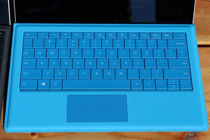
The first big change is that the keys have been spaced out and extended right to the edges of the cover. This makes a big difference in typing efficiency and accuracy. You can instantly feel where you are, and the chances of pressing the wrong key are greatly reduced. Not only that, it also makes the type cover feel like a proper notebook keyboard. Two thirds of the key spacing improvements were achieved by actually making the key caps smaller, and the other one third was achieved by moving the keys out to the farthest possible point on the cover. There are no funny key layouts either. This is a proper five row notebook keyboard.
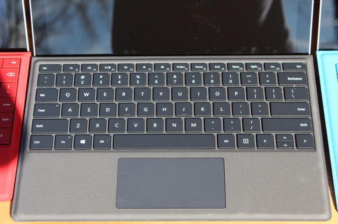
Spacing is important but so is the feel of the keystroke. The new Type Cover offers keys with 1.3 mm of travel, which is a decent amount compared to many Ultrabooks. The key pressure is also firm which makes for a great typing experience. The key noise has also been reduced to avoid the annoying clacking that could occur especially with a couple of people typing at the same time. Compared to the Surface Pro 3’s Type Cover, the new version is light-years ahead.
The trackpad has long been an issue on the Surface lineup. Despite these being tablets first the Pro line is really going after laptop users too, but the size and quality of the trackpad left a lot to be desired. The new model has a much larger trackpad, and it is now a glass surface. Combined with Microsoft’s Precision Touchpad in Windows 10, the trackpad is now an actual proper replacement for a notebook trackpad. Surface Pro 3 was OK, but the limited height of the trackpad made it a chore to do things like scrolling. The increased space on the new model, as well as the better material, makes a huge difference in usability.
Surface Pro 3 introduced the extra magnetic strip on the Type Cover to increase lapability and make the device more stable. That did its job, but the Type Cover itself was actually fairly flexible and would bounce when typing. The final big change to the Type Cover is that it is now a laminated design and the flex that was present before is practically gone.
The best part? The better keyboard, larger trackpad, and stiffer design was actually achieved with a thinner Type Cover than ever before.
| Microsoft Touch/Type Cover Evolution - Thickness | ||||||
| Touch Cover | Type Cover | |||||
| Surface Pro 1 | 3.35 mm | 5.7 mm | ||||
| Surface Pro 2 | 2.91 mm | 5.22 mm | ||||
| Surface Pro 3 | - | 4.95 mm | ||||
| Surface Pro 4 | - | 4.65 mm | ||||
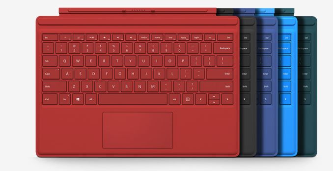
Owners of a Surface Pro 3 can of course use this new model, but there is also another version of the Type Cover too which includes a touch based fingerprint reader for use with Windows Hello. The Surface Pro 4 supports Windows Hello through a facial recognition camera, but owners of the Surface Pro 3 can upgrade their Type Cover and gain biometric support as well. Surface Pro 4 Type Covers are available in Black, Blue, Bright Blue, Red, andTeal.
The Pen Gets an Eraser
The pen has been a part of Surface Pro since the beginning, but it has changed over the generations. Surface Pro and Surface Pro 2 both used a Wacom pen based on EMR technology. For the Surface Pro 3, Microsoft moved to an N-Trig pen to reduce the display stack thickness. The Surface Pro 3 moved some of the digitizer electronics into the battery powered pen, but the number of pressure points dropped from 1024 to 256.
The new pen keeps the N-Trig technology, but it has now moved back to 1024 pressure levels. For people who use the pen for artwork, this could be a nice feature, but I’ll admit I struggle to find a difference between the two as far as pressure levels. Perhaps my hand isn’t very good at increasing pressure in such small increments, though I'd be interested in hearing what a professional artist like Gabe of Penny Arcade thinks of the change after his experiences with the Surface Pro 3. Regardless, specification wise it now meets the original EMR based Surface Pro in this regard.
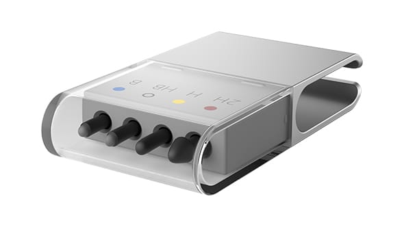
Likely the biggest change with the pen though is the tip. The included pen has a much softer tip, and writing with the pen feels much more like ink on paper thanks to the new tip. The tip is also replaceable, and Microsoft sells a tip pack which includes four different size tips: 2H, H, HB, and B sizes are contained in a nice case and the kit includes a tool (basically plastic tweezers) which lets you pull out the tip in the pen and swap it out. I think this is a great idea, and the pen tips are pretty inexpensive as well. When I was at CES, I met with N-Trig (their tech has since been purchased by Microsoft) and they showed me these different tips and I think there is going to be more choices available.
The shape of the pen has been changed as well. The last Surface Pen was a barrel shape, and now has a single flat side which allows it to be magnetically attached to the side of the tablet for storage. The magnets are pretty strong, so the pen is not going to fall off when you are carrying the Surface Pro around, but I could see it getting knocked off pretty easily in a bag. Panos Panay mentioned that pen storage is difficult, and on the outside you’d think it’s not, but truly it is if you are going to have a pen that is thicker than the tablet, which it really needs to be in order to be comfortable for any length of time.
The new pen is also slightly longer than the outgoing model, and features an eraser on the top. The eraser even feels like an eraser when you use it on the display which I think is a nice touch. Since the eraser is now at the top, the number of buttons required on the pen is reduced so the new pen just features a single button on the flat side for right click options.
The Surface Pen is still a battery powered unit, and the battery is still the somewhat difficult to find AAAA model. Battery life is expected to be 12-18 months though, so you should have some time to find one before it runs out. But there is no charge indicator on the pen, so when it goes dead it will happen without warning. The pen has an accelerometer inside which turns the pen off when it's not in use.
The pen is still paired via Bluetooth, and this process is integrated right into the out of box experience for Surface Pro. Holding the top button (the eraser is also a clickable button) for five seconds makes the pen enter pairing mode. The Bluetooth functionality is not for the pen functions though, but just for the ability to perform functions with the top button. You can use any Surface Pen on any Surface 3, Surface Pro 3, or Surface Pro 4, and without pairing, but if you wanted the additional functionality of the top button it has to be connected over Bluetooth.
The functions are a nice touch too, and shows the deep integration with the hardware and software that we’ve kind of been missing on Windows PCs over the years. Clicking the pen once opens OneNote, clicking it twice lets you do a screenshot and you can use the pen to select what to capture, and the captured image is sent to OneNote. Holding the pen button launches Cortana in listening mode, and she is ready to answer questions with voice.
Using the pen is incredibly smooth with the new tip, and the reduced display thickness means that the parallax is reduced even further, to the point where it really feels like ink is coming out of the end of the pen. Only on very steep angles can you really see the parallax.
The Surface Dock
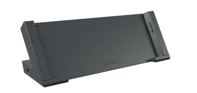
Surface Pro 3 was the first second model (forgot about the SP2 dock - my bad) to be offered with an optional dock, and this was aimed at business customers. It let you place the Surface Pro 3 into the dock with the keyboard attached, and wings on the side of the dock would slide in to connect the dock to the ports on the Surface Pro 3. The dock connected with the Surface Connect cable which hooks up to the same location as the power connector. This is Microsoft’s take on Thunderbolt, and lets them pass high speed peripherals to the Surface Pro lineup over their proprietary connector.
Microsoft kind of backed themselves in a corner though with the first iteration of the Surface Pro 3 Docking Station. They promised customers that they would be able to use the dock with future models, which meant that the new model would basically have to be the same dimensions and have the Surface Connect port in the same location. That has happened with the Surface Pro 4, although because it is thinner than the outgoing model they are offering a free spacer to make the Surface Pro 3 Docking Station work as smoothly as it should.
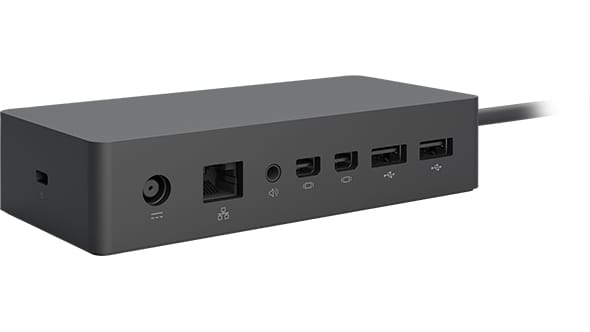
The new Surface Dock is compatible with Surface Pro 3, Surface Pro 4, and Surface Book
To avoid that in the future, the new Surface Dock is now a breakout box on the end of a cable, which means means it will work on any Surface device including the Surface Book. The Dock will charge the Surface, and at the same time give you access to Gigabit Ethernet, four USB 3.0 ports, audio, and two mini DisplayPorts. Since the connector is the same as the power connector, it quickly and easily attaches magnetically to the Surface, and it’s reversible as well. The nice part about the old dock was that it would hold the Surface Pro upright, but it was in a fixed position which might not be ideal. The new one lets you use the Surface kickstand, and it will be very future proof going forward unless they decided to ditch the Surface Connect port which I feel is unlikely at this time.





175 Comments
View All Comments
Shadow7037932 - Wednesday, October 21, 2015 - link
Excellent! I've been waiting for a review of this. Planning to upgrade from a Surface Pro 2 to this during holiday shopping season or earlier next year.boozed - Wednesday, October 21, 2015 - link
Okayhasseb64 - Thursday, October 22, 2015 - link
Okay?aoshiryaev - Monday, October 26, 2015 - link
Okay!theduckofdeath - Tuesday, November 10, 2015 - link
Okay...zeeBomb - Wednesday, November 11, 2015 - link
OKAY.Der2 - Wednesday, November 11, 2015 - link
ykaOjuliustaylor - Saturday, November 14, 2015 - link
I own a tablet which I also use for work. creating spreadsheets is not an issue with my tablet. Not having a problem in downloading apps and games and has a great specs and performance too! I got it from: http://www.consumerrunner.com/top-10-best-tablets/zhenya00 - Wednesday, October 21, 2015 - link
Brett, any comments or tests on the reflectivity of the new screen? As I use my SP3 outdoors a lot as a tablet for work, the reflectivity of the screen was a big issue. It was significantly worse than many other of its peers, and worse yet, completely unusable in portrait with polarized sunglasses. I'm really hoping they addressed these issues with the SP4.Luc K - Wednesday, October 21, 2015 - link
It's a bit brighter at least. But have you tried to use a screen protector on the SP3? It really should reduce reflectivity if you buy a matte protector.