A First Look At Apple's OS X El Capitan
by Ryan Smith on June 15, 2015 3:00 PM EST- Posted in
- Apple
- Mac
- Operating Systems
- macOS
Window Management: Split View & Mission Control
Although Apple’s application updates are likely to have the greatest impact for day-to-day users, that’s far from the only place the company has been working on improving the state of the OS versus Yosemite. As it turns out, Apple has also been busy working on window management, adding some new features here and revising the operation of other systems to bring about new functionality.
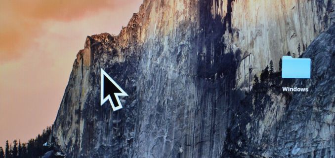
To address the elephant in the room first, Apple has added an interesting solution to the problem of finding the mouse cursor. With El Capitan, shaking the cursor – be it waving a mouse around or moving your fingers quickly about the trackpad – will cause the cursor to momentarily enlarge. Bad (and obvious) jokes aside, this feature is exactly as stupid as it sounds like. And in the process it becomes stupidly clever.
Although OS magnification is nothing new – OS X has had it practically forever – using magnification on just the cursor, and just temporarily at that, is a clever way to momentarily increase the visibility of a cursor. And the thrashing about is exactly how most people go about finding their cursor if they lose it (since humans are more sensitive to motion than detail), which makes this a very natural action. At the end of the day it strikes me as something that an engineer came up with in whatever Apple’s equivalent of “20% time” is, but it’s a dumb, effective little feature.
Moving on, let’s talk about what’s new with window management in El Capitan. Apple’s Mission Control feature is receiving some well-deserved attention with the latest version of OS X, and while there are no major changes here, Apple has made a number of smaller changes in an attempt to improve window management through it.
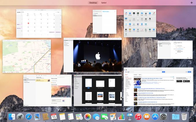
Mission Control: Now With A Single Layer
Window tiling in Mission Control has been adjusted to be flatter; no longer do windows belonging to the same application stack on top of each other, but instead they are laid out separately like another application. This is a pretty straightforward binary choice – you either stack windows or you don’t – but Apple seems convinced that hiding windows by stacking them was counter-productive (and they’re probably right). Meanwhile, how Mission Control and Spaces interact has been improved, and it is now possible to drag an application in Mission Control mode up in to Spaces to have that application put in its own space as a full screen mode application. Previously it was possible to drag applications into other spaces, but the option to go immediately into full screen mode is new.
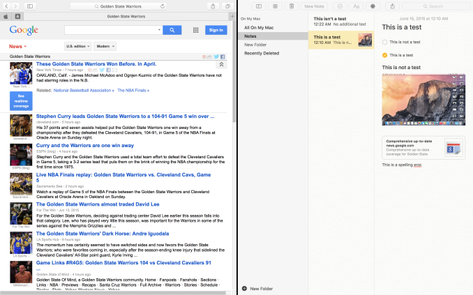
The reason for that change makes a lot more sense when we talk about the other major window management change in El Capitan, which is a new feature Apple calls Split View. Similar to Microsoft’s (Aero) Snap feature, Split View is based around the idea of setting up applications side-by-side such that each application goes full screen and takes up one side of the screen. The intention being to make it easier to focus on just using two applications side-by-side, with each application as large as it can be.
Given that background, Split View is unsurprisingly an additional function of full screen mode. Activating it is simply a matter of holding down the full screen button rather than tapping it, at which point it becomes possible to move an application to either side of the screen and to engage Split View. Doing so will then cause all other application windows to be tiled (ala Mission Control) in order to pick the other application to be used in Split View mode. It’s also possible to engage Split View via Mission Control and Spaces, dragging an application to a Space that already has a full screen application. Finally, split View mode also automatically creates a new space for the view (assuming it wasn’t already a full screen application in its own space), so the desktop remains available in another space.
As far as compatibility and adjustability go, in Split View each half of the screen is adjustable, at least up to a point. This seems to depend on the application, but we have been able to increase the split to 66/33 or so. Meanwhile compatibility is fairly good with Apple’s applications, but it’s clear that this feature can only work with applications that have a full screen mode and have the ability to be resized to fit. System Preferences, for example, can’t go Split View.
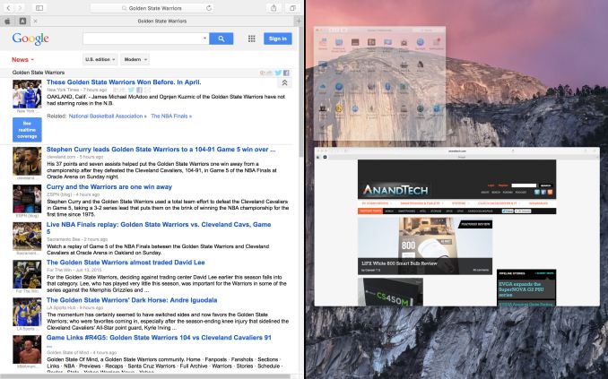
Split View: Picking The Right Application
Overall Split View is an interesting take on what else to do with full screen applications, and while it lacks a high degree of novelty since it has been done elsewhere before, Apple has clearly put some effort into polishing it and using Spaces to resolve the blindness that comes from filling up the screen. That said, given the fact that one of iOS 9’s marquee features for the iPad Air 2 is multitasking, which implements the same Split View feature, I’m not sure how much of Split View’s presence here is out of its usefulness in a desktop environment, and how much of it is based on the desire to keep iOS and OS X in harmony. I’m curious to see just how often it gets used on OS X as a result.





100 Comments
View All Comments
whyso - Monday, June 15, 2015 - link
Dumbest OS name I've every heard. Personally I can't take it seriously.solipsism - Monday, June 15, 2015 - link
OK, then refer to it as 10.11. What I can't take seriously is anyone that takes issue with a damn code name for SW. Your focus should be on whether the OS suits your needs, not whether you disagree with that the use of a Spanish term, a famous rock formation, or whatever reason you may have.retrospooty - Monday, June 15, 2015 - link
LOL. He is probably thinking of something more like Zorro and less like the massive granite formation in Yosemite. - Inigo Montoya would be proud.solipsism - Monday, June 15, 2015 - link
1) My guess is Apple's new code names that are all visually stunning points of interest/locations in CA are simply to bring awareness. My assumption with their first choice being Mavericks is that they weren't going to pick official location names like cities or national parks, but use names that are quasi-official or simply colloquial. Mavericks and El Capitan are good choices in that since as many having already some familiarity with the Yosemite National Park (although I have to wonder how many in the world saw it and pronounced it |yo-semite| or |yo-sa-mite|)2) They don't do this with iOS which has a much larger draw, so why continue this trend with Mac OS X? Even watchOS will likely outnumber Mac users in a few years. I wonder if the name is simply based on whatever impressive image they wish to use for their default desktop background. If that's the case that's a pretty weak reasoning for the nomenclature. But, again, it's just a naming convention so the real focus should be on whether the OS is worthwhile to the user or not.
StormyParis - Monday, June 15, 2015 - link
to harp on the "designed in California" they're using to glamour up the "made in China" they're forced to put on their products.Murloc - Tuesday, June 16, 2015 - link
oh so that's what it is.Something 99% of people in the world have never heard about in their life, and they just see "the captain" in Spanish with no apparent reason for that choice and have a laugh.
Alexey291 - Saturday, June 20, 2015 - link
Pretty much. To most people (unless they had it explained to them - which in itself is stupid) it sounds like Apple has gone Mexican all of a suddenShinzo Abe - Sunday, July 5, 2015 - link
I see your point, but let's not be ignorant about it--- the world is very different right now and has been for years from a time where that would be considered a bad thing. You're writing about lively people that are just like you as if you know their worth.close - Tuesday, June 16, 2015 - link
You should understand that for anyone living outside the US (probably most of the people living outside of California) the name is a joke. Also, if product names weren't important you wouldn't have so much money and effort put into this.If the name sounds like a joke you're very likely to consider the product as some sort of joke. Ok, Apple can afford this since the name is tied to the MacOS brand and also it's not like most users have much of a choice or wide selection of products.
But I bet you have avoided plenty of products because of the name and that you laughed at some. It's hard to take this name serious regardless of the landmark it refers to.
Murloc - Tuesday, June 16, 2015 - link
this