The Surface 3 Review
by Brett Howse on May 4, 2015 9:00 AM ESTThe Kickstand Evolved
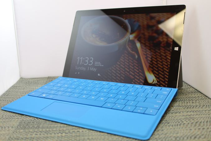
What has set the Surface line apart from all other tablets has been the inclusion of a built in kickstand. This simple addition is the key to the entire Surface philosophy. Surface RT came with a single position kickstand, Surface 2 moved it to a two position kickstand, and Surface Pro 3 changed the game again with an infinitely adjustable kickstand. The Surface 3 takes a slight step back, to save cost and weight, and goes with a three position kickstand. When Anand reviewed the Surface 2, he said that the addition of the second position fixes most of his issues with the original kickstand but he would love to see at least one more stop added. The Surface 3 delivers that third position, and lets the Surface 3 open even wider. While the Pro 3 kickstand may seem like the better version due to the infinitely adjustable angles, the Surface 3’s three position model is much easier to operate. The Pro’s friction hinge is very stiff so that it does not collapse when being used, but the three position version on the Surface 3 simply snaps from one location to the next.
Having the third position really helps in a lot of situations, and while I would have liked the final one to open as wide as the Surface Pro 3, it still opens sufficiently to watch content in your lap or to use the pen on a desk or table. Overall, it is still a step back from the Pro 3, but it fits in well and still makes the Surface 3 one of the most versatile tablets ever made.
In fact, looking at the hinge kind of sums up the entire device. It is very similar to the Pro 3, but slightly stepped back. The build quality of the stand is as good as ever, and there is still the reassuring ka-chunk when it is snapped closed.
One interesting thing on the Surface 3’s kickstand is the new logo. Microsoft has been changing the logo on Surface on almost every iteration, and they obviously still were not happy with the Pro 3’s Surface branding. The Surface 3 features a polished Microsoft logo now, perhaps signifying that this device is really more about the company and its direction than any single product line.
The Keyboard
Another key feature of Surface since its launch was the magnetically attached keyboard. The first generation devices could be had with either a touch keyboard, which did not have mechanical keys, or the type keyboard, which was slightly thicker but offered actual keys. Considering the tiny difference in size and weight versus the sometimes jarring difference in using a touch keyboard, it makes sense that the type keyboard is now the only option.
If you are new to Surface, the keyboard attaches magnetically to the bottom of the device, and can be used as a display cover when the device is not in use. When in tablet mode, the keyboard can be folded around the back like a normal tablet cover. The magic happens when you can set the Surface up on its kickstand, and the keyboard allows the tablet to be used as a laptop.
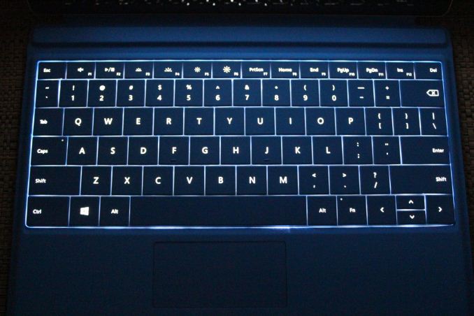
The Surface 3 keyboard cover is unsurprisingly smaller than the Surface Pro 3 model, due to the smaller display size of the new device. However the keyboard is only a little bit narrower than the Pro’s type cover. I did not have any issues typing on it despite the slightly smaller width but I have always used smaller devices. The keys themselves are surprisingly good considering how little travel there is. Microsoft has also kept the backlighting available with a couple of different levels on tap.
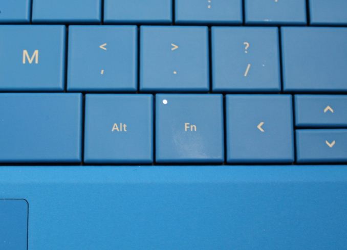
One big change compared to the Surface Pro 3’s type cover is the top row of function keys have ditched the Windows 8 keys and replaced them with the more standard function keys of a traditional laptop. Microsoft made a move to distance itself from Windows 8 with the Windows 10 naming scheme, and they are following through with that on this new device. Personally I find the new keys (which are really the old keys) much more useful than actions I could easily get to through the Charms anyway, so this is a net win for users.
For those that really pay attention, there are some other subtle differences in the keys as well. It is not an exact duplicate on a smaller scale, and instead a couple of things have been tweaked. One thing that has changed is the auditory response. Although some people love a good clack when typing for feedback on key presses, the sound was a bit much when there were a couple of people at a meeting, so Microsoft has tweaked the keyboard to be a bit quieter. The keys also have a slightly higher moment of inertia, and it takes a bit more force to actuate.
The trackpad is small. The Surface Pro 3 has a small trackpad, and so does the Surface 3. I have found it to be fairly accurate and easy to use, but it is very space constrained. There is not much that can be done here because the design of the Type Cover does not leave any room to move the keyboard up. This is because the Surface 3’s type cover features the same double latch system like on the Pro 3. If needed, the back of the keyboard can be snapped onto the bottom of the tablet to offer an additional contact point for it. This increases the stability of the keyboard quite a bit, but a big trade-off is the size of the trackpad.
The covers also have the same attention to detail as the rest of the tablet. With the cover closed, the exact same bevel on the sides is maintained with the cover, which is just slightly wider than the device to keep the angle correct. These are the kinds of touches that help put this tablet a step ahead on its build and design.
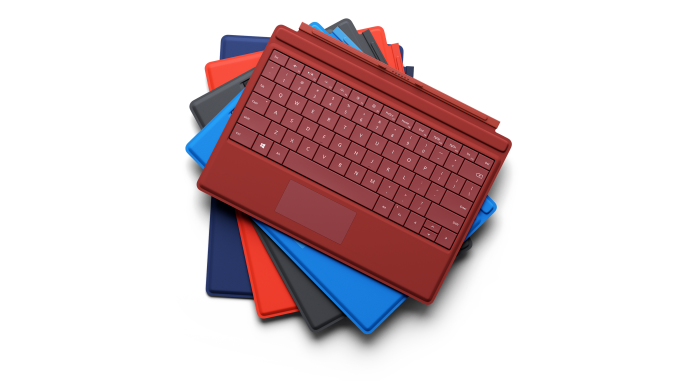
For those that like choice, the new type cover will be available in some splashy colors with blue, red, black, bright blue, and bright red. Everyone likes to put their own take on a device so it is great to see those options available.
Now for the elephant in the room. Price. The Type Cover is not an inexpensive accessory. At $130, it adds 28% to the bottom line when compared against the entry level Surface 3 tablet itself. That’s a big pill to swallow.
Microsoft’s vision of the Surface 3 is a tablet that can replace your laptop, and to do that, you need a keyboard. It is a lot better than an add-on Bluetooth keyboard, and acts like a cover too which saves you needing one of those as well, but still at $130 it is a big ask. You could of course use a USB or Bluetooth keyboard as well. Maybe you want to use it as a tablet when mobile, but back at your desk you can just plug it into a keyboard. That’s going to work great. But the Microsoft one really completes the Surface 3.
That said, do you really need the keyboard? Likely not, at least not if you are OK with the device being used mostly as a tablet. This at the end of the day remains a big part of the reason that the Surface 3 is sold without a keyboard, along with allowing it to hit a $499 price tag to be priced competitively with the Apple iPad Air 2.
As for the testing at hand, in most of my use with the tablet over the last couple of weeks, I would almost always remove the keyboard before using it. This saves a bit of weight, but also prevents the keys from being folded behind and making for an uncomfortable device to hang on to. So most of the time I would get by without it, but then when I want to type of an email, I fall back to snapping the keyboard back on (can we please get the Wordflow keyboard in Windows already?) so even though I do not use the keyboard all the time, I would still miss it if it were gone. It is not a must buy, but it is close, which puts a big dent in the price point of Surface 3.
The Pen
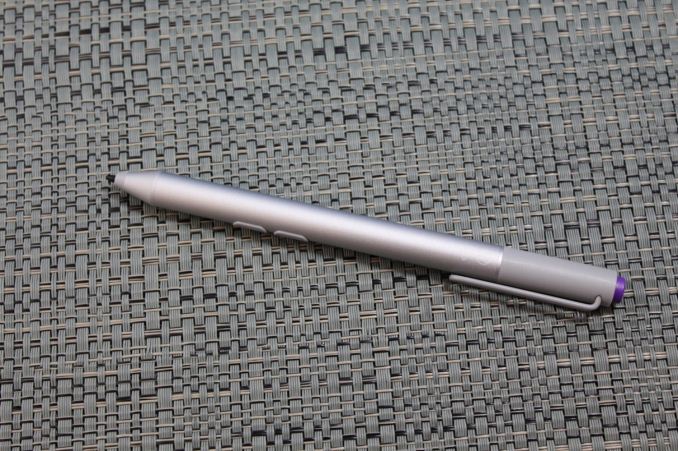
Surface 3 now features the same N-Trig pen technology as the Surface Pro 3. Just last week, Microsoft officially acquired this technology from N-Trig, so it looks like Surface Pen is here to stay. And that’s a good thing.
None of the previous non-Pro models ever had support for a pen, and adding it to this model really increases its appeal. Surface is now a fantastic device for note-taking, and just like the Surface Pro 3, the pen is Bluetooth equipped and you can launch OneNote just by clicking the button on top. There are even several colors of pen available to let you match it to the keyboard if you like.
In addition, there is now a Surface app installed by default to let you customize the pen and other functions.
One of the complaints about the Surface Pro 3 when it first launched was that the Start Button on the right side of the screen can cause you to jump to the start menu when writing. That appears to be sorted out now, and in the Surface app, you can enable a feature to avoid inadvertent presses of that key.
You can also adjust the pressure sensitivity of the pen to what suits your writing style, and the top button can be configured to launch OneNote either on the desktop or the default Windows Store version.
I found the pen to be a fantastic addition to the tablet, and it opens up a lot more use cases for the device. Almost every time we put up a news post about a tablet, one of the first comments is “does it have pen support?” and now we can say yes, even on the less expensive Surface models. With Windows 10, inking is getting a lot more support right into the operating system so it makes a lot of sense for Microsoft to try and showcase that with their first party devices.
The Dock
Last year Microsoft introduced a dedicated dock for the Surface Pro 3 to let you use it easily with an external monitor and keyboard/mouse. They have made a big push to make Surface Pro 3 a win in the enterprise segment, and you need to have a dock for that to happen. Although the dock is not inexpensive at $199, it has a great design and uses the power port for expansion.
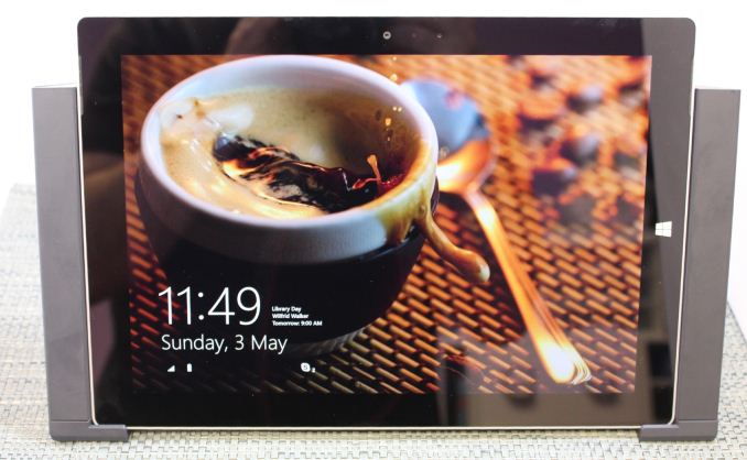
The Surface 3 has a similar dock, and for the same price. Although not as powerful as the Surface Pro 3, they are obviously hoping they will find some traction in the enterprise with the smaller device as well. The dock is well made, and it is very easy to dock the tablet with the wings that slide in and out. The left side of the dock features a magnetic spot to stick the pen when it is not in use, and you can dock the tablet with the keyboard attached.
Unlike the Surface Pro 3 though, the dock is basically just a port extender and connects to the existing DisplayPort and USB connectors and replicates them out. But it does give you plenty of connections once it does that. There are two USB 3.0 ports available, and two USB 2.0 ports on the back. Plus you get Gigabit Ethernet, and a full sized DisplayPort.


_thumb.png)
_thumb.png)
_thumb.png)
_thumb.png)


265 Comments
View All Comments
ingwe - Monday, May 4, 2015 - link
This definitely looks interesting. If they would lower the price a bit or use faster storage, I would almost certainly buy.hughlle - Monday, May 4, 2015 - link
Agree. As a device it is very compelling especially at that price point (i paid £480 for a 64gb ipad air 2 which could do pretty much nothing), however i'd only want one for the full functionality, and once you've paid out for that, it becomes quite a big argument as to whether you just pay the little more and go for the i3 sp3.stefstef - Thursday, May 7, 2015 - link
no need to be unhappy. used apple hardware goes like hell on ebay. you might surely get a good price for it.jim32 - Thursday, May 7, 2015 - link
I plan selling my iPad Air and getting the Surface 3 when the LTE version comes out. I need to wipe the dust from the iPad first though.hughlle - Monday, May 18, 2015 - link
Sold it a week later and took a 100 pound hit. 20% depreciation in a week is hardly good retention of value in my mind,houkoholic - Monday, May 18, 2015 - link
It's relative - with Android kit you usually lose 40%, and in 6 months more than 70%. So 20% is actually very good.JRX16 - Wednesday, May 27, 2015 - link
One week or 6 doesn't make much difference here. It would still be 20% which is excellent for anything used. What makes a difference is how close it is to the next release. It's not like a car with mileage, time of use doesn't make a big difference in price on these things. Condition does.jaydee - Monday, May 4, 2015 - link
My sentiments exactly. I feel there's a very small number of people who "need" a tablet/laptop all-in-one and are willing to sacrifice the best of either world, for an average tablet/mediocre laptop. I might be generous calling it an average tablet, just because of the lack of apps compared to android and Apple. If you're not going to hit at an attractive price point, then I'm not sure of your expectations.With the $600 model, plus type cover and dock pushing $930 plus tax, why not an HP Spectre x360 8GB/256GB for $999? Is the portability, really worth giving up that much CPU/SSD speed, and RAM/SSD capacity, better keyboard and larger screen?
deathwombat - Monday, May 4, 2015 - link
Lack of apps? It runs Windows! It runs about 8 billion apps written between 1995 and 2015. There is no large library of apps for any tablet.smorebuds - Monday, May 4, 2015 - link
Ikr. I just want to run my legacy Windows programs on a 10" screen using just my fingers. Can't do that on my sucky Samsung and Apple tablets. Who needs modern touch-friendly interfaces anyway...