The 2015 MacBook Review
by Ryan Smith on April 14, 2015 10:15 AM ESTGetting Thinner: New Keyboard, Keys, & Switches
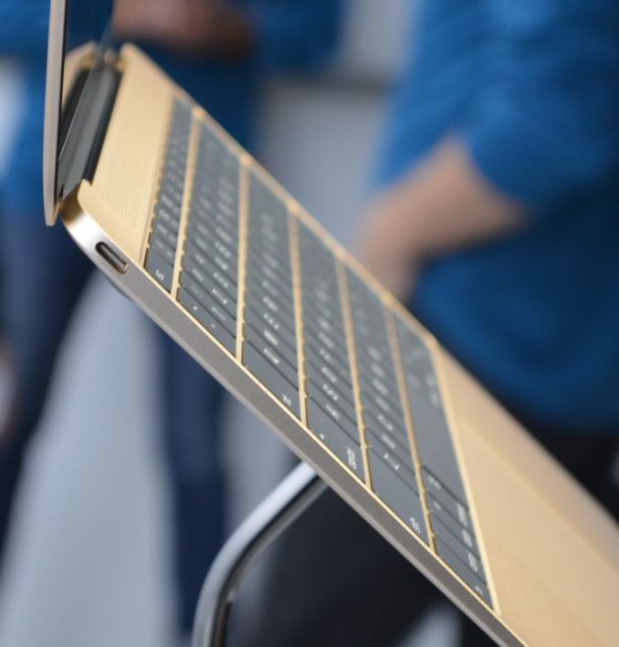
One of the more interesting and not immediately obvious set of improvements to the MacBook come in the form of new internal mechanisms for the keyboard and trackpad. Though both look the same – and largely behave the same – as Apple’s existing products, under the hood they’ve been doing some work to improve these input devices. The driving factor of course is to further reduce the amount of Z-height these two devices take up, but there’s also a secondary focus on improving their functionality overall.
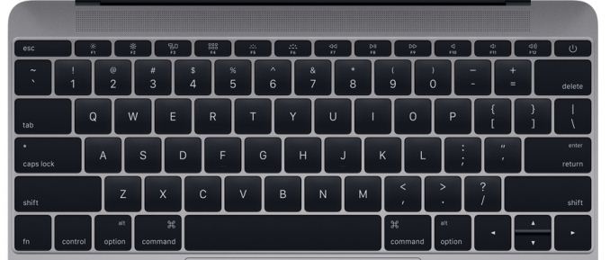
Starting with the keyboard, on the surface the MacBook implements a keyboard very similar to the now-traditional MacBook Air keyboard, incorporating a few smaller changes since their last design. Still a “full size” 78 key design that includes a top row of short function keys, Apple has made some changes to the keys themselves. Of note, the “inverted T” design of the arrow keys has been removed in favor of full size left and right arrow keys, giving the MacBook a somewhat odd arrangement where left/right are larger than up/down, rather than being identical in size as before. In Apple’s older design the space above left/right is empty space, so nothing is being sacrificed for this, but touch typists accustomed to the short arrow keys are going to have to do some adapting. Meanwhile at the other corner the escape key has been slightly elongated so that it’s wider than a normal key, and the other function keys have each been slightly narrowed to compensate.
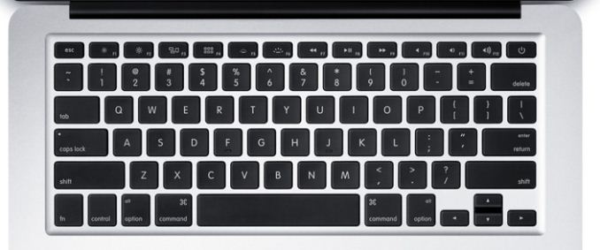
Top: MacBook Keyboard. Bottom: MacBook Air Keyboard
Apple has also changed the overall size of the other keys, though even regular Mac users may have trouble picking up on this. The keys are now 17% larger, with Apple having slightly reduced the amount of space between each key to compensate. Meanwhile the keys are also have a deeper curve, which Apple tells us is 50% deeper. Truth be told, if not for the fact that Apple took the time to point this out in their reviewer’s guide I likely would not have picked up on either of these changes; the wider keys are noticeable once you know what to look for, but only just. Ultimately I don’t find the MacBook’s keyboard to be any different to type on as far as key size and feel goes (even with my large fingers), but your mileage may vary.
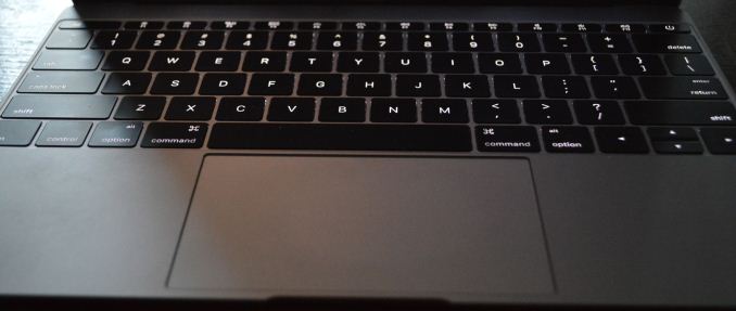
Backlit Keys: Minimal Edge Lighting
Meanwhile under the hood Apple has reworked the backlighting mechanism. The fiber optic lighting system that has been common in Apple’s designs until now has been replaced with a direct LED backlighting system, with each key having its own LED. Apple tells us that this was done for size reasons, as the direct backlighting system was smaller than the fiber optic lighting system. Not unexpectedly, this also changes how the overall backlighting system looks. The individual keys are as bright as ever – and Apple has gone so far to calibrate the LEDs to make sure they’re uniform – but with the LEDs now under the keys the amount of light around the edges of the keys has been greatly reduced. There is still some edge bleed, but now the lighting is much more focused on the symbols of the keys as opposed to lighting up the symbols and giving the keys a light border in the process.
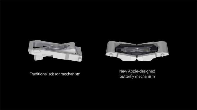
Last but certainly not least however is the new key mechanism used underneath key, with like a number of other technologies is being first introduced on the MacBook. Apple has forgone the traditional scissor switch in favor of a newly designed mechanism they’re calling the butterfly switch, which in the slow-moving world of keyboards is the first significant change in quite some time.
The purpose of the butterfly switch is two-fold. The first of course is to reduce the size of the switch, allowing Apple to make the keyboard and resulting laptop thinner. Officially the butterfly switch is 40% thinner than Apple’s traditional scissor mechanism. That said, I’m not entirely convinced that Apple needed to switch mechanisms to reduce the keyboard thickness (though perhaps not getting 40% thinner), as we’ve seen other keyboards such as the Surface Pro 3’s type cover use some very thin scissor switches. Instead I suspect Apple’s change was focused on key stability as well.
Along with allowing for thinner keys, the other major improvement in the butterfly switch is key stability. By making the butterfly mechanism symmetrical Apple has done away with the scissor switch’s corner instability, which if pressed at a far corner would allow the scissor mechanism to actuate without actually triggering the switch. With the butterfly switch essentially composed of two identical halves that each prop up their respective corners, the instability has been eliminated as all four corners are similarly supported.
The end result, as Apple likes to pitch it, is that butterfly-backed keys are more stable and have the same feel to them no matter where on the key you press. And true to their word, in my experience this is exactly the case. The MacBook’s keys feel the same no matter where you press, and more importantly we haven’t encountered any failed keypresses in our formal or informal keyboard testing. Having used a number of scissor keyboards over the years, including a couple that suffered from non-registering corner keypresses, this is a welcome change as it’s seemingly impossible to have a key fail to register. That said the quality of scissor mechanisms definitely varies on a vendor-by-vendor basis, and with Apple’s scissor mechanism already performing well, I’m not sure if this is really all that big of a step up from other Apple designs. On the other hand what I’ve also found is that the instability problems of scissor keyboards seem to get worse as they get thinner, so it’s quite likely that Apple needed to make this change as they wouldn’t have been able to maintain their high keyboard quality with an even thinner scissor switch keyboard.
In any case, the other big change to keyboard feel is that due to the thinner switches, the total amount of key travel is significantly reduced. While the MBA and other Ultrabooks already had fairly low key travel, the MacBook’s keyboard reduces it yet again, and coupled with the changes in switches it makes the MacBook keyboard feel very different at times, and this is a difference that can take some getting used to at first. As thin as the switches are they’re closer to buttons than traveling keys – think iOS device home button – so typists accustomed to more travel and spring in their keys will immediately pick up on the difference, and I would wager take a temporary hit in words per minute (WPM) until they’ve fully adapted. After having used the MacBook for a week I can already type on it as well as I can my MacBook Pro, so it’s a relatively short adjustment period, but it’s there.
For a device of its size, overall I’d consider the MacBook’s keyboard to be an improvement over similar designs. That said, while I wouldn’t be surprised to see the backlighting improvements and key size changes eventually brought over to other MacBook designs, I don’t imagine we’ll be seeing the butterfly switch used on other, larger designs where Apple doesn’t need to be so conservative on space. As well as it works here, Apple doesn’t have the same need to deviate from the greater travel of scissor switches in their larger laptops.




354 Comments
View All Comments
lilmoe - Tuesday, April 14, 2015 - link
"I’m going to start where I left off in our introduction, which was the concept of the laptop/tablet crossover. The idea of laptops and tablets crossing over is no longer merely an idea, but now it is reality"Yea. Back here, we call those "Netbooks". But "crossover" sounds cooler.
darwinosx - Tuesday, April 14, 2015 - link
You don't know what a netbook is. They were cheap devices with low quality screens and poor build quality. Try reading the review you are commenting on.lilmoe - Tuesday, April 14, 2015 - link
OK, so it's a better quality netbook. Got it :PvFunct - Tuesday, April 14, 2015 - link
Sorta like how a laptop is a higher quality netbook.Or, how a computer is a higher-quality calculator.
PEJUman - Tuesday, April 14, 2015 - link
Maybe in 2012 laptop is higher quality netbook. I am starting to feel that Anandtech is getting too 'careful' with the OEMs. M9 is bad, call it that. this Macbook fits squarely in the netbook term from functionality standpoint, despite the price premium for the fit and finish. No need to redefine a new 'crossover' term just to keep Apple marketing managers happy.Right now, chromebook and other ultraportables (such as this one) with the relatively slow core M are the de-facto sucessor to netbook. Single usb port also a netbook typical compromise. It not convertible nor it has a touchscreen, so.. NETBOOK.
Tech evolves, therefore performance expectation should evolve with it. the core M is barely faster than a 2012 intel i3-3217U on geekbench. It is the lowest performance tier of Intel big core family.
Anandtech used to be unbiased, I think they finally started the slow descent towards 'marketing for OEM'. I understand where this is coming from, and I am willing to pay for anandtech subscription if that what it takes to restore the one place a techie can get an unbiased, deep dive into new techs.
Purch should differentiate Tom's & Anand by using Tom's for their mainstream, 'marketing compatible portal' while turning Anand into a subscription based portal, with reviews selection based on customer votes, each one completely unbiased, purely technical, pull-no-punches style.
ws3 - Tuesday, April 14, 2015 - link
Something like the transformer book is a modern day netbook: atom processor, $300 price, questionable build quality --- all the traits of a netbook.BittenRottenApple - Wednesday, April 15, 2015 - link
Yet another fine addition to the long list of "Terrible Products Apple Makes to Gouge Money out of People".The new MacBook is a testament to Apple's collapsing technical acumen. They eliminate all ports except for one outdated USB port? This craven stupidity should send the last adherents running. But running to what? Windows isn't even a viable option anymore, since it now is the most widespread commercial NSA gathering tool available, closely followed by Android, iOS and OS X.
It's a sad day for people who need real computers. Jony Ive is a pompous, clueless hack who should be fired for introducing crippling regressions like this one.
Look at this POS: One USB port, which will require an adapter to do anything. So if you're going to require an adapter anyway, why not make that one port a modern one: Thunderbolt. Thunderbolt can carry USB, video, Ethernet, external storage... ALL AT ONCE. And it can be daisy-chained, which is hugely important when the computer has ONLY ONE PORT. So WTF is Apple doing making its sole port USB?
And again, are you kidding me? One tiny USB connector? Now every sorry user of this pos has to find a thunderbolt to USB C, a USB C to USB to HDMI, a USB to USB 3.0 period, a USB C to USB connector for apple’s time machine and also manage to don't short circuit all that with the AC/DC to USB C connectors, seriously ? Worth 200$ new pile of hairy connectors for the brand new gold macbook air, and that is called a revolution nowadays? No ********** way, the Dell XPS 13 is way superior, period.
By the way, they're perpetrating USB Type C connectors. Thunderbolt is a much-needed step to a modern I/O standard. USB is an outdated, abused standard that was designed for keyboards, mice, and modems. It's not suitable for external storage, video, or anything else requiring bulk data transfer with minimal CPU overhead. USB C is a regression, a major step BACKWARD.
$1599.99----Less than $550.00 worth of hardware = ~$1000 premium to use OS X instead of windows. (Honestly the most expensive component of this computer is probably the screen.)
Anyone with real work to do will not even be able to buy this thing. My friend’s last Air was neat in that it was small and lasted all day, but it was so under-powered, it was frustrating. I can only imagine how limited this machine will be.
Who cares about price, weight and size, when this product is crippled by a hopelessly defective design? You can't hook up a power adapter and external storage at the same time. You can't hook up an external display and external storage. Hell, you can't even plug in a thumb drive!
This product is the most asinine piece of shit Apple has produced, and that includes the (thankfully) short-lived Shuffle that could only be controlled by a gimped Morse code.
$700 less gets you the new Dell XPS 13 which will eat the Mac's lunch.
If you need to do a lot of processor intensive work, than you would not even go near this thing. It would be useless to you. If you need to crunch spreadsheets or are heavy in corporate analysis, this computer would also be useless to you.
This is the kind of computer that Apple sells a lot of. This computer is largely useless for anything other than email and facebook. It cannot store many files, it cannot process much information, and it has one external port. There is nothing wrong with using this computer for casual tasks, but it is CERTAINLY not a productivity machine.
It is what it is. A status symbol/statement. Or some other statement. A statement that you just bought a $400 netbook with a $900 case so you can show off in front of your hipster friends.
I hate to stick to Apple only facts here, but Apple said that the Air is 24% thicker than this new Macbook. That does NOT mean that the new Macbook is 24% thinner than the Air, it means that it is ~20% thinner than the Air. They clearly phrased it that way to make it sound more impressive and hence dupe the consumer, aka stupid isheep.
So, it's an iPad plus with a keyboard and an over expensive dongle so you can do everything a Dell can do, at twice the price while looking posh.
And here I thought technology was about function over form. I get it, functional art; art I can do things my phone does, but in a space that anyone can see me doing it, stylishly. Crippled and non standard in-house branded "business" software does great, can't do anything really artistic on it except maybe GarageBand or stock filter photo edits to my innumerable selfies, but it's got that partially eaten fruit on the back that screams "money I'm too stupid to keep or invest wisely."
Take my money!
I wouldn't hold my breath.
This is apple's marketing strategy: mind-numbing markup on dirt-cheap, mediocre laptops. They throw together a cheap little laptop, pretty it up with silver or gold paint, and ride the wave of ignorance, outrageous markup, and marketing that they've been using as a business model for many, many years now. The only thing Apple has ever made that's less worthless than all the other crap their conspirators like Hon Hai Precision Industry Co., Ltd excrete all day and night by taking advantage of child labour are iOS and OS X which, besides being notoriously crippled and constrained walled gardens, aren’t even worth the hassle unless you also dumped thousands of dollars into other apple products.
Many apple owners I’ve encountered never stop trying to belittle and demean others because they don’t have a Macbook or an iPhone and then try to act like their overpriced apple products are overall better when they are certainly not, by any standard.
Luxury cars, while still worthless crash grabs, usually offer some quality and features that are actually somewhat superior to cheaper competing brands and models.
Macbooks such as this start already expensive as hell with little performance to warrant such outrageous costs. Apple isn’t the luxury car of anything. It’s the luxury car DESIGN with a 4-cylinder under the hood and a tape-deck in the sound system, all with the price tag of "luxury". They sell laptops made cheap in china, using child labour and the same hardware you can find in SO many other laptops, slap their OS on it, put it in a thin case, and then markup the price by 300% to 600%. These are the facts. This laptop in question is nowhere NEAR worth that kind of money. I mean, laptops in general are overpriced, but apple has made their entire business model out of extreme markups backed by clever marketing with little actual technological superiority of any kind. Every single apple product on the market can be outperformed in every way by comparable products. Apple computers can be outperformed by computers that are FAR FAR cheaper while relying on older tech. The only thing that apple has that nobody else does is OSX and iOS, their operating systems. These are mediocre operating systems, but they are literally designed to be limited on anything it determines to be "non-apple hardware". Other operating systems can be installed on just about any computer you can slap together, whereas OSX is specifically and deliberately designed to be non-functional on ANYTHING that isn’t made by apple. It’s nothing but a cash-grab.
Apple is indeed playing run-of-the-mill capitalism, they try to capitalize on the ignorance of the average consumer with marketing campaigns designed to make you assume you're getting your money's worth.
There are millions of consumers who are on the fence, who are actually interested in buying something that's worth the money they spend. Those people deserve factual information and do not deserve to be exploited for their ignorance on the topic. So excuse me if I have a problem with it. College students especially, who don’t have a lot to spend in the first place, are being taken advantage of in every area of their life. Buying a computer should be one less area of exploitation. This is why I have a problem with apple and with many other companies and services that attempt to capitalize on ignorance.
Years down the road when the batteries in this model are dead and you have to keep it plugged in just to use then you'll have no way to plug in a flash drive or an external hard drive. I don't care how sexy it looks: sometimes and more often than not less means a serious lack of functionality.
We can only hope that consumers send this piece of diabolic garbage to oblivion, as they did the idiotic iPod Shuffle that could only be controlled with Morse code over a proprietary headphone wire.
Notwist - Wednesday, April 15, 2015 - link
You literally just typed a small novel spewing a bunch of claims without citing anything to support your arguments, or outright fabricating stuff. It's the absolute definition of a poorly written, complete waste of time. Please take your rants elsewhere, Anandtech readers, last I checked, enjoy discussing tech, not spouting conspiracy theories and raving like lunatics.superflex - Thursday, April 16, 2015 - link
I thought it was quite good.You sound like a butthurt iFanboi
star-affinity - Friday, April 24, 2015 - link
I thought it was bad and not nuanced at all. Things aren't that black and white. Reality comer in many shades.People have the right to have an *informed* opinion. The long post above is unfortunately based mostly on ignorance.