The 2015 MacBook Review
by Ryan Smith on April 14, 2015 10:15 AM ESTThe MacBook's Design
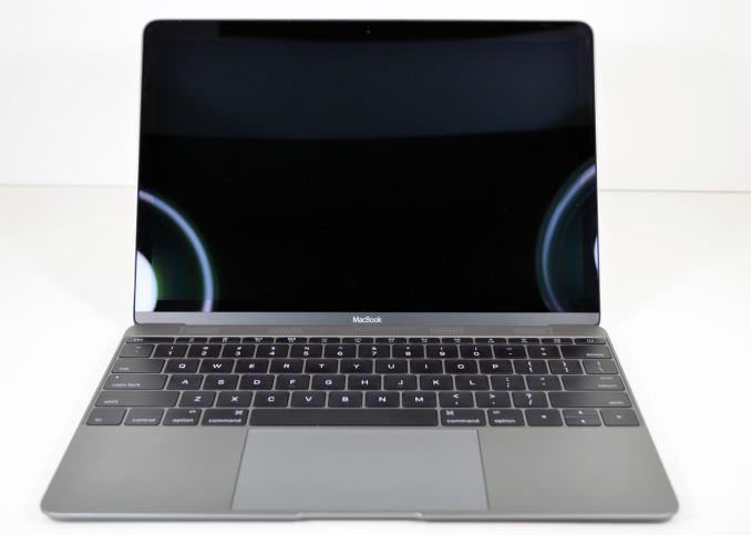
In terms of overarching design, the MacBook is both treading new ground and much of the same. As we’ve mentioned before, the big promotional point for the MacBook is how small it is. And yet at the same time Apple has retained more or less all of the stylings that have come to define the modern unibody MacBook family design. The end result is a laptop that looks and acts almost exactly like a smaller MacBook Air or Retina MacBook Pro.
This leads to the new MacBook having all of the contours and finishes we have come to expect from a MacBook family laptop. The all-aluminum unibody design continues to impress and holds up well even with the MacBook’s smaller form factor. For the MacBook in particular it serves two goals for Apple, the first being to give the device a premium feel, but the second is to serve as a means of cooling the MacBook.
For one of the biggest changes in the MacBook compared to the MBA is the fact that this is a completely fanless design. There are no fans or even vents on the laptop to move heat or hot air; the closest thing that comes to a vent is the grating at the top of the laptop, above the keyboard, which houses other items such as the speakers. Otherwise all real heat dissipation is carried on by the aluminum case itself, which in turn is made practical by the use of the ultra-low power Core M processor. This also means that the MacBook is silent, containing no motorized parts and the only moving parts being the keyboard keys, the trackpad, and the screen hinge. The MacBook Air for its part was seldom loud, but for whisper quiet there’s no topping fanless.
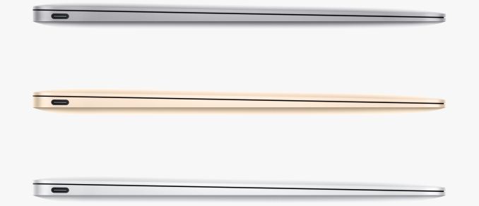
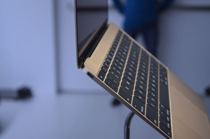
Moving on, Apple retains the sloped design of their MacBook Air, leading to this MacBook having a similarly variable thickness. At its thickest part, towards the rear of the laptop, it’s just 13.1mm thick, and towards the front of the laptop this narrows to just 3.5mm. As with the MacBook Air I’m not sure if this sloped design is really necessary or beneficial versus a flat design, or if Apple does it merely to show off, but if you like your wrists low to the table, then at 3.5mm at its thinnest point, the MacBook is among the thinnest. Meanwhile the fact that the edges are also curved makes the MacBook deceptively thin overall, as even at 131mm it doesn’t feel even that thick when grabbed from the edges.
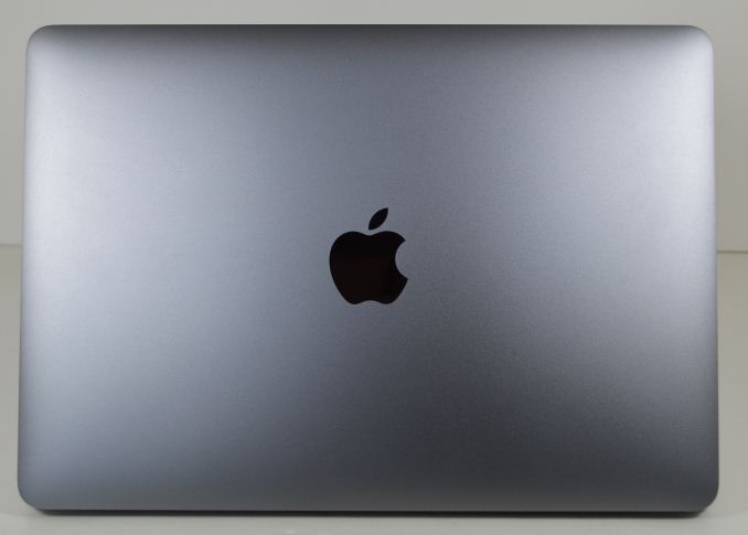
Perhaps the most notable – and admittedly cosmetic – change from the MacBook Air is the Apple logo on the top of the laptop. The iconic lit white logo is gone in favor of a black mirrored logo in its place. Apple doesn’t specifically address the logo, but with the tight constraints on both thickness and battery life – Apple needs to get 9+ hours off of a 39.7Wh battery driving a 12” Retina display – I suspect Apple finally sacrificed the logo to further save on power.
The other big cosmetic change here is the color of the aluminum laptop body itself, which in a first for an aluminum Mac now comes in multiple colors. Further reinforcing the crossover nature of the device and its place between a tablet and a traditional laptop, the MacBook comes in the current iOS device colors of Silver, Space Grey, and yes, Gold. Silver will be the closest to the traditional aluminum look, Space Grey is as close as you’ll get to a black MacBook, and Gold continues to defy our own expectations and be a popular color on Apple devices. Overall the current coloring is limited to just the MacBook, but given Apple’s drive for style, I wouldn’t be all that surprised if this eventually came to the Retina MacBook Pro as well, though perhaps not the MacBook Air for cost reasons.
I also want to quickly call attention to the lid hinge in the MacBook, which is something I feel Apple has done very well with. In such a thin and light laptop the percentage of the laptop’s weight that’s carried by the screen/lid has gone up, which risks the laptop becoming top-heavy. Not only has Apple managed to avoid a top-heavy design, but the hinge is as perfectly balanced as I’ve ever seen. The hinge is just loose enough that even trying to quickly lift the lid can’t really torque the laptop’s base up, and yet no looser than it needs to be. As a result the hinge still offers plenty of resistance without it being a problem for the relatively light base, and the laptop can easily be held at 90° without the lid dropping.
Moving on, we’ll cover the ports in depth a bit later, but we did want to quickly note the MacBook’s choice in ports while discussing the design. In another example of Apple minimalism – or maybe just another sign of the tablet/laptop crossover – the MacBook only has 2 ports: a USB Type-C port, and a 3.5mm combo jack for audio. All wired power, data, and video is routed over the single Type-C port, and the laptop itself is thin enough that there’s not room for something much larger, at the very least not without making the laptop thicker or eliminating the base’s curved sides. This makes the MacBook very much like an iPad, with its single Lightning port and a 3.5mm combo jack, and has some definite repercussions for usability.
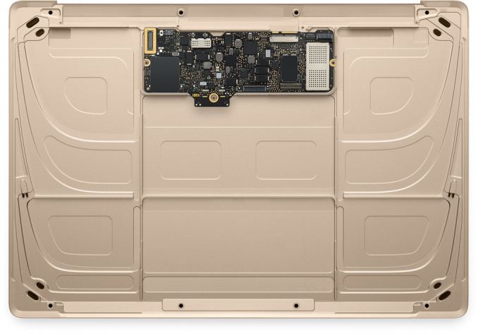
With regards to internal design there’s not a lot we can say at this time – Apple doesn’t like us disassembling review samples – but in lieu of the eventual iFixit teardown, Apple has posted a handful of sanitized shots of the MacBook’s internals. Apple is keen to show off the MacBook’s miniscule logic board, which is only 1/3rd the size of the 11” MacBook Air’s board. Much of this is enabled by the use of the Core M processor, itself using an especially small package to leave room for other components. This is combined with a highly integrated design that sees the RAM soldered on the board, and I suspect the SSD as well, meaning virtually nothing here is replaceable short of the entire logic board itself. In any case, along with this Apple has forgone some of the 3rd party chips like Intel’s Thunderbolt controller, which reduces to a minimum the number of chips they need alongside the Core M processor.
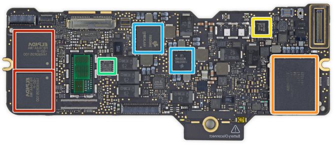
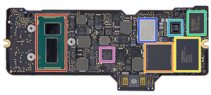
Update 04/15/2015: The iFixit MacBook teardown is in, giving us some excellent shots of the logic board. These pictures show us just how little is there beyond the Core M CPU, the RAM, SSD, a couple of extra controllers, and the necessary power management hardware.
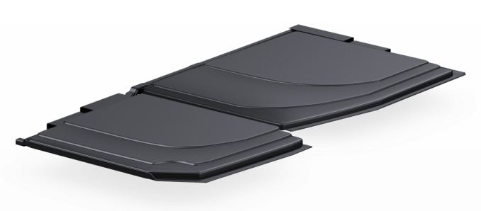
With such a small logic board, Apple has filled out the rest of the laptops internals with batteries, 39.7Wh worth to be precise. This ends up being just a bit more than the 11” MBA’s 38Wh battery, again despite the smaller overall footprint, and is a result of Apple’s use of their new layered lithium polymer batteries, or as Apple likes to call it, their terraced, contoured battery cells. Overall LiPoly has slightly lower energy density than Lithium Ion, however in return it’s a more malleable medium, allowing for greater shape customization, which is what Apple is taking advantage of here. The end result is that Apple is able to better fill out the sloping, rounded case of the MacBook with battery cells by terracing them, squeezing out what little space would have otherwise remained.
Taken in overall, the MacBook has a distinct iOS-device feel to it at times. This is most immediately apparent from the selection of chassis colors, but digging deeper it extends into the electronics and internal design choices as well. Pairing a relatively large screen with a small logic board and filling out every nook & cranny with batteries is very much the iPad way of building things, never mind the fact that the Core M processor itself is designed in part to be a high-end tablet processor. Then of course is the port selection: just a single combined power/data port, and then the 3.5mm jack for audio.
The end result is a device that has an interesting laptop/tablet crossover design to it. The MacBook is still without a doubt a Mac laptop, but it’s also more like an iOS device than anything before it. Consequently while it’s still primarily meant to be used as a laptop – just a very portable, very light one – it’s also clear that Apple envisions it being used like a tablet. To be charged overnight, carried around and run during the day, and then put back on its charger for the night.




354 Comments
View All Comments
lilmoe - Tuesday, April 14, 2015 - link
"I’m going to start where I left off in our introduction, which was the concept of the laptop/tablet crossover. The idea of laptops and tablets crossing over is no longer merely an idea, but now it is reality"Yea. Back here, we call those "Netbooks". But "crossover" sounds cooler.
darwinosx - Tuesday, April 14, 2015 - link
You don't know what a netbook is. They were cheap devices with low quality screens and poor build quality. Try reading the review you are commenting on.lilmoe - Tuesday, April 14, 2015 - link
OK, so it's a better quality netbook. Got it :PvFunct - Tuesday, April 14, 2015 - link
Sorta like how a laptop is a higher quality netbook.Or, how a computer is a higher-quality calculator.
PEJUman - Tuesday, April 14, 2015 - link
Maybe in 2012 laptop is higher quality netbook. I am starting to feel that Anandtech is getting too 'careful' with the OEMs. M9 is bad, call it that. this Macbook fits squarely in the netbook term from functionality standpoint, despite the price premium for the fit and finish. No need to redefine a new 'crossover' term just to keep Apple marketing managers happy.Right now, chromebook and other ultraportables (such as this one) with the relatively slow core M are the de-facto sucessor to netbook. Single usb port also a netbook typical compromise. It not convertible nor it has a touchscreen, so.. NETBOOK.
Tech evolves, therefore performance expectation should evolve with it. the core M is barely faster than a 2012 intel i3-3217U on geekbench. It is the lowest performance tier of Intel big core family.
Anandtech used to be unbiased, I think they finally started the slow descent towards 'marketing for OEM'. I understand where this is coming from, and I am willing to pay for anandtech subscription if that what it takes to restore the one place a techie can get an unbiased, deep dive into new techs.
Purch should differentiate Tom's & Anand by using Tom's for their mainstream, 'marketing compatible portal' while turning Anand into a subscription based portal, with reviews selection based on customer votes, each one completely unbiased, purely technical, pull-no-punches style.
ws3 - Tuesday, April 14, 2015 - link
Something like the transformer book is a modern day netbook: atom processor, $300 price, questionable build quality --- all the traits of a netbook.BittenRottenApple - Wednesday, April 15, 2015 - link
Yet another fine addition to the long list of "Terrible Products Apple Makes to Gouge Money out of People".The new MacBook is a testament to Apple's collapsing technical acumen. They eliminate all ports except for one outdated USB port? This craven stupidity should send the last adherents running. But running to what? Windows isn't even a viable option anymore, since it now is the most widespread commercial NSA gathering tool available, closely followed by Android, iOS and OS X.
It's a sad day for people who need real computers. Jony Ive is a pompous, clueless hack who should be fired for introducing crippling regressions like this one.
Look at this POS: One USB port, which will require an adapter to do anything. So if you're going to require an adapter anyway, why not make that one port a modern one: Thunderbolt. Thunderbolt can carry USB, video, Ethernet, external storage... ALL AT ONCE. And it can be daisy-chained, which is hugely important when the computer has ONLY ONE PORT. So WTF is Apple doing making its sole port USB?
And again, are you kidding me? One tiny USB connector? Now every sorry user of this pos has to find a thunderbolt to USB C, a USB C to USB to HDMI, a USB to USB 3.0 period, a USB C to USB connector for apple’s time machine and also manage to don't short circuit all that with the AC/DC to USB C connectors, seriously ? Worth 200$ new pile of hairy connectors for the brand new gold macbook air, and that is called a revolution nowadays? No ********** way, the Dell XPS 13 is way superior, period.
By the way, they're perpetrating USB Type C connectors. Thunderbolt is a much-needed step to a modern I/O standard. USB is an outdated, abused standard that was designed for keyboards, mice, and modems. It's not suitable for external storage, video, or anything else requiring bulk data transfer with minimal CPU overhead. USB C is a regression, a major step BACKWARD.
$1599.99----Less than $550.00 worth of hardware = ~$1000 premium to use OS X instead of windows. (Honestly the most expensive component of this computer is probably the screen.)
Anyone with real work to do will not even be able to buy this thing. My friend’s last Air was neat in that it was small and lasted all day, but it was so under-powered, it was frustrating. I can only imagine how limited this machine will be.
Who cares about price, weight and size, when this product is crippled by a hopelessly defective design? You can't hook up a power adapter and external storage at the same time. You can't hook up an external display and external storage. Hell, you can't even plug in a thumb drive!
This product is the most asinine piece of shit Apple has produced, and that includes the (thankfully) short-lived Shuffle that could only be controlled by a gimped Morse code.
$700 less gets you the new Dell XPS 13 which will eat the Mac's lunch.
If you need to do a lot of processor intensive work, than you would not even go near this thing. It would be useless to you. If you need to crunch spreadsheets or are heavy in corporate analysis, this computer would also be useless to you.
This is the kind of computer that Apple sells a lot of. This computer is largely useless for anything other than email and facebook. It cannot store many files, it cannot process much information, and it has one external port. There is nothing wrong with using this computer for casual tasks, but it is CERTAINLY not a productivity machine.
It is what it is. A status symbol/statement. Or some other statement. A statement that you just bought a $400 netbook with a $900 case so you can show off in front of your hipster friends.
I hate to stick to Apple only facts here, but Apple said that the Air is 24% thicker than this new Macbook. That does NOT mean that the new Macbook is 24% thinner than the Air, it means that it is ~20% thinner than the Air. They clearly phrased it that way to make it sound more impressive and hence dupe the consumer, aka stupid isheep.
So, it's an iPad plus with a keyboard and an over expensive dongle so you can do everything a Dell can do, at twice the price while looking posh.
And here I thought technology was about function over form. I get it, functional art; art I can do things my phone does, but in a space that anyone can see me doing it, stylishly. Crippled and non standard in-house branded "business" software does great, can't do anything really artistic on it except maybe GarageBand or stock filter photo edits to my innumerable selfies, but it's got that partially eaten fruit on the back that screams "money I'm too stupid to keep or invest wisely."
Take my money!
I wouldn't hold my breath.
This is apple's marketing strategy: mind-numbing markup on dirt-cheap, mediocre laptops. They throw together a cheap little laptop, pretty it up with silver or gold paint, and ride the wave of ignorance, outrageous markup, and marketing that they've been using as a business model for many, many years now. The only thing Apple has ever made that's less worthless than all the other crap their conspirators like Hon Hai Precision Industry Co., Ltd excrete all day and night by taking advantage of child labour are iOS and OS X which, besides being notoriously crippled and constrained walled gardens, aren’t even worth the hassle unless you also dumped thousands of dollars into other apple products.
Many apple owners I’ve encountered never stop trying to belittle and demean others because they don’t have a Macbook or an iPhone and then try to act like their overpriced apple products are overall better when they are certainly not, by any standard.
Luxury cars, while still worthless crash grabs, usually offer some quality and features that are actually somewhat superior to cheaper competing brands and models.
Macbooks such as this start already expensive as hell with little performance to warrant such outrageous costs. Apple isn’t the luxury car of anything. It’s the luxury car DESIGN with a 4-cylinder under the hood and a tape-deck in the sound system, all with the price tag of "luxury". They sell laptops made cheap in china, using child labour and the same hardware you can find in SO many other laptops, slap their OS on it, put it in a thin case, and then markup the price by 300% to 600%. These are the facts. This laptop in question is nowhere NEAR worth that kind of money. I mean, laptops in general are overpriced, but apple has made their entire business model out of extreme markups backed by clever marketing with little actual technological superiority of any kind. Every single apple product on the market can be outperformed in every way by comparable products. Apple computers can be outperformed by computers that are FAR FAR cheaper while relying on older tech. The only thing that apple has that nobody else does is OSX and iOS, their operating systems. These are mediocre operating systems, but they are literally designed to be limited on anything it determines to be "non-apple hardware". Other operating systems can be installed on just about any computer you can slap together, whereas OSX is specifically and deliberately designed to be non-functional on ANYTHING that isn’t made by apple. It’s nothing but a cash-grab.
Apple is indeed playing run-of-the-mill capitalism, they try to capitalize on the ignorance of the average consumer with marketing campaigns designed to make you assume you're getting your money's worth.
There are millions of consumers who are on the fence, who are actually interested in buying something that's worth the money they spend. Those people deserve factual information and do not deserve to be exploited for their ignorance on the topic. So excuse me if I have a problem with it. College students especially, who don’t have a lot to spend in the first place, are being taken advantage of in every area of their life. Buying a computer should be one less area of exploitation. This is why I have a problem with apple and with many other companies and services that attempt to capitalize on ignorance.
Years down the road when the batteries in this model are dead and you have to keep it plugged in just to use then you'll have no way to plug in a flash drive or an external hard drive. I don't care how sexy it looks: sometimes and more often than not less means a serious lack of functionality.
We can only hope that consumers send this piece of diabolic garbage to oblivion, as they did the idiotic iPod Shuffle that could only be controlled with Morse code over a proprietary headphone wire.
Notwist - Wednesday, April 15, 2015 - link
You literally just typed a small novel spewing a bunch of claims without citing anything to support your arguments, or outright fabricating stuff. It's the absolute definition of a poorly written, complete waste of time. Please take your rants elsewhere, Anandtech readers, last I checked, enjoy discussing tech, not spouting conspiracy theories and raving like lunatics.superflex - Thursday, April 16, 2015 - link
I thought it was quite good.You sound like a butthurt iFanboi
star-affinity - Friday, April 24, 2015 - link
I thought it was bad and not nuanced at all. Things aren't that black and white. Reality comer in many shades.People have the right to have an *informed* opinion. The long post above is unfortunately based mostly on ignorance.