The Dell Venue 8 7000 Series Review
by Brandon Chester on March 12, 2015 8:00 AM EST- Posted in
- Tablets
- Dell
- Android
- Mobile
- Venue 8 7000
Software
It could be said that software has always been something of a pain point for Android tablets. However, before discussing the application situation which is out of Dell's control, it's worth talking about the software that comes on the Venue 8 itself. The first thing users will notice is that despite being a flagship device launching after the release of Android Lollipop, the Venue 8 still runs Android 4.4.4 KitKat. Dell has promised that there will be a future update to Lollipop, but no concrete time frame was given and so users could be waiting for quite some time.
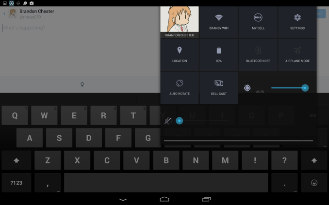
Unfortunately, there are some parts of the KitKat interface that look quite dated. The Tron blue on sliders, window borders, and buttons had run its course long before it was replaced in Lollipop, and seeing it re-appear after using Lollipop for quite some time is jarring. Other areas like the keyboard also look dated and don't fit in well with any applications that have been updated to align with Google's Material Design principles. Thankfully, applications like the keyboard that have been moved over to Google Play can be updated and switched to their new Material Design interfaces. Unfortunately, functional issues aren't as easily addressed in this manner. An example is how the notification shade and quick toggles are segmented into separate areas, which feels downright archaic after using Lollipop.
Dell has not made a great number of modifications to Google's Android KitKat interface. The launcher and settings applications have been given a turquoise texture for their background which I actually consider to be more aesthetically pleasing than the old Tron blue gradient in the case of the settings application. If users are unhappy with Dell's changes, they'll be in a similar situation to the keyboard where they can simply download the Google Now Launcher from Google Play and have the same interface as any users who are running Lollipop.
The decoupling of many applications from Android has done a great deal to reduce issues with interface and feature fragmentation introduced by not having the latest OS updates. Unfortunately, core applications like Settings and sections of the interface like the status bar and notification shade are always reminders that your device is running an outdated version of Android, and so I hope Dell is able to ship a Lollipop update sooner rather than later.
As for preinstalled applications, there are a number of them, including several Dell branded applications like Dell Cast and My Dell. None of these apps can be uninstalled, and it's especially concerning because after the space taken up by the OS, storage formatting, and preinstalled applications, there's only 9.12GB free for the user to use. While this can be expanded via MicroSD, it's not a solution for installing apps, and installing just a few large AAA games will fill the Venue 8 up quickly. Of the preinstalled applications, I recommend immediately disabling McAfee Security and MaxxAudio.
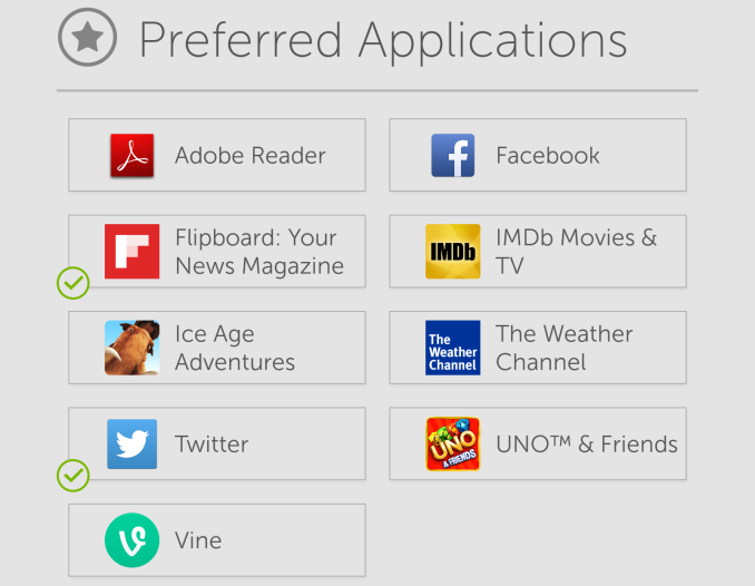
In addition to these preinstalled apps, the initial setup for the Venue 8 presents you with the screen shown above. I'm completely okay with the idea of offering potentially useful applications to be optionally installed during the setup process, and I think every single preinstalled application that comes on top of the stock Android apps should be offered in the same manner, unless it's necessary to use a certain hardware feature.
The Application Situation
One of the primary criticisms of Android tablets over the years has always been that the library of applications that are actually optimized for large screen devices is small, with the number of iPad applications usually taken as the reference point. There are a number of factors that have contributed to this, and it's worth mentioning them before looking at the tablet application situation currently on Android.
One of the reasons that developers may feel less compelled to make applications with special tablet interfaces on Android is actually due to the fact that Android has application scaling in the first place. Unlike on the iPad where applications made only for the iPhone look pixelated and display in a window, applications on Android will scale to fill an entire tablet display. The fact that phone applications aren't essentially unusable on Android tablets can definitely be a factor in developers preferring to focus on adding new features and fixing bugs rather than creating a specialized interface.
Another issue that seems to seldom be discussed is the aspect ratio and orientation of Android tablets. Generally, Android tablets have used a 16:10 aspect ratio, and their native orientation has been portrait for 7 to 8 inch tablets, and landscape for larger ones. While the 16:10 aspect ratio is better for watching videos than the 4:3 aspect ratio used on a select few tablets, its advantages don't go far beyond that. It's more difficult to fit dual-pane interfaces onto the screen in portrait mode, and there's a lack of vertical space to work with in landscape mode. The more narrow screen profile makes it difficult to build a common interface for tablets that expands when put into landscape without having to change significantly from the portrait interface. It's no surprise that Google has moved to 4:3 with the Nexus 9, but by this point most applications simply use their phone interface which will have proportions that scale fairly well to 16:10 in portrait.
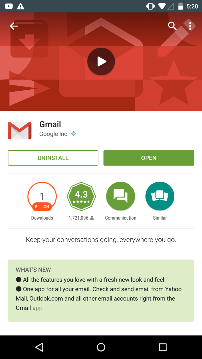
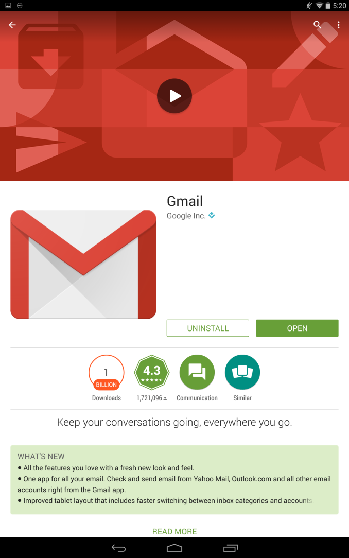
The third issue, and the one that I find to be the most significant and shocking is Google's own leadership in this space. During my time with the Venue 8, I actually found that the most poorly designed applications were ones made by Google. While I could find some third party applications like Flipboard and Skype that at least attempt to have good tablet interfaces, every Google application except for Gmail did not even attempt to present a suitable tablet interface.
Above you can see the Google Play application on the Venue 8 compared to its appearance on the Nexus 6. While the user with the Venue 8 has to carry around a significantly larger device, they're not getting much use out of it with regards to the amount of information they see on screen. This almost comically large interface exists throughout the Google Play application, as well as many of Google's other apps.
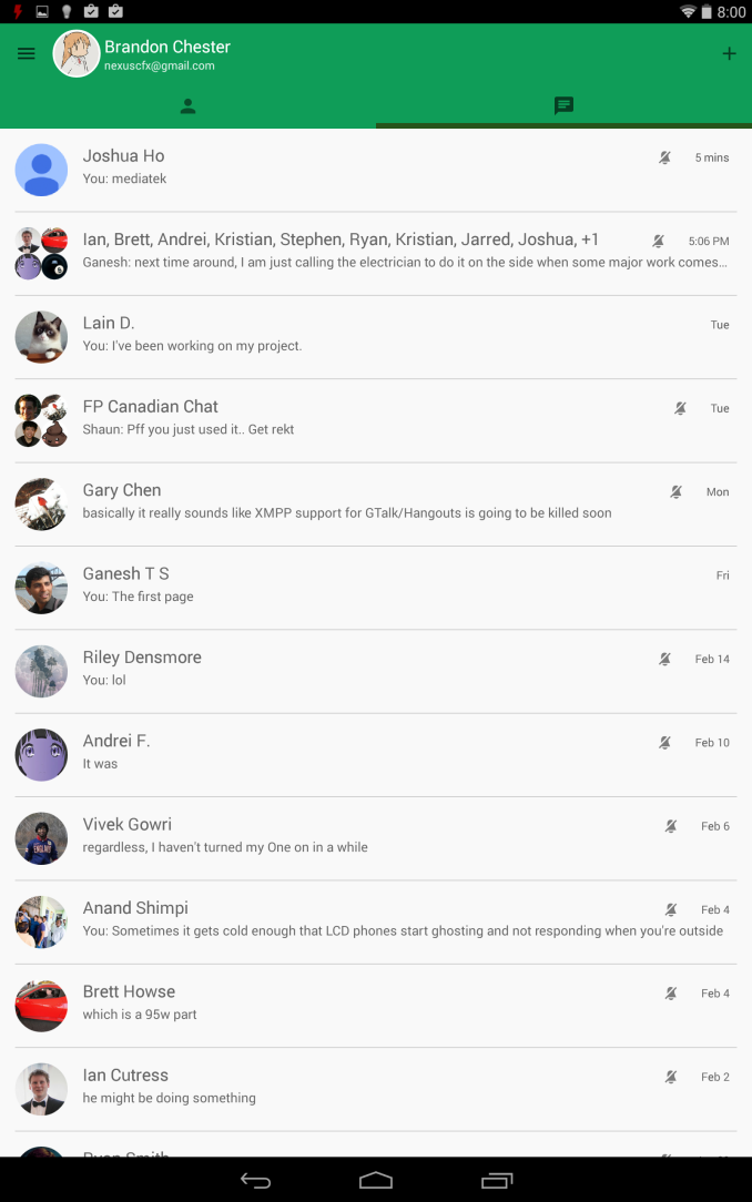
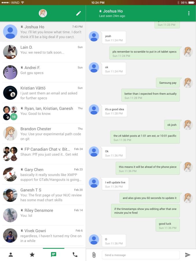
The Hangouts app is a good example of both the issues with the 16:10 aspect ratio in making tablet applications, as well a somewhat shocking lack of focus on Android tablet apps from Google. As you can see above, the Hangouts application on Android tablets is essentially an enlarged version of the phone application, with more conversations visible due to the size of the display.
The iOS application is completely different from its phone counterpart, with a segmented layout that allows the list of conversations to be seen alongside an open conversation. This is a common interface for messaging application on iPad, and it would be quite cramped if attempted on a 16:10 device in portrait mode. However, in landscape mode both tablets should be capable of displaying a segmented view, yet Google has done no such thing with the Android app and simply has it stretch out horizontally. It's honestly an embarrassing situation for what should be the prime examples for developers of how to do tablet apps correctly on Android.
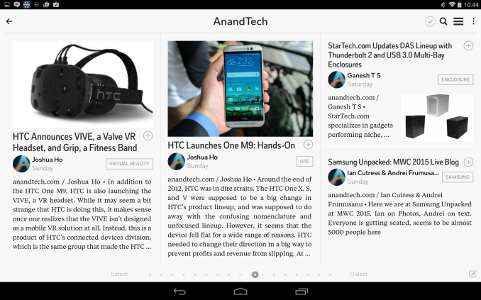
However, as I said earlier, there are notable examples of popular apps that have embraced the ability of Android tablets to display much more information than smartphones. Flipboard is a good example. It shows more tiles than its smartphone counterpart in portrait, and has a special interface for landscape that doesn't even exist in the smartphone layout. While it doesn't show quite as much text on the tiles as the iPad app due to the limited number of vertical pixels when using a 16:10 display in landscape, it's still a great tablet application on Android and something I would point to as an example for other developers to look at.
The issues with tablet applications is not something that Dell or any other tablet vendor can control, but it's something that needs to be discussed so users are aware of what they're getting into. I honestly can't lay any of the blame with third party developers on Android either, because they've been put in a difficult position by the more narrow 16:10 aspect ratio of these devices, and have had absolutely no leadership from Google on how to make great apps. If Google can't be bothered to do it, I don't see how other developers can be expected to. My fear is that even with Google making improvements to apps like Gmail, that it may be far too late to get proper support from developers at this point.




89 Comments
View All Comments
ruthan - Thursday, March 12, 2015 - link
Tablets without integrated 3G/4G/LTE modem are absolute, tablet for home use is ridiculous, same using with cell phone Wifi hotspot.althaz - Thursday, March 12, 2015 - link
Tablets with integrated modem are absolute garbage. Not using your existing phone or wi-fi connection for internet is simply ridiculous.Gunbuster - Thursday, March 12, 2015 - link
Not to mention they keep trying to unload really terrible tablets with built in modems. My Verizon guy keeps emailing about the Ellipsis 7 Crap Tablet. yeah no thanks...secretmanofagent - Thursday, March 12, 2015 - link
Cell phones are absolute garbage. Not using your own body as a mobile hotspot is simply ridiculous.wewantsthering - Thursday, March 12, 2015 - link
You should win a prize for this comment! Laughed so hard! :-)p1esk - Thursday, March 12, 2015 - link
Nice!akdj - Friday, March 13, 2015 - link
Unless you 'need' your phone for the day, 'using your existing phone (sic wifi) for Internet is ridiculous'. Indeed. I concurBut as an owner of each iPad. A half dozen Android tabs, ½ with, ½ without LTE --- I've YET to find an iPad 'with an intersted modem (that is) "absolute garbage"'
My iPad Air 2 is getting consistent speeds of 60-75 Mb/s down, 45-50 up. That's fast as hell without wires. And consistently stable. Maybe it's time you tried 'one' (ya know, with a modem?)
Sushisamurai - Sunday, March 15, 2015 - link
The above comments are pretty funny, especially with the sarcasm, for those who didn't catch that.As for cellular hotspots, I don't see what's the issue? In today's world, there's a multitude of ways to charge your phone on the go - in the car, at the office, while ur walking, pushing a stroller, riding your bicycle, a mobile battery pack, a solar powered battery pack etc. I would also assume that most wireless carriers also offer free wifi at certain locations just for being a data subscriber (at least where I live, we have this feature; the concept was to remove congestion from the 3G/4G networks in higher density areas). So, even if I didn't have a cellular data modem in my ipad, the coffee shop or random place I'm at usually has some form of free wifi or at least my subscriber's wifi. For the odd times I dont, I just use my cellular hotspot. It also costs less per month as I don't need a tablet data plan. I have a mini with LTE and with my purchases of the Air 2, I opted for wifi, as I barely used my LTE data on the mini
phoenix_rizzen - Monday, March 16, 2015 - link
How does that work when your phone isn't in the same location as your tablet, and you want to access the Internet from the tablet, and there isn't wifi available?WereCatf - Thursday, March 12, 2015 - link
"tablet for home use is ridiculous" -- Uh, why? If you only want to consume content why in your mind would a laptop or a desktop be somehow utterly superior?