The Huawei Ascend Mate 7 Review
by Andrei Frumusanu on December 2, 2014 8:00 AM EST- Posted in
- Smartphones
- Huawei
- Mobile
- Ascend Mate 7
- HiSilicon
User Interface - Emotion UI 3.0
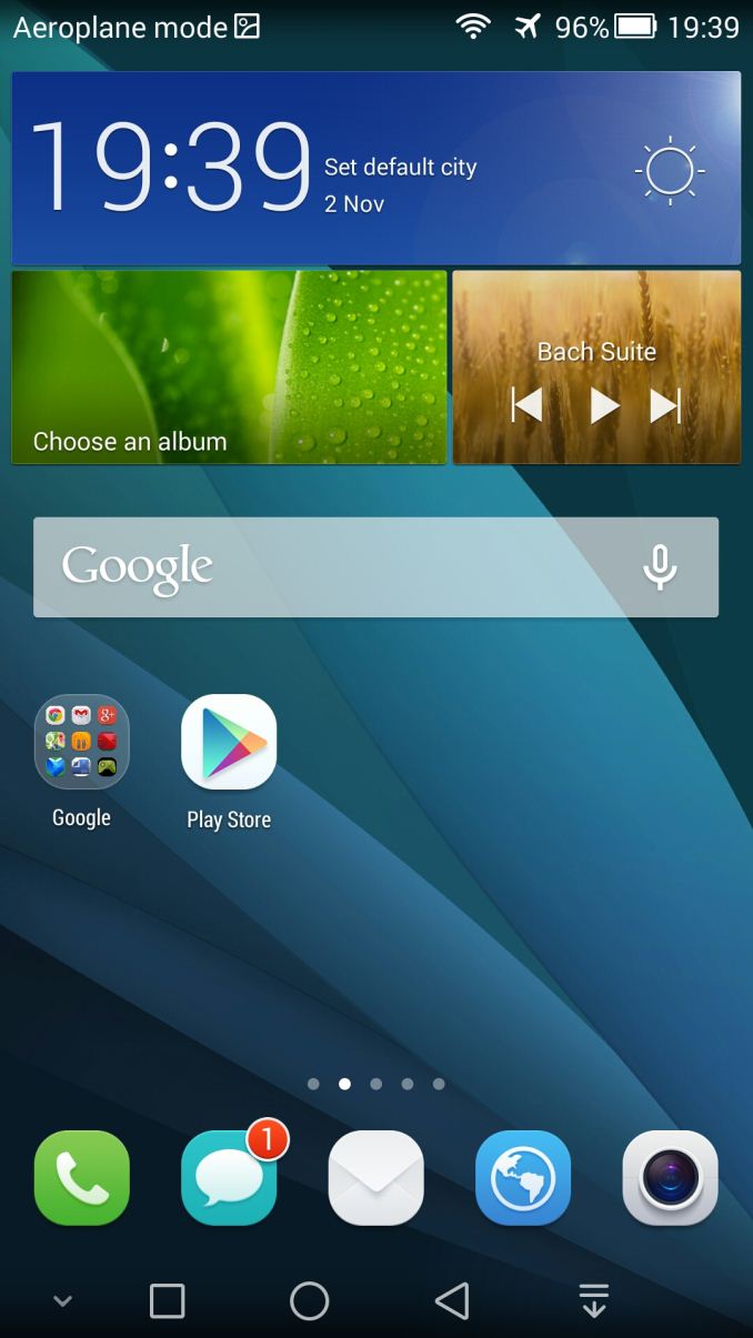
We've seen our first taste of Huawei's direction in UI design in my Honor 6 review. With the Mate 7 Huawei also introduced their new design language and overhaul of Emotion UI. Version 3.0 is basically a complete fresh take in terms of looks while still keeping the additional functionality that Huawei seems to be very good at to differentiate themselves from other vendors.
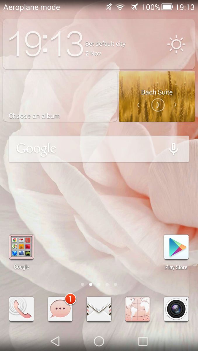
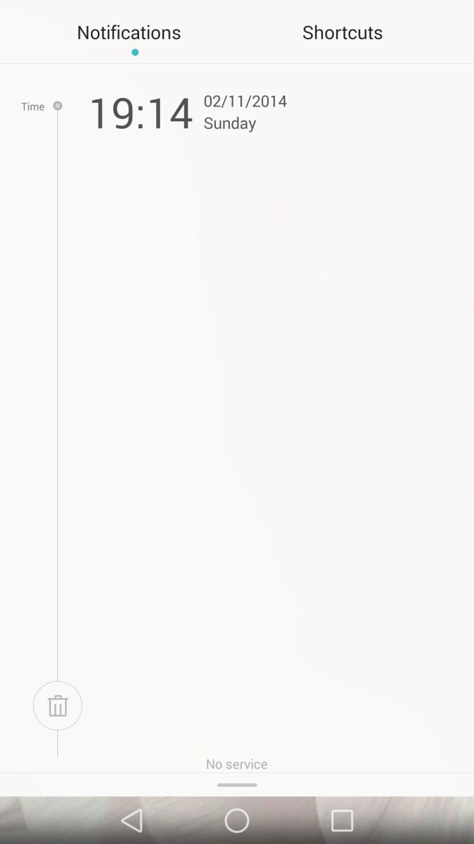
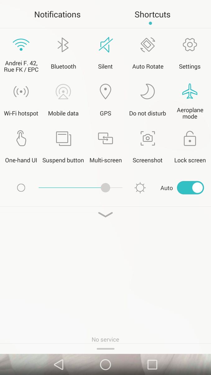
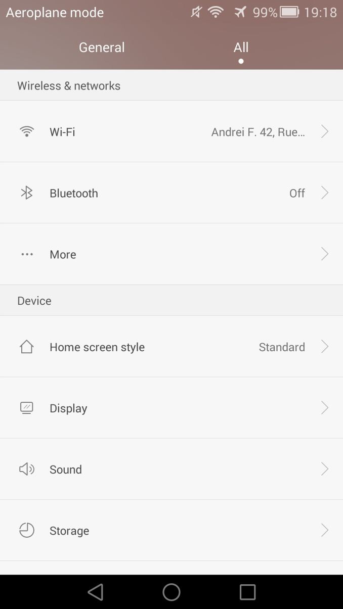
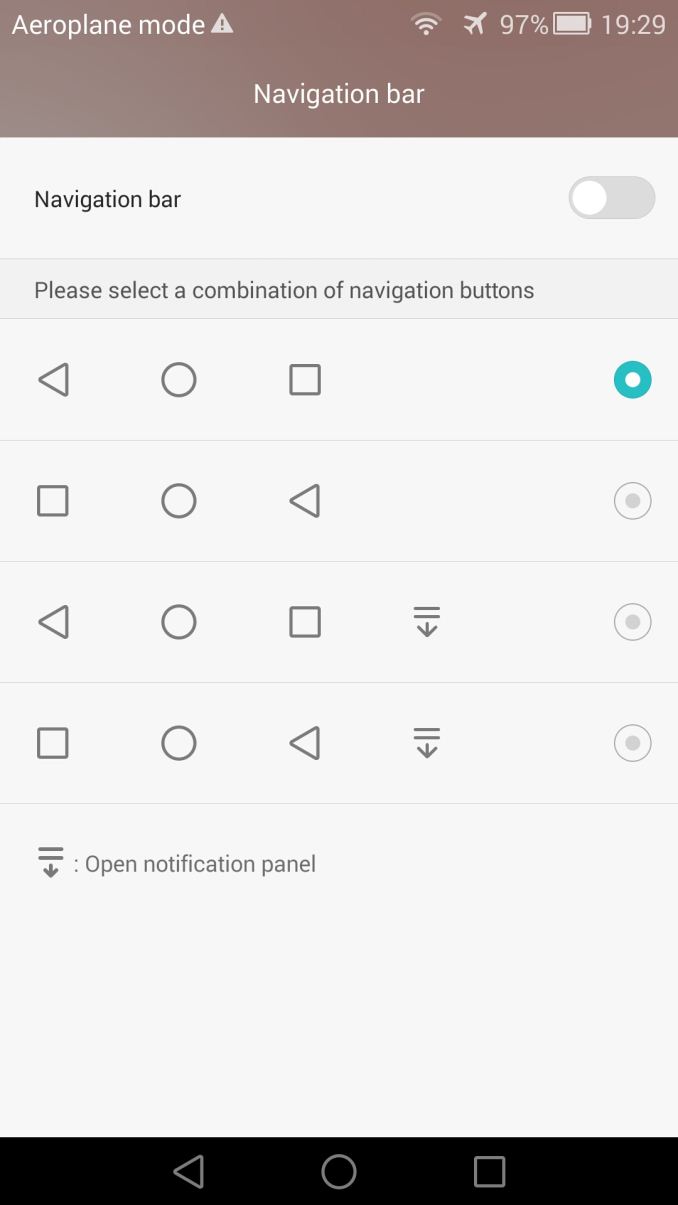
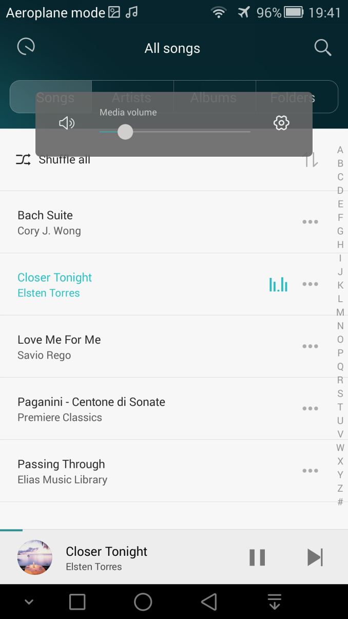
The basic skin that covers the notification shade and the settings menus employs a very minimalistic and white colour scheme. Simplistic icons throughout the interface offer one of the more conservative interface experiences on Android. I'd even be pressed to say that I preferred the more colourful icons in EmUI 2.3 as they added more diversity. This might not be at all an issue to most users as the main interface and colours in most applications is determined by the user applied theme.
The phone comes with a theme manager and allows for download of a wide variety of skins offered in its online browsing catalogue. Themes now also are able to set basic colour schemes of the built-in applications, meaning there's something there for everybody's taste.
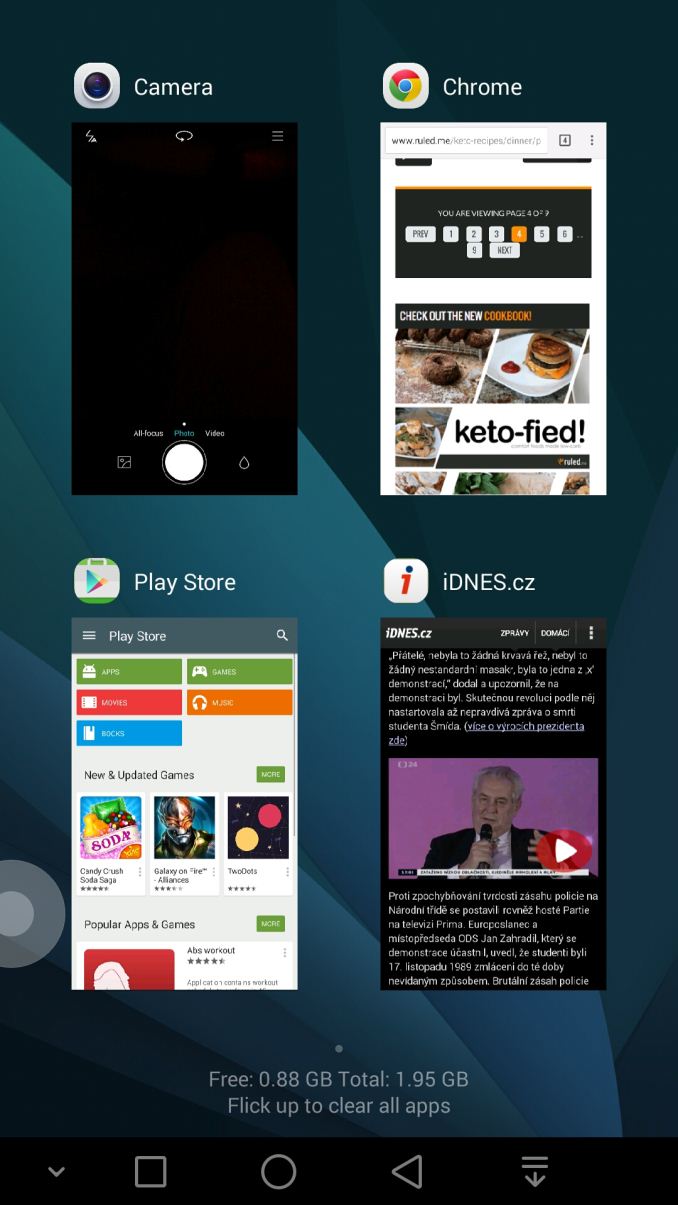
The recent tasks menu has also received a unique design, instead of having a linear list of screen caps or a card design as found in Android 5.0, Huawei offers a "tabbed" interface, showing 4 applications per screen and swipeable screens to be able to scroll through the tab windows. Swiping a tab up closes the application, swiping it down locks it from being closed by the memory manager. Alternatively you can swipe from the bottom of the screen to close all apps.
I find this very convoluted and actually impractical compared to the stock Android recent tasks screen, it adds nothing in terms of usability and even prevents you from quickly reaching an application which was less recently used as you have to swipe screens to search for it.
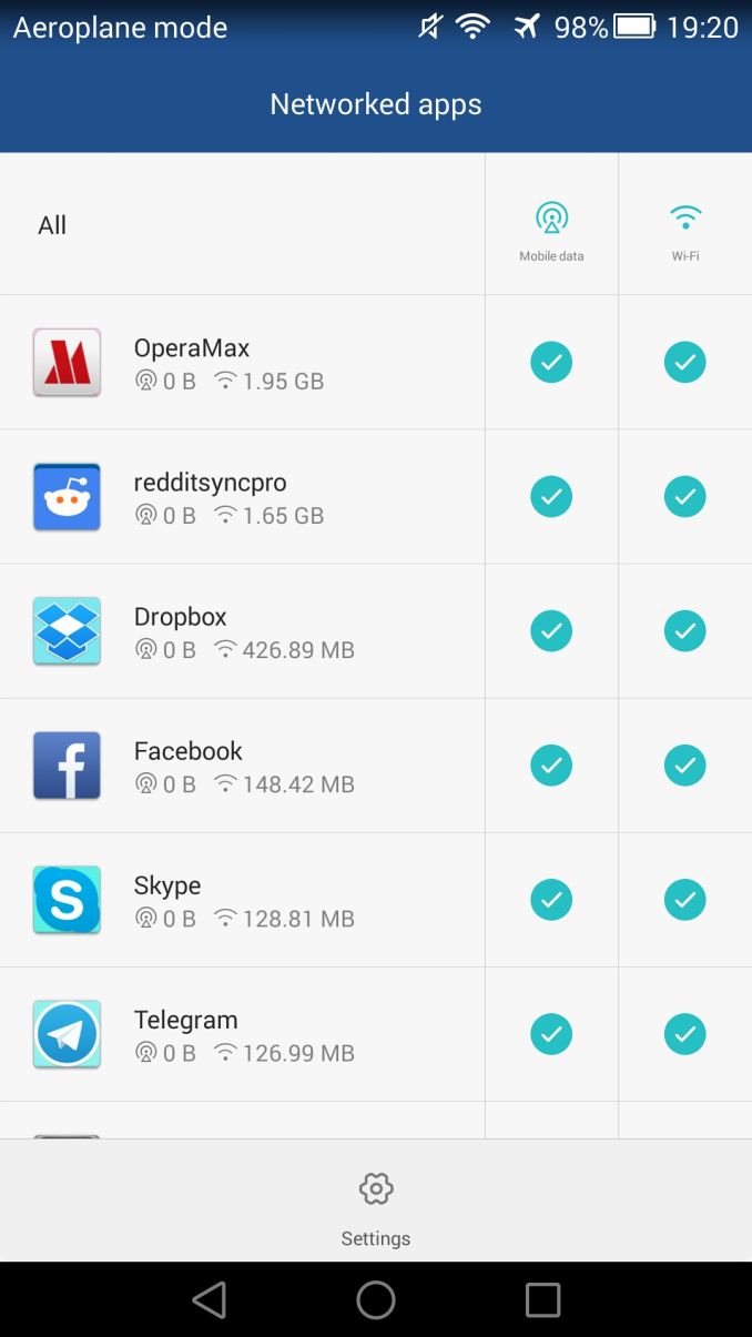
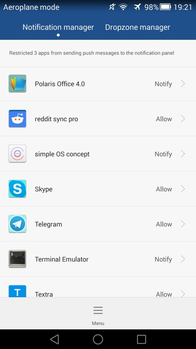
I've praised Huawei's modification of Android in EmUI 2.3 - luckily we find the same functionality again here in EmUI 3.0. Huawei provides fine-granularity controls over installed applications on the phone. As such, you're able to determine network access (WiFi or mobile data) on a per-app basis in the Network Manager, while also monitoring their data usage. A Notification Manager enables you to control which applications are allowed to push notifications to the system, giving the possibility to have apps prompt, or directly whitelist or blacklist them.
The Permission Manager is also extremely competent, almost totally foregoing Android's built-in permission settings. You can have an application prompt for specific permissions whenever they actually need them, and accept or deny them on a per-app, per-permission basis. The Android app ecosystem has an issue with applications requesting a lot of, sometimes dubious permissions. I see this as Huawei's attempt at alleviating user concerns about security. For those who think this might be a too bothersome system - I strongly disagree; it is not very intrusive, while still being able to provide lots of power of control.
The Battery and Power Consumption managers again offer lots of information - Huawei seems to be very strict in trying to reign in power abusive and misbehaving applications. If you have an application which is running in the background and taking up a more-than normal amount of CPU cycles a notification warning will tell you about it and give you the possibility to kill the app. A manager dedicated to listing the background power of all applications on the phone enables you to identify power drains.
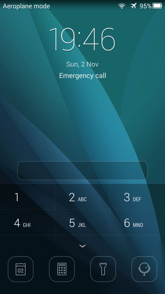
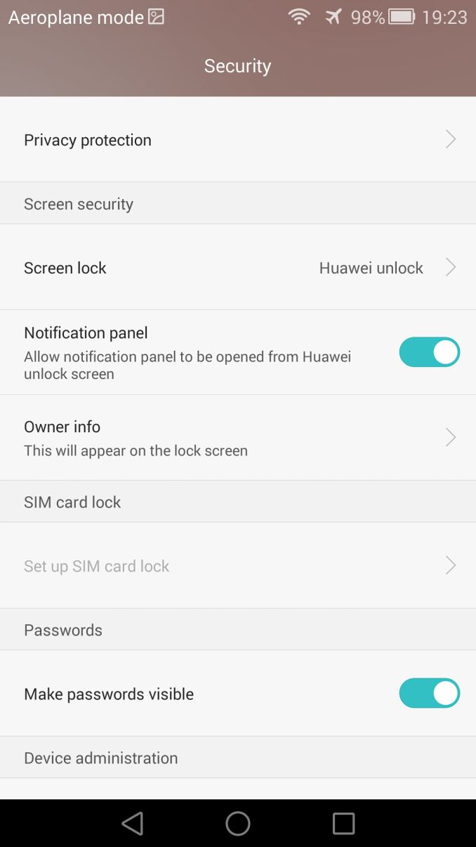
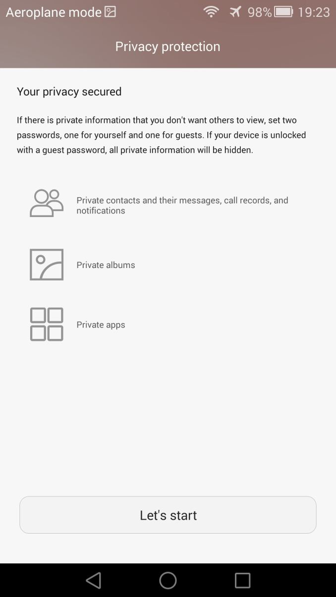
A totally new feature in EmUI 3.0 is the introduction of a vast array of new security and privacy features. With the introduction of the fingerprint sensor, Huawei is able to implement easily accessible privacy features on the phone. Beyond the obvious unlocking via the fingerprint sensor, you can also use your fingerprint to protect contacts, and message conversations, private albums and even per-app locking mechanism.
The album and application locking mechanisms is what I see people actually would be using pretty often. Being able to lock certain parts of your phone while still being able to not fear to give your phone to your friend or family member is a great feature that should avoid many embarrassing moments for some people. How it works is that the OS asks for a fingerprint scan (or passcode fallback) any time you access a given album or application.
Overall Huawei offers a lot in terms of software. EmotionUI 3.0 is a great overhaul over version 2.3 and might subjectively be one of the more attractive Android OEM skins. Aside from the recent tasks screen I don't have much critique in terms of functionality of the OS. Huawei continues to pack in unique features into the OS without affecting performance or overly bloating the device.







72 Comments
View All Comments
tipoo - Tuesday, December 2, 2014 - link
Really appreciate you guys reviewing some of the more niche phones! I was interested in this as well as the Oneplus, both got reviews I never expected.beehofer - Tuesday, December 2, 2014 - link
Nice but I'm wondering what Anandtech has against Sony? Why no Z3 or Z3C reviews. Hmmmm.Moizy - Tuesday, December 2, 2014 - link
They review the phones manufacturers provide for them. So if no Sony phones are being reviewed, that means Sony isn't giving them any phones to review. Perhaps you'd like to send them a Sony for them to review?beehofer - Tuesday, December 2, 2014 - link
If only I had the resources for that :)NeoteriX - Sunday, December 7, 2014 - link
...then maybe you should think again before jumping to conclusions and spouting your mouth off with accusations.techcrazy - Tuesday, December 2, 2014 - link
Do they really need a manufacturer to provide them phones? AnandTech Has enough money to buy any particular cellphone. Sony Xperia Z3 and Z3 compact are considered one of the best android phones of the year. AnandTech is my favorite tech review site, seeing they're not reviewing one of the best phones of the year is really disappointing. Unless Sony specifically asked them not to review their products i think AnandTech should review Xperia Z3 lines products. At least I really want to see them review Z3 Compact.JarredWalton - Tuesday, December 2, 2014 - link
While I'm sure AnandTech could afford to buy a device on occasion for review (and we've done so in the past), ultimately that doesn't work out -- there's always another device some people will want us to review. "Hey, you bought XYZ; it's not fair that you didn't also buy and review UVW, ABC, QRS, ...." Buying and reviewing (or not reviewing if it's not worth the time?) every product just can't be supported in a realistic manner I don't think.Fundamentally, there's also the question of reviewer throughput -- how many people are needed to review every potentially interesting device? And can AnandTech afford to pay them? We have coverage of most major categories, but simply increasing the amount of content on a site doesn't linearly increase the site revenues, so there's a balancing act. And you still need quality content, not just a deluge of "me too" stuff.
mkozakewich - Tuesday, December 2, 2014 - link
This isn't just "potentially interesting," though. Sony has released some new and different stuff, but it's barely even mentioned. I sometimes forget they're making high-end devices.I don't know how feasible it would be to borrow handsets if someone in your area is willing to lend theirs to you.
garretelder - Thursday, December 4, 2014 - link
The The Huawei Ascend Mate 7 is far from one of the better phones if you ask me! /Garret http://www.topreport.org/phones/Ethos Evoss - Wednesday, December 17, 2014 - link
dont understand what u mean .. do u have it ? u even didnt hold it in hands .. and u judging ..