The HTC One (M8) Review
by Anand Lal Shimpi & Joshua Ho on March 26, 2014 7:00 PM EST- Posted in
- Smartphones
- HTC
- Mobile
- HTC One
Sense 6.0
More than any other OEM, HTC’s Sense UI has continued to be a defining part of its product lineup for better or worse. It’s not uncommon to hear the refrain that HTC is wasting its time on Sense and that they should really stop trying to reinvent the wheel and focus upon adding features to an AOSP UI rather than make their own, following in the footsteps of Motorola. While this seems reasonable, historically HTC has done well because of its TouchFLO/Sense UI rather than suffered from it. While modern Android is a relatively well-designed GUI without any skin on top of it, Windows Mobile was effectively impossible to navigate without a stylus and was pretty close to unusable without a UI like HTC’s TouchFLO. TouchFLO was a huge selling point at the time because it turned Windows Mobile into something actually usable with a finger. The same also applied to early versions of Android, which were similarly in need of OEM UIs to bring some semblance of usability out of the box and a user interface that was consistent and relatively intuitive.
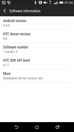
That leads us to Sense 6, HTC’s latest incarnation of their custom UX. If you read nothing else in this entire section, all you need to know is that Sense 6 is one of the most usable OEM UIs on the market, when it comes to UIs that deviate from the AOSP UI style. Of course, once at a certain point it does become a great deal of user preference, but few OEM UIs ever actually reach that point. HTC is launching Sense 6 on Android 4.4.2, so unlike last year HTC isn’t launching with a version of Android that’s already out of date. With Android 4.4 comes all the caveats that one might expect. HTC has stopped backporting Flash Player to work with the stock browser, the transparent status bar UI is present and fully working, immersive mode also works with supported applications such as YouTube, and the gallery, there’s a printing service in the settings menu, microSD now requires system signature in order to have global write access, and for anyone wanting to know more about what has changed in Android OS, I’d refer to Brian’s writeup on Android 4.4 in the Nexus 5 review.
 |
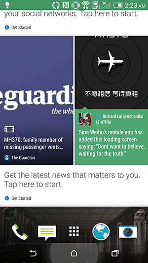 |
Above Android OS is what’s truly different between the 2013 and 2014 versions of the One, although Sense 6 should come to the former version if the past is anything to go by. BlinkFeed has been mildly changed, with the clock and weather application removed from BlinkFeed and the entire UI changed from a paginated UI to a free-scrolling one, although the scrolling is noticeably limited in its maximum velocity, presumably to avoid stuttering from image loading. As in Sense 5, tapping the status bar or pressing either the home or back button will return the feed to the top so this isn’t a major issue. HTC has added more services and applications, such as real time restaurant recommendations and FitBit fitness tracking to BlinkFeed, and significantly more granularity in the feeds that can be selected in the default topics. As always, it’s possible to add custom feeds by searching for a given keyword or by going to an RSS feed in the browser.
 |
 |
Last year, general consensus on BlinkFeed was that it was effectively just another gimmick to try and sell the One, and with the initial release of Sense 5, I was rather inclined to agree. For the most part it didn’t really have a lot of useful information floated to the top, but with Sense 5.5 and some of the new additions to Sense 6, I’ve found that it does serve as a useful aggregator of content when it comes to reading the news. When a feed says “highlights”, it’s definitely true. Only the major news of the day will show up in the feed, and it really does help to be an effective source of information. The picture-based format helps to also see things at a glance rather than getting bogged down with excessive depth. It’s great to also have a visible reminder for calendar events and similar cases where novel information can be floated to the top.
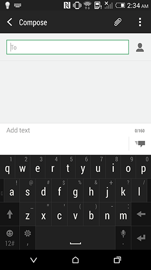
HTC also continues to be one of the only OEMs that seems to be capable of making a keyboard that is usable without being an aesthetic mess. The keyboard in Sense 6 is a mild refresh of the one from Sense 5. The same swipe to the right/left will switch to the number/symbol menu and back, bilingual prediction is also present, along with next word prediction, the trace keyboard, and arrow key toggles. The only real difference here is that the noticeable texture and gradient in the keyboard of Sense 5 is gone and replaced with a flat-color version in Sense 6. The keypress indicator is also changed, with a soft grey glow rather than a blue outline of the key.
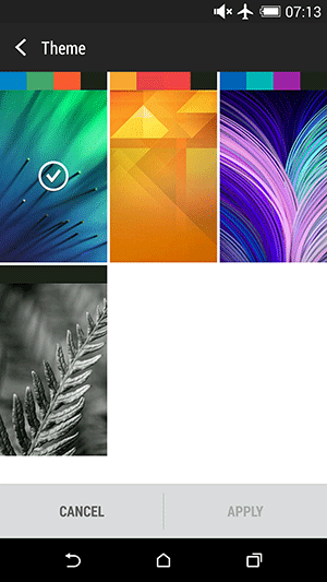
The other applications continue to follow AOSP design guidelines while infusing their own unique design, which is evidenced by applications like the dialer, which have Android design elements such as the transparent status bar, pivot bar, and Holo colors, but are clearly different from the AOSP dialer in interface and design. For the most part, the design of Sense 6 is similar to that of the design in Sense 5.x, but made flatter and generally more modern. For example, the accordion-like scroll effects of Sense 5.x are gone, and replaced with a simple bounce-back and flat colors throughout the settings menu. Some areas that proved to be confusing or otherwise difficult to use have been changed as well, such as the app drawer’s hidden settings menu that required a swipe down to view. Overall, the UI complements the new One quite well.
Motion Launch
With the M8 and Sense 6.0, HTC enabled a number of motion gestures for waking up the device. All of the motion gestures require that you first pickup the device, you can then turn on the display by double tapping on the screen, swiping up, left or right. A double tap just wakes the phone, swiping in a direction puts you on a particular homescreen. Swiping down launches voice dialing. It’s always interesting to me how quickly we see features implemented by one OEM incorporated into other designs. Unlike LG’s G2 however, the new One can’t use any motion gestures to put the device to sleep outside of the lockscreen. Double tap only wakes the device up (and only after you’ve picked it up), it won’t put the device back to sleep if you actually unlock the phone.
There’s a camera launch motion gesture as well: pick up and hold the One in landscape mode, then press and hold the volume down button.
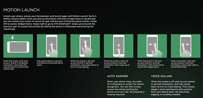
The wake gestures are a nice addition to the One, particularly given how tall the design became this generation. I almost never used the power button to wake the device, instead relying on HTC’s Motion Launch.
Sensor Hub
Another feature that’s all the rage these days is the inclusion of a discrete sensor fusion hub in any flagship smartphone. These are low power microprocessors that accept and store sensor input without waking up the primary SoC. Apple made a big deal about its M7 coprocessor (a sensor hub sourced from NXP), and HTC joins the fray with the new One.
An obvious fit for HTC's Sensor Hub is using the M8 as a pedometer. HTC will be shipping most of if not all M8s preloaded with the Fitbit app, which is capable of reading and accessing the device’s sensor hub. Unlike Apple’s M7, the sensor hub in the M8 doesn’t appear to always store the previous x-days of data but once you pair the One with the Fitbit app it’ll begin tracking. I carried both the One and the iPhone 5s with me and noticed similar step/distance counts between the two devices.


222 Comments
View All Comments
Grooveriding - Wednesday, March 26, 2014 - link
The best just got better!Only on page 2 so far, but it's looking excellent.
dylan522p - Wednesday, March 26, 2014 - link
While it's got flaws, all around best phone IMO. One weird thing is that even though HTC didn't advertise it, the One has passed water proofness tests in a sink for 2 hours..fokka - Wednesday, March 26, 2014 - link
i almost couldn't watch it... air slowly escaping out of the headphone port, like a fish slowly drowning. (wait a minute...)blanarahul - Wednesday, March 26, 2014 - link
Disappointed in the camera department. The camera is the single most important factor for me when buying a smartphone, so the One is a no go.blanarahul - Wednesday, March 26, 2014 - link
Btw, I am referring to the rear camera.HTC did a really awesome job by putting the power button on the top on a phone this tall.
They should have gone with capacitive buttons IMO. Atleast you wouldn't have to stare at the logo.
The S5 is the only remaining good phone for me (I have bad experiences with Sony's quality control, so Z2 is a no go). I just have to find a good back cover for it.
Cptn_Slo - Saturday, March 29, 2014 - link
actually, I think HTC is one of the few smart phone manufacturers to invest in specs that will actually make a difference rather than to impress idiots.shaolin95 - Tuesday, April 1, 2014 - link
Or fool idiots that think they are too smart...theduckofdeath - Tuesday, April 1, 2014 - link
The reality is, HTC cuts back on the internals simply to make up for the cost of vanity. Calling that "specs that makes sense" is a poor excuse, I think. :)noel_newell - Friday, October 3, 2014 - link
I agree, HTC One M8 is one fantastic phone and most sources seem to agree (my favorite source on the topic is http://www.consumertop.com/best-phone-guide/ ). The people that prefer Samsung or iPhone really haven't tried the M8. When my friends try out mine they are amazed.jonup - Thursday, March 27, 2014 - link
Can we turn off the broken record!? Listen, consumer does not need 8+MP camera other than for bragging rights. I bet you we can show a daylight picture taken on a One and S5 to 95% of the people on the street on a ~5" display and they will not tell which is higher resolution. Then we can do the same with a low light picture. You see what I did there!? ;) All I hear about every review out there is "oh the camera is only 4MP", especially the once paid off by Samsung. And all the people like you repeat it all day long. I have someone with an HTC M7 in the office along with iPnone 5s and my Nokia 925 and N5. Side by side shots with all 4 of them look pleasing to the eye. If you are into photography that you care so much about picture detail, you won't be using you phone to take pictures. You can overanalyze the picture quality but It's a mute, geeky point that makes for great marketing. When in reality, the way most of us use their phone camera, the HTC setup is the best camera setup out there. (obviously exaggerating a bit but you get the point) At the end of the day as Anand said it will end up compressed on social media and most likely will be displayed on a phone.