Samsung ATIV Smart PC: Revisiting Clover Trail Convertibles
by Vivek Gowri on March 18, 2013 12:00 AM ESTSamsung ATIV Smart PC: Design
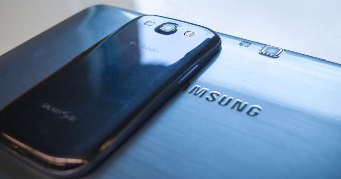
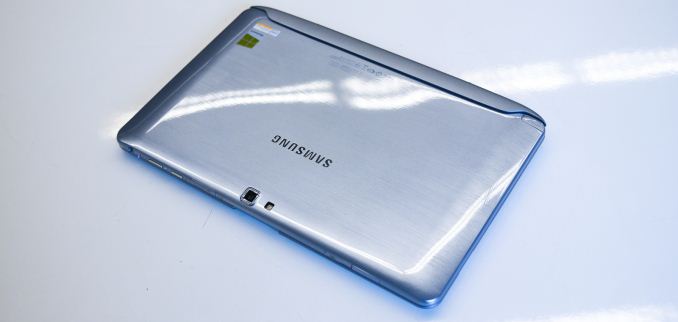
The ATIV Smart PC is unmistakably a Samsung design, for better or for worse. The front face is dominated by the display, along with details like the chrome-ringed Windows button, speakers placed on the right and left edges in similar fashion to the Galaxy Tab and Nexus 10, and the webcam and Samsung logo centered above the display. The bezel is uniformly three-quarters of an inch thick all the way around the screen, which allows for comfortable handling of the device without adding too much bulk to the footprint. The body is entirely glossy plastic, with contours similar to the rest of Samsung’s recent mobile industrial design language. The brushed plastic aesthetic in particular will be very familiar to anyone who has handled a pebble blue Galaxy S III or Galaxy Note II in recent times. This isn’t as dark a blue, but they’re clearly related products.
The ATIV Smart PC is kind of chunky though, with a width of 12” and a weight of 1.65lbs. It’s not that thin, either, though it does feel thicker than 9.9mm. It’s too big for ideal one handed use, and the dimensions of 10.1” slates (10.5” wide, roughly 1.25lbs) tend to be much better suited for that ergonomically. The problem though, with this slate in particular, is that it feels both bulky and not that well built. The plastic body offers pretty poor in hand feel, with a disconcerting amount of flex exhibited in normal day-to-day handling.
Samsung’s build quality on their plastic products has never thrilled me, particularly the original Galaxy S and Galaxy S III. They clearly know how to design a good looking computer, with their Series 7 and Series 9 notebooks and all-in-ones featuring attractive and well built aluminum bodies. The ATIV doesn’t even cut it from a plastic standpoint, with noticeable seams between the various injection molded plastic pieces that comprise the chassis. Next to the VivoTab, the Samsung feels bloated—the aluminum body of the ASUS is far higher quality and the thinner chassis is much better ergonomically. And compared to tablet design benchmarks like Surface and the iPad, it’s not even on the same planet.
Button and port placement is a bit haphazard, with microHDMI and volume controls on the right side, a USB port, 3.5mm combo jack, microSD card, and microSIM slot located on the top of the device, along with two chrome buttons (power and rotation lock) that are easy to confuse. One, the idea of a SIM slot on a device that doesn’t have a cellular radio is downright baffling. Two, all the ports have flaps. Three ports, a dummy SIM slot, and four flaps. It’s unclean, fiddly, and an industrial design faux pas in this day and age. I’m not necessarily the biggest fan of the top-mounted USB port, but at least it’s better than the ASUS VivoTab’s easy-to-lose and hard-to-replace dongle. Other miscellaneous design details: the raised chrome detailing around the webcam is very Galaxy S III-esque, the Wacom stylus on the side can be difficult to remove from the silo at times, and the Windows and Intel logo stickers on the back are the height of uncool.
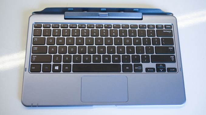
The keyboard dock is a definite bright spot. When you add it to the slate, the total size goes up to 3.1 pounds and 0.85” thick. It’s made of a matte plastic that feels better and more solid than the tablet, with a spacious and comfortable chiclet-style keyboard along with a buttonless ELAN multitouch trackpad. The dock also has two USB ports, one on either side, and both are covered by flaps (tragic).
The tablet connects to the dock with two clips and a 13 pin trapezoidal connector, and disengages with a button located at the center of the hinge. It’s a bit buggy at times—something about the electrical connection between dock and tablet occasionally goes on the fritz, resulting in a series of disconnections and reconnections usually fixed by adjusting the hinge angle or removing and reinserting the tablet. Unlike ASUS keyboard docks, the Samsung docks don’t include a battery. This results in a thinner, lighter dock, but having a second battery in the dock would probably be worth the extra bulk, for reasons I’ll discuss in the battery life section.
The ATIV Smart PC design and hardware is adequate, but honestly, based on the Windows tablets I’ve been dealing with in the last six months, I’d put Samsung behind Microsoft, ASUS, Vizio, and even Acer when it comes to Windows 8 tablet hardware design. Compared to the level of industrial design and quality we’ve come to expect from the current crop of tablets and ultrabooks, Samsung has really missed an opportunity to even be competitive here.


59 Comments
View All Comments
RollingCamel - Monday, March 18, 2013 - link
Just want to say TEAM17 make a decent touch-based Worms 2D and it'll sell like hot cakes. No need for fancy graphics just the old school 2D of Armageddon and World Party...nerd1 - Monday, March 18, 2013 - link
Too bad it took so long for this not-quite-long review....Personally I really hate any >10" tablet without inking capability, so it is actually great now OEMs are making tablets with active digitizers. I'd like to see the reviews for Thinkpad tablet 2 and Dell latitude 10 too.
VivekGowri - Monday, March 18, 2013 - link
Yeah, that was my bad, it got caught behind some other stuff and has spent a long time sitting at the 90% completion state. Will be more timely in future.hughtwg - Tuesday, March 19, 2013 - link
I had a Thinkpad Tablet 2. In general Windows 8 or more specifically the Modern UI has very poor pen support. You can't use the pen to move around the UI like you would use your finger. You have to use the pen to activate the scroll bars. Unfortunately the TPT2 has very poor pen calibraition particularly along the edges of the screen. This makes using the scroll bars in the Modern UI a real pain in the butt. This also holds true for trying to hit the close or resize button on any maximized windows in the desktop. These issues and the lack of a good dock/keyboard are why I sold my TPT2 and replaced with an an Envy X2.nerd1 - Wednesday, March 20, 2013 - link
The main use for pen is inking - I cannot understand the LACK of active pen makes Envy X2 any better device.hughtwg - Wednesday, March 20, 2013 - link
For me the main use of a pen is not having to touch the screen. I use the pen on my Note II 99% of the time and I never ink. While I would prefer a device that supported a pen the difficulty of navigating the Modern UI with a pen made it mostly useless to me.What makes the X2 a better device then the TPT2 is the keyboard , battery life, ports, and larger screen. For me anyway. YMMV.
I am as mad as hell - Monday, March 18, 2013 - link
1366x768... that's all I needed to read.VivekGowri - Monday, March 18, 2013 - link
You're not going to see higher than that on an Atom-based tablet, nor any of the RT slates. Disappointing reality, but I don't think Clover Trail would offer a satisfactory experience at 1080p anyways - maybe CT+?Snotling - Monday, March 18, 2013 - link
Do the test, plug in an old Atom netbook in a 1080p display... for everything except 3D games or HD video, it will be fine (and I'm talking OLD single core Atom) New Atoms are far more capable, especially for HD video.jeffkibuule - Monday, March 18, 2013 - link
My guess is battery life suffers running at 1080p resolution.