The HTC One Review
by Brian Klug on April 5, 2013 8:50 PM EST- Posted in
- Smartphones
- HTC
- Android
- Mobile
- HTC One
- Snapdragon 600
Sense 5
UI skins are generally a polarizing thing for Android users. On one hand, there’s a camp of enthusiasts who want nothing but the AOSP (Android Open Source Project) experience, the unadulterated version of Google’s Android platform which is reserved typically only for Google Experience Devices. Then there are enthusiasts who spend time crafting their own custom ROMs with features that are essentially analogous to skins, but somewhere in-between full-on OEM skins and the AOSP version of Android. At the other side of the spectrum we have what OEMs deliver which they believe adds value for normal — dare I say naïve — users who just want a smartphone. You have to realize that UI skins and OEM customizations are the result of the back and forth optimization function which takes place between operators and OEMs. The operator is trying to reduce returns and increase attachment and satisfaction, while the OEM has to somehow keep a middle ground without their platform becoming a homogenous mess and at the same time manage their own vision for the platform.
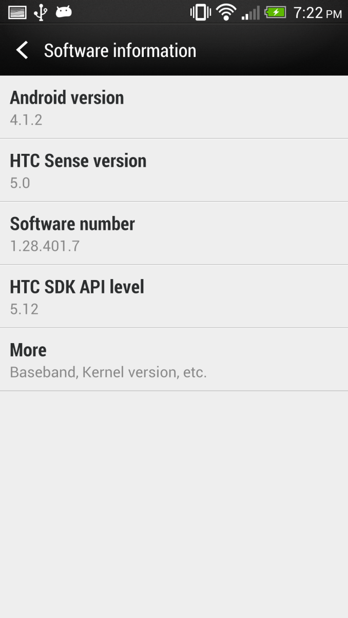
The HTC One is launching running Android 4.1.2, and the software that I’ve been testing is the final build for the hardware I’m using. At some point in the future, the HTC One will get an update to Android 4.2.x, but at this point I can live with 4.1.x, and HTC says it went with 4.1 for both stability and time to market reasons, which I think is reasonable considering some of the 4.2.x issues people have complained about, though 4.2.2 fixes most of it. At this point it would be awesome to have 4.2, but for a smartphone the only features I miss are the notification shade settings and perhaps photosphere. I’m sure Google I/O will make me want whatever version of Android comes out there, but for now the HTC One running 4.1 isn’t a problem.
The new Sense 5 experience is a re-imagining of what HTC’s idea of an Android experience should be. Sense 5 introduces a number of new features that HTC believes address the most common user work patterns on a smartphone, and at the same time creates an entirely different visual theme.
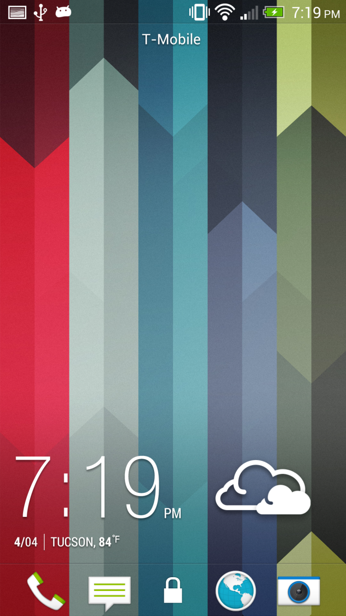
The Sense 5 UI does away with the rounded edges and 3D looking effects that previous iterations included and instead moves to a much more modern looking flat UI style. There are still some gradients here and there, but most of the places which previously had that late 2000s bubbly appearance to them have been smoothed over or flattened entirely. Perhaps the most striking difference is the move to Roboto Condensed for the system font, which looks amazing throughout the UI. I’m surprised Google doesn’t make more use of that font given how good it looks as a system font, just about the only place I’ve seen it in AOSP is during setup. HTC has also moved to their own flat iconography for system icons throughout, which look attractive and much different from the tacky, bubbly icons I’ve seen on various other Android skins I won’t name.
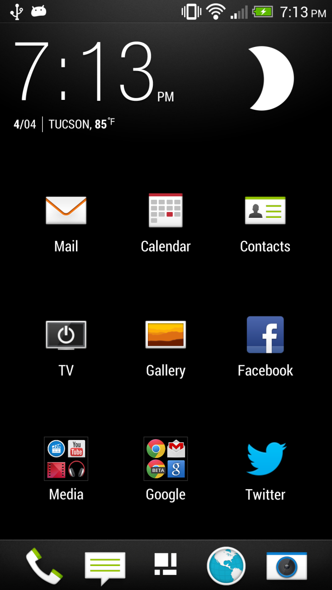
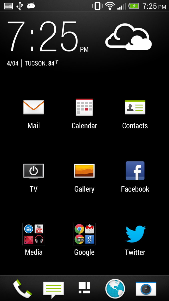
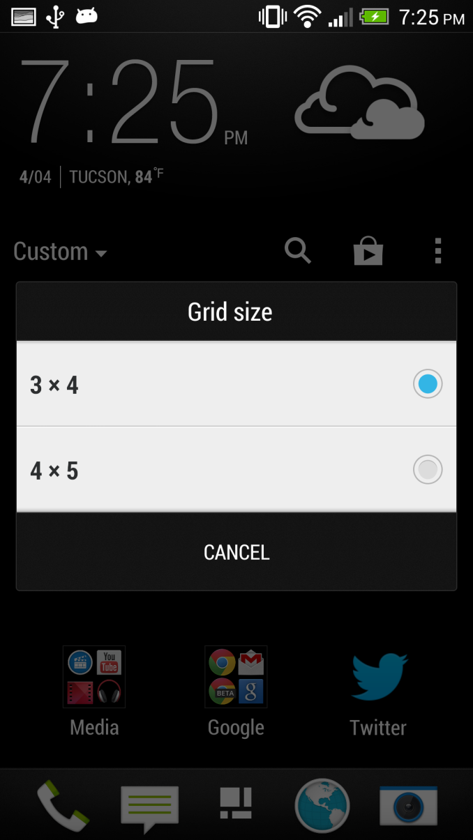
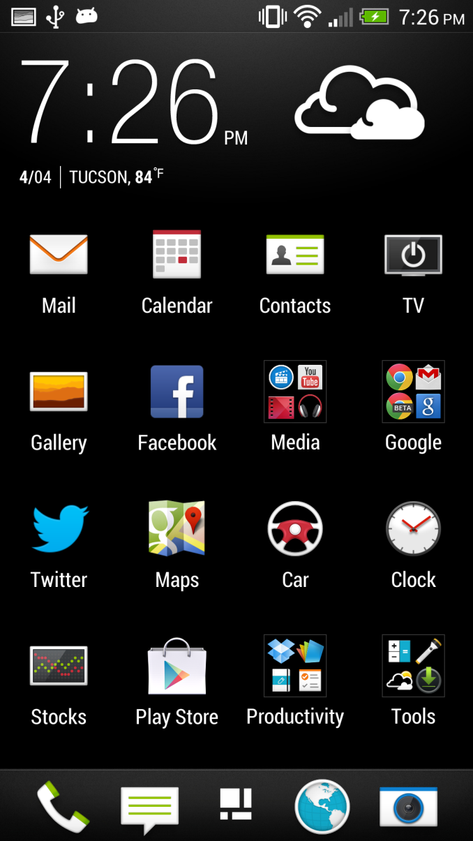
The application launcher gets a number of striking changes. First, by default the grid is a 3x4 arrangement which leaves a lot of negative space around the application icons themselves. The list is paginated vertically by default as well. There’s of course an option to return to the more dense 4x5 grid of icons, however, there’s something about the 3x4 grid which seems less intimidating, and that’s a lot of what HTC wants to do with Sense 5 — make Android less intimidating to normal users and the launcher less of a sea of icons.
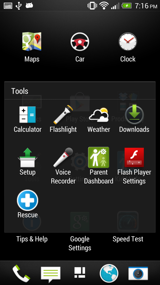
Probably the biggest new thing in the launcher is that there’s now some level of default organization. My biggest mental friction point when getting a new device is the soup of applications dumped in an ad-hoc fashion into the launcher on whatever new device I’m using. With the One, HTC is mandating order to the chaos, and there are no exceptions. Operators can preload applications, but they now will always be sorted into their own folder by default, rather than peppered all over the place. There are no exceptions to the organization mandate, their apps all live inside a folder with the operator name. The rest of the first party HTC applications are likewise sorted into some logical containers like Google, Media, Tools, and so on, not just an arbitrary mess. Of course all this can also be turned off, if you want a stock-looking 4x5 grid with an alphabetized list, it’s there for you to select.
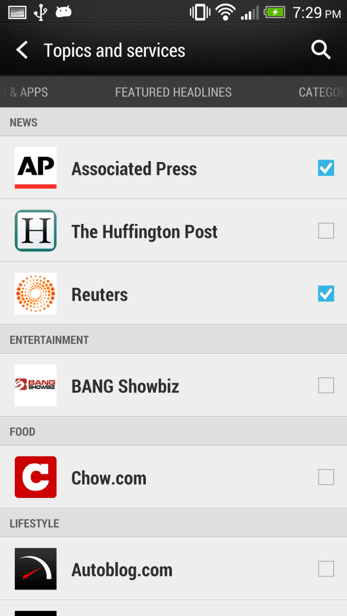
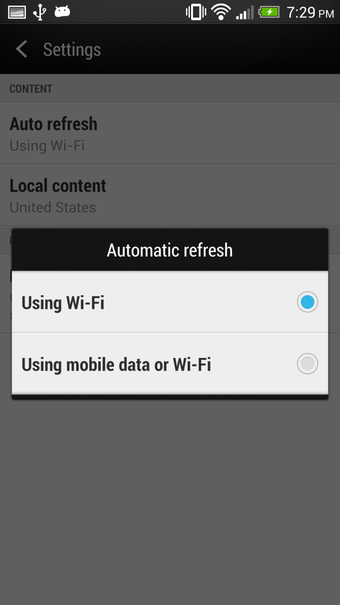
Probably the biggest new feature in Sense 5 is HTC’s BlinkFeed, which is a combination of local and remote content aggregator and optional home screen replacement. BlinkFeed aggregates media from accounts that are signed in on the device like Facebook and Twitter, as well as events from the gallery, calendar entries, and news from aggregation sources. HTC uses a third party content service called MobileRepublic to aggregate and bubble interesting stories, which it then exposes as feeds users can enable for consumption via BlinkFeed. By default BlinkFeed only auto refreshes when connected via WiFi, where it has essentially minimal impact on battery life. When on mobile, getting new data requires a pull to refresh the external feeds, though I’ve noticed that local data on the device will still get surfaced into BlinkFeed which makes sense. HTC says it wants to provide easily glanceable information for users to consume during idle periods. I should note that BlinkFeed by default is the home page, however it is entirely possible to change the home page in Sense 5 to one of the traditional widget panels and never have to look at BlinkFeed again. There’s no way to turn it completely off, but if you really want you can disable all the services and set the homepage to another widget panel. At launch there’s no support for arbitrary RSS feeds in BlinkFeed, but this obvious omission will supposedly get added in with a later update. RSS is on everyone’s mind right now after the loss of Google Reader, so I suspect this will come sooner rather than later.
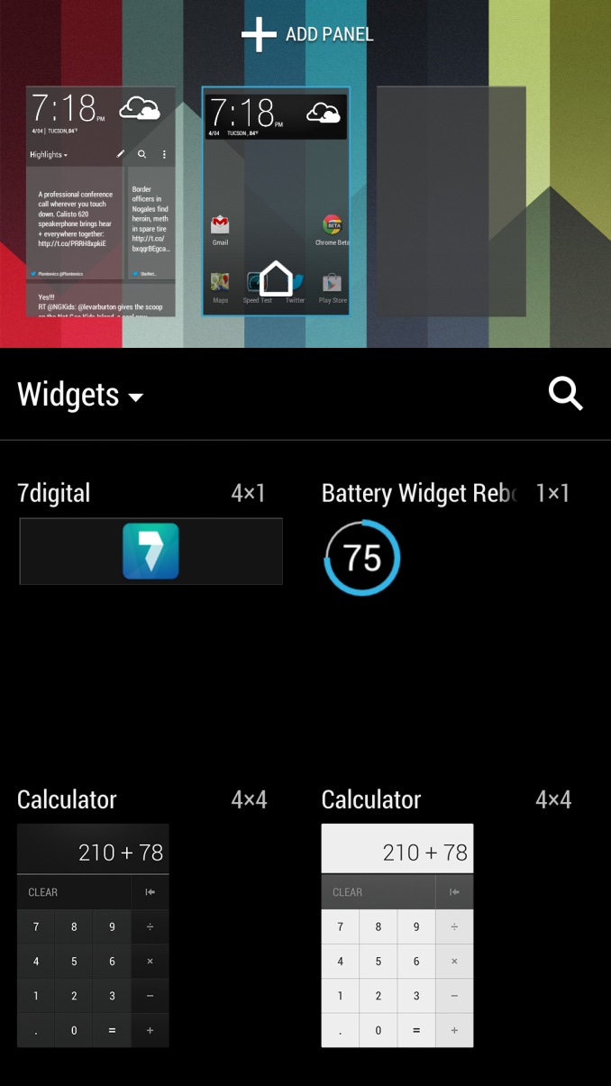
Again the traditional widget panels don’t really change much, and in Sense 5 you can have four of them in addition to the leftmost BlinkFeed homepage. HTC changed up their first party widgets as well, though the ever-familiar Sense clock and weather widget still is in there if you choose. Most of the widgets get the same nice flat themed UI and style, however.
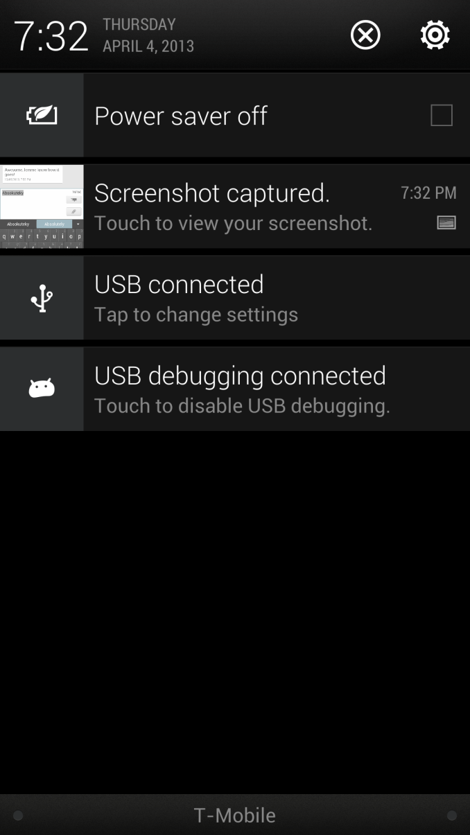
The notification shade is now cleaned up drastically as well from previous versions of Sense, there’s the shortcut into settings which we saw with 4.1, expandable notifications, and the time and date in Roboto Condensed. An always-present fixture is the power saver option, which seems like a bit of wasted space to have always present, but is a handy feature otherwise. Multitasking gets a big change with a 3x3 grid that shows the 9 last applications in the order which you used them. These can be dismissed by dragging up.
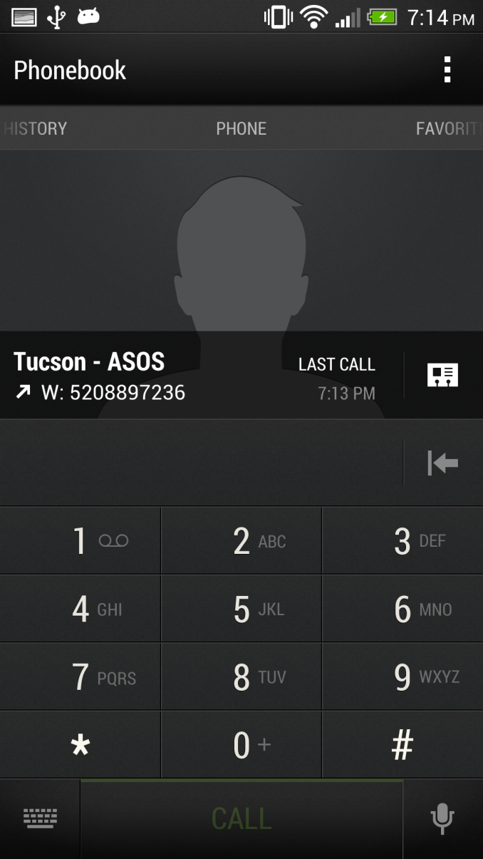
The rest of the first party applications in Sense 5 get a complete makeover too, many of which rely on a pivot bar design which is very Holo-like. It’s actually surprising to me how well HTC managed to stick to the pivot bar design pattern, even in ways that I haven’t seen the first party Google applications.
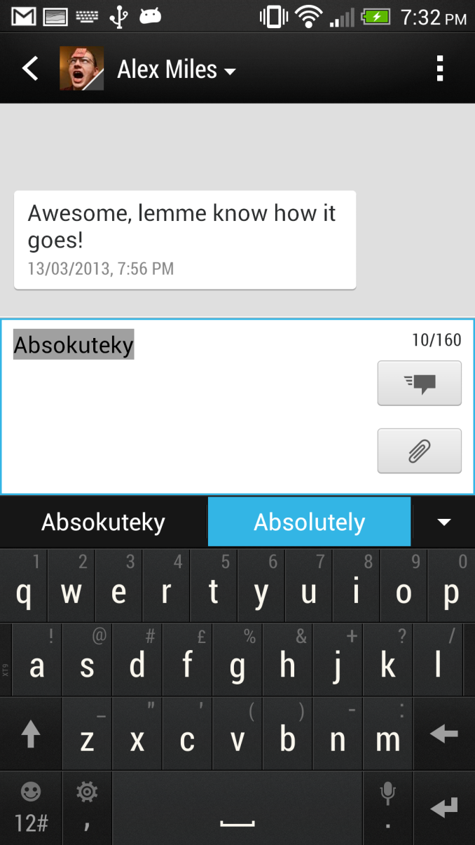
I spend a lot of time using messaging SMSing friends, and in Sense 5 most of the UI patterns are the same, however the opposed conversation dialog also gets a bit of a makeover and looks better. I still wish the compose box wasn’t nearly as big however, so I could view more of the conversation context. I feel like the send and attach buttons should be moved from the right side so that the conversation box starts out being one line tall and grows with the message, rather than starting with such huge size.
The stock keyboard also gets a makeover in Sense 5 to a design that is much cleaner and, you guessed it, flatter than the rounded virtual domes of Sense 4 and 4+. It matches the rest of the Sense 5 UI, however there don’t appear to be any major changes if you’re comparing the 4+ and 5 keyboards beyond visual style. There are still some issues with a few applications like Plume (which HTC and Plume trade blame on), and I can occasionally out-type autocorrection, but I was able to last longer with the Sense 5 keyboard before feeling the urge to jump ship to SwiftKey like I inevitably always do on any Android phone.
The combination of that pivot bar UI pattern, Roboto Condensed, as well as overall flat design, really make Sense 5 feel the most like Android 4.x of the skins I’ve seen in this last cycle or two. I have been using Sense 5 for a while now and don’t have a problem with it, in fact, it’s just about the cleanest and most sensible skin I’ve seen on Android to date. If you don’t like BlinkFeed, you can basically configure the home screen so that a widget panel is what you’ll see instead, however I’ve found myself discovering content from BlinkFeed far more often than expected. Now if only AnandTech was included as of the feed sources…
HTC Sense TV
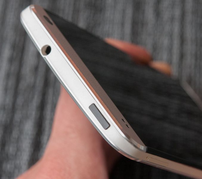
HTC has added TV control to the HTC One via a Consumer IR transmitter and receiver cleverly hidden in the power/standby button at the top. For whatever reason, IR went away after the Palm OS and Pocket PC days, never to really surface again. IR seems to be making a resurgence however in tablets or larger tablet-style phones, but the HTC One thankfully brings this back to the smartphone form factor.
With the One, HTC doesn’t want to replace the Logitech Harmony type universal remotes of the world, but rather try to make the smartphone you’re going to wind up holding while watching TV anyways a functional utility for controlling it. As such there’s no state machine like workflow on the One, and the instructions sometimes bear this out by asking you to press input until the right device appears.
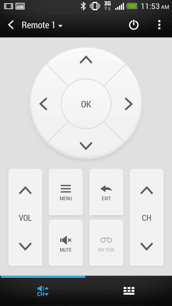
The TV experience is driven by a custom HTC application which uses Peel as the backend, and is pretty well done, though there are a few rough points in the UI. There’s some basic setup and configuration at first, with your market and either TV cable, satellite, or OTA package, and then download of device profiles. What’s great about marrying a smartphone with IR is that the device profiles are always online and easy to pull down, so now everyone can quickly hack hotel room TVs for the HDMI inputs or change channels at the sports bar or airport (though I’ve noticed airports are getting smarter about this lately). There’s no longer any need for me to cart around a Logitech universal remote and miniUSB cable for programming it when I want to use HDMI at a hotel that thinks locking it down is a wise endeavour.
The experience is pretty good. I admittedly pretty much never watch TV anymore, even OTA programming, but I can imagine this being more than just a little bit handy if you’re an avid TV watcher. There are alerts for shows you’re interested in or might be interested in, reminders, and supposedly good integration with set top boxes. Again I can’t really speak to any integration beyond OTA tuning on the TV itself since I haven’t had TV since I entered the dorms. I do however love having an IR port on my phone again — I can relive the shenanigans which played out while having an IR-enabled device in my pocket during high school.
There’s allegedly no official way to talk to IR devices in Android, for this HTC will open up an API through HTCdev and its OpenSense SDK to enable development of IR applications.
USB-OTG Support
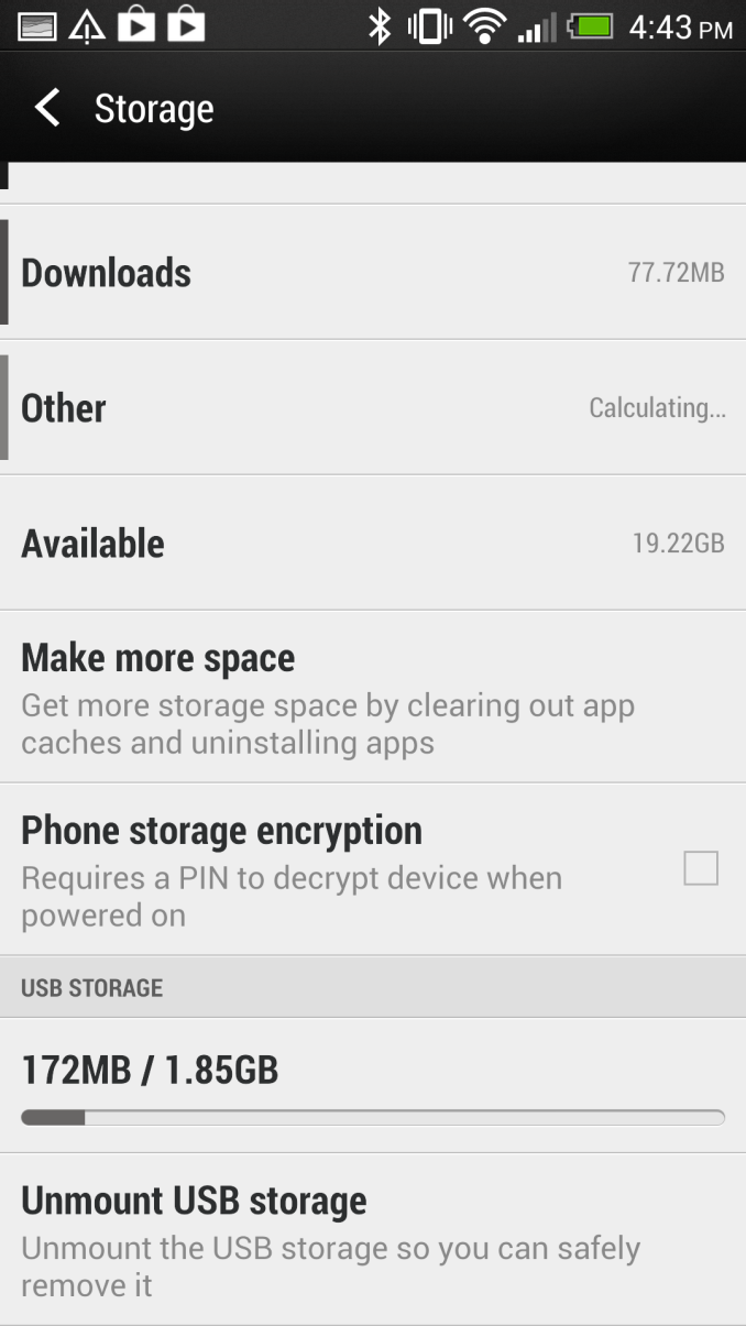
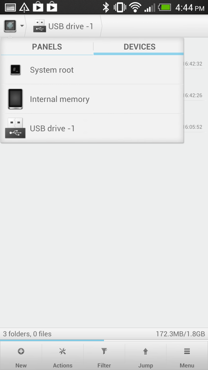
Lately I’ve been getting questions about USB On The Go (USB-OTG) support on just about every handset I test. With microSD cards going away for the most part, it does make sense to explore this somewhat. I tested the HTC One using a USB-OTG adapter I bought a while back, and can report that it does work with USB mass storage devices, keyboards, mice, and even hubs. I tried the USB ethernet adapter that I’ve used with the Galaxy Nexus and Nexus 7, but that didn’t work.
If you want to mount USB storage that’s totally a possibility on the One, I had no issues playing back media or browsing a simple USB flash drive attached to the device. In addition an SDXC card reader I attached over USB-OTG works, finally I can tweet JPEGs from my DSLR on the HTC One! It’s nice to see decent USB-OTG support included on the HTC One.


