ASUS VivoTab RT Review
by Vivek Gowri on October 23, 2012 3:01 PM EST- Posted in
- Asus
- Mobile
- Tablets
- Windows RT
- Vivo Tab
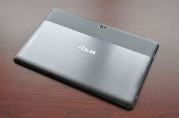
The VivoTab RT design is right in line with the last few Transformer releases - everything since the Transformer Prime has looked pretty similar, with a brushed metal aesthetic, chrome ASUS logo, and a mostly flat chassis with ergonomically curved edges. In the VivoTab, the top inch and a half is actually contoured plastic, while the rest of the back is brushed aluminum. The differences are all in the minor details, like the circular brushed aluminum finish from the Transformer Prime and Transformer Pad Infinity being replaced by a horizontal brushing, but the main design of the VivoTab RT is clearly derived from the Transformer line.
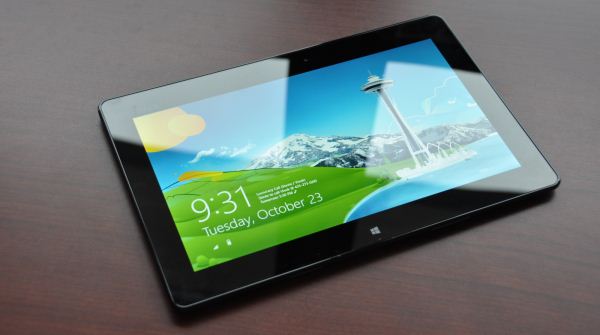
The front is almost identical to the Transformers as well, with one key exception - the capacitive Windows button located beneath the display. That means radiused edges, an ASUS logo silkscreened in the top left corner, and the weirdly off-center webcam. The buttons and ports are all located on the curved part of the chassis, with the power button on the top left corner, the headphone jack and volume control buttons on the right side, power/dock connector on the bottom (also weirdly off-center) along with latch points for the laptop dock, a latch release near the bottom of the left side, and finally the microSD card slot and microHDMI port also on the left side. Thankfully, the rear-facing camera is centered on the back and features a small LED flash alongside it.
This is the first time I’m seeing ASUS integrate the latch release slider on the tablet itself; previously that had always been located on the hinge of the dock. I don’t understand why they felt the need to locate the webcam and power connector away from the central axis, but it’s just a minor industrial design flaw that irks me and doesn’t affect the functionality in the slightest. Other ID nitpicks - the dummy microSD placeholder is just begging to be lost, and the plastic cover over the micro-HDMI port is fiddly and difficult to get on and off. Uncovered ports are the way to go - they just look and feel cleaner when integrated properly, like on the Transformer Infinity.
Speaking of the Infinity, the VivoTab uses the same NMT (nano molding technology) that debuted on the top of the line Android device earlier this year. NMT is described by ASUS as a process used to fuse plastic and aluminum particles together at a nano level using injection molding. I did a little bit more digging into the process and found that it involves a few steps. The stamped aluminum piece undergoes various surface treatment processes - first, being dipped in a basic solution to form a very fine etching on the surface - we’re talking nanoscopic scale here, with a surface roughness of 10 to 50 nanometers. The second surface treatment involves immersing the aluminum in a solvent that leaves the material covered by a thin film of amine (organic compounds formed by a basic nitrogen atom with a lone pair). Then a liquid thermoplastic resin is injected into the nanoscale dimples and react with the amines such that when the unit cools, the plastic is very strongly bonded to the original aluminum piece.
The thermoplastic compounds typically used in the NMT process are polyphenylene sulfide (PPS) or polybutylene terephthalate (PBT) depending on application, and can have a tensile strength of over 1500 psi. Both are highly crystalline engineering plastics, and exhibit significantly better mechanical and thermal characteristics than commodity plastics. The plastic infiltrates the aluminum during the injection molding and forms recesses that allow for a mechanical bond (ASUS uses the analogy of tree roots growing into the ground,) so the result is a composite material that is quite light. It allows internal plastic components to be integrated into the case, things like the internal frame and mounting points for the PCB and other various electronic components. This cuts down on additional part content by basically combining the internal frame with the external chassis, not to mention reducing or eliminating entirely the need for glue and fasteners. This in turn allows for thinner mechanical parts and a lighter and more structurally sound design overall. It’s pretty interesting stuff actually, and HTC was at one point rumoured to be making use of this technology as well.
I generally had no major issues with the design, except this: it felt too safe. Thin, light, and generally well-built, it does a good job of not making itself noticed. The “if it ain’t broke, don’t fix it” rule applies here, and it’s clear that ASUS didn’t want to mess too much with what has been a very successful design for them over the last twelve months. But in the face of some radical new redesigns for Windows RT and Windows 8 devices, I’d have liked to see ASUS take some risks here.
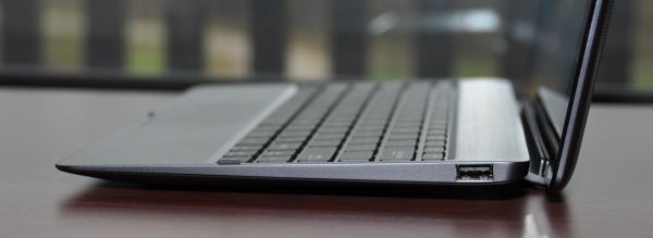
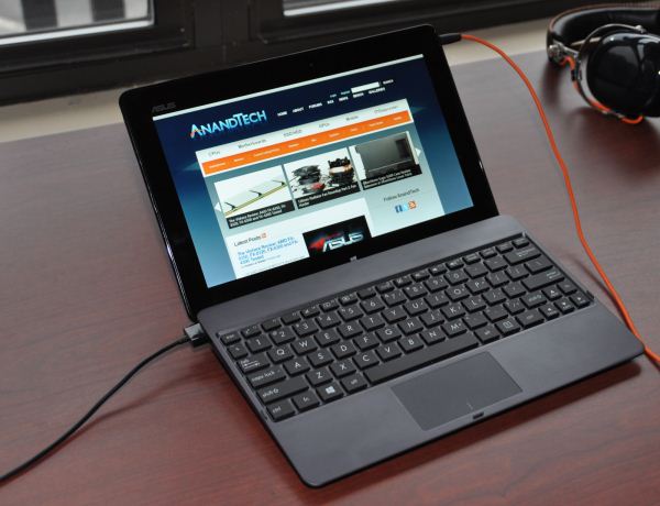
The dock has seen some updates as well, with each new Transformer shipping an iterated version of the trusty notebook dock. This is the newest yet, with a completely new unibody hinge design amongst other minor changes. I think the biggest difference is the latch mechanism, which has been moved to the tablet body. This gives the VivoTab RT the rather odd distinction of being one of the few slate tablets with moving mechanical assemblies (the Surface, of course, being another notable one). ASUS claims that makes it easier to dock and undock the tablet, which I disagree with, but it’s a minor usage difference. The dock features a 22Wh integrated battery that ASUS claims will extend the battery life of the tablet by another 7 hours. In addition, it has a USB port and the docking port. The 3.5mm audio jack is up at the top right corner, so it’s a little awkward looking when you have a headset plugged in. I’d categorize that as a minor ID flaw too, but it was a decision that was in all likelihood dictated by PCB layout, so I can’t fault them too much for it.
The keyboard remains pretty similar to what we’ve seen in the past, just with slightly different iconography and a Windows key replacing the Android home button. When docked, the capacitive Windows button on the tablet’s front face no longer works. Considering how difficult it is to press in when oriented as such, that’s not really a loss. The keys are obviously not full size, they’re about the same size as you used to find on netbooks - if you have small or nimble fingers, it’s not hard to get used to at all. I switched between a full sized desktop keyboard, a few different notebook keyboards, and the VivoTab dock without much trouble. Generally, I liked using the docking station, it was convenient, integrates seamlessly, and offers a pleasant typing experience. The amount of battery runtime it offers on top of that is simply awesome too - it’s incredibly liberating to literally never be concerned about whether or not your mobile computer has been charged. If I had an issue with it, it would be this: the dock takes an operating system designed around touchscreen input and puts it into a form factor optimized for mouse-based navigation - a natural segue to the next topic.





68 Comments
View All Comments
N4g4rok - Tuesday, October 23, 2012 - link
This review definitely made my view of Windows 8/RT tablets a little more optimistic. I'm still set on the Surface Pro or some other x86 capable Win8 Tablet, providing the price is right.Good to know RT is starting out so well. Let's hope the developers jump on it quickly.
andykins - Tuesday, October 23, 2012 - link
I'm really optimistic and excited about Win8/RT :Dtipoo - Tuesday, October 23, 2012 - link
Interesting that it goes from a wide lead in Sunspider to such a loss in the other tests, if I'm not mistaken the x86 IE10 does not have that kind of variance. So I wonder if it has to do with Tegra 3s memory bandwidth becoming an issue, or something else. However if it can beat the Nexus 7 by such a margin with a similar Tegra 3 that says good things about ARM IE10.lowlymarine - Tuesday, October 23, 2012 - link
Actually, that's right in line with x86 IE10. On my Core i3-based ASUS laptop, IE10 crushes every other browser at Sunspider but is only about half as fast as Chrome at Kraken and V8/Octane.Given these results and the results from the iPhone 5 review, it's clear that IE and Safari are locked in a "who can cheat more at Sunspider" contest.
VivekGowri - Tuesday, October 23, 2012 - link
Yeah, basically this. It's not much of a credible benchmark anymore, too many people are starting to optimize very heavily for it in software.The1nchicago - Tuesday, October 23, 2012 - link
This is the ONLY blog site I visit where I truly believe Anand opinion is not biased. I got blessed out by people for saying the Ipad Retina was not the greatest business tool. Glad someone shares my view in a sense.JKflipflop98 - Wednesday, October 24, 2012 - link
I think you mean that his bias matches your own.augiem - Tuesday, October 23, 2012 - link
"Side note: in Windows 8, particularly for normal notebook and desktop users, this is an entirely overblown issue - ... but people who claim that Windows 8 will ruin their desktops just sound ignorant to me. But I digress."This does not belong in a review of this tablet. And calling people ignorant who don't agree with you on how their workflow is affected by the changes to the UI is totally inappropriate.
Boogaloo - Tuesday, October 23, 2012 - link
If you've actually used win8 you'd agree with what he's saying. It's literally exactly the same as windows 7, except with a fancy startbar. The only way someone would profess something different is based on ignorance (which isn't stupidity, it's lack of knowledge).Pirks - Tuesday, October 23, 2012 - link
only slowpokes and lame/dumb oldfags keep saying Metro "ruins" somethingthey will slowly get it that they are wrong and the noise will disappear
don't pay attention to them. I use Win8 RTM for more than a month already and I know what I'm talking about.