LG Optimus 4X HD: Tegra 3 Handsets Stay Global
by Vivek Gowri on August 29, 2012 4:30 AM EST- Posted in
- Smartphones
- LG
- Ice Cream Sandwich
- Mobile
- Tegra 3
LG devices typically have good displays, no matter how the rest of the device turns out (notable exception: the Revolution). The G2x, for example, was one of my favorite smartphones simply because the display was very, very good. It wasn’t borne out so much in our numerical tests, but the IPS panel had decent contrast and brightness numbers and really, really nice colour reproduction, so it looked very nice even if it couldn’t match the brightness or contrast ratio numbers of the Sensation or Droid X2.
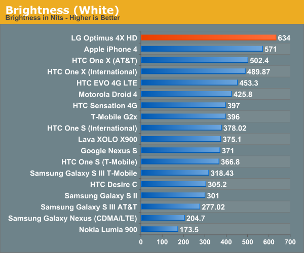
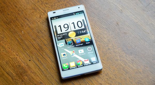
The Optimus 4X HD’s namesake is the same obligatory massive 720p display that has seemingly defined every headline phone since the Galaxy Nexus. It’s an IPS panel like the G2x, and looks similarly great, with a pixel density of 312 PPI, class leading brightness and near-180 degree viewing angles. It’s an RGB stripe panel, so subpixel density ends up matching the One X and being higher than the RGBG Pentile panels in the Galaxy Nexus and Galaxy S3. The O4XHD at full brightness is actually painful on the eyes, and the numbers back it up - this is the brightest phone we've had go through our labs:


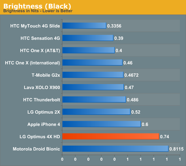
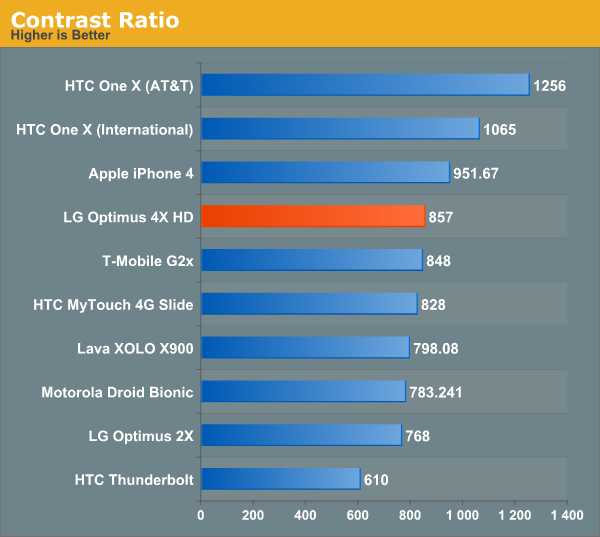
The contrast ratio of 857:1 is essentially the same as the G2x, and certainly competitive by mobile display standards - the black levels are a little bit on the high side, which is what hurts the display respective to the One X’s SLCD2 panel, but it’s not terrible. The only real issue I could find is that the screen appears to be set back a bit from the glass, and the gap results in a bit of extra glare that can be quite distracting under direct sunlight. It’s a minor complaint at best though, and the screen is bright enough to overcome the glare.
But while the display is very good, it can’t top the One X, which is far and away the most impressive mobile display I’ve seen thus far. I prefer the O4X HD to the Galaxy Nexus and put it just ahead of the SGS3, but both the One X and the One XL (AT&T One X) are just at a different level right now.


46 Comments
View All Comments
lowlymarine - Wednesday, August 29, 2012 - link
The chart on the first page says the Galaxy Nexus has an "ARM Mali-400" for the GPU, but I'm fairly certain it actually uses a PowerVR SGX540.lowlymarine - Wednesday, August 29, 2012 - link
Also, no version of the Galaxy Nexus has a MicroSD slot, to my knowledge. And on page 7:"from an optical standpoint it comes with what I believe is a 4P (4 plastic elements) system with a focal length of <focal>mm."
Not sure what's going on there.
Excellent review overall though. I have to agree on the button layout, it's a shame they didn't use the ICS default buttons ans instead chose to stick to a legacy menu button.
VivekGowri - Wednesday, August 29, 2012 - link
Missed a couple of things when I was switching it from SGS2 to the Galaxy Nexus. The focal length is 3.2mm - I just put in a placeholder when I was writing and simply forgot to put in the value when the review went live.Skidmarks - Wednesday, August 29, 2012 - link
It seems to have very capable hardware but is truly a dreadful looking thing IMO.Belard - Wednesday, August 29, 2012 - link
Agreed... then again, look at it this way. When a touch-screen device, such as a phone is made - everything is made around the screen. Right? That doesn't leave much room for much of anything else. Other than the size, thickness, materials, placement of buttons. If you GO BACK in time in the days of candy-bar, sliders, flip-phones - someone like SONY alone had about 60 different phones on the market at once time. Now SONY has about a dozen active smart phone designs (almost all are rectangle with curved corners) - some are quite attractive. But few are available - or they are at the SONY STORE at full price. at&t only sells 1 SONY phone. (I don't consider SONY because their track record with Android is sub-par at this time and their love for those rubber covers over the USB port which I have to fight to remove)You had different colors, different shape of buttons, different size screens. Remember the days of the LG Chocolate?
The required touch-screen kill design ideas. But looking at MC/ Samsung / SONY and NOKIA - there are style DNA that can still be applied to the shape. SONY's style tends to make the phone bulkier than it should be.
Mike0 - Wednesday, August 29, 2012 - link
Also, the International One X has 32GB NAND, not 16GB unless you're referring to the Snapdragon S4 variety which would be useless in this comparison :PMike0 - Wednesday, August 29, 2012 - link
And it's screen is Super LCD2, if you're including technical terms like SAMOLED.Mike0 - Wednesday, August 29, 2012 - link
Also also, (last one I promise :P) the latest 4.0.4 update for the One X International dramatically improves it's scores in BrowserMark (Some people are getting 125000+) and Vellamo (Over 2000 now) and probably more benchmarks so it may be worth updating your results.VivekGowri - Wednesday, August 29, 2012 - link
Yeah, I copied the table over from another review and missed a few things when I was changing them. Missed the GPU/SD card thing when I changed from SGS2 to SGN, and the NAND when I changed from One X (AT&T) to One X (Intl.) Should be fixed now though.arnoudw - Thursday, August 30, 2012 - link
The update to 4.0.4 also drastically improved battery life. Here are some tests: http://tweakers.net/nieuws/83464/update-htc-one-x-...