LG Optimus 4X HD: Tegra 3 Handsets Stay Global
by Vivek Gowri on August 29, 2012 4:30 AM EST- Posted in
- Smartphones
- LG
- Ice Cream Sandwich
- Mobile
- Tegra 3
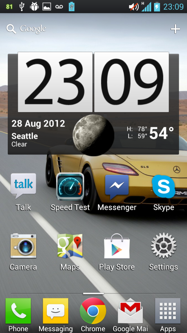
My first reaction to LG's shipping ICS skin (based on 4.0.3, LG is calling it UI 3.0) was simply “wow, this is a lot better than expected.” As time went on, I realized that it’s actually the best I’ve felt about an Android skin since...well....ever. I’m still a pure Android lifer, but I don’t mind UI 3.0. LG described it as unobtrusive and simple, and though I was skeptical at first, it’s really not very invasive.
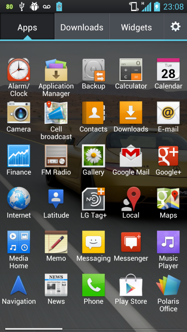
As such, a lot of the good old ICS UI elements are present and accounted for, but LG has made the entire theme much lighter than ICS (good) as well as changing the iconography (not so good). My lone complaint with the stock Android interface is that it’s pretty dark, so the white menus and UI elements do a good job of making ICS that much less gloomy. The iconography is basic and dull, unfortunately, but at least LG lets you change the icons quite easily by holding down on them. It’s still very clean, thankfully - that’s what LG has done a good job with, really keeping the essence of ICS the same while just changing some of the details and adding functionality where they could. Examples being the lock screen shortcuts, a 5x6 icon grid in the launcher, quick setting toggles in the notifications drawer, and things like that.
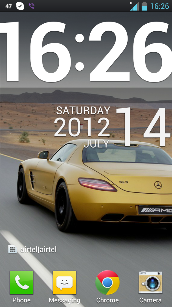
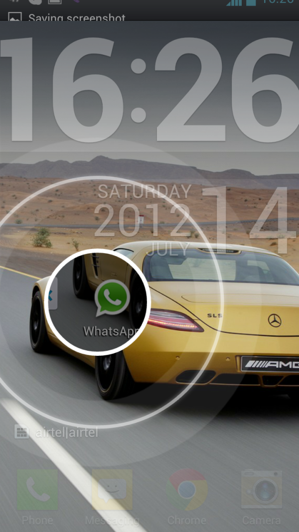
The animations are all quite slick - you can basically touch anywhere on the lock screen and swipe to unlock the phone, and underneath your finger appears a transparent “window” that shows you your homescreen as you swipe outwards. It’s hard to describe, but hopefully the screenshot above gives you a decent idea of what I’m talking about. It’s also seriously cool to use in practice.
There are seven homescreens, with a number of different swipe animations to choose from - accordion, carousel, panorama, domino, layer, breeze, and the basic default. All of them are smooth, maybe not as much as Butter, but still quite good. And compared to the LG norm, this is leaps and bounds ahead.
There’s not much really to report other than that - LG hasn’t done too much to the ICS we know and love. It’s far less intrusive than Sense 4.0 - I tolerated it with the HTC One S, but I think deviates too much from Google’s Android builds and tries to be different simply for the sake of being different. I’ve also never been a huge fan of TouchWiz - I disliked it enough on my SGS2 that I almost immediately switched to CM9. The Nature UX variant on the Galaxy S III, though it has some nice animations, seems to be more cluttered than ever. It’s just inelegant, both in look and feel. I really have to applaud LG for going the opposite direction and not messing with a good thing - they added just enough functionality and fanciness in the UI to differentiate themselves from Google, but didn’t resort to a heavy reskin of ICS to achieve it.


46 Comments
View All Comments
lowlymarine - Wednesday, August 29, 2012 - link
The chart on the first page says the Galaxy Nexus has an "ARM Mali-400" for the GPU, but I'm fairly certain it actually uses a PowerVR SGX540.lowlymarine - Wednesday, August 29, 2012 - link
Also, no version of the Galaxy Nexus has a MicroSD slot, to my knowledge. And on page 7:"from an optical standpoint it comes with what I believe is a 4P (4 plastic elements) system with a focal length of <focal>mm."
Not sure what's going on there.
Excellent review overall though. I have to agree on the button layout, it's a shame they didn't use the ICS default buttons ans instead chose to stick to a legacy menu button.
VivekGowri - Wednesday, August 29, 2012 - link
Missed a couple of things when I was switching it from SGS2 to the Galaxy Nexus. The focal length is 3.2mm - I just put in a placeholder when I was writing and simply forgot to put in the value when the review went live.Skidmarks - Wednesday, August 29, 2012 - link
It seems to have very capable hardware but is truly a dreadful looking thing IMO.Belard - Wednesday, August 29, 2012 - link
Agreed... then again, look at it this way. When a touch-screen device, such as a phone is made - everything is made around the screen. Right? That doesn't leave much room for much of anything else. Other than the size, thickness, materials, placement of buttons. If you GO BACK in time in the days of candy-bar, sliders, flip-phones - someone like SONY alone had about 60 different phones on the market at once time. Now SONY has about a dozen active smart phone designs (almost all are rectangle with curved corners) - some are quite attractive. But few are available - or they are at the SONY STORE at full price. at&t only sells 1 SONY phone. (I don't consider SONY because their track record with Android is sub-par at this time and their love for those rubber covers over the USB port which I have to fight to remove)You had different colors, different shape of buttons, different size screens. Remember the days of the LG Chocolate?
The required touch-screen kill design ideas. But looking at MC/ Samsung / SONY and NOKIA - there are style DNA that can still be applied to the shape. SONY's style tends to make the phone bulkier than it should be.
Mike0 - Wednesday, August 29, 2012 - link
Also, the International One X has 32GB NAND, not 16GB unless you're referring to the Snapdragon S4 variety which would be useless in this comparison :PMike0 - Wednesday, August 29, 2012 - link
And it's screen is Super LCD2, if you're including technical terms like SAMOLED.Mike0 - Wednesday, August 29, 2012 - link
Also also, (last one I promise :P) the latest 4.0.4 update for the One X International dramatically improves it's scores in BrowserMark (Some people are getting 125000+) and Vellamo (Over 2000 now) and probably more benchmarks so it may be worth updating your results.VivekGowri - Wednesday, August 29, 2012 - link
Yeah, I copied the table over from another review and missed a few things when I was changing them. Missed the GPU/SD card thing when I changed from SGS2 to SGN, and the NAND when I changed from One X (AT&T) to One X (Intl.) Should be fixed now though.arnoudw - Thursday, August 30, 2012 - link
The update to 4.0.4 also drastically improved battery life. Here are some tests: http://tweakers.net/nieuws/83464/update-htc-one-x-...