Google Nexus 7 and Android 4.1 - Mini Review
by Brian Klug on June 28, 2012 3:25 AM EST- Posted in
- Tablets
- Smartphones
- Mobile
- Nexus 7
- Android 4.1
Android 4.1 is the newest release of Android, and in keeping with the dessert-alphabet naming scheme, goes by the name of Jelly Bean. Henceforth you'll see JB or 4.1 interchangeably. Google sampled me another Galaxy Nexus, running the same build of Android 4.1 that was handed out to Google I/O attendees today. This isn't the final version that will be pushed out in July, but is close to final – or at least final enough to give to a few thousand attendees and press.
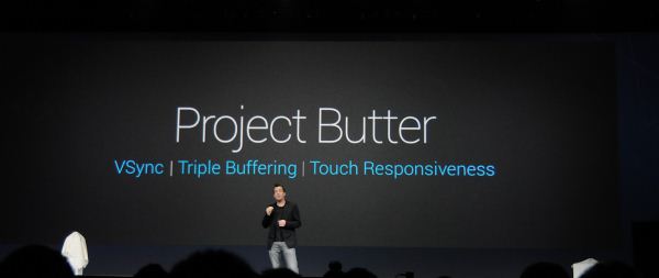
I mentioned in the pipeline post about Android 4.1 that I heard UI performance was going to be a big emphasis in 4.1, that Google wanted to make the UI "smooth as butter" everywhere possible. Today seeing the announcement of Project Butter comes as no surprise, and represents further optimization to the hardware accelerated OpenGL ES render path that was introduced in Android 3.0 Honeycomb, and further improved in Android 4.0.x with more graphics primitives, making moving to it easier for developers.
In Android 4.1, the improvements that are under Project Butter are really four things:
- Improved 60 Hz Vsync timing from the Android drawing framework for individual applications. That means render path, touch, and display composition now take place on a 16 ms step.
- Triple buffering for the UI, which I believe previously could be enabled, but only in individual OpenGL ES instances. The Android 4.0.x UI did not have triple buffering enabled as it now is.
- Changes to the CPU governor which now send the SoC into its highest performance state as a function of touch interaction. I'm still eager to learn more about this in an upcoming session, but Android now better handles the latency associated with changing P-states on SoCs and getting into that maximum state when you're aggressively scrolling and panning.
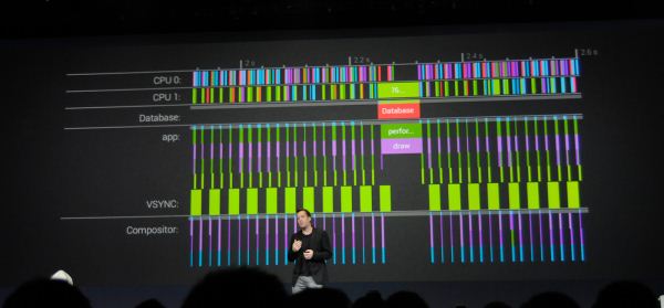
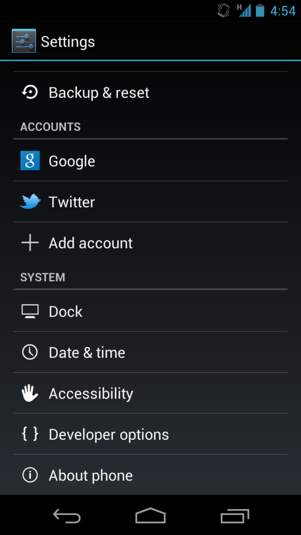
- Enhancements to analysis in the form of Systrace for seeing the actual time spent in each part of the render process for a frame. This is being pushed out in the new Android SDK and there are obvious hooks into it under Developer Options inside 4.1. Google also gave us a glimpse of that earlier today.
The result of these improvements is that the Galaxy Nexus feels like a different device to me with Android 4.1. It isn't huge, but the trouble spots that used to annoy the heck out of me with Galaxy Nexus and 4.0.4 are now largely smoothed over. That's not to say it's perfect, but it's clear Google has invested time (finally) into mitigating some of Android's lingering UI choppiness.
I wanted to show this on video, however my DSLR only captures at 24 FPS which would make it pretty difficult to see dropped frames. I brought my other Galaxy Nexus with 4.0.4 and put it alongside the 4.1 device, and there's a substantial difference in trouble areas.
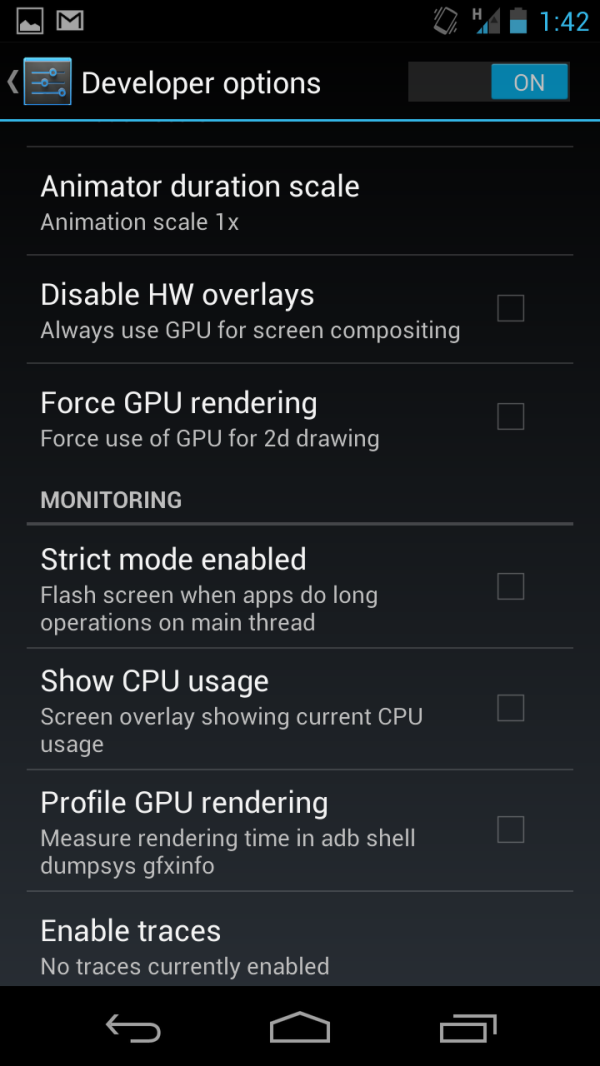
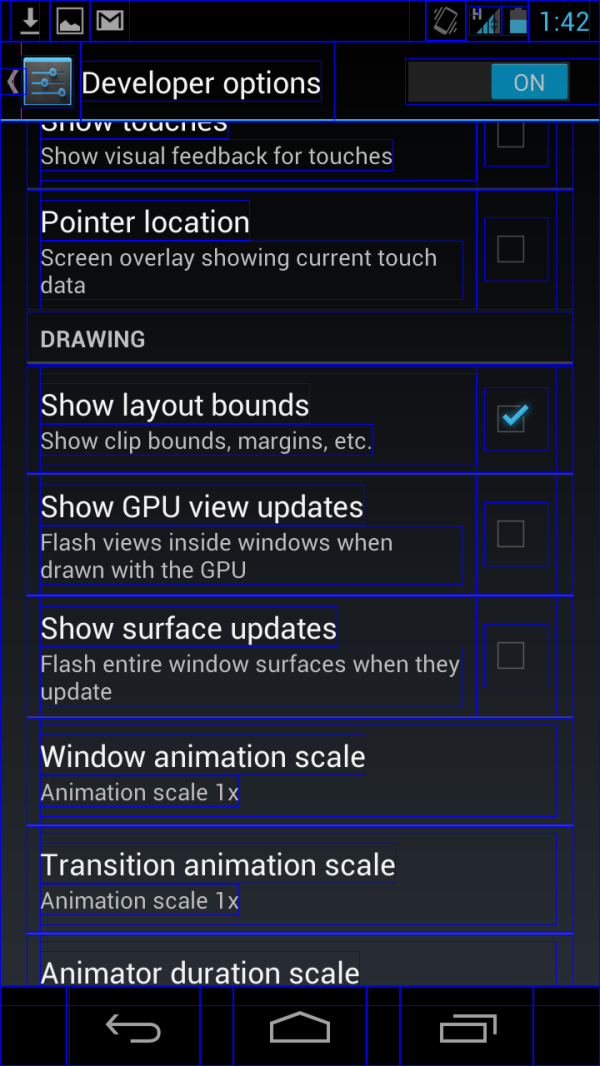
Additional GPU related drawing debugging under Developer Options
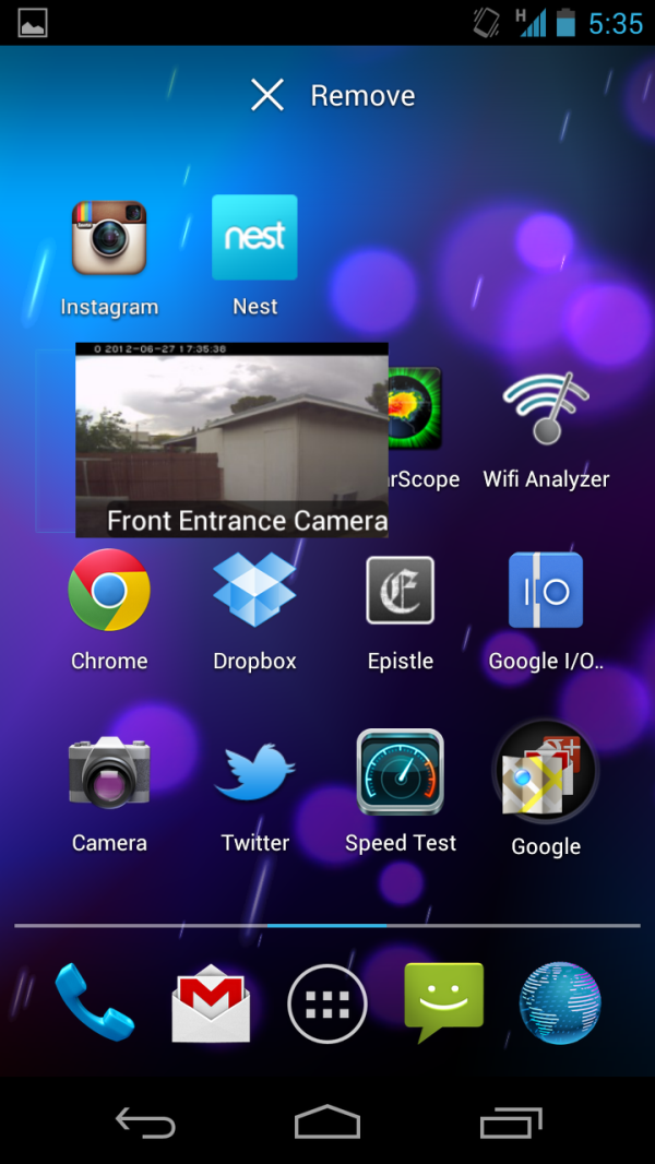
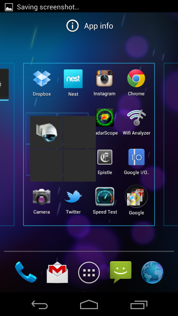
Some of those trouble spots included: scrolling the applications launcher into the widgets tab, the task switcher, screenshot compress and fade animation, application launch / close, and scrolling list boxes. In the case of the task switcher (which was not smooth in 4.0.4), the animation is now finally one that doesn't drop frames left and right. It is a huge difference. The others just feel better. I've also noticed that a number of other primary UI transitions have been somewhat simplified from a squeeze and fade to just a translation up or down across the screen. I think some might make the case that this is just optimization by removing transition flashiness, but on the whole the result is a much snappier interface.
I still feel like the SGX 540 running at non-max clocks inside the Galaxy Nexus' OMAP4460 is overburdened, but with the right SoC Android 4.1 is going to scream. On the Nexus 7, the interface is very close to being fluid everywhere. I'm very impressed with performance on that device.
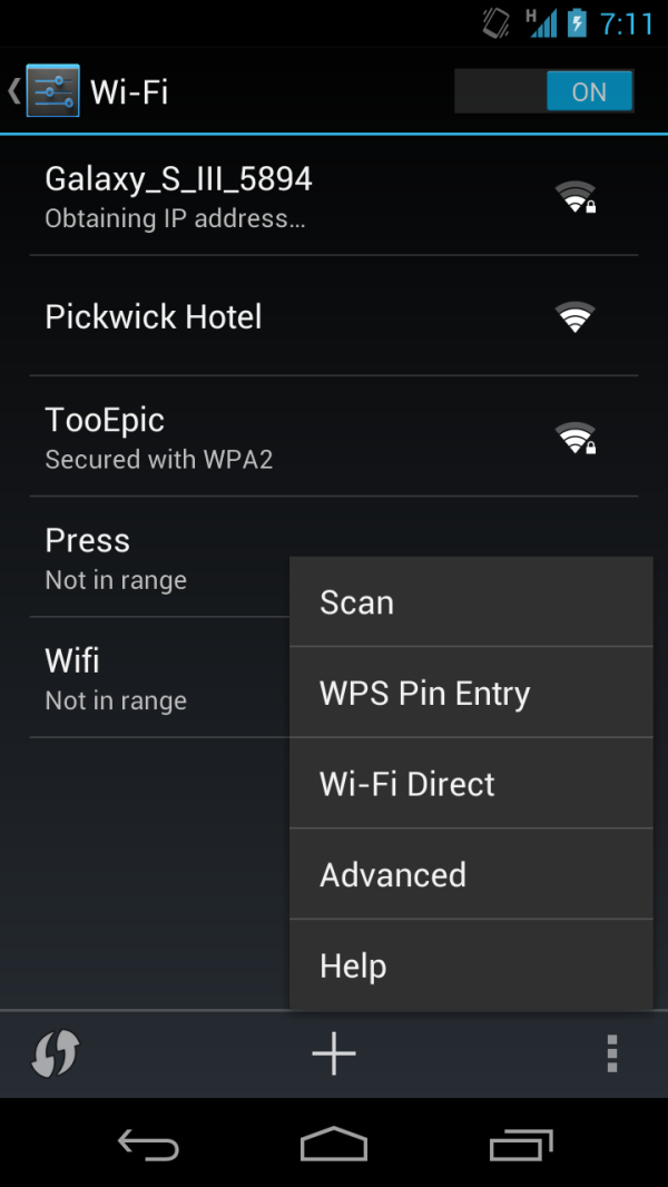
While we're talking about settings related improvements, the settings page gets some reorganization, including putting accounts right on the settings page, and under WiFi are new toggles for WiFi direct, and WPS pairing. Google has also changed up the toggles in 4.1, from the slanted, almost razor-blade like sliders to just plain switches. Another subtle thing is a change under About Phone -> Status: the network type indicator now shows "HSPA+" instead of "HSPAP" which previously confused users.
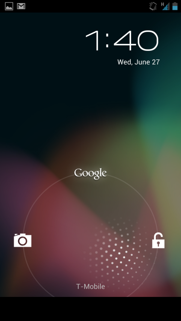
There are some other new UI related 4.1 features. First up, notifications shade gets a dramatic improvement, including support for action to be taken right from the notification menu, such as dismissing a calendar alert, declining a call, or sharing photos. The top entry in the list also gets shown off in a larger box, and includes more detail. The bar also includes a rotation lock for tablets, and moves higher up on the display, obscuring the status bar indicators. The lock screen also gets an updated look, and a shortcut to Google Now.
Widgets are also automatically resizeable and reposition themselves in 4.1, which is a subtle but important improvement over the rigidity of the AOSP home screen in 4.0. I feel like a lot of these subtle improvements are inherited from various skins and 3rd party customizations, which makes sense. Third party widgets will need an update to support official resizing.
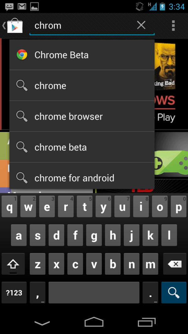
The keyboard also gets some improvements, including support for additional languages, and an expanded dictionary. One subtle change is that when you have the keyboard up, the back symbol changes to a down caret, which will no doubt make that UI step easier to grasp for new users.
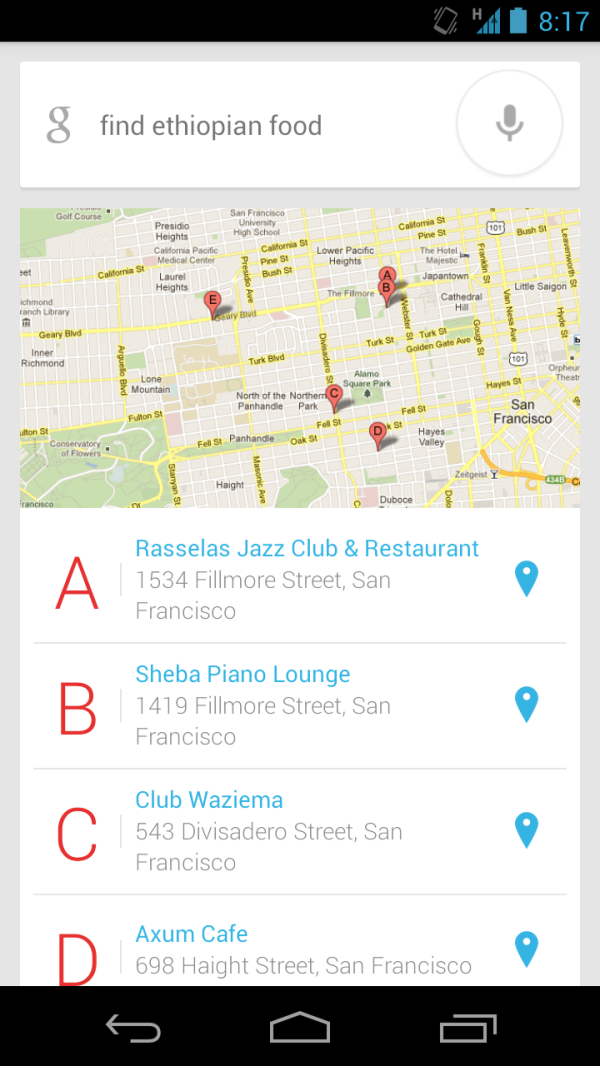
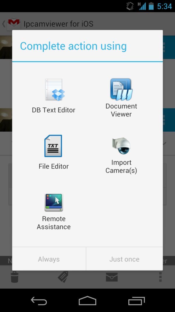
Left: Another Google voice search query, Right: New intents picker
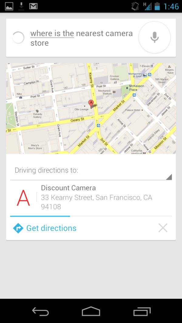
Google's answer to Siri is a two pronged approach - improved voice search with offline voice recognition, and semantic data results to those queries. In practice, the use paradigm is almost exactly like Siri, though the approach Google demonstrated is a bit less conversational. I have only had time to ask a few queries (such as the above search for a camera store for a new battery charger), but voice recognition does indeed work with no cellular connectivity, though you do lose the confidence level underline under words. Part of the better Google search idea is Google Now, which Google believes so strongly in, it dedicated an entire shortcut to it.
Camera UI gets an overhaul and now reminds me of the Windows Phone 7 approach. You can swipe left to view the previous captured images, while the live preview remains live and slides off the screen. Photos can be deleted by then dragging up, like dismissing a card in webOS. This is also nice and smooth throughout. Android 4.1 also adds a new capture animation, but oddly enough I couldn't grab a screenshot of it.
| Android 4.0.4 vs 4.1 on Galaxy Nexus | ||||||||
| Location | WebKit Version | HTML5test.com Score | CSS3test.com Score | Sunspider 0.9.1 | Browsermark | |||
| Android 4.0.4 | 534.30 | 280 + 3 bonus | 49% | 1830.9 | 99493 | |||
| Android 4.1 | 534.30 | 281 + 3 bonus | 49% | 1411.8 | 125103 | |||
While the Nexus 7 formally replaces Browser with Chrome (sans beta as of today), Android 4.1 proper on the Galaxy Nexus and other devices will retain Browser for some time. That web browsing experience gets improved in 4.1 with better support for HTML5 video, better rendering performance and memory usage, and further improvements to the V8 JavaScript engine. In browsermark and sunspider the difference in V8 is pretty dramatic, elsewhere there isn't a big change at all, as it's the same core version of webkit, just optimized more.
There are more changes as well, including binary diff / delta update support for updating marketplace applications. Google has done the usual thing and outlined all of those other changes on their developers page for Jelly Bean. It's impossible to pass judgment on Android 4.1 after just 12 hours with both an updated Galaxy Nexus (with my primary SIM inside) and the Nexus 7, but thus far the improvements to UI smoothness have made a noticeable difference. Beyond that, probably the second most appreciable difference is in notifications, which now conveys much more information for things like new mail beyond the subject line and sender. The other thing to note is that again, this Android 4.1 isn't 100% final, but it is extremely close. I haven't seen any glitchiness yet, but obviously there will be changes before the final mid-July OTA update for Galaxy Nexus devices and others that were announced in the keynote. I'm looking forward to digging up the other subtle things that are new in Android 4.1 and updating if necessary.





188 Comments
View All Comments
Alroys - Thursday, June 28, 2012 - link
If only it had a micro-sd slot.janderk - Thursday, June 28, 2012 - link
This being a Nexus device Google probably left the microSD slot out, not due to cost restrains, but because they want to force themselves (and you) to live from the cloud.Local storage should be nothing more than cache. Enough to get you through an around the world flight, but nothing more. No SD slot forces the Google developers to make cloud access more seamless and user friendly.
Sufo - Thursday, June 28, 2012 - link
And yet there is no cellular option... I think this is one of those situations where you've said something that sounds reasonable, but is, in fact, not the case. My guess would be that it is, almost entirely, down to cost (and perhaps a way to encourage more people to spend $50 on 8GB of extra flash).Spunjji - Thursday, June 28, 2012 - link
Agreed.prophet001 - Thursday, June 28, 2012 - link
I would agree if....Google did not consume information to survive.
Google offered options for syncing Nexus' data to local PCs.
Google supported Samsung's Kies software.
Google did not require a gmail account for the majority of its services.
It wasn't blatantly obvious Google wants you in their cloud.
EnzoFX - Thursday, June 28, 2012 - link
err, but is that not the "forcing" part? I think it has to be true, they wouldn't hurt themselves on purpose with no MicroSD slot. It being wifi only isn't a big deal either. There is a market that wants cellular, and people who don't, so they have to have that option, makes sense that the wifi only option is cheaper. In regards to the cloud, well then you have to think about the times you don't have internet access. Are people going to use their tablet then? I'd say not likely. Which is more the root of the issue I'd say. It's a device, people will buy it for what it can do now, they won't think, oh how much junk can I load onto it? This at least, for the common person out there that isn't very tech savvy. Yet again it seems like the power users here on anandtech aren't the ones driving design/tech, it's the average consumer they're all trying to cater to. For us power users, maybe they think that the specs alone would make it worthy enough for us to buy, because those specs don't mean all that much to the average consumer.rushmore - Friday, June 29, 2012 - link
If you guys have been following ANdroid team since the pre G1 days, you will find that they HATE external storage and wanted flash and no SD for the G1 and all Android devices. The problem was Apple's contract manufacturing buyers secured the majority of flash memory allocations for a few years. This meant it was not practical for a few years to put anything beyong 4gb and alot were half of that.Google was forced to embrace sd cards as a reult, and still were a year late getting an official apps2sd or sd cards. They hate coding for external storage and the security concerns. The goal all along was a Google market portal and cloud storage. Android team has stated this a few times, so not conjecture.
rushmore - Friday, June 29, 2012 - link
My spelling is on drugs.fteoath64 - Saturday, June 30, 2012 - link
Your comments on sd card nand did not make sense and did not pan out in the market as 16gb micro SD are now dirt cheap.Besides let the users put their media on the SD card. not all people have cloud access nor want it as yet. if google wants to move in a direction their users do not want to go then eventually will lose these users. Why pay for what you do not want ?
Neoprimal - Monday, July 2, 2012 - link
Actually his comments did make sense. nand (internal flash memory) /= sd card (external, much slower flash memory) so please take note of that.Nand at the time the G1 came about was ridiculously expensive - whether due to Apple or not, I have no clue. All I do know is that in device teardowns, the storage was often the most expensive besides the screen and albeit for very little of it. For this reason, many initial Android devices had tiny internal storage...a ridiculous amount even, allowing the bare essentials to be installed which consists of the OS and a few apps.
It has been established, if you listened to Google devs since day 1, that they reluctantly used SD/external storage. It was a necessity in order to facilitate storing media and gaming apps early on.
They didn't even like the idea of non-gaming apps on them at all, but as time went by the need arose to allow it (since people would run out of storage space on their devices). Trade offs were made and it became an Android feature to easily move some apps to SD with the caveat that its widget could no longer be used on the ui.
If you've owned different brands of devices you'll see that each of them has their own implementation of how the system sees/names the external storage. Not only does this create a disparity for software devs but it decreases system security. External memory can also be an issue and liability to the system since they can be too slow or of bad quality and fail (a likely reason Apple didn't include the sd card slot in any mobile device).
Eventually we will see more and more devices ship without it. Even without consideration given to the cloud, it is just much better for a device to depend on internal storage. It basically removes all the wild cards that the microSD can cause from the equation.