Nokia Lumia 900 Review - Windows Phone with LTE
by Brian Klug on April 3, 2012 9:00 PM ESTDisplay Quality
Like the Lumia 800, the Lumia 900 uses an AMOLED display instead of an LCD. One of the chief differentiators between the two models however is the difference in subpixel rendering. Whereas the Lumia 800 used a 3.7“ PenTile RGBG SAMOLED panel, the Lumia 900 uses a 4.3” SAMOLED+ panel with an RGB subpixel stripe. Those names fit, that is, if we’re following Samsung’s naming scheme, and as an aside this is undoubtedly a Samsung panel.
The effective resolution of both displays are 800x480 WVGA, like all Windows Phones, however. Jumping up in display size pretty much necessitates that change to RGB, since PenTile really only works when subpixels are below human visual acuity. In addition, we’ve already seen 4.3" SAMOLED+ WVGA displays out of Samsung (see the Focus S).
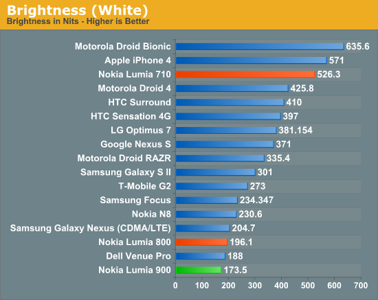
I measured the Lumia 900 display using an i1D2 just like I’ve done with numerous other smartphones, though at this point the advanced color and gamut information will have to wait until I make some targets. Again, because AMOLED is emissive, black color pixels are literally off, so contrast graphs are omitted. The Lumia 900 doesn’t go super bright, like other AMOLEDs I’ve seen. In fact, it’s slightly dimmer than the Lumia 800’s maximum of 196 nits. Remember that going to a larger display, especially AMOLED due to its emissive nature, increases power demands as r^2 since we’re talking about areal size.
| Lumia 900 Display Metrics | |||
| Brightness Level | Black Brightness (nits) | White Brightness (nits) | White Point (K) |
| Low | 0 | 72.68 | 6635 |
| Medium | 0 | 140.06 | 6930 |
| High | 0 | 173.55 | 6812 |
Nokia was able to get the Lumia 900 display nice and close to 6500K, which is interesting considering how many other AMOLED displays I’ve seen which are up near 8000K or higher and noticeably blue all the time.

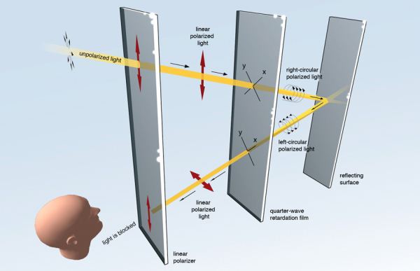
I glossed over ClearBlack on the previous Lumia reviews partly due to time constraints, partly due to not knowing the exact details of their optical path. That said, it was immediately obvious that the system used circular polarization’s behavior upon reflection to attenuate back reflections. However, since writing those reviews, Nokia has outlined their optical system in a conversations post, and the long and short of it is that the system consists of a linear polarizer and quarter-wave plate.
Incoming diffuse light gets vertically polarized by a surface polarizer, which becomes right hand circularly polarized when passing through the quarter wave plate. When circular polarized reflects off of a surface, it changes handedness - in this case from right to left handed circular. Upon passing through the quarter wave plate on its way out, this becomes horizontally polarized, which is then strongly attenuated by the surface polarizer with its fast axis aligned vertically on its way out, which acts like an analyzer. The end result is that outdoors the only reflection you’ll get is from the first surface, not the surface of the display itself, which does reduce resulting glare.
This change also permits the Lumia 900 to still look bright outside, and in turn allows Nokia to run the display at a lower brightness and save some amount of power. For a while I was waiting for some OEM to introduce a system using polarization to diminish back reflections, and Nokia has done it with ClearBlack.
Indoor viewing angles for the Lumia 900 are excellent as evidenced by the purple test pattern from WP Bench not changing color at extreme field angles. In addition, I subjectively can’t find any issues with the display - there are none of the other problems that affect the higher dot pitch AMOLEDs such as grain or mura. Outdoor viewing angles are likewise good for the Lumia 900 in part thanks to ClearBlack.


128 Comments
View All Comments
Denithor - Tuesday, April 3, 2012 - link
Kinda sucks. You put in three Nokia models? Why not a comparison to other phones US buyers are likely to be considering? I know the specs are available but it makes for a much quicker reference.Brian Klug - Tuesday, April 3, 2012 - link
That's a valid point, and honestly picking the phones for the comparison table is always a bit of a struggle, I just wanted to show how the other Nokia WP7 devices line up in comparison with the flagship. Perhaps another one with Galaxy Nexus GSM/UMTS and iPhone 4S? I mean we've shown those in tables many, many times.-Brian
Operandi - Wednesday, April 4, 2012 - link
Uhh.. yeah I would say so. This is the only WP7 I would ever consider, the others migh as well not exist frankly.abhaxus - Wednesday, April 4, 2012 - link
What he said. This phone is sexy, I'd like to see it's size compared to other sexy handsets. Most WP7 handsets are... plain.niva - Thursday, April 5, 2012 - link
Performance wise it's not much different from the 710 or the 800, which are both phones worth considering. I think the 800 is better than the 900, but I prefer smaller phones. I think I might just bite the bullet and settle on the 710.geddarkstorm - Wednesday, April 4, 2012 - link
Why is no one mentioning the absolutely abysmal battery life of this phone? It's at the very bottom of the tethering chart for instance. I don't see this phone rising above the lower half of the tests in anything other than 4G. And who really wants a phone with sharp corners and no sense of hand ergonomics?Can't wait for Windows 8, and good hardware.
seanleeforever - Wednesday, April 4, 2012 - link
that and this phone is actually slower than it looks on the chart.great review, but the chart is seriously outdated.
take my HTC sensation for example, i just run the sun spider 0.91 and i get 1935ms and browsermark of 77138 with andriod STOCK browser. my phone does have ICS and ARHD rom, but if you honestly think a mod rom would somehow increase the phone performance by 94% faster (39768 on your chart vs 77138 i get), or by 221% faster(6217.4ms vs 1935 ms), you must be drunk.
this is with ICS stock browser, i think if you updated your chart, you will find windows phone will looks even worse (a lot worse) than it is now.
dtolios - Friday, April 6, 2012 - link
"who really wants a phone with sharp corners and no sense of hand ergonomics?"- It has hard corners - where you DON'T hold the phone from...iPhone 4 series has sharper edges - where you do hold the phone from...If that's not an issue - and marketing wise clearly it's not - then the 900 is fine. Afaik most ppl really like the design, and so do I.
UltraTech79 - Saturday, April 7, 2012 - link
Yeah iPhone 4 has sharp edges, if it weren't for all the rounded edges. And who are you to tell us how to hold a phone? Never played any games on a phone have you?Its badly designed.
Spunjji - Wednesday, April 11, 2012 - link
Who are *you* to tell us how to hold a phone?See how easy that was? Try a better argument. You had a valid point (worse gaming ergonomics) until you made yourself sound like an idiot (opinion as fact, referring to meaningless notions of sales figures).