T-Mobile MyTouch 4G Slide Review - Photographers Wanted
by Vivek Gowri on August 12, 2011 8:45 PM EST- Posted in
- Smartphones
- Snapdragon
- HTC
- 4G
- Mobile
- T-Mobile
- MyTouch
- Slide
Okay, I’ve been mostly ignoring the software side of things here, for not really any good reason, but here it goes. The MT4GS ships with Gingerbread 2.3.4, with a UI skin that basically amounts to a decontented version of Sense 3.0, which Brian covered in depth with his Sensation review. T-Mobile made a whole bunch of changes to the skin, mostly taking features out or just tweaking interface elements.
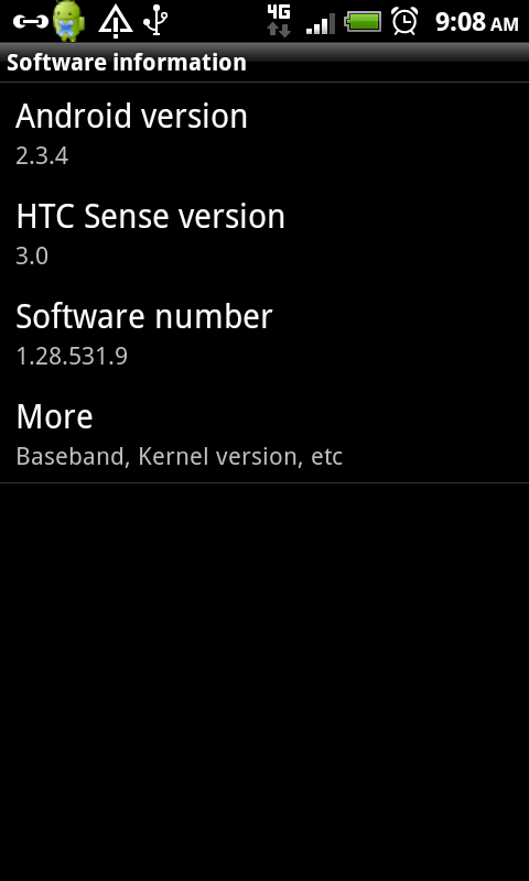
I’m not a huge fan of UI skins. At all. They can make perfectly good phones feel downright slow, and slow phones feel unbearable. For example, the completely unskinned G2 feels subjectively quicker then the Sense-ified MT4GS, even though it’s down a core and has 50% lower clocks. This has nothing to do with how powerful the phone is and everything to do with how responsive it feels in basic OS interactions. Very rarely do they ever add anything of value, especially ones done by LG and Samsung. Surprisingly, I never had as much animosity towards Sense as the others, and certainly not as much as Brian. Sense 3.0 on the Sensation is simply the only UI-skin I’ve dealt with that adds functionality and amounts to a logical reskin of Android.
The skin T-Mobile chose to ship with the Slide is basically Sense 3.0 with all that functionality taken out. The biggest losses here are the lockscreen app shortcuts and the rich info you get from the weather lockscreen. The other disappointing thing is that HTCSense.com features aren’t supported in full as they are on devices with the official version of Sense. This is a pretty big loss, since HTCSense.com comes with some pretty nice features, like remote backups, a locating feature with remote dialing (even when set to silent), remote lock and wipe, editing and multimedia features for photos and video taken on your phone. In my opinion, it’s one of the best things about Sense, but you get none of that with T-Mobile’s custom variant (hereby dubbed nonSense, for lack of a better name).
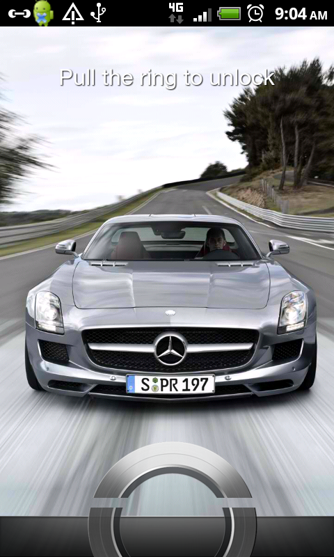

Let’s look at what you do get. The sliding ring is still there, you pull it up to unlock the phone. When you’re answering the phone, you can drag the green and red icons into the ring to accept or decline the call. Alternately, you can swipe the ring upwards to answer the call.
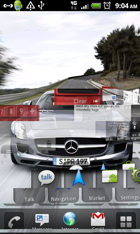
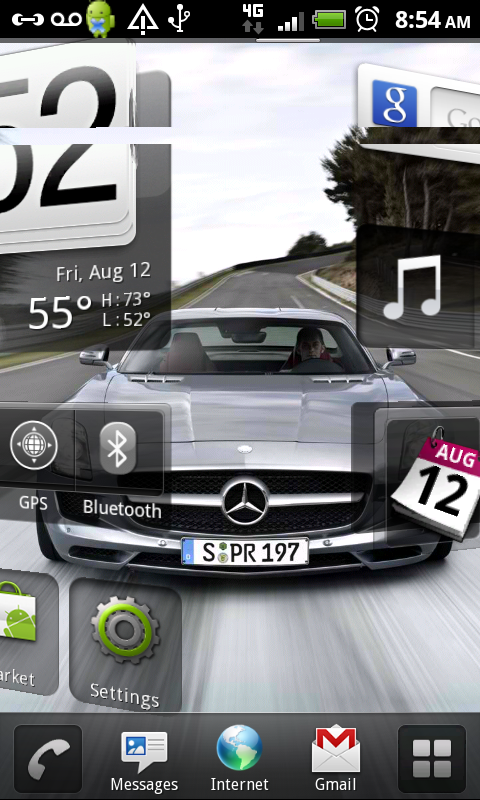
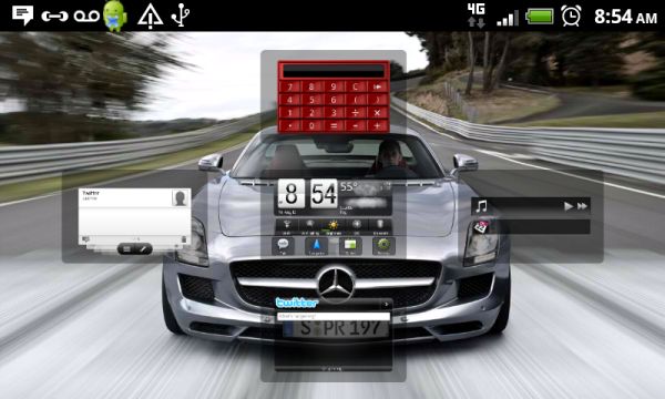
The homescreens rotate in on a circular track, almost like a revolving door of lockscreens. HTC has really emphasized the smoothness of the animations here, but it feels like a waste of computing resources if you ask me. (Sorry for the terrible images, DDMS has some issues with taking screenshots of the rotating motion.) The general interface actions here are identical to those in Sense 3.0. Quickly swiping through homescreens gets the entire deal to spin fluidly, with a virtual version of inertia deciding which screen you land on.
Unlike Sense 3.0, there’s only 5 homescreens and no real easy way to rearrange them. Double-clicking the home button from one of the homescreens gets you an exploded view of all five, but there’s no way to drag them around or anything. Long-pressing on empty space brings up the Personalize menu, which you can also get to by hitting the menu button from the homescreen. You can mess with a bunch of stuff, including the system theme, wallpaper, widgets, folders, app shortcuts, shortcuts to specific parts of certain apps (such as the battery use part of the settings menu, a Gmail label, or a specific playlist in the music app), the ringtone, and notification sound.
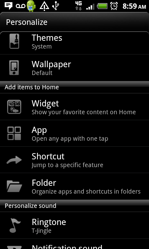
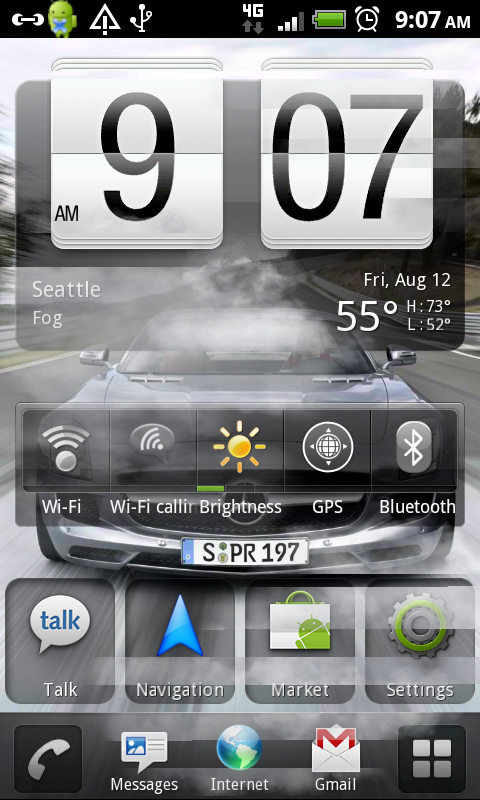
The system theme sounds interesting, but literally all it does is change the wallpaper, ringtone, and appearance of the bottom row of icons. I like having my own wallpapers and ringtones, so it’s only a very small appearance difference to me. The bottom row of icons has its own issues though, in that it has five icons, two of which (phone and app launcher) aren’t modifiable. I like keeping it simple and just having three options - phone, browser, and app launcher. Sense 3.0 messes with it by dumping the browser button for the Personalize menu, but I can live with it. Something about having 4 or 5 icon docks just bugs me, especially when some of the icons are fixed. You get used to it fairly quickly though, so it’s not a huge deal.
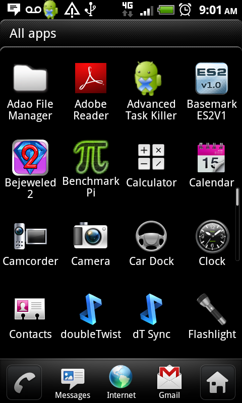
The app launcher is another place where minor annoyances lie. You scroll through pages, grids of 20 at a time, instead of scrolling through by row. This is a feature imported from Sense 3.0, and it’s another one that I personally don’t like. As with the dock, you get used to it. The big difference in the app launcher between Sense 3.0 and the MyTouch-version is that the MyTouch devices lose the tabs, which is actually a bigger loss than I first thought. The frequently-used apps tab is pretty sweet, I’d have liked to see it in this UI.
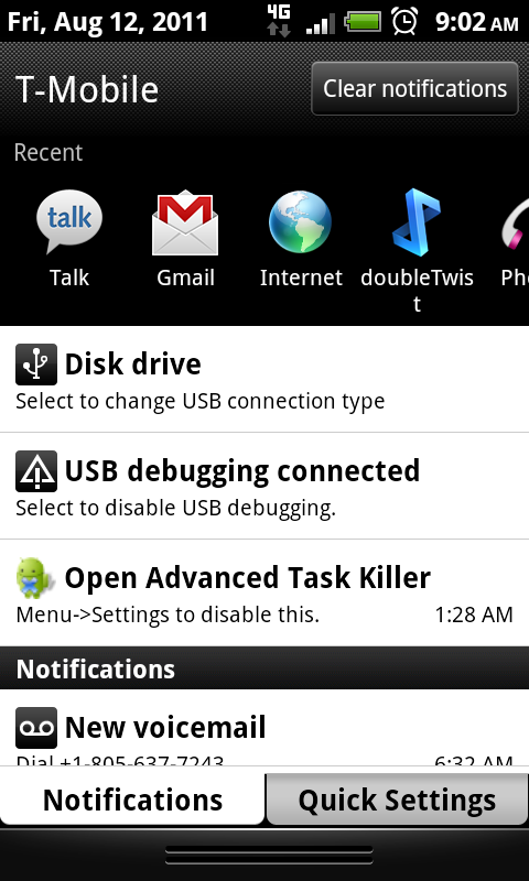
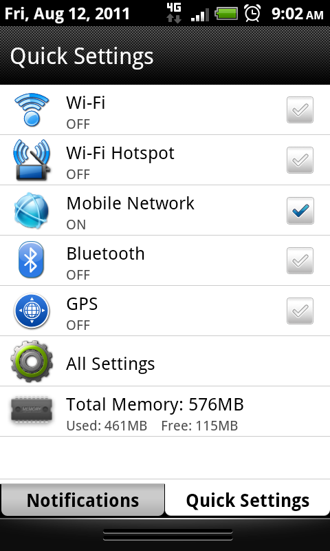
The notifications shade is another carryover piece from Sense 3.0, with a recently used apps list and a quick settings tab. It’s a nice touch, one of the additions I really enjoyed, though a brightness slider would have made it even better. The task manager, too, is a good feature to have built-in, it’s a pretty clean way to manage running applications.
The only other major change is one that I mentioned earlier, with the Search button being replaced by something called the Genius button. Just right off the bat, let me make it known that it’s not as brilliant as T-Mobile seems to think it is. It’s a glorified voice command interface done by Nuance, the company behind Dragon Speech and Ford’s SYNC. It’s a well done bit, but it’s not ingenious. Think of it like Windows Phone 7’s voice command shortcut, and you’ve got the right idea.




24 Comments
View All Comments
Impulses - Friday, August 12, 2011 - link
" Anand is going to do a deep dive into the dual-core Snapdragon microarchitecture in our forthcoming EVO 3D review. "Been hoping it'll come out already for a while! Any ETA? Also, can you share some specifics about how the battery tests are run? I'm not doubting the results, I'd just like to do my own testing here, my EVO 3D (which I'm still unsure if I'll keep) doesn't seem to be in the same league as the Sensation despite nearly phenyl identical internals.
Impulses - Friday, August 12, 2011 - link
Great review btw, as always from AT... You guys go into way more detail than anyone else out there, it's really appreciated. I think the software side could use even more depth tho, ultimately people will customize phones and install their own apps, launchers etc but if you're gonna harp on manufacturer skins for what they get wrong, you should also highlight some of the value that some of them do add, beyond the obvious (lockscreen, camera interface, etc.).Take the print feature for instance, I dunno if the MT4G has it but the Sensation and EVO 3D sure do, and it's really really handy... True Wifi printing that works without a computer or a cloud service and seems to work even with older printers (at least it worked with my 5+ year old HP AIO).
Or how about the ringer settings for pocket mode, speaker on flip, and quiet on pickup? How about the power saver mode? Sense's FB contact integration tho done in a less-than-elegant manner (adds a tag to your Gmail contact notes) at a technical level still works better at a user level than FB's own app imo. The calendar is a vast improvement over past versions of Sense, tho I guess that's not saying much since they had really butchered it.
My biggest beef with Sense, besides the launcher (easily remedied) continues to be the browser. Generally it works pretty well, I like the big previews of open windows and bookmarks, the couple extra settings HTC tucks in, and the full screen mode... But why do they continue to limit you to four open tabs/windows at a time?! It's maddening, to an extent it keeps me from leaving stuff I intend to read/do open in the browser forever, but AFAIK everyone else is doing 8 no? 16 on tablets?
FrederickL - Saturday, August 13, 2011 - link
"But why do they continue to limit you to four open tabs/windows at a time?! "
I cannot of course say for certain but might it not be that the average smartphone even high-end still has a relatively limited amount of RAM (max currently AFAIK is 1Gb) and they are concerned about the browser crashing?
Impulses - Saturday, August 13, 2011 - link
Crashing or getting cached out of memory? I rarely see my stock browser crash on Gingerbread, I don't think it happens more than once a month... I used to see it get closed and tossed out of memory a lot on my EVO 4G whenever I switched to other apps (games, gmail oddly enough, or a combination of various apps would often do the trick). On the EVO 3D it seems to rarely happen thanks to the extra memory, which is really nice.I haven't taken notice of how much memory each tab may consume while open, but the browser as a whole usually hovers at around 100MB; higher than most other daily use apps but low enough that it still leaves 100-200MB free (while also having another dozen apps loaded I'm memory, totaling about 150MB). It seems the OS itself and Sense + the stock widgets consumes a beefy 400MB...
I've avoided customizing it too much while I make up my mind about it, freezing the Sense launcher and using ADW with some lighter widgets would probably free up a decent chunk of that 400 MB.
FrederickL - Saturday, August 13, 2011 - link
Yep, I suspect you are right as far as the amount of RAM being used by Sense in Gingerbread is concerned (although I have not had any big issues with my updated Desire Z). Certainly the less than stellar offering from HTC to its original Desire customers of a crippled Gingerbread/Sense upgrade, "install at your own risk", would seem to confirm my suspicions that the producers are (all of them) currently putting the absolute minimum RAM in most of their phones that they think that they can get away with at the time. Until there is a bit more customer pressure over the issue I do not see the tactic changing any time soon. The current attitude of the producers appears to be "if you want more than one upgrade, buy another phone". Given that the price of a modern high end smartphone lies in the range 650 - 800 dollars (unlocked), I find that attitude pretty contemptible. The only reason they can get away with it IMHO is that the US market is the leading market world wide and most in the US buy on a "plan" from the carriers. If a significant proportion of the customers in the US bought unlocked then the producers would probably be experiencing a much more negative attitude from their customers than they currently get.
Impulses - Saturday, August 13, 2011 - link
Problem is there is no incentive to buy unlocked, plans cost the same on all carriers regardless of whether you got a subsidized phone or not. T-mobile's the only exception to that and a) the discount is only like $10 b) it looks like they'll soon be part of AT&T.Nevermind that buying unlocked isn't even an option for customers withe two other major carriers (Version and Sprint), since they use CDMA.
FrederickL - Saturday, August 13, 2011 - link
Indeed, I see your point. That then raises the question of what is going on here with regard to prising. How is it, that there is no "bonus" in regard to plan costs if you buy unlocked? There is something very wrong and illogical with a "market" where that could possibly be the case. It is very strange that a deal that involves signing up for a "plan" which in *addition* provides you with a phone should (apparently) cost you the same as if you bought unlocked and *then* bought your plan. A market where such a phenomenon is possible ought to be the subject of *very* close investigation by the federal competition authorities. There is something that smells here and it is not pleasant.
andrewbuchanan - Sunday, August 14, 2011 - link
Yeah. I am pretty upset with the attitude that one or two upgrades is all you get. But I'm also upset that htc cuts corners.I had an htc dream with android 1.5, it never got any upgrades. Even though the dream got 1.6 on other carriers... The phone had very little internal flash which didn't leave much room for upgrades.
I have an htc desire, which is a nice phone, but they cheaped out on flash so it doesn't have room for htc's version of android 2.3 (the desire z, desire hd, got it because they came out slightly later and have more internal flash).
Anyways, if I had known they would stop supporting the phones after 6 months, I wouldn't have bought them. Carriers push 3 year contracts, but then the phones are only supported for 6 months. I'm sure a motivated individual could sue. And hopefully somebody does.
I'm not much of an apple lover, but they support their stuff for at least 3 years. And the microsoft ones seem to be as well.
Impulses - Saturday, August 13, 2011 - link
It'd be interesting to get those kinda memory usage stats in reviews, it'd probably explain some of the performance drags that manufacturer customizations often incur.FrederickL - Saturday, August 13, 2011 - link
Agreed, that would be most useful information.