Google's Android Event Analysis
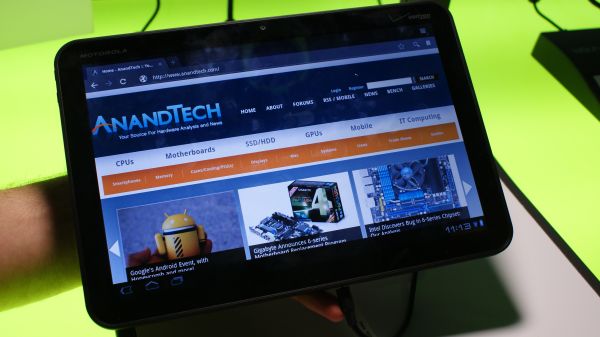
by Mithun Chandrasekhar on February 2, 2011 4:26 PM ESTGoogle teased us (actually, more like flooded!) with what Honeycomb had to offer and multiple tablet announcements at CES last month. Today was more of a detailed look at what Honeycomb was about and what new features and paradigms it brings to the tablet form-factor. Also, unlike the Xoom tablets at CES which just looped demo videos, we got to see Xoom's running Honeycomb firsthand, although it was a 'supervised' hands-on.
I confirmed this with Google; Honeycomb, atleast in the current form, will not be coming to non-tablet devices. But that being said, I was told that features from Honeycomb will definitely trickle down to smartphone OSes and Google actually built Honeycomb with this in mind. I will elaborate a bit more on this later, but after seeing the demos, I can already make a sizeable list of Honeycomb features that Google needs to bring over to the smartphone version of Android ASAP.
Honeycomb + Xoom is Google's straight up answer to the iOS + iPad. Yes, although Google didn't say this openly or brand the Xoom as a 'Nexus' device, talking to people around did confirm my initial impressions that the Xoom is infact the halo device for Honeycomb and Google did work quite closely with Motorola on it. I will mainly be talking about Honeycomb and what it brings to the party; you can find specific information about the Xoom itself here, and here. Plus, we'll go more in-depth when we review the Xoom later.
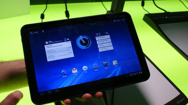
Honeycomb (Android 3.0 from here on) is a pretty massive departure from previous iterations of Android. It is quite clear that Android 3.0 is built from the ground-up keeping the tablet form-factor and the resulting use-cases in mind. It makes very good use of the screen real estate at its disposal. The widgets displayed on the homescreen aren't just static snippets of the app they belong to; the mail widget for example, let's you sift and scroll through your inbox without having to enter the app itself. It's great to have your calendar, inbox and contact list, all displayed and available for use in the same location.
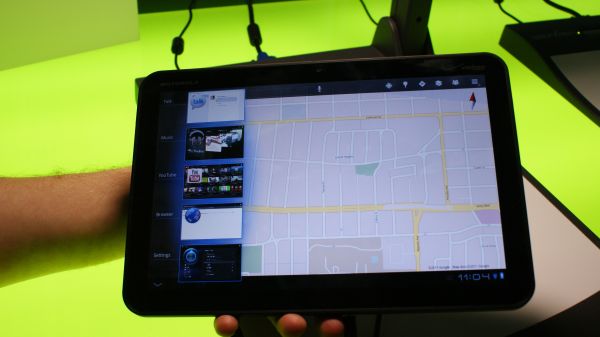
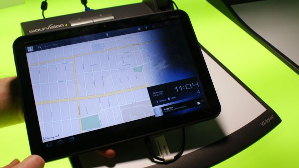
(Top left) Widgets on the homescreen, (Top right) the multitasking pane, (Bottom) Notifications
The second major update is to the multi-tasking aspect of Android. While Android has always supported multi-tasking in some form, it was very similar to the way Symbian handles it; the OS let's you know what other apps are running in the background if you explicitly ask it. As a result, your usage behavior makes you switch apps only when you have to, not when you want to. With 3.0, Android brings multitasking to the forefront much the same way webOS does. Pressing the multitask icon on the bottom left corner of the screen brings up a verticle pane of mini-windows, each representing an app (similar to the cards in webOS). Using this pane, you can easily get in and out of apps running in the background. This is a definite and marked improvement over how Android handles multitasking currently and is one of the features that hopefully gets ported over to Android on smartphones.
The next feature that Android brings along in its latest iteration is a redesigned (and less obtrusive) notifications system. You now get notification pop-ups in the bottom right corner of the screen which you may or may not choose to acknowledge/act upon. You don't get interrupted with a jarring pop-up in the middle of the screen. And the features demoed seemed to make good use of the notifications in Android 3.0. This is another feature that should definitely be ported over to smartphones.


22 Comments
View All Comments
bplewis24 - Wednesday, February 2, 2011 - link
Is there any doubt that Duarte was the driving force behind Honeycomb now? The lead designer for WebOS gets nabbed up less than a year ago, and a version of one of the best features of WebOS (Deck-of-Cards multi-tasking) ends up making an appearance. Coincidence?Samus - Thursday, February 3, 2011 - link
Only time will tell if Hurd is as benificial to Oracal...InternetGeek - Wednesday, February 2, 2011 - link
I like the market. Looks clean, works fast and you can get stuff done.My only qualm is that it seems that for a while now Google has been filtering the apps available to you not based only on your phone model but also on your operator. My proof is that I bought my Nexus One directly from Google and searching for a Bing app in the market from the phone the results will include only Bing for China. If I use the web version of the market there's also an English version of Bing. The website says I cannot install the English version because it is not available from my Operator. I believe this is wrong because this is only a search function that does not require operator support beyond a data connection. It is not related to a revision of the phone specifically for my Operator (Vodafone Australia) because I bought my phone directly from Google.
chocks - Wednesday, February 2, 2011 - link
Filtering on the country and carrier is something that's set up by the application publisher when they submit the application to the market, so it's Microsoft's fault rather than anything Google has done. Possibly they only specified US carriers.alovell83 - Thursday, February 3, 2011 - link
If you are rooted you can use MarketEnabler to fake a carrier code that'll be a carrier that has access to Bing.sprockkets - Wednesday, February 2, 2011 - link
"You don't get interrupted with a jarring pop-up in the middle of the screen."Isn't this something iOS does and up until iOS 4 the option to turn it off wasn't even offered?
I thought Android did this right to begin with.
chocks - Thursday, February 3, 2011 - link
Yes notifications in earlier Android versions appear briefly in the status bar at the top, which can be pulled down to display the full notification. I wouldn't call this a "pop-up in the middle of the screen".alovell83 - Thursday, February 3, 2011 - link
Also, this doesn't require a dismissal, which is half of iOS's problem. Also, I haven't seen a notification when you are in an app, such as a game, or more importantly a movie, which is another big problem on iOS.ltcommanderdata - Wednesday, February 2, 2011 - link
The article mentions several times how certain features of Android 3.0 should be ported over to smartphones. So does this mean that Android 3.0 will not be coming to smartphones? So does Google intend to maintain separate OS versions for smartphones and tablets or will they be unified at some point?And it's interesting that despite the supposed animosity between Apple and Google, Google is using OS X to demo their new App Store, OS, and tablet which of course competes against Apple's ecosystem.
mythun.chandra - Wednesday, February 2, 2011 - link
Quote from the article:"I confirmed this with Google; Honeycomb, atleast in the current form, will not be coming to non-tablet devices. But that being said, I was told that features from Honeycomb will definitely trickle down to smartphone OS's and Google actually built Honeycomb with this in mind."
:)