Dell Adamo 13: CULV Goes Upscale
by Vivek Gowri on July 6, 2010 1:51 AM ESTDell Adamo 13: Industrial Design and Build Quality
The Adamo is stunning to behold. There simply is no better word to describe it. And oh man, is it thin. Best comparison: when closed, the Adamo is roughly as thick as the bottom casing of the 13” MacBook Pro. Yeah.
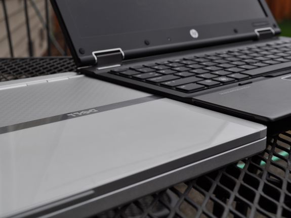
Dell really outdid themselves with the Adamo. Every exterior surface is either glass or machined aluminum. The bottom casing is a single piece of aluminum, a la Apple, and it’s less than a half inch thick. The LCD lid is half glass, half aluminum and surprisingly rigid for something so thin.
All of Apple’s products follow the design principles laid out in Dieter Rams’ 10 Commandments, which pretty much condenses to “Thou shalt be minimal, thou shalt be elegant, thou shalt be functional.” Dell took those design principles and then added some bling to it. Where Apple’s laptops feature clean surfaces and body panels, the Adamo has a visually interesting pattern on the aluminum part of the lid and the bottom of the notebook, not to mention the polished aluminum strip in the middle of the lid. Remarkably, even with the gloss and the aluminum brightwork, the Adamo doesn't look overdone. It has just enough glitz to be eye-catching, but not too much to be a distraction.
The chassis is just a single piece of aluminum, milled out from a thick sheet of aluminum. However, it appears that Dell's engineers reduced the thickness of the aluminum beyond normal levels, presumably to create as much space for the internal components, but they went far enough to allow for a fair amount of flex throughout the chassis. The body of the notebook and the LCD lid are both fairly sturdy given the thinness, but overall when compared to the similarly thin MacBook Air, the Adamo isn't as rigid or as solid structurally. There's some perceivable flex, which is unexpected in such a premium-level device. Also, the screen shows quite a bit of ripple effect under pressure. Again, given the thinness, it's not unexpected, but don't expect this to be a particularly rugged system.
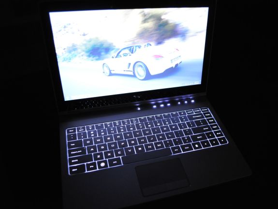
What the thinness can't explain away is the quality of the keyboard. I was pretty hopeful about the backlit keyboard, with it's full size keys, logically laid out keys, and stylishly modern font on the keys. As with the rest of the notebook, it's one of the most elegant looking of its kind. However, the feel is pretty poor - the keys themselves feel plasticky and cheap, and there's perceptible flex. Not a lot mind you (how much give could there be on a .65" thick laptop?), but it just doesn't feel particularly well put together or built to last. The backlighting is pretty weak, so against the silver keyboard it makes it pretty difficult to see in higher light situations. But in the dark, the backlighting is a great feature to have.
The touchpad is pretty nice, I like how the metallic surface feels and the multitouch works well. The buttons themselves are nothing special, they work. The real story with the touchpad is the detailing - the subtle pattern of concentric circles machined into the touchpad surface, how the touchpad buttons integrate with the rest of the touchpad, the polished aluminum ring around the touchpad, etc. It's beautiful, and the detailing is marvelous, which is the Adamo's raison d'etre.
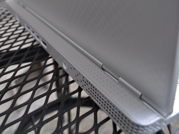
Ports are sparse, but not as limited as on the MacBook Air. In comparison to the almost laughable single USB, micro-DVI port, and headphone/mic combo jack on Apple's superthin portable, the Adamo has a pair of USB ports on the rear panel, joined by a DisplayPort video out, an eSATA/USB combo port (a rarity on ultraportable computers), and Gigabit Ethernet. On the right side, we have a combination headphone/mic port and a built in SIM card slot for 3G data. Interestingly, the SIM slot is designed the same way as the iPhone's SIM card tray and rendered in anodized aluminum, evoking memories of the original iPhone's SIM slot. There's also a 1.3MP webcam and a mic, which work well for Skype.
The speakers are mounted on the extrusion beyond the LCD hinge, presumably because they wouldn't fit anywhere else in the chassis. Unfortunately, this means everyone else around you can hear what's going through your speakers better than you can. The speakers aren't that great, and frequently you want more volume from them. This likely has more to do with them being behind the screen and less to do with the speakers themselves. More impressive is the actual speaker grille, with laser cut holes to let the sound through and a single status light concealed in the middle. The grille is attached magnetically (though it needs to be pried off and doesn't remove easily) and covers the Windows COA sticker along with some of the chassis screws. Putting that much engineering and design thought towards a normally minor piece like the speaker grille again just goes to show how much attention Dell paid to every painstaking detail during the design process of the Adamo.


67 Comments
View All Comments
Wander7 - Tuesday, July 6, 2010 - link
I like the MacBook Pro 13" for the design of the hardware and long battery life, but is there an alternative in the Windows world? I know about the HP Envys and they suck. Any help would be great.retrospooty - Tuesday, July 6, 2010 - link
LEnovo X301 - better all around, higher res, more reliable+ an internal DVDdarwinosx - Tuesday, July 6, 2010 - link
More reliable? A cheap plasticky Lenovo? Puh-lease. Plus you run the archaic Windows OS on it. Unless you use Linux. Terrible battery life too.Btw the 13" MacBook has an internal DVD drive not that I really use one anymore. I can't remember the last time I burned a DVD or CD.
This Dell is a slightly gussied up copy of a MacBook. Hardly innovative design. Brought to you by the company that knowingly sold thousands of defective computers and is known for the worst quality control and support in the industry. This one is overpriced too. Anandtech must be hungry for Dell advertising $$ at the cost of their reputation.
gescom - Tuesday, July 6, 2010 - link
@darwinosx "A cheap plasticky Lenovo? Puh-lease. "What are you talking about? What plastic? What cheap?
The internal chassis and roll cage use an advanced carbon-fiber / glass-fiber material that provides both strength and light weight. The case material is made of magnesium, press as hard as you want anywhere on the body of the notebook and it will not flex. Like all ThinkPads, the X301 is designed for accidental abuse and drops.
And you even compare it to a 13" MacBook / pro? Apple machines are far far behind in everything.
Samus - Tuesday, July 6, 2010 - link
Seriously, if not a Lenovo X301, then what would you have us buy Darwin?quiksilvr - Friday, July 9, 2010 - link
The ENVY 13 and 15 aren't that great.The ENVY 14 and 17 however, are masterpieces.
http://www.shopping.hp.com/webapp/shopping/compute...
maratus - Thursday, July 8, 2010 - link
>>And you even compare it to a 13" MacBook / pro? Apple machines>> are far far behind in everything.
Yes, those crappy extremely low contrast and non-existent viewing angle screens Lenovo puts in almost any of their ThinkPads is a definite sing of the advancement over Apple. So does using inferior GPUs (Intel 4500/5700 for the whole X200, X300 lineup, 2D-optimised version of low-end 310M for T410 and so on). Some say that connectivity is a weakness of Apple laptops. But it does four extremely important things for me:
– MBP does support 2560x1600 (like modern Lenovo and Dell models though) which is a mandatory for me,
– MBP does have high-speed port like FW800. (E-sata is a joke unless it's combined with USB for bus power and even then its power capabilities are far behind of FW800 port). You can run RAID enclosure with two 2.5" / 7200rpm HDDs and fan completely bus powered without single problem. 80MB/s is good for me.
– MBP does have good (and excellent for 15" and 17") battery life.
– MBP runs Mac OS X natively
And while roll cage may withstand a drop why does it flex and creak like a cheap eMachines masterpiece?
mojohacker2010 - Saturday, July 10, 2010 - link
Steve, is that you?damianrobertjones - Tuesday, July 6, 2010 - link
"Plus you run the archaic Windows OS on it"Funnily enough, a collegue in work owns a macbook but refuses to run OSX as it offers 'Nothing new and is basically for stupid people'. Straight from his mouth and he's running Win7 Pro instead of OSX.
Seriously, darwinosx, remove your own head from up your own behind. OSX is no better or worse than windows.
Wizzdo - Wednesday, July 7, 2010 - link
The Lenovo may be a nice machine but... (other than fanboy nonsense) Windows 7 definitely does play second fiddle to OSX in the majority of serious comparisons. Dolled out as an expensive fix for the unhappy Vista era (which itself took forever and mainly brought only incompatibility, high system requirements and general instability and annoyance to its users), Windows 7 added and a handful of OSX like (coincidence?) features and the usual pile of driver incompatibility\workaround headaches along with broken support for psuedo real-time integrations such as professional audio (the vast majority who still use OSX or XP).To say OSX is a toy is to be quite ignorant of its UNIX underpinnings. It is still the preferred platform in the Art (video/graphics/audio) professions which are generally far more demanding and expectant on performance and reliability than most other fields.
Anyhow, one can just do a simple poll of satisfied, hassle free OSX users vs Windows (xp/vista/7). Having to use both daily in practically every possible context, I can tell you which is the most 'toy' like (read: not for serious use) and it just so happens to be the one that plays most of the games ;)