Apple's iOS 4 Explored
by Anand Lal Shimpi on June 22, 2010 3:27 AM EST- Posted in
- Smartphones
- Apple
- iOS 4
- Gadgets
- Mobile
A Much Quicker Camera
Though the real camera update will come with iPhone 4 and the ability to take photos with the front and back cameras, iOS 4 brings camera improvements for the rest of supported hardware as well. One of the first things we noticed was just how much faster the iOS 4 camera software is compared to iOS 3. It’s very, very responsive now.
Previously, there was a good one to two seconds between taking the photo and being able to take another photo on the iPhone 3GS. With iOS 4, you can take photos nearly as fast as you can mash the camera button - it’s stupid fast compared to the old camera application. On an iPhone 3GS, taking a takes about 2 seconds - there’s a shutter animation, preview, and finally you can take a photo again. iOS 4 keeps the UI experience the same, but the shutter animation is considerably faster now. (2.1 seconds on iOS 3 iPhone 3GS, 0.7 on iOS 4 iPhone 3GS)
Unfortunately, the application still takes a long time to launch, between 2 and 5 seconds depending on whether you’re starting from a cold or warm launch. (iOS 4: 2.3 seconds. iOS 3 2.4 seconds for warm launches respectively)
Tapping near the bottom of the camera dialog brings up the digital zoom scrub bar. Initially, we stumbled on digital zoom while trying a tap to focus gesture. It’s difficult to trigger until you specifically try and find it. You can then drag the scrubber all the way to the right, giving you 5x of digital zoom. Digital zoom still remains a marginally useful feature, but it can come in handy in the right context, e.g. for snapping pictures of license plates with funny characters. Definitely not while stalking.
The other major change to the camera application is the ability to tap-to-focus while taking live video. It works just like it sounds like - tap to focus and expose while you’re recording video, not just beforehand. This might sound marginally important, but it’s a hugely welcome update round these parts when taking videos of devices close up or trying to expose for screens and then ambient light.
Viewing Photos
The photos application itself has seen a number of welcome updates. Though the camera application has been geotagging photos for quite some time, the native iOS photo application has until now given users no way of putting that to any use outside of iPhoto.
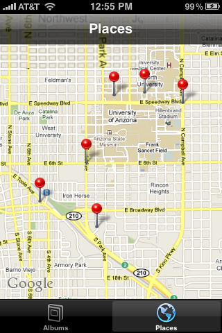
Now, there’s a “places” tab at the bottom that when tapped drops pins wherever you’ve taken photos. The initial zoom shows you all of the places you’ve taken photos, and as you zoom in, pins expand into other pins, giving you finer data. Tapping on a pin brings shows you how many photos you’ve taken at the location, and tapping the blue arrow brings up a custom album view with all the photos.
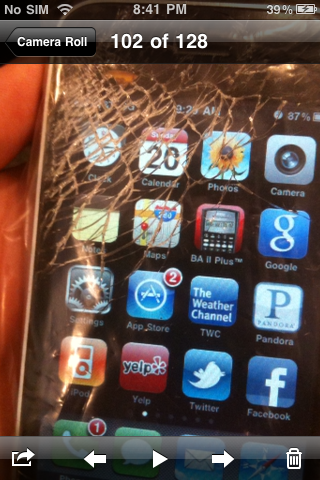
Back in the albums tab, while viewing a single image, there’s now a small play button at the bottom in the center. Tapping it starts a simple slideshow - there’s no Ken Burns effect, but there are fade transitions. It’s a subtle addition, but one nonetheless.


46 Comments
View All Comments
jigglywiggly - Tuesday, June 22, 2010 - link
I haven't used my iphone 3g in a while. I have been using the Droid and HTC EVO 4g.These features have all been implemented better in Android anyway lawl.
Rnair - Tuesday, June 22, 2010 - link
I wonder why the other sites are not as objective! I understand IOS 4 and its pros and cons a bit better now :).medi01 - Tuesday, June 22, 2010 - link
I could only imagine how "objective" other sites are.Anand's site doesn't dare to display iSomethings in a bad light. Check recent article on android devices,
iphone is visible next to android phones, when it has advantage, but "incidentally dissapears" when it would look terrible (screen contrast).
What a shame... :(
deputc26 - Tuesday, June 22, 2010 - link
Yeah i noticed the selective presence of the iphone in that android review as well.Affectionate-Bed-980 - Tuesday, June 22, 2010 - link
You mean Anandtech only knows phones that are sold in the US? The rest of the phones fail to receive coverage. We all know how biased and limited the US cell phone market is. It only glances at part of the industry and only reveals part of the entire market. There's much more out there. Thank goodness for the N900 review, but honestly, if you want to do smartphones, do it like other sites do. Cover EVERY phone.medi01 - Wednesday, June 23, 2010 - link
No, being oriented to a particular market is ok for me.But showing iSomething when it has advantage (even when it is irrelevant), but "incidentally" hiding it (the author explained it like: "oh, it was probably in my pocket", that explains it, right?), when it sucks balls (contrast, for starters) is a shame.
So it seems that we have Mr Jobbs corporation, that sells a fraction of Nokia's market share, but that enjoys free, positive or very positive but god forbid negative, coverage in press.
I recall anand's site as rather objective (even though they seem to aggressively punch AMD quite a bit more than deserved recently, it was rather subtle, compared to what other sites do), so it's VERY frustrating, that it also bends to a Mr Apple's will.
:(((
Rnair - Tuesday, June 22, 2010 - link
I agree that the smartphone is getting more and more complicated. Good for us teck geeks :).But, Is it time to get back to the roots and introduce a version that is more basic, anyone for an iphone mini (an ala kin) ?
eirikma - Tuesday, June 22, 2010 - link
...then windows 95 is a cluster operating sytem. Even old versions of symbian does better than that.Any smart phone user who've tried using a computer knows that there are limits to how many thing you can do at once. When things stop working, you have to close down something. It is actually that simple - you don't have to "invent" absolutely everywhere.
SkullOne - Tuesday, June 22, 2010 - link
Yeah but this is Apple we're talking about. If they didn't invent or improve upon it then it sucks. ;) My Droid has never run out of memory with its multitasking and I have it doing quite a bit at times.Apple didn't do multitasking "the right way." They did it half-assed and claim that it's magically delicious.
All I can say is it's about time iOS finally caught up to Android...oh wait they're still behind because Android 2.2 is upon us bringing JIT compiler and Flash 10.1.
I'll keep my rooted, overclocked Droid with Froyo ROM thanks. Hope iPhone users enjoy iAds. AdMob in apps on my old iPhone 3G drove me insane, glad my Droid doesn't have that problem. It's nice actually having control over the hardware you pay for. ;)
sigmatau - Tuesday, June 22, 2010 - link
Multitasking is not at all what I expected and am very dissapointed. This is one feature I have been waiting for several months.I found the memory problem myself using Safari and multiple tabs. Some of the multiple tabs would dump whenever you scrolled through them, and then all of them would dump when you would switch to another app and back to Safari. I cleared out all the "multitasking" apps and opened up Safari again. I reloaded all tabs and they stayed fully loaded when I switched to a system monitor app to look at my memory.
Before clearing out the "multitasking" apps I had 5mb of free RAM. After clearing out the "multitasking" apps, I had 125mb free. They really, really need to give you the option to chose what to multitask. Why do I need Phone, Settings, Contacts, Clock to go in the "multitasking" bar? It makes no sense. Apple is 1 year behind others in implementing multitask and it surely is not as good as the competition.
I wont even go into being pissed that they haven't fixed the basic phone alert functions and other simple things you could do with most other free phones never mind smart phones.