The Microsoft Surface Laptop Studio Review: Dynamic Design
by Brett Howse on October 5, 2021 9:00 AM EST- Posted in
- Laptops
- Microsoft
- Surface
- Surface Laptop Studio
Design
I was a big fan of the Surface Book. The idea of having a detachable display – which means the main parts of the computer were behind the display – was unique in the high-end PC space. Utilizing the keyboard base for extra battery and a GPU meant that the Surface Book was not just a tablet with an attachable keyboard. It was a powerful notebook, with a great design.
That design, unfortunately, had some compromises to contend with. As a notebook, the Surface Book did not have the same balance as a traditional laptop computer; thanks to the main components of the laptop being located behind the display, the convertible laptop was top-heavy. Microsoft was able to counter this with a unique hinge design which would roll out when opening the device, which extended the base and made the laptop less prone to tipping backwards. Also, having the dGPU in the base gave it much more room for cooling, which improved GPU performance, but since you cannot just disconnect an active GPU from a program without crashing it, it caused some usability quirks with the detach mechanism.
So far as interesting and unique as the Surface Book was, it was clear that there were some challenges with the design that could not be overcome.
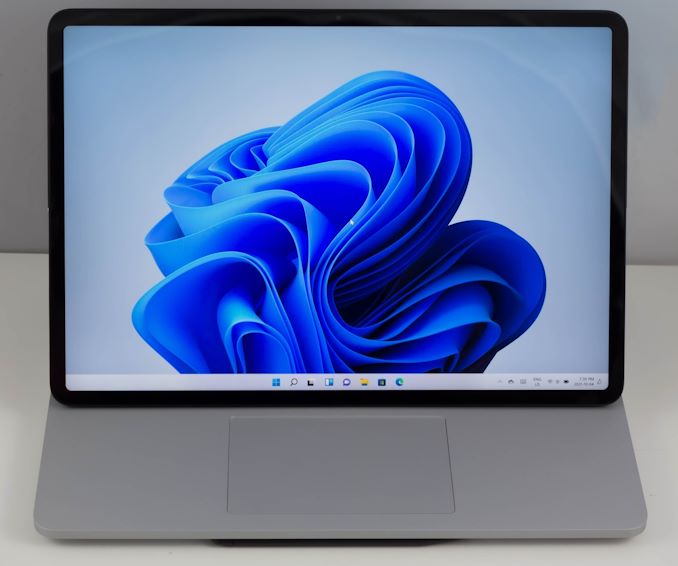
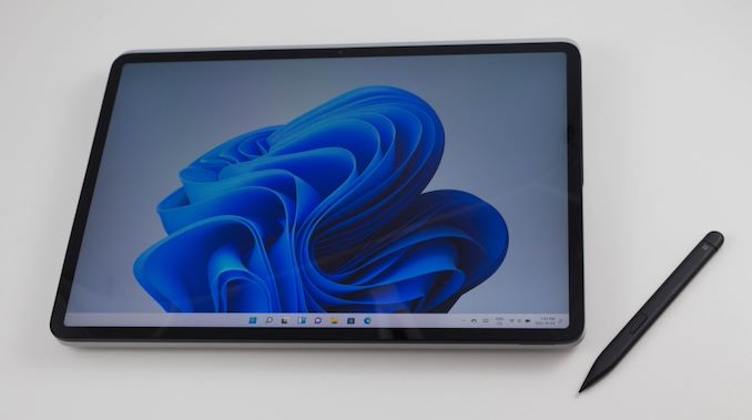
Enter the Surface Laptop Studio, which takes the idea of a powerful convertible notebook, and addresses the usability issues to make it a much more fluid experience. Thanks to the dynamic woven hinge, Surface Laptop Studio gets the convenience and usability of a convertible design, but without the traditional drawbacks. Microsoft is not the first to have a display be able to be tilted and folded into a tablet-like experience, but their new hinge is the most elegant solution yet and eliminates almost all the drawbacks of a convertible.
Taking a closer look at the display there are some subtle-yet-wonderful design touches. Microsoft has gone with a radius design on all the exterior corners, and that same radius is matched on the LCD itself. This is a nice touch and fits in well with the new UI aesthetic of Windows 11. The display bezels are not small by the standards of today, but they are dramatically smaller than the outgoing Surface Book. I also like that Microsoft chose to keep the bezels consistent on all sides, rather than tiny on the sides are large on the top and bottom to accommodate the webcam.
In regards to the webcam, probably no laptop component has become as necessary with the prolific rise of video conferencing, and Microsoft has outfitted the Surface Laptop Studio with a 1080p webcam which also supports Windows Hello 2.0 IR. Windows Hello 2.0 is what you would expect, with faster recognition and quicker unlocks, and is apparently better at recognizing you even with some of your face obscured by sunglasses or facial hair. In my limited experience with the Surface Laptop Studio, the Windows Hello worked flawlessly in all tested conditions and regardless of lighting.
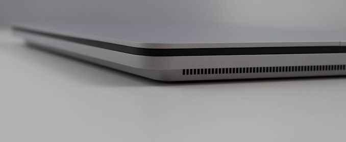
Microsoft has created the chassis of the Surface Laptop Studio with a unique step design. The base is slightly smaller than the keyboard deck and features cooling holes on both sides. The fan design puts the fans at the front, which draws cool air on from the back and expels the hot air out the front sides. The step design also provides the perfect spot to store the new Surface Slim Pen 2, which can be magnetically docked on the sides or the front, which also charges the pen. It is a smart design.
Speaking of smart touches, the first time you tile the display forward, the Laptop Studio automatically launches a short video explaining how to utilize the device, and it ends with a demo of where to dock the pen. Once you dock a pen (assuming you buy one) it will then move to pairing it automatically. It is a well thought out experience which will make first time users more easily get the most out of the design.
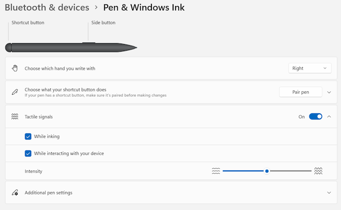
The new Surface Slim Pen 2 has also been improved in terms of latency and responsiveness. A newly designed digitizer offers higher sensitivity, meaning even less contact is needed before the pen starts to register. The pen still offers an eraser on the opposite end, as well as a haptic button. The carpenter’s pencil shape works well in the hand for writing, although I am curious to see how artists feel about the new design compared to the outgoing Surface Pen. It also does not appear that you can change the tip anymore either. But the fact that it does dock to the device will likely sway most people to its design. The new pen is also compatible on older devices, although not with the same levels of latency. The new Slim Pen 2 when used with the Surface Laptop Studio offers latency down to 12 ms, compared to 25 ms on the older Slim Pen (1).
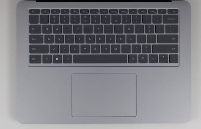
Microsoft has upped their game in the experience department again with a new keyboard design which they are saying is the best they have ever put on a notebook. After using it, it is hard to argue, The Surface Book offered a fantastic keyboard as well, but the mechanical clicking action of the new Laptop Studio is definitely a step above. Also, they have made the key caps themselves a darker color than the body, unlike the Surface Book’s monochrome look, and that dramatically improves the contrast of the keys when using the white backlighting. The key caps are slightly dished, which lets you get a better perch on them with your fingertips.
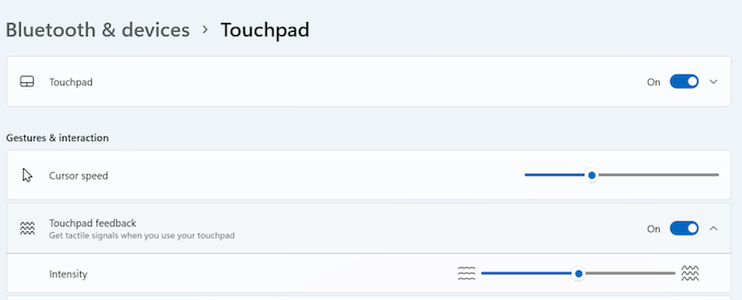
Also new is the first ever haptic touchpad on a Surface device. In years past, Microsoft has provided some of the best touchpads for PC laptops, and with the Surface Laptop Studio they have widened the gap further. The trackpad is smooth and responsive, and the haptic feedback does a wonderful simulation of the old-school click without having to have a moving trackpad. It of course supports multi-finger gestures as well, and both the trackpad and haptic feedback are adjustable in the settings.
Microsoft has held onto USB Type-A for so long that it is almost surprising to see it completely removed on the new Surface Laptop Studio, but the inclusion of two Thunderbolt 4 ports should ease the pain. The best part about Thunderbolt 4 is not that you have a very high speed I/O interface, but that Intel has done the right thing and ensured that Thunderbolt 4 supports all options on Type-C. There is no question of does this port support display or charging or whatever. It does it all and will open up a much better docking experience than the USB-based docking of Microsoft docks.
Overall, the design of the Surface Laptop Studio is fantastic. The build quality is fantastic, and the design touches such as the radiused corners also being on the LCD are a great touch. Microsoft has improved their keyboard and trackpad as well, and it was already one of the best in the PC industry. The Surface Laptop Studio packs all the performance of the Surface Book and more and does it while also eliminating some of the pain points on the Book’s unique design, and while coming in smaller, and lighter. It is hard to see how this is not a win on all sides.




53 Comments
View All Comments
cknobman - Tuesday, October 5, 2021 - link
I feel like Microsoft made a bad decision to go with the 3050ti.Nvidia hamstrung the 3050ti really bad with its memory capacity and bandwidth.
One of the few times I'd say save your money and stick with integrated graphics.
Manch - Tuesday, October 5, 2021 - link
Maybe a mid year refresh will have their in house discrete GPU's.I like the Surface book. This like all other foldables is a compromise. The book, disconnects and I have a nice thin tablet, connect, I have an excellent laptop with great battery, KB/TP and a DGPU. both of these are noticeably heavier than the previous kitted out Surface Book. Wish they'd keep selling the Book.
tipoo - Tuesday, October 5, 2021 - link
This isn't really a gaming system and the RTX stuff can help with some pro apps (such as OptiX), there's not really a comparable IGP yet.gescom - Tuesday, October 5, 2021 - link
I feel like Microsoft also made a bad decision to go with a 4 core Intel cpu.timecop1818 - Wednesday, October 6, 2021 - link
As opposed to what, 8 core piece of shit from AMD that doesn't have USB 4.0 or working IGPU?Prestissimo - Wednesday, October 6, 2021 - link
You know what's funny? "Acer ConceptD 3 Ezel 14" laptop is basically identical to this (because MS copied it), but the original Acer wisely used a 8-Core Intel + GTX 1650 and saved a few bucks on their low-end model.The Ezel 3 costs $1200 on eBay right now, VS the SLS that costs $2500 with a 2 year warranty, for almost identical specs.
Acer will refresh their whole Ezel lineup (5 laptops, goes up to i9/Xeon and 3080/Quadro A5000) in a few weeks, and for $2500 that Microsoft charges, you can buy the Acer Ezel 7 that will have an i7-11800H + 3060, and a much better Wacom EMR stylus.
cknobman - Wednesday, October 6, 2021 - link
Oh wow good catch!!Looking at the Acer it appears like Microsoft did copy their design.
edzieba - Friday, October 15, 2021 - link
That 'flip screen' form factor dates at least back to the 2013 Vaio Flip, and I'm pretty sure there was at least one Netbook (remember those?) that used that layout even earlier.Tams80 - Thursday, October 7, 2021 - link
It's a shame that the ConceptD 3 Ezel uses AES. The 7 is a bit too big, but Wacom EMR...Prestissimo - Saturday, October 9, 2021 - link
The device comes included with AES 1.0 but third party AES 2.0 pens do work on it, which is on par with the Surface Slim Pen 2's performance in terms of diagonal jitter and input lag.