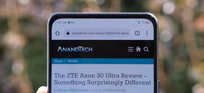
The Axon 30 with Under Display Camera: Hands-on Mini-Review
by Andrei Frumusanu on September 3, 2021 9:00 AM EST- Posted in
- Mobile
- Smartphones
- ZTE
- Axon 30
Conclusion & End Remarks
The Axon 30 is an interesting device, both in terms of specifications and also in terms of product category. First and foremost, I had to keep reminding myself that this is a $499 phone, and that’s also a quite important aspect of the device for US readers who usually have extremely little options in that price segment.
Design wise, it’s a relatively generic phone that’s more defined by its size than anything else; with a 6.92” display and 77.8mm body with, it’s a large footprint phone even though it manages to keep things quite reasonable at 189g. Build quality is decent but generally below that of the smaller, higher-end Axon 30 Ultra – which is actually not much of a surprise.
Performance of the phone is great, thanks to the still very competent Snapdragon 870 chip. Peak performance isn’t at S888 levels, however this chip is more power efficient and manages to keep the device cooler than the Axon 30 Ultra.
The defining characteristic of the device is the under-display camera and the screen by Visionox which enables it. There are two large conclusions to be made here:
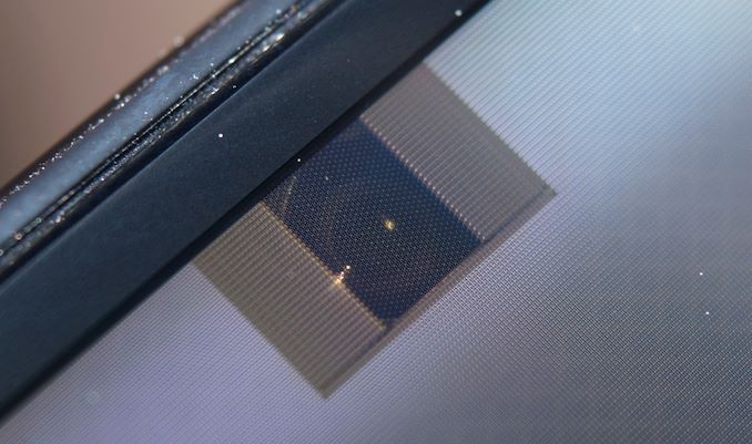
Firstly, the visual implementation of the UDC is amongst the best we’ve seen so far. While not perfect, the phone manages to hide its under-display camera extremely well. If ZTE manages to even out the brightness differences between the UDC area and the regular panel when viewing the phone head-on, I would say that essentially, you’d be hard pressed to see it anymore.
From a camera quality perspective, I had low expectations, but I was actually still surprised at what ZTE managed to achieve thanks to software processing. Essentially, the camera acts as a 4MP unit, which is quite low res, so you should not really expect great details. Dynamic range and textures are also quite below the norm, however compared to the raw output of the camera, you can’t help but respect the image processing that the phone is achieving.
Overall, if you’re the kind that looks to hide away the front camera to achieve the bezel-less look, I think the Axon 30 is a success. If you still value camera quality – we’re not quite there yet.
The second conclusion of the UDC is related to the display panel itself. It’s the first time we’ve tested a Visionox panel, so I wasn’t sure what to expect, but I had rather low expectations. In terms of brightness, the panel is extremely competitive, however that’s about it when it comes to the positives. The panel differs quite a lot from the usual OLED contenders – when looking at it from extreme angles you can see the polariser shimmering in viridescent colours, something I haven’t seen in many years. The pixel layout, while not exactly visible to the eye, also does feel somewhat less sharp than the regular diamond pentile we’ve gotten used to from Samsung.
One could live with the aforementioned aspects; however, the large deal-breaker is the unsatisfactory power efficiency of the panel. At 423nits brightness, the phone uses 2.87W of power, which is significantly worse than Samsung Display OLED panels (S20U – 2.4W, S21U, 1.8W) Much like the many phones that got ruined by inefficient displays in the past, it also looks like the Axon 30 is also suffering from a larger battery life hit due to the display.
Given the choice of a UDC with an inefficient screen, or a hole-punch with an efficient screen, I’d always choose the latter.
Overall, I think the Axon 30 is an interesting phone, but I can’t help feel it’s still more of an immature technology showcase rather than a refined product. I think the Ultra sibling is still a much better phone, but at least ZTE is pricing the Axon 30 at a quite reasonable level.


24 Comments
View All Comments
GreenReaper - Friday, September 3, 2021 - link
It seems what is essential to this phone is invisible to the eye... except at an angle.Kangal - Friday, September 3, 2021 - link
The implementation would have been more convincing if the UDC was on the Top-Left Corner. There needs to be some software/OS feature built-in to actually "black out" that section when the Front Camera is in use. Not just for the Stock Camera, but for other Apps like openCamera and Snapchat etc etc. On top of this, I think it requires a slightly better front camera (sharper camera, larger sensor).Portrait mode; the UDC might be hidden by the icons in the notification bar. And when the Notification Bar isn't displayed, that entire section could just be a colour that blends in with the content.
Landscape mode; that corner is mostly un-used. Think of most movies, that section is more like the blindspot. So here, the subtle differences, will also be masked.
Overall, they've done great with the UDC implementation, camera choice, 4MP downsampling, post-processing, and the adequately sharp 1080p display. Can't wait for this to get even better.
Samus - Sunday, September 5, 2021 - link
Kangal took the thoughts out of my brain bone: if they put this in a top corner its much more "transparent" to the user.Either way, the under screen camera implementation is far more impressive than I thought it would be going into the article, and honestly the 4MP output is totally adequate unless you are actually taking selfies with the front camera.
sharath.naik - Monday, September 6, 2021 - link
Why do these manufacturers feel the need to do under display camera? It is at best horrible, NO ONE IS ASKING FOR IT. It is baffling the level of nonsensical decision making that goes into going into this direction. The display cut out is Already small enough to be a nonissue.Round cutouts are that are small enough and in the center are absolutely fine. Even having a small bezel at the top and bottom to accommodate the camera and front Firing speakers are even better. No one is asking for Zero bezel at the top and bottom, let alone an under display camera.
CampGareth - Tuesday, September 7, 2021 - link
"NO ONE IS ASKING FOR IT"Hello, I am a human being and I am asking for under-display cameras. I bought a galaxy fold 3 instead of a 2 for this reason. I like big uninterrupted displays but a camera is still useful for video calls, face unlock and the occasional selfie. I would accept a motorised pop-out camera but that takes up more space than a UDC, space which I would rather use for batteries. I would love to have UDCs on my laptops in exchange for slimmer bezels leading to smaller laptops for a given screen size or more screen for a device size.
Speak for yourself not for others, we all have different opinions.
Tams80 - Tuesday, September 7, 2021 - link
You want slimmer bezels on your laptops...Sorry, but that alone makes your opinion silly.
Tams80 - Tuesday, September 7, 2021 - link
I'm only interested if the camera is going to be placed in or near the middle of the display. That would be innovative and useful (if still poor image quality).But otherwise, yeah, just use a damn bezel.
shabby - Friday, September 3, 2021 - link
Surprised the udc area ppi is identical to the main screen, Samsung's implementation has 10 year old ppi in that section, how are they so far behind?Fulljack - Saturday, September 4, 2021 - link
Samsung uses foldable display which adds complexity.Samus - Sunday, September 5, 2021 - link
Samsung also used previous gen tech. Even the recently launched Z Fold 3 uses a 4MP front camera (the actual sensor is 4MP, not just capturing at 4MP like this one.)This phone appears a generation ahead on UDC technology.