The iPhone 7 and iPhone 7 Plus Review: Iterating on a Flagship
by Joshua Ho & Brandon Chester on October 10, 2016 8:00 AM EST- Posted in
- Smartphones
- Apple
- Mobile
- iOS
- iOS 10
- iPhone 7
- iPhone 7 Plus
iPhone 7 Software UX
Section by Brandon Chester
Last month I published my review of iOS 10. I feel that iOS 10 is a large release for iOS, bringing improved stability and performance as well as important advances to key APIs and a number of new features. In particular, the expansion of 3D Touch support throughout the OS and the addition of a proper API for developers will be a big part of pushing developer adoption of Apple's pressure sensitivity features. All of the iPhone features I talked about in the review apply to the iPhone 7, and like every new iPhone, the iPhone 7 comes with some exclusive features and developer APIs of its own.
Haptics and 3D Touch
Haptic feedback now plays a prominent role throughout the UI in iOS 10. Different UI interactions can trigger different feedback responses. This is not an entirely new feature, as the iPhone 6s utilized its Taptic Engine to provide three different types of feedback for 3D Touch interactions. When using standard 3D Touch actions like peeking to preview a ViewController or opening quick actions, you would experience a very quick and relatively weak vibration. In the case of Peek and Pop, applying more force to pop that ViewController onto the screen would generate a stronger and slightly longer vibration. The third case was trying to 3D Touch in an area where it isn’t applicable, which would generate three very quick vibrations in sequence.
The three classes of vibration that exist on the iPhone 6s have been carried over to the iPhone 7, but they have been somewhat altered. Anyone familiar with 3D Touch on the iPhone 6s will notice that the feedback response is much stronger on the iPhone 7, and it may be more accurate to say that the Taptic Engine now has a range of feedback strengths. 3D Touch on the iPhone 6s used different vibration patterns and durations for different actions, but every vibration generated could be described as quick and light, and each one had a relatively high frequency noise accompanying it. On the iPhone 7 the sound made is almost inaudible, and the vibration really makes it feel like the phone is responding to the force of your finger. These changes can be attributed to improvements in the design of the Taptic Engine, which would have been necessary to provide feedback to simulate pressing the home button. However, Apple hasn't provided any details on what has changed at the hardware level, so exactly what improvements have been made is a matter of speculation.
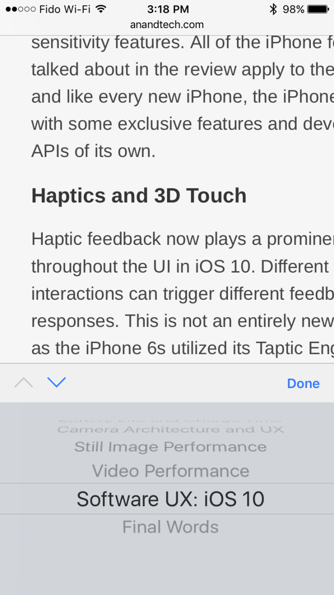
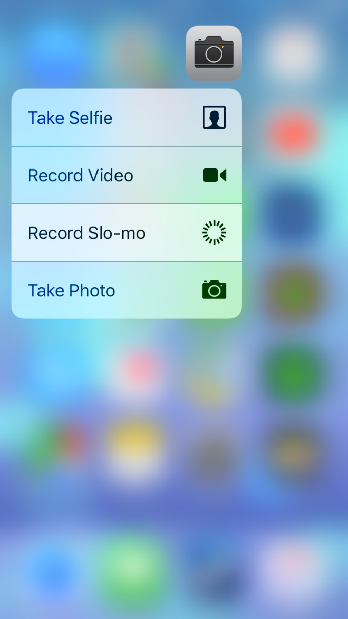
In addition to support for stronger feedback, the improvements to the design of the Taptic Engine have enabled additional types of haptic feedback that are not available on the iPhone 6s. The most obvious use of feedback is in selecting things from menus. For example, quick actions on application icons work well because your finger will already be on the display when the menu appears, allowing you to slide up or down to the desired action before releasing. To indicate when the selection has changed, the iPhone 7 will generate quick vibrations generated as your finger moves between the different rows in the menu. By giving the interaction a true physical response, it cuts down the abstraction in the idea of moving fingers on a piece of glass to manipulate what you see on the screen. This type of response is used in other areas as well, with the most common being data inputs or dropdowns that use a UIPickerView.
Haptic feedback is also used when views move into position on the screen. This is often used when a reaches its final position, or when it collides with one of the edges of the display. For example, Notification Center now has two areas where haptic feedback is played. The first is when opening it relatively slowly while inside an app. In this situation Notification Center has a search bar embedded in it, and when that falls into place there's a quick vibration generated. When the menu is pulled down fully there's another vibration as the bottom collides with the bottom edge of the display. While these sound like small changes, the feedback generated when views collide with other views or the edges of the display really gives the interface a whole new level of depth. I think it'll be really interesting to see how feedback can be integrated with games, as well as physics-based interfaces built using UIKit Dynamics.
Haptic Home Button
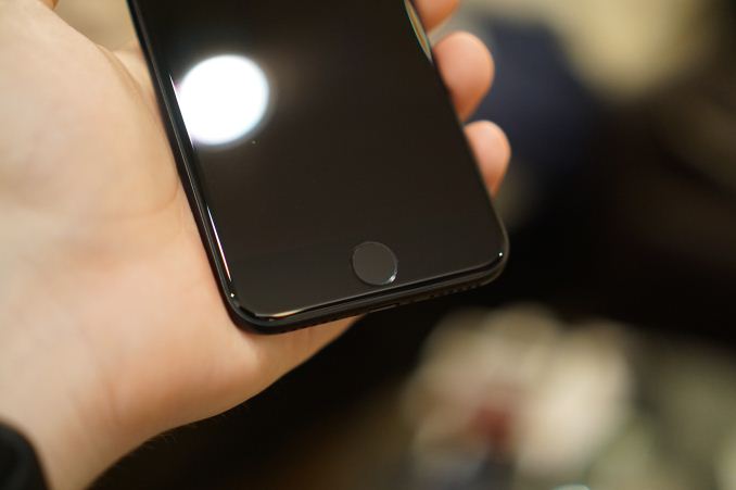
The most prominent use of haptic feedback is actually in the iPhone 7's new home button. It's a solid state button, with absolutely no physical mechanism underneath. In fact, it doesn't move at all. It's often claimed that Apple's Force Touch trackpad doesn't move, but on their MacBooks there is a degree of vertical movement even if there's no physical mechanism being pressed underneath. In the iPhone's case, it's just a circle shaped the same way as the old home button, and it's fixed in place as part of the bottom bezel. Rather than pushing down to activate a switch, the button detects when force is applied and generates a vibration using the Taptic Engine to simulate the feedback of pressing a physical button.
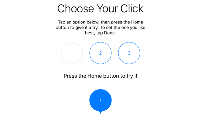
Apple provides three different click settings for the home button, much like how the firmness required to activate the Force Touch Trackpad can be customized with three different levels. The first setting is a very quick and sharp vibration, and it gives the feeling of a button that doesn't have much vertical movement. The second setting isn't as quick or as sharp as the first, giving the feeling of a button that has more vertical movement. The increased vibration can be felt more throughout the entire phone, which impacts the perception that the button is what's moving rather than the entire bottom bezel. The issue is that as you increase the strength of the vibration, you expand the area of the phone through which you can feel the vibration. On setting three the vibration is strong enough that it feels as though the entire bottom of the phone is being pressed down, and it can be felt easily from the back of the phone which ruins the trick of simulating the feeling of a button with the vibrations. As a consolation, the third setting is the only one that actually feels usable when the phone is laying on a table, as you only feel the vibration on the button and the strength of that setting is required to avoid the feeling that you're just pressing against a solid piece that isn't moving.
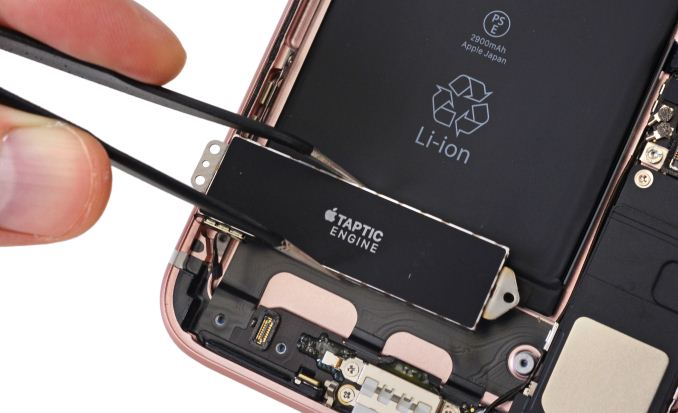
iPhone 7 Plus Taptic Engine (Image Courtesy iFixit)
As for how these settings correlate to the existing home buttons, that really depends on what device you're coming from, and how old it is. It's not really a secret that the feeling of the physical home button in past iPhones degrades as time goes on and the physical mechanism wears, with it being quite clicky and sharp to begin with, but gradually becoming softer feeling with a less pronounced clicking noise. For anyone coming from a 4-inch iPhone, all I can say is that none of the settings will feel like your existing home button because those iPhones have more vertical movement and a different mechanism than larger iPhones, and even the third click setting can't come close to mimicking it. Users coming from an iPhone 6 or 6s will have to choose between the first and second settings, with the former mimicking the sound and sharp clickiness of the existing buttons, and the latter being closer to the force required and better simulating the vertical movement. If you have an older iPhone 6 that has lost some of its clickiness you'll probably lean toward setting two as well.
I was initially apprehensive of the new home button, but as I've used it I've become used to how it feels. I think it's fair to say that the button on the iPhone 6s was nicer to press, and none of the settings for the new button truly replicate that. They likely never will. However, the solid state nature of the new home button actually presents some interesting advantages. Because it's not a physical button that has to move down and then move back to its original position, you can perform successive clicks with essentially no delay beyond how quickly you can press down with your finger. This means that actions like double tapping to open the recent apps tray or double tapping to access Apple Pay on the lock screen are significantly quicker on the iPhone 7. Ultimately, while there are tradeoffs, I think users will grow to enjoy the new home button, even if there's an initial period of unease toward the change.
UI Performance
One thing I wanted to address about the iPhone 7 is an issue that I've noticed with certain system animations. I've seen this pointed out by other members of the tech press, and I initially believed that it was an issue of performance, but after talking with Apple it seems that the explanation is more complicated than I had imagined.
On iOS 10 Apple added the ability to interrupt certain animations. They've also made significant changes to how UIKit handles animations, allowing for better transitions between two animations and the ability to reverse an animation. I briefly covered these in my review of iOS 10. One of the areas where Apple has deployed these features is opening and closing applications. In the past, you were forced to wait for the app opening animation to finish before you could return to the home screen, which was quite bothersome if you accidentally opened an application that took a while to load its initial ViewController. This animation can now be interrupted, allowing you to cancel the opening of the application instantly by pressing the home button. The iPhone 7 and 7 Plus also have a special feature when closing applications. If you keep your finger on the home button and press it a second time after pressing to close the app, you can override the app closing and transition to the recent apps screen.
App closing animation on iPhone 7
Recent apps animation on iPhone 7
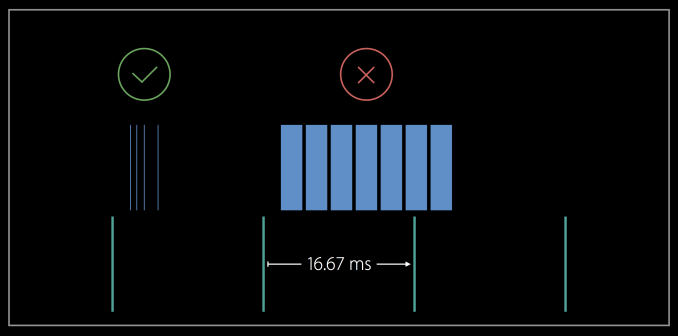
Being able to transition directly into recent apps is an interesting feature enabled by Apple's new home button, but the implementation is imperfect in its current form. The first issue is that it actually introduces a momentary stutter in the app closing animation. This stutter occurs at the point where it's no longer possible to cancel the closing of the app and move to the recent apps screen, and it comes as a consequence of Apple altering the timing functions used for the animation to enable the feature. It also causes strange motions when you open the recent apps menu, as even if you tap the home button twice in quick succession, the tweaked response of the new home button will always be faster than your finger clicking a second time. This means that you always see the start of the app closing animation before the recent apps animation starts, giving a different animation than you'll see on other iOS devices. I actually went through the animations frame by frame to create the images above. Apple is working to improve both of these issues, and ultimately it will come down to improving how transitions between animations are handled, as well as altering the timing function for the animations to prevent the areas where frames are dropped.
While the two issues above are more like animation bugs than performance problems, I think it's worth mentioning that even on the iPhone 7 with iOS 10's scrolling performance optimizations there are still a number of areas where strange frame drops and stutters can occur. For example, the performance in the Music app is just a complete and utter disaster, and it has been since iOS 7. Other areas just have inconsistent and random performance issues, like dropped frames when swiping and scrolling widgets, or when first bringing up 3D Touch quick actions, or when swiping between locations in the Weather app. I'm certainly not the first tech journalist to bring these issues up, and perhaps the most apt description I've seen is that the tiny bugs and stutters end up being death by a thousand cuts.
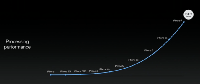
As mobile operating systems have become more complex, the task of maintaining a constant frame rate of 60fps has become more difficult. Obviously it's impossible to guarantee perfect performance in every scenario, but assuming you write software with the limits of your hardware in mind, you should generally be able to promise good performance. It's also worth noting that every year we hear about how Apple has increased CPU performance by some amount, and GPU performance by some other amount. Apple then shows how their SoCs are tens or hundreds of times faster than the original iPhone. While Apple's advancements in SoC performance are very impressive, they haven't necessarily translated into improved interface fluidity. I think it's very concerning that the mobile device I would consider the smoothest I've ever used is not the iPhone 7, nor is it the iPhone 6s, iPhone 6, or iPhone 5s. I can say with a great degree of certainty, based on actually having used one relatively recently, that the iPhone 5 running iOS 6.1.5 is the smoothest mobile device I have ever used. iOS 10 is definitely the smoothest of the iOS releases after that point, but it's still not at the same level despite the hardware its running on being many times faster.
I actually don't find this situation surprising, as it speaks to how market forces have influenced the direction of Apple's software in the years since iOS 6. At that time, Android was rapidly adding new features and abilities, and the sentiment among the technology press was that Apple wasn't keeping up on features. Knowing what iOS 6's feature set was compared to Android Ice Cream Sandwich and Jellybean, that was absolutely correct. It's also true that iOS maintained 60fps throughout the UI much better than any Android device at the time, even on older devices like the iPhone 4.
In addition to the redesign that came with iOS 7, Apple began rapidly adding new features to iOS. Whether you want to describe this as software innovation, or catching up to Google is up to you. I personally don't care for pointless arguments about feature copying and similar matters. However, what I do recognize is that there are a finite number of hours in each day, and because of that, a finite amount of engineering effort that can be put into making an operating system. While the situation is not entirely binary, if you focus strongly on adding new features, you have less time to spend optimizing performance. Anyone who works in software development can also confirm that the problem is not solved by doubling the number of engineers working on a project, and in fact, naively adding additional developers to get work done quicker can actually have a negative impact on productivity.
As Apple has rapidly added new features, UI performance has taken a hit, and the nature of the performance problems is such that throwing more hardware at them won't make them go away because they're often due to circumstances where rendering is blocked or is being done in a manner such that even large improvements in performance would not bring things back to 60fps. While I'm not going to comb through the entire OS to find all the cases where this happens, it happens enough that it's something I would describe as a significant pain point in my experience as a user.
As far as tackling these problems goes, the simplest option for Apple is to just do nothing. This sounds absurd, but if you actually look at the state of the market it's a perfectly viable option. Even if you agree that iOS performance has gotten worse since iOS 6, that hasn't done anything to hurt sales of the iPhone, or to hurt iOS update rates. The iPhone gets more sales and brings in more money now than it did during the time of the iPhone 5. This raises the question of whether your average user is actually bothered by frame drops throughout the OS. Even if they do notice, it doesn't seem to pose a very significant problem. As someone who is bothered greatly by these performance issues, I would not like Apple to go this route, but I recognize it as a valid decision.
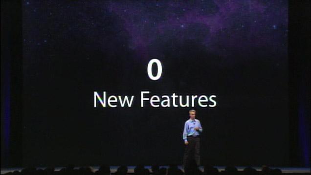
Assuming that the route of not addressing the problems is not the one Apple takes, then the question is how these issues get fixed. It could be done over time through updates on top of iOS 10, and going forward with the next major versions of iOS. The pace of feature additions on iOS could also be stopped, and there's actually precedent for Apple releasing software updates that focus solely on optimization. OS X Snow Leopard followed Leopard, and it was advertised for improved performance and efficiency, with no new features. The latter part is obviously an exaggeration, especially since it introduced OpenCL and Grand Central Dispatch for developers, but in general, the number of brand new user-facing features was small. This would give Apple their entire development cycle to focus on optimization and efficiency, and I think it would represent enough time to iron out the majority of the major performance problems that exist on iOS.
The problem with a major update that only focuses on efficiency is that the marketability of such an update is questionable. As I said before, these problems don't seem to be stopping iOS device sales in any capacity. No new features is not exactly an appealing marketing message when you could market that you have 200 new features. It also puts Apple back in the same position where the tech community will deride them for not innovating and falling behind the competition. I personally think that Apple is in a position where they can ignore such complaints in order to truly focus on the user experience, but as an external observer I obviously don't know all the factors that have to be considered in making such a decision. In any case, OS X Snow Leopard provides precedent for such an update if Apple decides to go that route, and given that an update focusing only on performance would be the quickest way to sort out these problems in the operating system, I think it would be to the benefit of all iOS users if they did.






377 Comments
View All Comments
ddriver - Monday, October 10, 2016 - link
So much for long delayed reviews because of "details".willis936 - Monday, October 10, 2016 - link
It's been literally a month. What world are you living in?ddriver - Monday, October 10, 2016 - link
The world in which AT reviews take many many months apparently.londedoganet - Monday, October 10, 2016 - link
I, too, would like to base my buying decisions on quick impressions made in the week immediately after a product's launch. And Anandtech doesn't quite scratch that itch for me.solipsism - Monday, October 10, 2016 - link
If you want fast reviews of products there's innumerable websites and YouTube videos in which to choose. If your argument is, "sure, but it want it from AnandTech," and the reason is you want it from AT is because of their detail and thoroughness, then you have to wait for them to be detailed and thorough.Note that AT did give you a hands-on review from the event and an article of the teardown:
• http://www.anandtech.com/show/10657/hands-on-with-...
• http://www.anandtech.com/show/10687/early-iphone-7...
Cheesetogo - Monday, October 10, 2016 - link
Oh please, it doesn't require a month to write a review like this. Not sure if Purch doesn't fund the site enough or people just aren't motivated since Anand left, but there's been a very noticeable decline.Here's an AT review of the iPhone 3G, published *5 days* after the phone came out. It's also more detailed than this one.
http://www.anandtech.com/show/2571
dsumanik - Monday, October 10, 2016 - link
Everyone remember when i predicted this review, its content, the photos, and its outcome a few weeks back?Who's laughing now?
8)
solipsism - Monday, October 10, 2016 - link
You're compared they efforts they put into testing this phone's HW with how they tested the 2nd gen iPhone and also compiled a "more detailed" article because you're lumping in what would eventually be called iOS 2, which was demoed several months earlier? Geez man, I don't even know how to deal with someone who purposely posts such crap.Samus - Thursday, October 13, 2016 - link
Even Engadget writers live with the phone for a week or so before writing a review. A zero day review is useless for something like a smartphone.I like AT's style. They use the device for awhile, and don't even start writing a review until the first or second OTA update to reflect the realistic ownership scenario.
londedoganet - Monday, October 10, 2016 - link
I was actually being sarcastic.