Windows 10 Anniversary Update: The Road To Redstone
by Brett Howse on August 2, 2016 8:00 AM EST- Posted in
- Operating Systems
- Microsoft
- Windows 10
Windows 10 Gets Polished
When Windows 10 launched, Microsoft set it up to be “Windows as a Service”. The goal of W10 was for it to be continually updated going forward. In 2015, this is pretty much the default for any new software, which relies on a connected world to always allow constant updates. Windows previous to 10 were patched for security fixes every month, but other than the rare service pack which brought feature updates, what you saw on day one was pretty much what you got when the operating system went out of support. This has changed in a big way with Windows 10. A few months after release, it saw its first feature update to build 1511. This was a small update, but it brought a lot of nice fixes that didn’t make it in time for launch.
The Anniversary Update is an extension of this, bringing a lot of polish to the operating system. Windows 10 didn’t ship in a broken state, but there were certainly a lot of areas where you could see it wasn’t quite done. They’ve made quite a few tweaks for this round, and many of them are quite welcome, while others are purely aesthetic.
Start Menu Changes
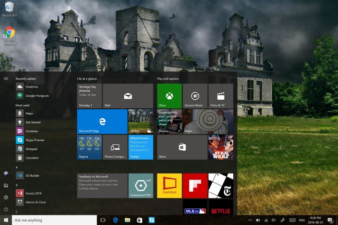
The Start Menu has been a work in progress ever since it made its way back to Windows with the Windows 10 launch. Throughout the insider builds, there were quite a few iterations of the start menu, and even with the 1511 update in late 2015, Microsoft updated it to add the ability to add more tiles.
With the Anniversary Update, they are at it again. The biggest change is the 'All Apps' option, which is now gone. All of the apps now default to showing in the Start Menu in a scrollable list, with the most used and recently added apps at the top. The 'Recently Added' option now also shows three apps, which is a nice change. Keeping all of the apps accessible makes it easier to navigate to them. You can of course still just type the name of the app as well, and it will populate from an indexed search.
Action Center Updates
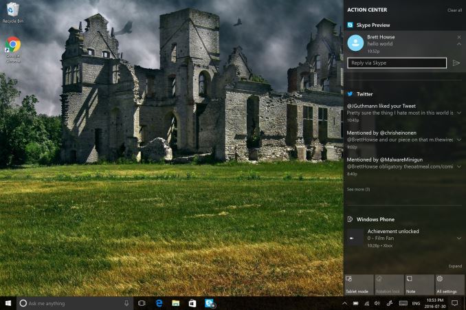
The Action Center gets some nice changes as well. The icon has been subtly tweaked, and it now shows how many notifications you have. The notifications have been increased in size, and Windows 10 now allows you to set priority levels for notifications, so your most important ones are always on top. With apps like Skype, you can reply in-line with the notification, either through the toast pop-up when it first arrives, or later through the Action Center.
Microsoft demoed Universal Dismiss and Notification Mirroring at the Build developer conference, which will allow for notifications dismissed on one device to mirror that dismissal to all devices, and that’s made it into this update. One tip for Windows 10 notifications: if you have an app that spams notifications, you can right click it in the Action Center and turn off notifications for that app. This existed prior to this update as well, but it’s a very handy trick so I figured I’d mention it.
Settings Gets Icons
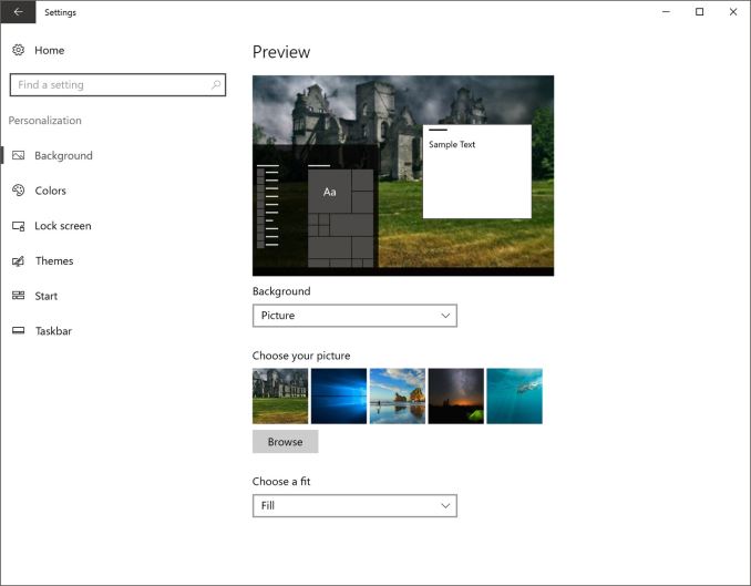
This is a small change, but Settings was completely text based in Windows 10 until this update. Now, there are icons for each setting. In addition, some of the settings have been broken out a bit better into their own categories.
For example, if you want to join the Windows Insider Program, that has its own category under Update & Security, rather than under and Advanced menu for Updates themselves. Settings continues to offer the search function as well, which makes it much quicker to find any setting.
Lock Screen Changes
The Lock Screen has always been a bit of an odd thing in Windows 10. It’s origins are from the mobile side, where notifications and detailed status updates can be quickly seen when you power on your phone. On a tablet or phone, this is likely more useful than on the desktop, but since Windows 10 is the same OS across all of those devices, the lock screen updates are of course across all devices. The new lock screen now integrates Cortana, and the image on the lock screen is now the same one as the log-in screen, meaning it’s a less jarring experience to unlock the PC. The two images was always a bit odd. These are small changes, but a lot of this update is about making a more consistent experience, so they fit well.


194 Comments
View All Comments
faizoff - Tuesday, August 2, 2016 - link
Most excited for edge extensions, hopefully the update rolls out soon to my PC.retrospooty - Tuesday, August 2, 2016 - link
Can I ask why? Not trolling you, just curious as to what you like about Edge. I found it pretty much "meh" and dont know anyone that uses it at all. Granted extensions will help it, but what would that give you over Chrome or any other browser that already has a huge extension library?mphuie - Tuesday, August 2, 2016 - link
If you have a laptop, Edge is a livesaver. Chrome is a huge battery hog. Granted, I still prefer Chrome on the desktop, but Edge is decent. Extensions would make it a whole lot better.retrospooty - Tuesday, August 2, 2016 - link
Thanks... That makes sense. I do have a T460s, but I really dont use it on battery a ton, usually docked in the office.Michael Bay - Tuesday, August 2, 2016 - link
Agreed. Anything beside Edge on tablet either works woefully slow or eats battery like it`s plugged in.Samus - Tuesday, August 2, 2016 - link
Edge is 2 faced for me. Even after following some how to's on performance tweaking Edge, it is inconsistently slow. Sometimes it's faster than anything, sometimes I can't even scroll smoothly.There is no doubt it uses less memory than especially chrome though. Chrome spreads itself across task manager like an infection, sometimes running 10 instances for 4 just tabs, no wonder android and chrome devices need so much RAM.
JimmiG - Tuesday, August 2, 2016 - link
I use Edge exclusively on my Atom-powered tablet. It's noticeably faster and smoother than the other browsers, and much more touch friendly. However on my desktop and laptop systems I use mostly Vivaldi.Alexvrb - Wednesday, August 3, 2016 - link
I'm glad they implemented swipe gestures like they had in IE on 8.x. Swiping for back/forward nav is so much easier on a tablet or hybrid.Alexvrb - Wednesday, August 3, 2016 - link
Edge is MUCH better on battery life. If you need Chromium and are using an untethered device, run Opera instead. Anyway with the new updates Edge seems even better overall, performance is better and it retains the same low memory usage and power efficiency. Heck with extensions I will have less cause to use anything else... even on the desktop. I'll keep FF around too though I think.powerarmour - Tuesday, August 2, 2016 - link
Chrome isn't a battery hog on a Chromebook... That's purely a 'Windows' thing.