The NZXT Manta mITX Case Review
by E. Fylladitakis on June 16, 2016 9:00 AM EST- Posted in
- Cases/Cooling/PSUs
- Mini ITX
- NZXT
- Case
The Interior of the NZXT Manta
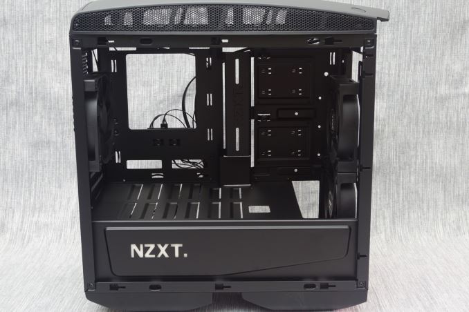
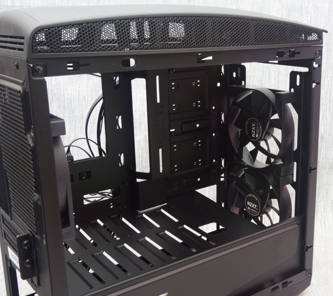
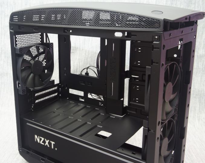
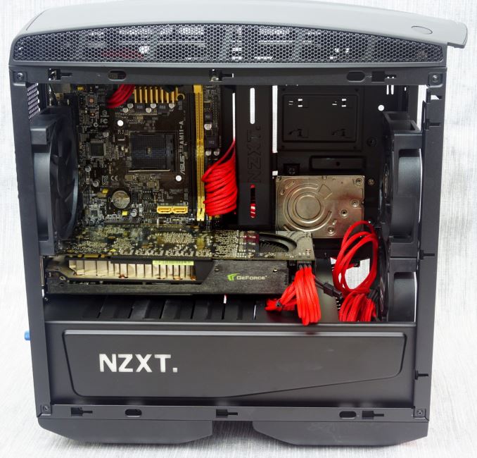
NZXT used the same satin black paint as the exterior to spray the interior of the Manta as well. Everything in the case is black, including the stock cooling fans and their blades. An opening on the motherboard tray allows for the installation of aftermarket CPU coolers without having to remove the motherboard from the case. The opening looks small, but there should not be any compatibility problems with most Mini-ITX boards.
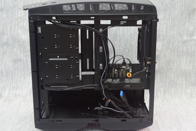
Openings for the routing of cables can be seen above and below the motherboard area. None of the openings have rubber grommets installed, which is strange for a case of this price range. The right side of the motherboard is essentially entirely open and covered by a metallic bridge installed above it. A non-removable metallic shield separates the system area from the PSU compartment.
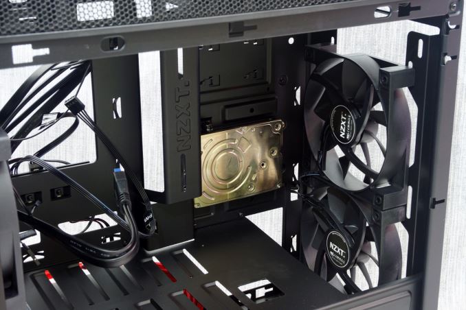
Two metallic 2.5” drive trays can be found to the right side of the main system. Each tray is held by a thumbscrew and can be easily removed without the use of tools, but the device itself needs to be secured onto the tray using screws. The position of the trays also has the devices facing towards the front of the case, meaning that the stickers of some SSD drives will be upside down.
Two 120 mm intake fans can be found installed at the front of the case. 140 mm fans will also fit here, as will 240 mm and 280 mm long liquid cooling radiators. This is equally true for the top panel of the case, allowing the user to concurrently have two powerful liquid cooling systems installed. One 120 mm exhaust fan is installed at the rear of the case, the position of which can be vertically adjusted.
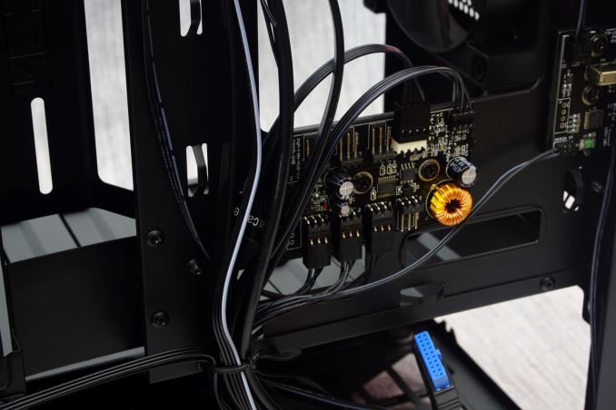
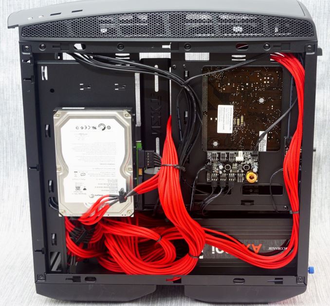
NZXT installed a simplistic but functional fan controller at the rear of the motherboard tray. The controller has seven headers, three of which are occupied by the stock cooling fans. It simply takes the PWM signal from one of the motherboard’s headers and uses it to control the speed of the fans connected to it.
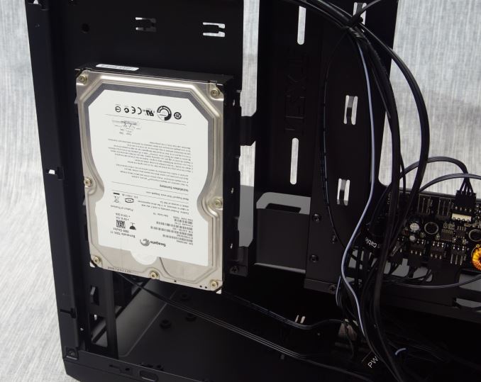
One 3.5” drive can be installed on the back of the system area, behind the 2.5” drive trays. The 3.5” drive needs to be secured using screws and, to that end, the 2.5” drive trays need to come off. Another 3.5” device can be installed to the bottom of the case.
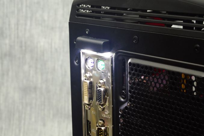
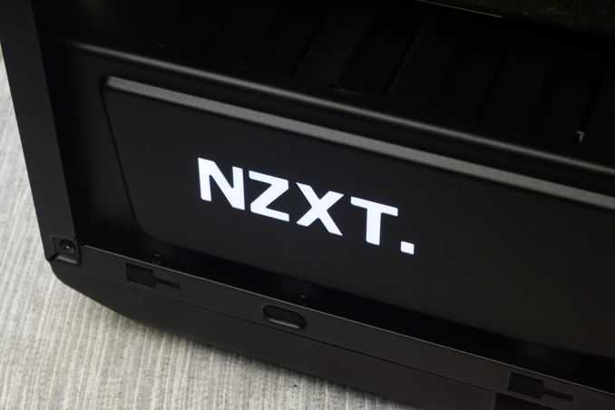
A small button at the rear of the case controls the lighting of the Manta. There are two lighted areas on the Manta. The first one is the white company logo on the front side of the PSU compartment and the second is the exterior of the motherboard’s I/O panel at the rear of the case. This is an interesting approach and can possibly be functional whenever someone wants to insert a cable in the dark. The switch has four settings: all on, logo on, rear panel on, all off. The system area is not in any way illuminated and LED fans or other light sources are virtually necessary to those who want to showcase their system.
For the means of this review, we installed a Corsair AX760i with the red cable set, for strong visual contrast. The AX760i easily fits inside the NZXT Manta, with enough room for managing the cables. The cables are also more than long enough for a typical system, as the Mini-ITX motherboard tray is significantly shorter than what the PSU has been designed for. There are numerous cable tie points that aid with the management of the cables and several openings that bring each cable near its intended connector. Our only concern lies with the metallic bridge to the right side of the motherboard, as it seems to be doing more harm than good, prohibiting the 24-pin cable from taking a proper turn and limiting access to the 2.5” device connectors. Although the clearance looks to be just OK from these pictures, it actually is massive when the extra couple of centimeters that the curved side panel adds are taken into account, which is how the 3.5” drive easily fits there are well.
The Mini-ITX system fits inside the system area of the Manta with ease, allowing the installation of large air coolers, liquid coolers and long/wide graphics cards. There is a long of space in front of the motherboard, allowing cards up to 420 mm long to the installed. However, note that the installation of a liquid cooling radiator at the front of the case will reduce this clearance. The CPU cooler’s maximum height is 160 mm, which is not great considering the massive width of the case. Several top tier air coolers will not fit into the Manta.




48 Comments
View All Comments
jimjamjamie - Thursday, June 16, 2016 - link
Does it have a valve so that you can deflate it?DanNeely - Thursday, June 16, 2016 - link
It's a feature. It's screwed up lines mean that even a reviewer who doesn't know how to take good product photos will have all of their flaws hidden by the WTFs in the case design itself.damianrobertjones - Thursday, June 16, 2016 - link
+1The photos, for this article, are terrible.
HideOut - Thursday, June 16, 2016 - link
But the case looks like a mini pregnant guppy.ddriver - Thursday, June 16, 2016 - link
It looks like it was already used, and the system in it suffered a terrible meltdown.fanofanand - Thursday, June 16, 2016 - link
I thought they were fine. This is a tech site not a photography site.BrokenCrayons - Thursday, June 16, 2016 - link
Photos were adequate for getting the point across. I'd prefer the reviewers put more of their limited time into reviewing a product and writing about it as opposed to setting up glam shots for hardware.Murloc - Thursday, June 16, 2016 - link
yeah companies create enough of those.Plus I want to see how the case looks in real life as well, so pics have to be unrefined.
deanx0r - Sunday, June 19, 2016 - link
Except that aesthetics are an essential part of a case. Most people wouldn't even bother with review of cases they find ugly or uninteresting. It isn't hard to take decent photos. The poor photo quality isn't balanced by the outstanding content of the review either. Their case reviews tend to be generic, borderline mediocre. If anything the poor picture quality just shows a lack of effort from the reviewers.BrokenCrayons - Monday, June 20, 2016 - link
I guess I wouldn't understand. My desktop case sits in a corner, hidden behind a shelf unit. I see it once in a while when I need to press the power button to turn it on. As long as it keeps the parts inside it in the places where I put them and provides enough airflow for cooling, I could care less what it looks like. When I'm playing games on it, I'm streaming them and sitting in different room with my laptop. So for me, the looks of my computer's case is as unimportant as the color of the plastic of my hair dryer.Sure, some people are a lot more superficial about what the box looks like which is why there's a market for fashionable cases that have the right sparkles and sunshine in the right places. Those people seeking a certain style are willing to pay for it so from a company perspective, there's no reason not to release a product in order to reap in larger per-unit margins.
However, taking pics for a review? Whatever. Throw it on your kitchen table, shoot a few photos of it. I don't even care if there's a few dishes loitering in your drying rack in the background. You guys are too picky and its a good thing that most of your spouses, girlfriends, and boyfriends aren't doing that in a more important context than a review of some silly computer case otherwise all those rashes, gaseous emissions, obesity, and body odors would doom the human race.