The Huawei Honor 5X Review: Mid-Range Meets Maturity
by Brandon Chester on February 29, 2016 8:00 AM EST- Posted in
- Smartphones
- Huawei
- Android
- Snapdragon 616
- Honor 5X
Software
In my review of the Huawei P8 Lite I opted to not spend too much time talking about EmotionUI as Andrei had already done a very thorough job in his reviews of other Huawei devices. The same is true for the Honor 5X to a degree, as Andrei has covered EmotionUI 3.1 fairly extensively already. That being said, I do have a few remarks to make about how it looks and performs on the Honor 5X.
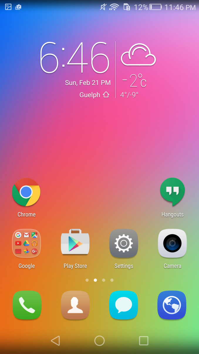
The first thing I noticed that contrasts with EmotionUI 3.1 on the Huawei P8 is the fact that the Honor 5X goes for a much more colorful look. Everything from the icons to the wallpaper is brighter and uses a greater range of bright colors than on the P8. I'm not sure how much of this has to do with Huawei's target audience is for the Honor family (e.g. Millennials), but it's a significant deviation from the default UI on the Huawei Mate and Ascend smartphones.
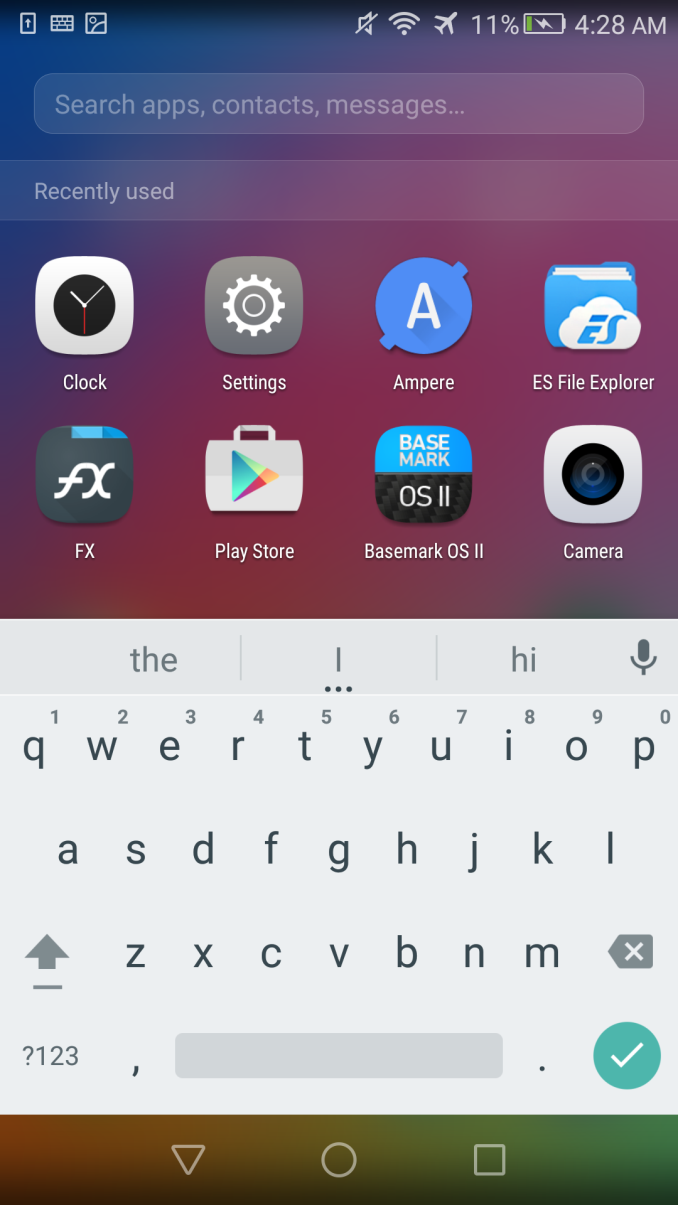
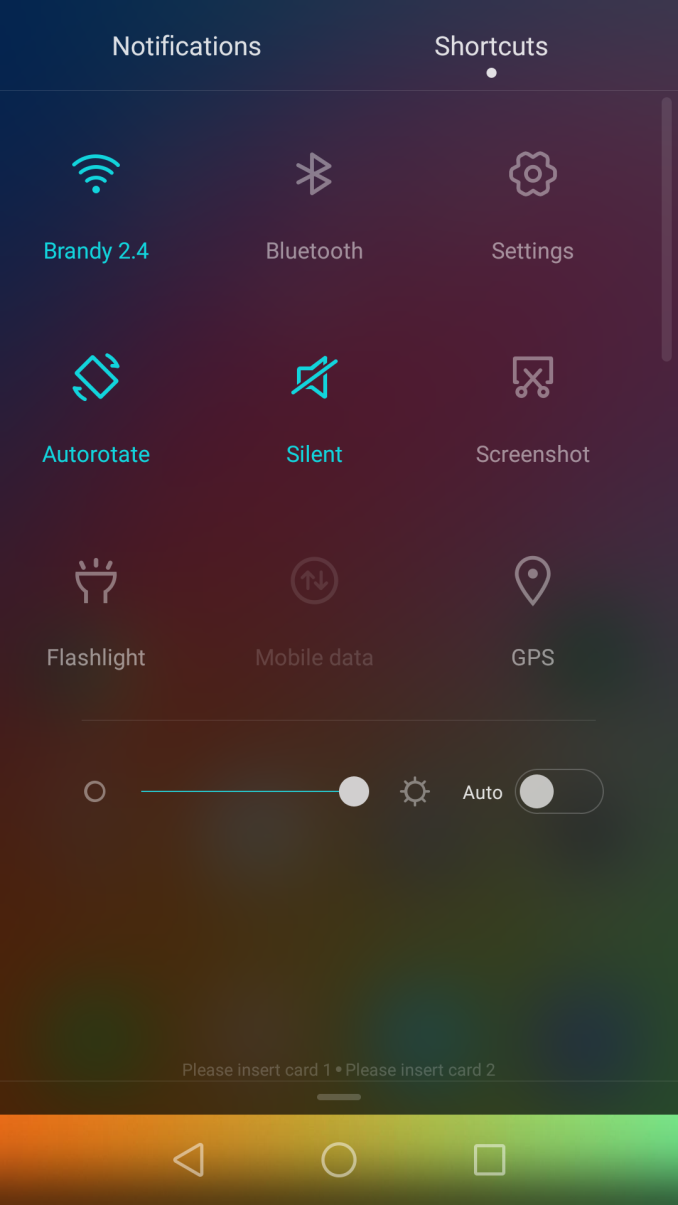
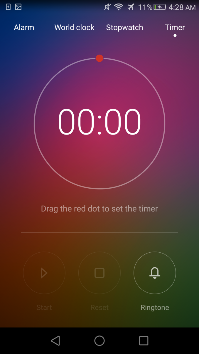
What interests me about EmotionUI is how quickly some people are to dismiss it as a wholesale copy of iOS. There are certainly elements inspired by iOS, just as much as iOS has elements inspired by Android devices. However, there are only a few things that really remind me of iOS devices, with most applications being as unique as they can be considering the fact that they still need to be accessible and usable by a wide range of users who will have preconceptions about how a calendar app or a calculator app is supposed to work. The only things that do make me raise an eyebrow are the liberal use of translucency, the Clock app, swiping down on the home screen to bring up a search bar, and the little settings drawer that you can bring up by swiping up from the bottom of the screen on the lock screen. To be honest, I never found that feature to be very useful either, as most of the functions are things that I also want access to within other applications instead of only when my phone is locked.
Android purists will definitely hate the fact that Huawei's launcher does away with the application drawer and integrates apps and widgets on the same pages. For me this wasn't a big problem, because I rarely find any use for Android's widgets. Ironically, the Honor 5X has a clock and weather widget that I actually did like and end up keeping, and yet I still didn't take issue with Huawei's decision. If you aren't a fan, you can always install one of the many launchers from Google Play and return to the norm, but it's definitely worth noting that EmotionUI is far from what you get on a Nexus phone out of the box.
Something that definitely differentiates the Honor 5X from other smartphones in this price range is its fingerprint scanner. Fingerprint scanners have gotten a lot better on Android than what we saw on the Galaxy S5, or going back even farther, the Motorola Atrix. Like Google's Nexus smartphones, the Honor 5X uses a rear-mounted fingerprint scanner. It doesn't protrude like Nexus Imprint does, so it's actually more like the fingerprint scanner on the HTC One Max than the Nexus phones, but the idea is basically the same across all of the devices.
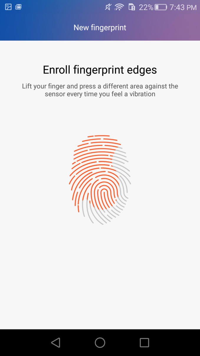
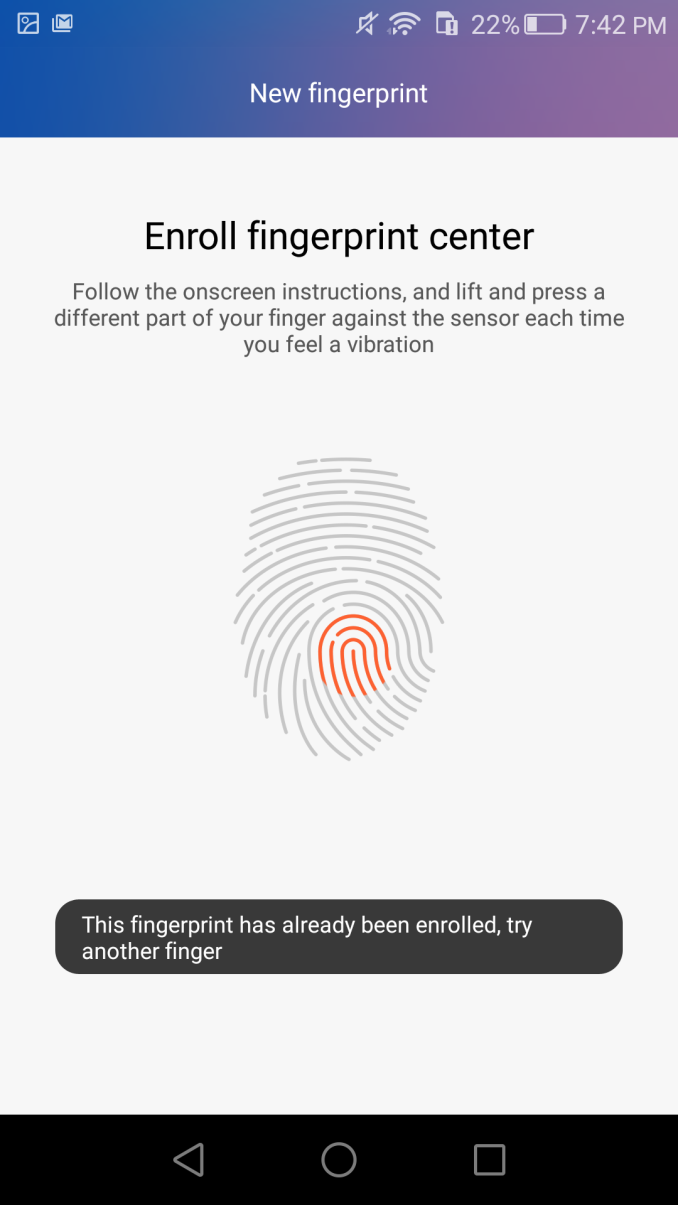
Training your fingerprint is fairly easy. You just press it against the scanner five times, and if it thinks it didn't scan a certain area thoroughly it'll prompt you to press a certain area against it one more time. Interestingly enough, it blocked me from registering one finger a second time, and it only took a single press for it to recognize and block it from being scanned. Thankfully, there's no need to scan a finger multiple times, because the scanner is fairly accurate and I haven't had too many problems with it not scanning on the first try.
Huawei also includes some features like the ability to quick launch apps when you scan a certain finger, but I think this is completely overcomplicating the entire interaction. On top of that, the scanner is quite small and the position of it makes it difficult to use with any finger other than your index finger, so I don't see that feature as being very useful.
UI Performance
Something that I haven't always been impressed with is the UI performance on the Honor 5X. To be honest, it can feel quite sluggish at times, with noticeable jank and dropped frames. These issues often crop up when you're in a part of the UI that uses translucency heavily, and that's just the price you pay for running computationally complex effects on a GPU that really can't manage them properly at this resolution. For example, the notification drawer often can't manage 30fps animations, let alone 60fps. Pulling down on a home screen to bring up a search bar and a keyboard is always janky too.
I don't think it makes sense to have a unified UI if the effects don't run well on your devices, and I would trade the blur for higher framerates in a heartbeat. It looks pretty, but the hardware on the 5X just can't pull it off. On top of that, the display's posterization is most apparent when there's blurring occurring because there's simply not enough precision to render the gradients correctly. Translucency can be a nice effect, but color banding really kills it.
Unfortunately, the big issue with the idea of removing translucency is the fact that the UI depends fairly heavily on it. Applications like the Clock app, and UI elements like the notification drawer adapt to the color scheme given by your wallpaper, and that's a way to personalize your device beyond simple changes like icons or the wallpaper when you're in the launcher. I suppose there's always going to be a tradeoff, and I think I would still opt to get rid of it if it meant areas like the notification drawer would perform better, but I understand the reasoning behind keeping it around even on the less powerful devices.
In the end I'm actually pretty happy with EmotionUI. There are often times where you'll use a device and there's just something about the manufacturer's interface that really feels like a regression from Google's own UI or the UI from another vendor. I never really got that feeling when using the Honor 5X. The only problem for me is the fact that the blur is definitely causing performance problems, and even though it looks really nice I would rather have the performance than the visuals. On top of that, the color banding really lets it down, and in general I think on their mid range devices Huawei should probably in a different direction in order to maintain performance. From what I've been told, the Honor 5X is slated to move to EmotionUI 4.0 around the time it gets the Android Marshmallow update, and it'll be interesting to see what happens to the UI and performance when that transition occurs.




30 Comments
View All Comments
londedoganet - Monday, February 29, 2016 - link
No LTE Web Browsing battery test? Are the bands incompatible?Brandon Chester - Monday, February 29, 2016 - link
I was having difficulties getting sufficient reception due to the weather conditions. The phone has to be placed in a place where it's vulnerable to snow and rain. I'll try to run it at a later point if it's possible.tipoo - Monday, February 29, 2016 - link
Looks like a fair jump over the Moto G for around the same price, nice to see this space heating up. I think the midrange is honestly where the excitement is now, the high end has gotten boring.Though, neither this nor the G are close to taking down the Zenfone 2 for GPU performance yet in the same price category, impressively. I'm unsure if the early issues with the 2 were worked out (battery life, screen color shifting to save power), but for gaming that has both trumped. I'd like to see the Zenfone 3.
blanarahul - Monday, February 29, 2016 - link
If wonder what the real life performance /power differences are between S610 and S615 considering that the extra four cores barely make any difference. Also S610 should be a little cheaper as well.usama_ah - Monday, February 29, 2016 - link
I purchased one from Amazon the day it was released for my mom. Prior to that she was using my OG Moto X on AT&T in Chicago.She's extremely pleased with the phone. There was a slight learning curve going from a near stock launcher to this OS but she loves the big, bright screen and the fingerprint unlock. Camera is good enough for her too. She has noticed the slight UI jankyness while moving about but that's not something she cares about. She uses WhatsApp with family and gets a LOT of pictures and videos so now she doesn't have to delete to make room because she can move them to a microSD card (I set it up to be one button transfer to microSD since WhatsApp doesn't let you default media there). She loves the battery life, and usually charges every other day. She loves the build quality and color (we got her the gold). Works well on AT&T LTE in Chicago and soon she'll be running dual SIM when she goes overseas.
Overall I'm very happy with the purchase, and more importantly she is. It was hard for me to not get her the Moto G but I think we made the right choice, for her. If I was to recommend one to a friend I might still recommend the Moto G first because of customization and flexibility, closer to stock interface. Maybe this year's G will also have a fingerprint reader, we'll see.
zeeBomb - Monday, February 29, 2016 - link
Phone doesn't surprise me due to all the phones I looked at MWC, LOL.Brandon, if you get the chance, review the Alcatel Idol 4!
fanofanand - Monday, February 29, 2016 - link
So it barely beats year old Motorola and Asus phones that sell for the same price. We are impressed because it has a little aluminum? I'd rather a plastic phone with Marshmallow, a better LTE radio, faster ram, and more NAND. This seems like year old specs at the launch, which shouldn't impress anyone.formerglory - Monday, February 29, 2016 - link
Fun fact: the Honor 5X's screen *doesn't* have an oleophobic covering, thus the screen protector that comes with it (that has a coating). Ideally, you're not supposed to remove it, or else suffer the wrath of a constantly fingerprint-covered screen.revanchrist - Monday, February 29, 2016 - link
This is a low end phone priced at mid range price. Man, look at the Snapdragon 616, it's manufactured on 28nm LP. How old was that process already? I'll consider the 28nm HPM Snapdragon 650 and 652 and even the 14nm LPP Snapdragon 625 as mid range, but not the Snapdragon 615 and 616 thanks.beginner99 - Tuesday, March 1, 2016 - link
My though as well. I don't see the midrange except in price. A53's are too slow for midrange and if you really use those, take ones made on 14/16 nm and hence better battery life. The charts clearly show you are better off with a 2 year old flagship.